Proxima Nova Font Pairing: 12 Best Combinations
Proxima Nova is one of those rare typefaces that defined an era of web design. Designed by Mark Simonson and released in 2005, it became arguably the most popular web font of the 2010s — appearing on thousands of sites from BuzzFeed to Mashable to Spotify. Its appeal is structural: Proxima Nova sits at the exact intersection of geometric and humanist sans-serif traditions, borrowing the clean proportions of Futura while softening them with the warmer, more readable letterforms of a humanist design.
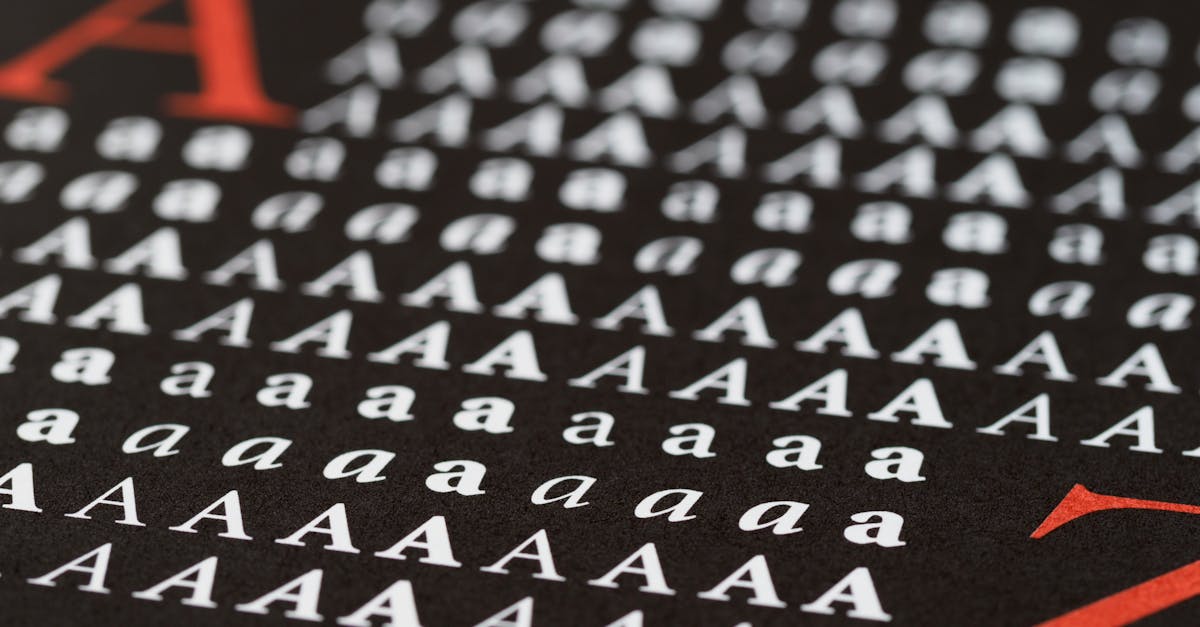
The family is enormous. Forty-eight styles span seven weights (from Thin to Black) across three widths (Condensed, Regular, and Extra Condensed), giving designers significant range within the family alone. It is a premium typeface, available through Adobe Fonts (formerly Typekit) rather than Google Fonts, which keeps it out of the most overused tier while still making it accessible to anyone with a Creative Cloud subscription.
Finding the right Proxima Nova font pairing presents an unusual challenge. Because it bridges two sans-serif traditions, Proxima Nova is so versatile that it pairs acceptably with almost anything. That sounds like an advantage, but it actually makes the choice harder. When nothing clashes, how do you find the combinations that genuinely sing? The best Proxima Nova pairings are the ones that play off its geometric-humanist duality — either leaning into one side of its personality or deliberately contrasting against it.
Here are twelve curated combinations, organized by category, with specific weight recommendations and use cases for each.
Key Pairing Principles for Proxima Nova
Before jumping to specific combinations, it helps to understand what makes Proxima Nova tick — and what its companions need to bring to the table.
Play off the duality. Proxima Nova’s defining characteristic is its blend of geometric structure and humanist warmth. The most effective pairings choose a companion that commits to one side. A strictly geometric sans-serif like Futura creates contrast by being more rigid than Proxima Nova. A traditional serif like Georgia creates contrast by being more organic. Either approach works because it gives each typeface a clear identity in the hierarchy.
Match the x-height. Proxima Nova has a generous x-height, which is one reason it reads so well on screens. Companions with a significantly smaller x-height — many classical serifs, for instance — will look undersized next to it unless you bump up their point size. When evaluating a pairing, set both fonts at the same size and check whether they feel optically balanced.
Respect the weight range. With seven weights available, Proxima Nova can handle a wide range of typographic roles. Avoid pairing it with a companion that only comes in Regular and Bold — you will end up needing a weight that does not exist. The best companions offer at least four weights so you can maintain visual consistency across headings, subheadings, body text, and captions.
Consider the premium context. Proxima Nova is a paid font. If your companion is a free Google Font, that is perfectly fine for web projects — but be aware that mixing a premium sans-serif with a low-quality free serif will make the quality gap visible. Stick to well-crafted companions regardless of licensing.
Serif Companions
Serifs are the natural pairing territory for any sans-serif. With Proxima Nova, the best serif companions either echo its clean, modern sensibility or deliberately contrast it with classical warmth.
1. Proxima Nova + Georgia
Why it works: Georgia is the most reliable serif on the web — it was designed specifically for screen reading by Matthew Carter and ships on virtually every device. Its generous x-height closely matches Proxima Nova’s, which means the two sit together comfortably without size adjustments. Georgia’s slight warmth and old-style figures complement Proxima Nova’s humanist side, while its sturdy construction holds up against Proxima Nova’s geometric clarity. This is the safest possible pairing: it works in every context and requires zero additional font loading.
Best for: Content-heavy websites, blogs, news publications, documentation sites, any project where performance and universal rendering matter more than typographic distinctiveness.
Recommended weights: Proxima Nova Semibold (600) for headings, Georgia Regular (400) for body text. Use Proxima Nova Regular (400) for navigation and UI elements.
h1, h2, h3 {
  font-family: "Proxima Nova", "Helvetica Neue", Helvetica, Arial, sans-serif;
  font-weight: 600;
}

body, p, li {
  font-family: Georgia, "Times New Roman", Times, serif;
  font-weight: 400;
  line-height: 1.7;
}
2. Proxima Nova + Merriweather
Why it works: Merriweather was designed by Eben Sorkin with screen readability as the primary goal. Its large x-height, open counters, and slightly condensed proportions make it one of the best Google Fonts serifs for body text. Paired with Proxima Nova, it creates a polished, contemporary editorial feel. Merriweather’s subtle bracketed serifs provide texture without fussiness — exactly the kind of low-key detail that complements Proxima Nova’s clean geometry.
Best for: Long-form editorial, content marketing sites, SaaS marketing pages, any project that needs a premium look with free body text.
Recommended weights: Proxima Nova Bold (700) for H1, Semibold (600) for H2-H3, Merriweather Regular (400) for body, Merriweather Bold (700) for inline emphasis.
h1 {
  font-family: "Proxima Nova", sans-serif;
  font-weight: 700;
  letter-spacing: -0.02em;
}

h2, h3 {
  font-family: "Proxima Nova", sans-serif;
  font-weight: 600;
}

body, p {
  font-family: "Merriweather", Georgia, serif;
  font-weight: 400;
  line-height: 1.75;
  font-size: 1.0625rem;
}
3. Proxima Nova + Playfair Display
Why it works: This flips the typical script — Playfair Display takes the headline role while Proxima Nova handles body text. Playfair’s dramatic stroke contrast, elegant ball terminals, and Didone-inflected style create striking headlines that feel editorial and sophisticated. Proxima Nova’s neutral warmth then provides a clean, readable base that never competes with Playfair’s personality. The contrast between Playfair’s high drama and Proxima Nova’s steady composure is what makes this pairing electric.
Best for: Fashion, editorial, luxury brands, portfolio sites, wedding invitations, lifestyle publications.
Recommended weights: Playfair Display Bold (700) or Black (900) for headlines only, Proxima Nova Regular (400) for body text, Proxima Nova Light (300) for captions and metadata.
h1 {
  font-family: "Playfair Display", Georgia, serif;
  font-weight: 700;
  font-size: 3rem;
  line-height: 1.15;
}

body, p {
  font-family: "Proxima Nova", "Helvetica Neue", sans-serif;
  font-weight: 400;
  line-height: 1.65;
}

.caption, .meta {
  font-family: "Proxima Nova", sans-serif;
  font-weight: 300;
  font-size: 0.875rem;
  letter-spacing: 0.02em;
}
4. Proxima Nova + Freight Text
Why it works: Freight Text, designed by Joshua Darden, is a refined transitional serif built for extended reading. Its moderate stroke contrast and open counters give it excellent legibility at body sizes, while its slightly condensed proportions pair beautifully with Proxima Nova’s compact geometry. Together, they create a combination that feels polished and intentional — the kind of pairing you see in well-designed long-form publications and high-end brand systems. Both typefaces share a sense of controlled sophistication without pretension.
Best for: Book and magazine layouts, literary publications, long-form journalism, brand identity systems for premium products.
Recommended weights: Proxima Nova Bold (700) for headings, Freight Text Book (400) for body, Freight Text Bold for pull quotes and inline emphasis.
5. Proxima Nova + Adelle
Why it works: Adelle, by Veronika Burian and José Scaglione of TypeTogether, is a slab serif designed explicitly for editorial use. Its sturdy, squared serifs give it a slightly mechanical feel that echoes Proxima Nova’s geometric tendencies, while its open proportions and careful detailing keep it warm and readable. This is a pairing for designers who want more visual weight and presence in their body text than a traditional serif provides, without sacrificing readability.
Best for: News websites, magazine redesigns, content-driven platforms, branding for media companies.
Recommended weights: Proxima Nova Semibold (600) for headings, Adelle Regular (400) for body, Adelle Semibold for subheadings when you want the serif to carry more of the layout.
Sans-Serif Companions
Pairing two sans-serifs requires more care than pairing a serif with a sans-serif, because the risk of the two looking too similar is real. The key is choosing companions that differ from Proxima Nova in construction, proportion, or personality — not just in minor details like the shape of the lowercase g.
6. Proxima Nova + Futura
Why it works: Futura is the archetypal geometric sans-serif — Paul Renner’s 1927 design is all circles, triangles, and straight lines. Proxima Nova was partly inspired by Futura but softened its strict geometry. Pairing the two creates a fascinating tension: Futura’s rigid, almost architectural headings sit above Proxima Nova’s warmer, more approachable body text. The shared geometric DNA keeps them cohesive, while Futura’s stricter proportions establish a clear contrast.
Best for: Architecture firms, design studios, modernist branding, tech products that want a distinctive edge, gallery and museum sites.
Recommended weights: Futura Bold or Heavy for display headings (often in uppercase with generous letter-spacing), Proxima Nova Regular (400) for body text.
7. Proxima Nova + Inter
Why it works: Inter, designed by Rasmus Andersson, was built specifically for user interfaces. Its tall x-height and carefully tuned letterforms at small sizes make it the ideal companion when Proxima Nova handles the brand and marketing layer while Inter does the functional heavy lifting in the product UI. This is not a pairing built on dramatic contrast — it is a practical division of labor where each font serves the context it was optimized for.
Best for: SaaS products, web applications, any project that has both a marketing site (Proxima Nova) and a product interface (Inter) that need to feel connected but serve different purposes.
Recommended weights: Proxima Nova Semibold (600) and Bold (700) for marketing headings and brand moments, Inter Regular (400) and Medium (500) for UI text, labels, navigation, and in-app content.
8. Proxima Nova + Open Sans
Why it works: Open Sans, designed by Steve Matteson, is a humanist sans-serif with friendly, open letterforms. While it shares some territory with Proxima Nova, the two differ enough in construction to work together. Open Sans is rounder, wider, and more overtly humanist. Use Proxima Nova for headings and brand elements where its geometric precision adds authority, and Open Sans for body text where its wider letterforms and open counters improve readability at small sizes.
Best for: Corporate websites, government and nonprofit sites, documentation, any project that needs to feel approachable and universally readable without strong personality.
Recommended weights: Proxima Nova Bold (700) for headings, Open Sans Regular (400) for body text, Open Sans Semibold (600) for subheadings and labels.
Display Pairings
Display typefaces are designed to shine at large sizes — headlines, hero sections, posters. They often have distinctive features that would impair readability at body sizes but create impact and personality when used big. Proxima Nova is the perfect supporting actor for display fonts because it provides clean, neutral body text that never competes for attention.
9. Proxima Nova + Canela
Why it works: Canela, designed by Miguel Reyes for Commercial Type, is a hybrid serif that merges serif and sans-serif conventions. Its soft, slightly flared stroke endings and organic curves feel warm, human, and luxurious. Against Proxima Nova’s clean geometry, Canela creates a pairing that is both sophisticated and accessible — the Canela headlines draw you in with personality, and the Proxima Nova body text keeps you reading with clarity. This combination has become a staple in contemporary brand design.
Best for: Luxury brands, beauty and wellness, lifestyle publications, hospitality, high-end product marketing.
Recommended weights: Canela Light or Regular for large display headings (it looks best with generous sizing), Proxima Nova Regular (400) for body text, Proxima Nova Medium (500) for subheadings.
10. Proxima Nova + Abril Fatface
Why it works: Abril Fatface is a free display serif inspired by the heavy titling faces of 19th-century advertising. Its extreme stroke contrast — hairline-thin horizontals against thick, bold verticals — creates headlines that demand attention. Proxima Nova provides the perfect counterbalance: clean, unfussy body text that lets Abril Fatface be the star without the layout feeling chaotic. The contrast between Abril’s theatrical presence and Proxima Nova’s quiet confidence is enormous, and that is exactly why it works.
Best for: Fashion editorials, restaurant and food branding, event sites, magazine covers, any design that needs dramatic headlines.
Recommended weights: Abril Fatface Regular (it only comes in one weight) for headlines at 48px and above, Proxima Nova Regular (400) for body text, Proxima Nova Semibold (600) for supporting headings and navigation.
11. Proxima Nova + GT Sectra
Why it works: GT Sectra, by Dominik Huber and Marc Kappeler of Grilli Type, is a contemporary serif that draws inspiration from the pointed pen rather than the broad nib. Its sharp, almost crystalline serifs and angular details create a distinctly modern personality that feels right at home next to Proxima Nova’s 21st-century sensibility. Where many serifs add warmth and tradition, GT Sectra adds precision and contemporary edge. Paired with Proxima Nova, the combination feels forward-looking and intellectual — ideal for brands that want to signal sophistication without nostalgia.
Best for: Architecture and design publications, cultural institutions, tech companies with editorial ambitions, academic and research organizations.
Recommended weights: GT Sectra Bold for headlines, GT Sectra Regular for pull quotes and featured text, Proxima Nova Regular (400) for body text and interface elements.
Monospace Pairing
12. Proxima Nova + Fira Code
Why it works: Fira Code, based on Mozilla’s Fira Mono by Nikita Prokopov, is a monospace typeface designed for programming with coding ligatures that combine common character sequences (like =>, !=, and ===) into single glyphs. Its generous proportions and clear letterforms make it one of the most readable monospace fonts available. Paired with Proxima Nova, it creates a layout that moves seamlessly between prose and code — Proxima Nova’s humanist warmth makes the explanatory text feel approachable, while Fira Code’s monospace rhythm signals “this is technical content” clearly and attractively.
Best for: Developer portfolios, technical documentation, coding tutorials, software company blogs, API documentation sites.
Recommended weights: Proxima Nova Semibold (600) for headings, Proxima Nova Regular (400) for body paragraphs, Fira Code Regular (400) for code blocks and inline code, Fira Code Light (300) for code in smaller contexts.
Free Alternatives to Proxima Nova Pairings
Proxima Nova is a premium typeface, and not every project has the budget for an Adobe Fonts subscription. If you want to achieve a similar aesthetic using only free Google Fonts, here are equivalent combinations that capture the spirit of the pairings above.
Montserrat as a Proxima Nova substitute. Montserrat is the closest free alternative to Proxima Nova. It shares the geometric-humanist hybrid approach, has a similar x-height, and comes in a wide weight range (Thin through Black). It lacks Proxima Nova’s refinement in the details — the spacing is less polished, and the curves are slightly less controlled — but for most web projects, it is an excellent stand-in.
- Montserrat + Merriweather — replicates the Proxima Nova + Merriweather editorial feel
- Montserrat + Playfair Display — captures the high-contrast headline + neutral body dynamic
- Montserrat + Lora — a warm, readable alternative to the Proxima Nova + Freight Text pairing
- Montserrat + Source Code Pro — the free equivalent of Proxima Nova + Fira Code for technical content
Nunito Sans as an alternative substitute. Nunito Sans has a rounder, friendlier personality than Montserrat but still occupies the geometric-humanist middle ground. It works particularly well in pairings where Proxima Nova’s warmth (rather than its geometry) is the main draw.
- Nunito Sans + Libre Baskerville — a warm, readable combination for blogs and editorial content
- Nunito Sans + Abril Fatface — the same dramatic headline contrast, entirely free
These free alternatives will get you 80% of the way to the Proxima Nova pairings above. The remaining 20% is in the details — Proxima Nova’s more refined spacing, its wider range of widths, and the overall polish that comes from a typeface that has been meticulously crafted and refined over many years.
Frequently Asked Questions
What is the best font to pair with Proxima Nova?
For most projects, Georgia or Merriweather are the safest and most versatile Proxima Nova pairings. Both have a large x-height that matches Proxima Nova’s proportions, both are optimized for screen reading, and both provide the serif contrast that creates clear visual hierarchy. Georgia has the advantage of being a system font (zero additional loading time), while Merriweather offers a more contemporary feel and is free via Google Fonts. For display headlines, Playfair Display and Canela are the standout choices.
Is Proxima Nova still worth using in 2026?
Yes, but with awareness. Proxima Nova defined the web design aesthetic of the mid-2010s, and some designers now associate it with that era. However, the typeface itself remains excellently crafted — the proportions, spacing, and weight range are all top-tier. The key is to pair it with companions that feel current rather than defaulting to the combinations that were ubiquitous a decade ago. Pairing it with a contemporary face like Canela or GT Sectra keeps the combination feeling fresh.
Can I use Proxima Nova for free?
Proxima Nova is a commercial typeface. The most accessible way to use it legally is through an Adobe Fonts subscription, which is included with any Creative Cloud plan. It is not available on Google Fonts. If you need a free alternative, Montserrat is the closest match in terms of proportions and personality, followed by Nunito Sans for a warmer interpretation of the same geometric-humanist approach.
How many weights of Proxima Nova should I load for a website?
For most web projects, load three to four weights maximum: Regular (400) for body text, Medium (500) or Semibold (600) for subheadings and UI emphasis, and Bold (700) for primary headings. If your design uses light or thin type for captions or decorative elements, add Light (300). Avoid loading the full family of 48 styles — it will impact page performance significantly. With Adobe Fonts, the hosting is handled for you, but the browser still needs to download and render each weight, so restraint matters.


