Roboto Font: Google’s Go-To Typeface
The roboto font is the typeface that powers Android. Designed by Christian Robertson and released by Google in 2011, Roboto was created to serve as the system font for Android 4.0 Ice Cream Sandwich and has since become one of the most widely used typefaces in the world. Its presence extends far beyond mobile screens: Roboto is the default font for Chrome OS, a cornerstone of Google’s Material Design system, and one of the most popular families on Google Fonts with billions of weekly views. Despite a rocky start and a controversial redesign, Roboto has matured into a highly versatile neo-grotesque sans-serif that works across interfaces, websites, and applications of every kind.
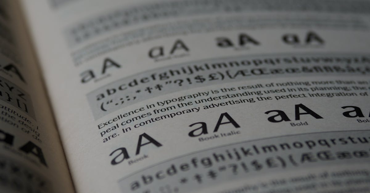
But what makes Roboto different from other sans-serifs? How does it compare to Helvetica and Inter? And is it still a good choice for your next project? This complete guide covers everything you need to know.
Quick Facts About the Roboto Font
- Designer: Christian Robertson
- Foundry: Google
- Release Year: 2011 (redesigned 2014)
- Classification: Neo-grotesque sans-serif
- Weights: Thin (100), Light (300), Regular (400), Medium (500), Bold (700), Black (900) — 12 styles including italics
- Best For: Android UI, web applications, apps, body text
- Price: Free, open source (Apache License 2.0)
- Notable Users: Android, Chrome OS, Material Design, YouTube
The History of the Roboto Font: From Android’s System Face to Global Default
Origins: Android 4.0 Ice Cream Sandwich (2011)
Before Roboto, Android’s typographic identity was scattered. Early versions of the operating system relied on Droid Sans, a serviceable but unremarkable typeface created by Ascender Corporation. As Android matured and Google’s design ambitions grew, the need for a more sophisticated, more flexible system font became clear. Google commissioned Christian Robertson, a type designer who had previously released the open-source typeface Ubuntu Titling, to create an entirely new typeface for Android.
The original Roboto debuted alongside Android 4.0 Ice Cream Sandwich in October 2011. Google positioned it as a modern, forward-looking typeface — one that would unify the look and feel of the Android platform and signal that Google was serious about design. The announcement was ambitious, but the reception was mixed.
The Controversy: “Part Helvetica, Part DIN, Part Univers”
Typographers and design critics were quick to dissect the original Roboto, and the verdict was not kind. Many commentators observed that the typeface appeared to borrow heavily from existing designs. The proportions and overall rhythm recalled Helvetica, the geometric characteristics echoed DIN, and certain letter shapes seemed lifted from Univers. The type critic Stephen Coles described it as a “Franken-font” — a collage of existing typefaces rather than a cohesive original design. The letterforms had inconsistencies in their construction: some characters were fully geometric, others were humanist, and the overall family felt like it lacked a unified design philosophy.
Despite the criticism, Roboto shipped on millions of Android devices, giving it an installed base that most typefaces could only dream of. And Google, to its credit, listened to the feedback.
The Redesign: Material Design and Roboto 2.0 (2014)
When Google unveiled Material Design at its 2014 I/O conference, the new design language came with a significantly revised version of Roboto. The redesign addressed many of the criticisms leveled at the original. Characters were redrawn with more consistent proportions. The letterforms became slightly wider and more rounded, lending the typeface a friendlier, more approachable feel. Awkward details were refined, and the overall design gained the coherence it had previously lacked.
The 2014 Roboto was not just a refinement — it was effectively a new typeface wearing the same name. The changes were substantial enough that text set in the original Roboto and the redesigned version would reflow, changing layouts and line breaks. This was a bold move, but it paid off. The revised Roboto was received far more favorably by the design community and established itself as a credible, if not revolutionary, neo-grotesque sans-serif.
Roboto Flex: The Variable Font Era (2022)
In 2022, Google released Roboto Flex, a variable font version of Roboto developed in collaboration with Font Bureau. Roboto Flex is one of the most technically ambitious variable fonts ever released, offering not just weight and width axes but also optical size, grade, and multiple parametric axes that give designers unprecedented control over the typeface’s appearance. With Roboto Flex, a single font file can produce an enormous range of typographic variations, from ultra-condensed to expanded, from hairline to black, all while allowing fine-tuned adjustments to details like x-height and counter width.
Design Characteristics of the Roboto Font
What defines Roboto’s visual identity is its dual nature. Christian Robertson has described the typeface as having a “dual nature” — a skeleton that is largely geometric combined with curves and letterforms that are more friendly and open than a strictly geometric design would allow. This philosophy is central to understanding what Roboto looks like and why it behaves the way it does on screen.
Geometric Skeleton, Humanist Proportions
Roboto’s underlying structure is geometric: many of its letters are built on circles and straight lines, giving it the clean, rational quality associated with typefaces like Futura and DIN. But where a purely geometric typeface can feel cold and mechanical, Roboto softens its geometry with curves borrowed from the humanist tradition. The result is a typeface that feels modern and efficient without being sterile. This blend is most visible in characters like the lowercase “a” (which uses a double-story form rather than the single-story form common in geometric faces) and the lowercase “e” (whose open aperture adds warmth).
Open Apertures
The redesigned Roboto features notably open apertures — the openings in letters like “c,” “e,” “a,” and “s” are wide and welcoming. This is a significant departure from the closed apertures of Helvetica and other classic neo-grotesques, and it contributes directly to Roboto’s readability at small sizes on screen. Open apertures help readers distinguish between similar letterforms, which is critical in the low-resolution, high-speed reading environments of mobile devices.
Large x-Height
Roboto has a tall x-height, meaning its lowercase letters are relatively large compared to its capital letters. A generous x-height is one of the most reliable ways to improve readability at small sizes, and it makes Roboto feel larger and more legible than other typefaces set at the same point size. This characteristic is shared by most modern UI typefaces, including Inter, but Roboto’s x-height proportions are well-calibrated to balance readability with a comfortable, natural rhythm.
Friendly Curves
Where strict neo-grotesques like Helvetica maintain an almost mechanical uniformity in their curves, Roboto introduces subtle variation. Its round characters are not perfect circles; they are gently squared off, which reduces the optical illusion that round letters appear larger than flat-sided ones. This gives Roboto a more even color — the overall density of text appears more consistent across a block of copy.
Upright Italic
Roboto’s italic style is notably upright compared to the italics of many other sans-serifs. Rather than applying a heavy slant, Roboto’s italics are more gently inclined, maintaining much of the vertical emphasis of the roman forms. This makes the italics less disruptive in running text — they signal emphasis without dramatically altering the texture of a paragraph.
Condensed Variant
Roboto Condensed provides a narrower version of the typeface that is useful in space-constrained environments like mobile navigation, data tables, and sidebars. The condensed variant preserves Roboto’s design DNA while fitting significantly more text into a given horizontal space, making it a practical companion to the standard width.
Roboto vs. Helvetica vs. Inter: A Quick Comparison
These three sans-serifs occupy overlapping territory but serve different purposes and embody different design philosophies.
Helvetica is the classic neo-grotesque: neutral, closed apertures, tight letter spacing, designed for print. It is the most “invisible” of the three, prizing uniformity over readability at small sizes. Helvetica remains the gold standard for brand identity and print typography but struggles at the small sizes and low resolutions common in digital interfaces.
Roboto occupies the middle ground. It borrows Helvetica’s neo-grotesque framework but opens the apertures, increases the x-height, and adds subtle warmth. It is a screen-first typeface that retains some of Helvetica’s neutral character while being far more functional in digital environments.
Inter is the most humanist of the three, with the widest apertures, the most comprehensive OpenType feature set (including tabular figures by default), and the most distinctive character. Inter was designed exclusively for screens and is the most technically advanced, but it has less of the neutral, “invisible” quality that some designers prefer.
In short: choose Helvetica for print and brand, Roboto for Android and Material Design projects, and Inter for cross-platform web applications where typographic features and open licensing matter most.
The Roboto Family: A Complete Ecosystem
One of Roboto’s greatest strengths is its extended family of related typefaces, each designed for a specific purpose.
Roboto (Regular)
The standard version, available in six weights with matching italics. This is the workhorse of the family, suitable for body text, headings, and UI elements.
Roboto Condensed
A narrower version of Roboto available in Light, Regular, and Bold weights with italics. Designed for situations where horizontal space is limited, such as navigation bars, data tables, and mobile interfaces.
Roboto Slab
Roboto Slab adds slab serifs to Roboto’s skeleton, creating a friendly, contemporary slab serif that pairs naturally with its sans-serif sibling. Available in four weights (Thin, Light, Regular, Bold), it works well for headings and display text where you want more visual presence than the sans-serif provides.
Roboto Mono
Roboto Mono is a monospaced version designed for code, terminal output, and any context where characters need to align in columns. Its dual nature — geometric structure with humanist details — carries over from the main family, making it more readable and pleasant than many monospace alternatives.
Roboto Flex (Variable Font)
The most technically advanced member of the family, Roboto Flex offers axes for weight, width, optical size, grade, and several parametric axes. It is one of the most capable variable fonts available, allowing designers to generate an enormous range of typographic styles from a single file. Roboto Flex represents the future direction of the family, offering performance benefits for web use and creative flexibility for designers.
Best Pairings for the Roboto Font
Roboto’s neutral character makes it a flexible pairing partner. Its lack of strong personality is actually an advantage when combining it with more expressive typefaces. Here are the most effective pairings for the Roboto font. For more pairing principles, see our font pairing guide.
Roboto + Roboto Slab
The most natural pairing in the Roboto ecosystem. Because both typefaces share the same underlying structure, they combine effortlessly. Use Roboto Slab for headings and Roboto for body text to create a cohesive, Google-native typographic system with just enough contrast to establish hierarchy.
Roboto + Lora
Cyreal’s Lora is a well-balanced contemporary serif with calligraphic roots. Its warmth and elegance provide a pleasing contrast to Roboto’s rational geometry. This pairing works beautifully for blogs, editorial websites, and content-heavy applications where body text benefits from the readability of a serif.
Roboto + Playfair Display
For projects that need visual drama, Playfair Display provides high-contrast, elegant headlines that pair strikingly with Roboto’s clean body text. The sharp contrast between Playfair Display’s fine serifs and Roboto’s geometric forms creates a sophisticated, editorial feel suited to fashion, culture, and lifestyle content.
Roboto + Merriweather
Eben Sorkin’s Merriweather was designed for screen readability, making it a technically compatible partner for Roboto. Both typefaces share a generous x-height and were built with digital environments in mind. This pairing is reliable for long-form content, documentation, and any project where sustained reading comfort is a priority.
Roboto + Open Sans
While pairing two sans-serifs is less conventional, Roboto and Open Sans have enough subtle differences in character to create hierarchy when used at different sizes and weights. Open Sans is slightly more humanist and warmer, making it a viable secondary sans-serif for projects that want to stay within the Google Fonts ecosystem without using a serif.
Roboto + Oswald
Vernon Adams’ Oswald is a condensed, impactful sans-serif that excels at headlines and display text. Pairing Oswald’s tight, headline-optimized forms with Roboto’s comfortable body text creates a strong hierarchy suited to news sites, magazines, and content-driven platforms.
Roboto + Montserrat
Julieta Ulanovsky’s Montserrat is a geometric sans-serif with more personality than Roboto. Using Montserrat for headings and Roboto for body text creates a pairing where the heading face carries the brand voice while Roboto ensures comfortable reading in longer text.
Roboto + Noto Serif
Google’s Noto Serif is designed to cover every writing system in the world, making this pairing ideal for multilingual projects. The shared Google DNA ensures consistency, and Noto Serif’s sturdy, readable forms complement Roboto’s utilitarian character across languages and scripts.
When to Use the Roboto Font — and When Not To
Where Roboto Excels
- Android applications — Roboto is the native system font for Android. Using it ensures visual consistency with the platform and compliance with Material Design guidelines.
- Material Design projects — If your design system follows Material Design, Roboto is the prescribed typeface and integrates seamlessly with Google’s component libraries.
- Web body text — Roboto’s open apertures, large x-height, and readable proportions make it an excellent body text font for websites and web applications.
- Multilingual projects — When paired with Noto, Roboto supports an extraordinarily wide range of languages through Google’s font ecosystem.
- Performance-conscious projects — As a Google Font, Roboto benefits from aggressive caching on Google’s CDN, meaning many users already have it cached in their browser.
Where to Think Twice
- Brand differentiation — Roboto’s association with Google and Android is so strong that using it can make your project feel “Google-like” whether you intend that or not. Brands seeking a distinctive typographic identity may want to look elsewhere.
- Print-first projects — While Roboto works in print, it was designed for screens. Typefaces with proper ink traps and optical size adjustments tuned for print will produce better results on paper.
- High-end editorial or luxury contexts — Roboto’s utilitarian character lacks the refinement and personality expected in luxury, fashion, and high-end editorial design.
- Projects where you need the most advanced OpenType features — Typefaces like Inter offer a more comprehensive feature set, including tabular figures by default, contextual alternates, and stylistic sets.
How to Use the Roboto Font
Google Fonts Import
The easiest way to add Roboto to a website is through Google Fonts. Add the following link to your HTML <head> section:
<link rel="preconnect" href="https://fonts.googleapis.com">
<link rel="preconnect" href="https://fonts.gstatic.com" crossorigin>
<link href="https://fonts.googleapis.com/css2?family=Roboto:ital,wght@0,100;0,300;0,400;0,500;0,700;0,900;1,100;1,300;1,400;1,500;1,700;1,900&display=swap" rel="stylesheet">
CSS Implementation
Once loaded, apply Roboto in your stylesheet with a sensible fallback stack:
body {
  font-family: 'Roboto', Arial, Helvetica, sans-serif;
  font-weight: 400;
  font-size: 16px;
  line-height: 1.6;
}

h1, h2, h3 {
  font-family: 'Roboto', Arial, Helvetica, sans-serif;
  font-weight: 700;
}

.caption, .label {
  font-family: 'Roboto Condensed', 'Roboto', Arial, sans-serif;
  font-weight: 400;
}
Performance Tip
For production websites, load only the weights you actually use. Loading all 12 styles will slow your page down unnecessarily. Most projects need only Regular (400), Medium (500), and Bold (700) with their matching italics. If you need maximum performance, consider using Roboto Flex as a variable font — a single file that contains every weight and can be subset to reduce file size further.
Roboto Font Alternatives
If Roboto does not quite fit your project, these alternatives occupy similar typographic territory.
Inter
Rasmus Andersson’s Inter is arguably the strongest alternative to Roboto for UI and web design. It offers a more humanist character, a more comprehensive OpenType feature set, and tabular figures by default. Inter is platform-independent and has been adopted by GitHub, Figma, and dozens of prominent tech companies. Choose Inter when you want superior typographic features and do not need Android platform integration.
Open Sans
Steve Matteson’s Open Sans is a humanist sans-serif with a friendly, open character. It is slightly warmer and rounder than Roboto, with excellent readability across sizes. Open Sans is one of the most popular typefaces on Google Fonts and works well for body text, headings, and UI elements in projects that want a more approachable feel than Roboto provides.
Noto Sans
Google’s Noto Sans is designed to support every writing system in the Unicode standard, making it the best choice for truly global, multilingual projects. Its design is harmonious with Roboto (both are Google typefaces), and it serves as the default system font for Chrome OS alongside Roboto. Choose Noto Sans when multilingual support is a primary requirement.
Source Sans Pro
Adobe’s Source Sans Pro (now Source Sans 3) is a versatile, open-source sans-serif with a slightly more humanist feel than Roboto. It was one of the first open-source type families commissioned by a major software company and offers excellent readability across a wide range of sizes and weights. It pairs well with its serif and monospace companions, Source Serif and Source Code Pro. Choose Source Sans when you need a cohesive multi-style family from a single designer. For more options, see our guide to the best sans-serif fonts.
Frequently Asked Questions About the Roboto Font
Is the Roboto font free to use?
Yes. Roboto is completely free and open source, released under the Apache License 2.0. You can use it for any purpose — personal, commercial, web, app, or print — without paying licensing fees. The entire Roboto family, including Roboto Condensed, Roboto Slab, Roboto Mono, and Roboto Flex, is available for free download through Google Fonts. You can also find the source files on GitHub.
Why was Roboto redesigned in 2014?
The original 2011 Roboto received significant criticism from the type design community for being an inconsistent blend of influences from Helvetica, DIN, and Univers. Many felt it lacked a unified design philosophy. When Google launched Material Design in 2014, the company took the opportunity to substantially redraw Roboto. The redesigned version features wider, more rounded letterforms with more consistent proportions and a friendlier overall character. The changes were extensive enough that the 2014 Roboto is effectively a different typeface from the 2011 original.
What is the difference between Roboto and Roboto Flex?
Standard Roboto is a traditional font family with fixed weights (Thin, Light, Regular, Medium, Bold, Black). Roboto Flex is a variable font that contains the entire design space in a single file, with axes for weight, width, optical size, grade, and several parametric axes. Roboto Flex gives designers continuous control over the typeface’s properties rather than being limited to preset weights. It also offers performance advantages for the web, since a single variable font file can replace multiple static font files. Roboto Flex represents the most advanced and flexible version of the Roboto family.
Should I use Roboto or Inter for my website?
It depends on your project. Choose Roboto if you are building an Android application, following Material Design guidelines, or want seamless integration with Google’s ecosystem. Choose Inter if you are building a cross-platform web application and want superior OpenType features, tabular figures by default, and a more distinctive humanist character. Both are free and open source. For most modern web projects outside the Android ecosystem, Inter is generally the stronger choice due to its more advanced feature set and active development. For a deeper look at design tools that support both, see our roundup.


