Periwinkle vs Lavender: What’s the Difference?
The whole question of periwinkle vs lavender hinges on which parent color wins. Periwinkle is a soft, light color that starts from blue and borrows a little purple. Lavender starts from purple and borrows a little blue. Both are pale and gentle, which is exactly why people mix them up.
What color is periwinkle?
Periwinkle is a pale blue-violet named after the periwinkle flower. A representative hex is #CCCCFF. Crucially, its dominant hue is blue: if you nudged the saturation up, periwinkle would resolve into a soft cornflower or sky blue rather than a violet. That blue base is why periwinkle feels calm but still cool and slightly crisp.
In design, periwinkle works as a soft, friendly blue that avoids the coldness of a true light blue. It is popular in spring palettes, wellness branding, and stationery, where it brings a touch of whimsy without becoming overtly purple.
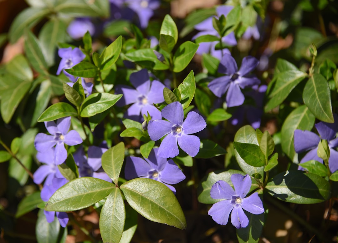
What color is lavender?
Lavender is a pale purple named after the flower and herb. A representative hex is #E6E6FA. Its dominant hue is purple: increase the saturation and lavender resolves into violet or lilac, not blue. That purple base gives lavender a softer, more romantic, slightly warmer feel than periwinkle.
Lavender reads as soothing and elegant, which is why it dominates beauty, spa, wedding, and gentle lifestyle branding. It is a quieter, more pastel cousin of richer purples, and it pairs beautifully with sage, dusty rose, and warm gray.
Periwinkle vs lavender: side-by-side comparison
Exact values vary across brands and screens, but these representative specs show the blue-versus-purple split clearly.
| Attribute | Periwinkle | Lavender |
|---|---|---|
| Hex code | #CCCCFF | #E6E6FA |
| RGB | 204, 204, 255 | 230, 230, 250 |
| CMYK (approx) | 20, 20, 0, 0 | 8, 8, 0, 2 |
| Undertone | Purple over a blue base | Blue over a purple base |
| Hue family | Pale blue (blue-violet) | Pale purple (violet) |
| Best used for | Spring palettes, calm cool branding | Beauty, spa, wedding, soft elegance |
| Mood / feel | Calm, whimsical, fresh | Soothing, romantic, gentle |
How can you tell periwinkle and lavender apart?
The reliable test is the “squint and decide” method: look at the swatch, squint, and ask whether your gut says blue or purple. Periwinkle answers blue; lavender answers purple. A second cue is temperature. Periwinkle feels slightly cooler and crisper, while lavender feels marginally softer and warmer because purple carries a hint of red.
Numbers help too. In periwinkle the red and blue channels are usually balanced with blue equal or slightly higher, keeping it cool. In lavender the red channel creeps up relative to green, pushing it toward purple. If you want to see how this plays out in deeper, more saturated tones, compare our notes on indigo vs violet and lilac vs lavender.
Where do periwinkle and lavender sit on the color wheel?
Both colors live in the blue-violet region of the wheel, which is exactly why they are neighbors rather than opposites. Periwinkle sits a notch closer to blue, while lavender sits a notch closer to red-violet. In hue terms, periwinkle hovers around the boundary where blue tips into violet, and lavender sits just past it on the purple side. They are separated by only a small angular distance, which is the technical reason the human eye struggles to label them confidently.
The second axis that matters is lightness. Both are pale, high-value tints with low to moderate saturation, which strips away a lot of the cues we normally use to identify a hue. When a color is very light, small differences in undertone become harder to read, so two swatches that are objectively different can look almost identical. That combination of close hue and high lightness is why periwinkle and lavender are among the most frequently confused color pairs in design.
How do periwinkle and lavender perform in branding and interiors?
In branding, the two send subtly different messages. Periwinkle, with its blue base, reads as calm, dependable, and a little playful, which suits wellness apps, fintech with a softer face, and youth-leaning lifestyle brands that want approachability without losing trust. Lavender, with its purple base, reads as soothing, creative, and gently luxurious, which is why it dominates beauty, self-care, and wedding work.
In interiors, periwinkle behaves like a soft blue: it cools a room, recedes slightly, and pairs well with crisp whites and warm woods. Lavender behaves like a soft purple: it adds a touch of warmth and romance, and it flatters brass, blush, and sage. Both are excellent low-commitment accent colors because their paleness keeps them from dominating a space, but the room will feel marginally cooler with periwinkle and marginally cozier with lavender.
When should you use periwinkle vs lavender?
Choose periwinkle when you want a soft blue with personality, something calming but still fresh and a little playful. It suits wellness apps, children’s products, spring and Easter palettes, and any brand that wants approachable coolness. Choose lavender when you want gentle, romantic elegance: beauty and skincare, spa and self-care, weddings, and quiet luxury.
They also pair well together precisely because they straddle the blue-purple line, creating a smooth pastel gradient. For a brand-level decision about whether your palette should lean cool or warm overall, read warm vs cool colors, and for a deeper blue companion to periwinkle see cobalt vs sapphire.
Frequently Asked Questions
Is periwinkle blue or purple?
Periwinkle is technically a blue-violet, but its dominant hue is blue. If you increase its saturation it resolves into a soft cornflower blue rather than violet. So while it borrows a little purple, designers correctly treat periwinkle as a pale blue.
Is lavender a shade of purple?
Yes. Lavender is a pale, desaturated purple with just a hint of blue. Raise its saturation and it becomes a clear violet, which confirms its purple identity. It is one of the lightest and softest members of the purple family.
What is the difference between lavender and lilac?
Both are pale purples, but lilac usually carries a touch more pink and warmth, while lavender stays slightly cooler with its hint of blue. Lilac feels a shade rosier; lavender feels a shade airier. The difference is subtle and the names are often used interchangeably.
What colors go well with periwinkle?
Periwinkle pairs nicely with white, soft yellow, peach, mint, and warm gray. For contrast, combine it with coral or a deeper navy. Because it is a calm cool tone, it also sits beautifully alongside lavender and other pastels in a spring palette.
What colors go well with lavender?
Lavender flatters sage green, dusty rose, cream, and soft gray. For a richer look, pair it with deep plum or charcoal. It also harmonizes with periwinkle and other pastels, making it a flexible base for gentle, romantic color schemes.
Are periwinkle and lavender warm or cool colors?
Both are cool, since they sit in the blue-violet range, but periwinkle is the cooler of the two because of its blue base. Lavender’s purple base gives it a faint hint of red warmth, so it feels marginally softer and cozier. In practice both read as calm, gentle, cool-leaning tones.


