Amethyst vs Purple: What’s the Difference?
Comparing amethyst vs purple is really comparing a single named shade to an entire color family. Purple spans a huge range of red-blue mixtures. Amethyst is a specific, jewel-named point within that range: a medium purple that leans slightly toward violet and reads as soft and elegant.
What does “purple” actually mean?
Purple is an umbrella term for any color between red and blue on the color wheel. A representative “standard” purple hex is #800080, an even mix of red and blue. But the family is enormous: it includes violet, plum, mauve, lavender, magenta-leaning purples, and dark eggplant. When someone says “purple,” they could mean almost any of these.
Because it is so broad, purple is best treated as a category rather than a precise color. For practical design work you almost always need to specify which purple you mean, which is exactly why named shades like amethyst exist.
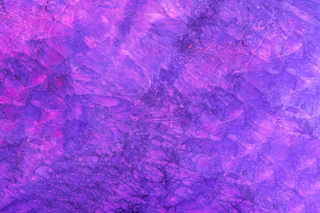
What is amethyst?
Amethyst is a specific medium purple named after the quartz gemstone, with a representative hex of #9966CC. It leans slightly toward violet and blue, giving it a cool, refined character, and it sits at moderate saturation, so it feels softer and more sophisticated than a fully saturated primary purple.
That gemstone heritage gives amethyst a built-in sense of quality. It is a popular choice for beauty, wellness, spiritual, and premium lifestyle branding, where it signals calm luxury. Compared with a generic purple, amethyst is more specific, more elegant, and easier to build a cohesive palette around.
Amethyst vs purple: side-by-side comparison
Since purple is a family, the row below uses standard purple as the reference point. Exact values vary.
| Attribute | Amethyst | Purple (standard) |
|---|---|---|
| Hex code | #9966CC | #800080 |
| RGB | 153, 102, 204 | 128, 0, 128 |
| CMYK (approx) | 25, 50, 0, 20 | 0, 100, 0, 50 |
| Undertone | Cool, slightly violet | Balanced red-blue |
| Hue family | Medium violet-purple | Purple (entire family) |
| Best used for | Beauty, wellness, premium branding | Broad use; specify a shade |
| Mood / feel | Elegant, calm, jewel-like | Bold, regal, variable |
How is amethyst different from a generic purple?
Three things set amethyst apart. First, specificity: amethyst names one defined shade, while “purple” could be any of dozens. Second, lightness and saturation: amethyst is medium and moderately muted, where standard purple is darker and more intense. Third, undertone: amethyst leans gently toward blue and violet, giving it a cooler, softer feel than the punchy balance of a primary purple.
If you want to understand the wider purple landscape, it helps to see how the related shades differ. Our guides to indigo vs violet and lilac vs lavender map out the cooler and paler corners of the family, while periwinkle vs lavender covers the blue-purple boundary.
Where does amethyst fit among the named purples?
It helps to see amethyst in the context of its siblings, because the purple family is crowded and the names overlap. Toward the blue end you find violet and indigo, which are cooler and often more saturated. In the pale corner sit lavender and lilac, soft tints that read as gentle and airy. Toward the red end you find warmer purples like plum, mauve, and magenta-leaning purples that feel richer and cozier.
Amethyst lands in the middle of all this: a medium-lightness, moderately saturated purple with a slight cool lean toward violet. That central position is part of its appeal. It is light enough to feel approachable but saturated enough to feel like a real color rather than a pastel, and its gemstone name gives it a premium identity that a generic “medium purple” lacks. When a brief calls simply for “purple,” amethyst is often the specific shade that satisfies it without tipping too dark, too pale, too warm, or too cool.
What does the color purple communicate?
Purple has carried symbolic weight for millennia, largely because the dyes that produced it were historically rare and expensive, which tied it to royalty and the church. That heritage still echoes today: purple broadly signals luxury, creativity, spirituality, and imagination, sitting at the meeting point of blue’s calm and red’s energy.
Within that, the specific shade shifts the message. Deep, saturated purples lean regal and dramatic. Pale purples like lavender lean soothing and romantic. Amethyst, in its balanced middle ground, reads as calm luxury with a spiritual or wellness undertone, which is exactly why it appears so often in beauty, meditation, and premium self-care branding. Understanding both the family-wide associations and the shade-specific nuances lets you use purple deliberately rather than defaulting to whichever swatch your software offers first.
When should you use amethyst vs a broader purple?
Reach for amethyst when you want a specific, elegant, jewel-toned purple with a calm and premium feel: spa, beauty, wellness, spiritual, and luxury lifestyle brands all suit it. Its moderate saturation makes it usable across large areas without overwhelming the eye.
Use a broader purple term only as a starting point, then immediately narrow it down. Decide whether you want something deep and regal, soft and pastel, or bright and energetic, and pick the precise shade. For the foundational decision of whether your palette leans warm or cool, see warm vs cool colors, and for a deep-blue partner to amethyst, compare cobalt vs sapphire.
Frequently Asked Questions
Is amethyst a shade of purple?
Yes. Amethyst is one specific shade within the purple family, a medium gemstone purple with a slight violet lean. Purple is the broad category; amethyst is a defined point within it. So every amethyst is purple, but the purple family contains many other shades too.
What is the difference between amethyst and violet?
Violet sits closer to blue on the spectrum and is often more saturated, while amethyst is a slightly more muted, medium purple with a gemstone softness. Amethyst borrows some of violet’s coolness but reads as gentler and more refined than a pure, vivid violet.
Is amethyst warm or cool?
Amethyst is a cool purple. Its slight lean toward blue and violet gives it a calm, serene quality, unlike warmer red-leaning purples such as plum or magenta. This coolness is part of why it feels elegant and works well in wellness and beauty branding.
What colors pair well with amethyst?
Amethyst pairs beautifully with soft gold, sage green, blush, cream, and charcoal. For a jewel-tone palette, combine it with emerald or sapphire. Its moderate saturation also lets it sit comfortably beside neutral grays and warm metallics.
Why is there no single “correct” purple hex?
Because purple is a family, not a single color. It spans every mix of red and blue, so there is no one definitive value. Standard purple is often given as #800080, but violet, plum, lavender, and amethyst are all equally valid purples with their own hex codes.
What colors does amethyst pair with for a luxury palette?
For a premium look, combine amethyst with soft gold or champagne, which echoes the gemstone-and-metal pairing of fine jewelry. Add charcoal or deep navy for grounding and a touch of cream for breathing room. To build a true jewel-tone scheme, set amethyst alongside emerald and sapphire for a rich, balanced result.


