Best Script Fonts for Every Style
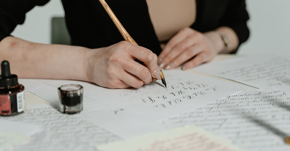
Script fonts are any typefaces that mimic the fluid, connected strokes of handwriting or calligraphy. The category is vast — it stretches from the white-glove formality of copperplate wedding invitations all the way to the loose, carefree energy of a hand-painted cafe sign. That range is exactly what makes script fonts so useful and, at times, so easy to misuse. Picking the right one means understanding the sub-categories and knowing which style fits your project.
This guide organizes more than thirty of the best script fonts into five groups: Formal and Elegant, Modern and Casual, Brush, Retro and Vintage, and Free options on Google Fonts. Each entry includes a short description, its best use case, and pricing so you can make a fast, confident decision. If you are looking specifically for lettering rooted in traditional pen techniques, our guide to calligraphy fonts goes deeper on that sub-genre.
Script Font Sub-Categories Explained
Before diving into individual picks, it helps to understand how script fonts divide into sub-categories. These distinctions are not always razor-sharp — plenty of typefaces straddle two groups — but knowing the general landscape will speed up your selection process.
Formal and copperplate scripts draw from the tradition of pointed-pen calligraphy. They feature high contrast between thick and thin strokes, elegant swashes, and carefully regulated letterforms. Think wedding invitations, diplomas, and luxury packaging. Casual scripts loosen the rules — the strokes are more uniform in weight, the connections between letters feel relaxed, and the overall impression is friendly rather than ceremonious. These are the scripts you see on food packaging, greeting cards, and lifestyle branding.
Brush scripts simulate the marks of a brush or broad-tipped marker. The strokes are energetic, sometimes rough around the edges, and carry a sense of spontaneity. They work well for anything that needs to feel handmade or dynamic. Calligraphic scripts sit close to formal scripts but lean more directly into the tradition of flat-nib or broad-edge pen writing, often preserving the specific stroke patterns that come from those tools. For a deeper look at that distinction, see our guide on what calligraphy is. Finally, retro and vintage scripts reference the sign-painting, mid-century advertising, and lettering traditions of the past — they carry built-in nostalgia and visual warmth.
Formal and Elegant Script Fonts
Formal scripts are the aristocrats of the script font world. They are built on pointed-pen calligraphy traditions, with dramatic thick-thin contrast, precise letter connections, and often an abundance of swashes and flourishes. These are high-ceremony typefaces — they elevate the occasion but demand careful handling. Use them at display sizes only, keep your text short, and give the letterforms plenty of breathing room.
Snell Roundhand
Snell Roundhand is one of the most widely available formal scripts, bundled as a system font on macOS and included with many Adobe products. Based on the eighteenth-century round hand writing of Charles Snell, it strikes a balance between calligraphic authenticity and typographic polish. The letterforms connect smoothly, the contrast is dramatic without being brittle, and the overall rhythm feels graceful rather than fussy.
Its availability makes it a practical default for projects that need an elegant script font without a licensing investment. The Bold weight is surprisingly versatile for short display text, and the Script variant adds extra flourishes for formal stationery.
- Best for: Wedding stationery, formal invitations, certificates, luxury print materials
- Price: Free (system font on macOS)
Edwardian Script
Edwardian Script ITC is the go-to formal script font for anyone working with Microsoft products — it ships with most Windows installations. Designed by Edward Benguiat, it has a flowing, connected structure with moderate contrast and restrained swashes. The letterforms lean to the right at a consistent angle, giving blocks of text a cohesive, rhythmic appearance.
Edwardian Script does not have the refinement of premium alternatives like Burgues Script, but its universal availability makes it a workhorse for event invitations, diplomas, and certificates where the designer may not have access to specialty fonts.
- Best for: Invitations, certificates, event materials on Windows-based workflows
- Price: Free (bundled with Windows)
Bickham Script
Bickham Script Pro, designed by Richard Lipton for Adobe, is arguably the finest formal script font available in digital form. It is modeled on the eighteenth-century engrossing scripts of George Bickham, and the Pro version includes an extraordinary range of OpenType features — ornamental swash capitals, contextual alternates, ligatures, and flourished endings that let designers build compositions of genuine calligraphic beauty.
The three-weight family (Regular, Semibold, Bold) provides flexibility across sizes. Bickham Script rewards designers who take the time to explore its alternate glyphs; with the right software and a careful eye, it can produce results that rival custom hand-lettering.
- Best for: High-end stationery, luxury brand packaging, formal event design
- Price: Included with Adobe Fonts subscription
Shelley Script
Shelley Script, designed by Matthew Carter for Linotype, comes in three levels of ornamentation: Andante (the most restrained), Allegro (moderate flourishing), and Volante (full-dress calligraphic extravagance). This tiered approach is practical — it lets designers dial the formality up or down within a single design system.
The letterforms reference English round hand calligraphy, and Carter’s draughtsmanship ensures that even the most elaborate Volante swashes feel controlled rather than chaotic. Shelley is an excellent choice when you need a formal script that offers flexibility without switching typefaces entirely.
- Best for: Tiered formal designs (invitations, menus, programs) that need varying levels of ornamentation
- Price: Premium (Linotype / Monotype)
Burgues Script
Burgues Script, designed by Alejandro Paul of Sudtipos, is a love letter to the American ornamental penmanship tradition of the nineteenth century — specifically the Spencerian and Zanerian styles that defined business correspondence and engrossing of that era. The font includes an astonishing number of alternates and swash forms, giving designers the tools to create compositions that look genuinely hand-lettered.
Burgues is more ornate than Bickham Script and leans harder into decorative territory. It is not a neutral choice — it announces itself boldly. For projects that need maximum calligraphic drama, few digital script fonts can compete.
- Best for: Ornamental certificates, vintage-luxury branding, decorative display headlines
- Price: Premium (Sudtipos)
Zapfino
Zapfino, designed by legendary calligrapher Hermann Zapf, is one of the most ambitious calligraphic typefaces ever produced. The design draws on Zapf’s own handwriting and includes multiple sets of contextual alternates that automatically vary letter shapes based on surrounding characters, preventing the repetitive patterns that plague most script fonts.
The effect is remarkably close to actual calligraphy — no two instances of the same letter need look identical. Zapfino ships with macOS and is available through Linotype. Its flowing, expansive letterforms require generous line spacing and work best when set in short phrases rather than extended text.
- Best for: Branding, packaging, display headlines where a calligraphic feel is essential
- Price: Free (system font on macOS), premium extended versions from Linotype
Modern and Casual Script Fonts
Casual scripts trade formality for friendliness. The strokes are usually more uniform in weight, the connections between letters feel natural rather than studied, and the overall impression is warm and approachable. These script fonts are the ones you reach for when a project needs personality without pretension — branding, packaging, social media, and any design that should feel human and inviting.
Pacifico
Pacifico is one of the most popular free script fonts on the web, with a breezy, retro-California personality that recalls 1950s surf culture and hand-painted shop signs. The letterforms are connected, moderately thick, and rounded at the edges, giving text a relaxed, friendly quality. It reads well at display sizes and has enough character to work as a logotype foundation.
Because of its popularity, Pacifico can feel overexposed in certain design circles. But popularity exists for a reason — the design is genuinely well-crafted and versatile within its casual range.
- Best for: Casual branding, food and beverage packaging, social media graphics, T-shirt design
- Price: Free (Google Fonts)
Allura
Allura occupies the space between formal and casual script. Designed by TypeSETit, it has the flowing connections and moderate contrast of a calligraphic script but with a relaxed, contemporary rhythm that keeps it from feeling stuffy. The letterforms are elegant without being ornate — think of it as a script font that can attend both a garden party and a board meeting.
Allura is freely available on Google Fonts and has become a popular choice for wedding websites, event branding, and feminine product packaging. It pairs especially well with clean sans-serifs that let its flowing character take center stage.
- Best for: Wedding websites, event branding, beauty and lifestyle design
- Price: Free (Google Fonts)
Lobster
Lobster brought the bold script font into the modern web era. Designed by Pablo Impallari, it has thick, connected strokes with a distinct retro-modern personality. The font includes an impressive set of contextual alternates and ligatures that keep letter connections looking natural rather than mechanical — a feature that was groundbreaking when Lobster first appeared on Google Fonts.
Lobster’s popularity peaked in the early 2010s, and it has become something of a meme in design communities for overuse. That said, the underlying design is strong, and for projects where its bold, bouncy personality fits, it remains a capable choice. Lobster Two offers a lighter alternative with a more refined stroke.
- Best for: Headlines, logos, packaging where bold personality is needed
- Price: Free (Google Fonts)
Satisfy
Satisfy is a smooth, flowing casual script font with connections that feel natural and unhurried. The stroke weight is consistent, the letterforms lean gently to the right, and the overall tone is warm and approachable. It reads more clearly than many casual scripts because of its generous letter spacing and open counters.
This is a good default when you need a casual script that does not draw too much attention to itself — it sets a friendly tone without overwhelming other design elements. Available free on Google Fonts, Satisfy works well in web contexts where you need a script accent for headings or pull quotes.
- Best for: Web headings, restaurant menus, greeting cards, casual branding
- Price: Free (Google Fonts)
Cookie
Cookie is a casual script with brush-like qualities — the strokes have a slight taper and a hand-painted feel without going full brush-script territory. Designed by Ania Kruk, it has a warm, slightly retro personality that works well for food branding, bakeries, and any project that wants to feel homemade and welcoming.
The font is compact and readable at moderate sizes, making it more practical than many decorative scripts. Its letterforms are connected but not overly stylized, keeping the focus on friendliness rather than calligraphic flair.
- Best for: Food and bakery branding, handmade product labels, casual event materials
- Price: Free (Google Fonts)
Rochester
Rochester has a vintage, slightly formal quality that sets it apart from other casual scripts. Its letterforms reference early twentieth-century commercial lettering, with moderate stroke contrast and a confident, upright posture. The connections between letters are smooth but not overly flowing, giving the text a composed, deliberate feel.
This is a useful in-between script — more casual than Edwardian Script, more polished than Pacifico. It works for branding that needs a touch of heritage without full-blown formality, and its clean construction makes it legible at smaller display sizes than many script alternatives.
- Best for: Vintage-inspired branding, restaurant identities, editorial accent text
- Price: Free (Google Fonts)
Brush Script Fonts
Brush scripts capture the energy of ink on paper, simulating the strokes of a brush, marker, or broad-tipped pen. They carry a sense of movement and spontaneity that more polished script fonts cannot replicate. Brush scripts are excellent for designs that need to feel handmade, dynamic, or artistically raw — think album covers, street-wear branding, event posters, and social media content. For more on the tradition behind these styles, see our piece on hand lettering.
Mistral
Mistral, designed by Roger Excoffon in 1953, is one of the original and most influential brush scripts in typographic history. Its letterforms capture the quick, confident strokes of a sign painter working at speed — the connections between letters are irregular, the baseline shifts naturally, and the overall effect is lively and spontaneous. Mistral was designed so that each letter connects to the next without visible joins, an innovation for its time.
As a system font included with Windows and available through various foundries, Mistral remains accessible. Its mid-century French character gives it a specific personality — think Mediterranean cafe signage and vintage European poster design.
- Best for: Retro-European branding, poster design, casual display text with mid-century flair
- Price: Free (system font on Windows)
Brush Script MT
Brush Script MT is the ubiquitous brush script font, available on virtually every operating system. Designed by Robert E. Smith in 1942, it simulates the strokes of a flexible brush with moderate stroke contrast and smooth, connected letterforms. The design leans to the right at a consistent angle, and the overall feel is mid-century commercial — friendly, approachable, and distinctly American.
Brush Script MT suffers from the same issue as Comic Sans — overuse and inappropriate application have given it a poor reputation in some design circles. Used thoughtfully and in the right context, however, the underlying letterforms are well-crafted. It is best reserved for casual, nostalgic, or intentionally retro projects.
- Best for: Retro-themed designs, nostalgic branding, casual packaging
- Price: Free (system font)
Playlist
Playlist is a contemporary brush script by Artimasa Studio that comes in three complementary styles: Script (flowing connected letters), Caps (hand-drawn block capitals), and Ornament (decorative swashes and flourishes). This system approach is incredibly useful — it gives designers a complete hand-lettering toolkit in a single font family, allowing for layered compositions that feel custom without hiring a lettering artist.
The Script style has a natural, unforced quality with irregular baseline bounce and varied stroke widths that convincingly simulate real brush writing. Playlist has become popular for wedding stationery, lifestyle branding, and social media templates.
- Best for: Wedding design, lifestyle branding, social media graphics, layered typographic compositions
- Price: Premium (Creative Market / Artimasa)
Bromello
Bromello is a textured brush script with raw, expressive energy. The strokes show visible brush texture — dry edges, irregular ink distribution, and a slightly rough finish that gives the font an authentic, hand-painted quality. This texture is what separates Bromello from smoother brush scripts and makes it effective for designs that need to feel genuinely handmade.
The font works best at large display sizes where the brush textures are visible. At smaller sizes, the detail can muddy readability. Bromello is a strong choice for packaging, poster design, and brand identities in the food, craft, and outdoor spaces.
- Best for: Artisan product packaging, poster design, craft and outdoor branding
- Price: Premium (available on Creative Market and similar platforms)
Wildflower
Wildflower is a delicate brush script with an organic, botanical quality. The strokes are thinner than most brush scripts, with gentle variation in weight that suggests a fine brush rather than a broad one. The effect is airy and feminine — closer to watercolor calligraphy than sign painting. It includes a generous set of alternates and ligatures that help text feel hand-written rather than typeset.
This font occupies a specific niche — it is perfect for floral branding, botanical illustrations, wellness packaging, and editorial projects with a natural, organic aesthetic. It would feel out of place on a tech startup’s website, but for its intended audience, Wildflower delivers exactly the right tone.
- Best for: Floral and botanical branding, wellness packaging, feminine editorial design
- Price: Premium (various font marketplaces)
Retro and Vintage Script Fonts
Retro scripts carry built-in nostalgia. They reference the sign-painting traditions, mid-century advertising lettering, and hand-drawn commercial scripts of decades past. These script fonts are useful when a project needs warmth, character, and a sense of established history — whether the brand is genuinely old or simply wants to feel that way.
Magnolia Sky
Magnolia Sky is a romantic, vintage-inspired script with flowing connections and a gentle baseline bounce. The letterforms have a softness that suggests ink on textured paper, and the overall personality is nostalgic without being kitschy. It includes a good range of alternates and swash characters that add variety to longer passages of text.
The font has found a strong audience in wedding design, vintage branding, and social media content creation. Its elegant but approachable character makes it a versatile choice for projects that need romance without the rigid formality of copperplate scripts.
- Best for: Wedding stationery, vintage-romantic branding, social media templates
- Price: Premium (various font marketplaces)
Pinyon Script
Pinyon Script bridges the gap between formal copperplate and vintage character. The letterforms are based on pointed-pen calligraphy with high contrast and elegant connections, but the overall feel is warmer and less rigid than pure formal scripts like Bickham or Shelley. There is a slight vintage patina to the design that makes it feel lived-in rather than freshly engraved.
Available free on Google Fonts, Pinyon Script is a practical choice when you need a formal-leaning script without premium licensing. It performs well for invitations, certificates, and any design that needs calligraphic elegance on a budget.
- Best for: Budget-friendly formal invitations, vintage certificates, elegant display text
- Price: Free (Google Fonts)
Lavanderia
Lavanderia, designed by James T. Edmondson, was inspired by the vintage hand-painted signs of San Francisco’s laundromats — specifically the ornate lettering traditions of the city’s Mission District. The font comes in three weights: Sturdy (the heaviest), Regular, and Delicate (the thinnest). Each weight has a distinct personality, from bold and confident to light and airy.
The design is rooted in sign-painting traditions, with ball terminals, looping ascenders, and a confident baseline that gives it a distinctly American vintage character. Lavanderia is an excellent choice for branding, packaging, and any project that needs to feel locally crafted and historically grounded.
- Best for: Local business branding, vintage packaging, restaurant and cafe identities
- Price: Free (available from Lost Type Co-op)
Sign Painter
Sign Painter, from House Industries, is a family of typefaces based on the lettering traditions of American sign painters. The Script variant is a confident, flowing brush script with the irregular rhythms and organic stroke variations that come from painting letters by hand at large scale. It captures the craft and imperfection of a real sign painter’s hand.
House Industries produced Sign Painter as part of a broader exploration of American vernacular lettering, and the attention to authenticity shows. The font includes multiple styles beyond the script — including block capitals and decorative variants — making it a versatile toolkit for vintage-Americana design projects.
- Best for: Americana branding, hand-painted signage aesthetics, craft and artisan packaging
- Price: Premium (House Industries)
Thirsty Script
Thirsty Script, from Yellow Design Studio, is one of the most commercially successful retro script fonts of the past decade. It blends mid-century sign-painting warmth with contemporary polish, resulting in a script font that feels nostalgic but clean enough for modern applications. The letterforms are thick, confident, and well-connected, with an upright posture and generous curves.
The family includes multiple weights and a companion sans-serif (Thirsty Soft) that make for effortless pairing. Thirsty Script has been widely adopted for food and beverage branding, restaurant identities, and packaging design — anywhere that vintage warmth meets contemporary craft.
- Best for: Food and beverage branding, restaurant logos, retro-modern packaging
- Price: Premium (Yellow Design Studio)
Best Free Script Fonts on Google Fonts
Google Fonts has become the most important source of free, high-quality web fonts, and its script font selection has improved significantly. These options are free for both personal and commercial use, load quickly via the Google Fonts API, and cover a range of styles from near-formal to fully casual. If you are building a web project, these are the script fonts to try first. For more free options across all categories, see our best Google Fonts guide.
Pacifico
Covered in the casual section above, Pacifico remains one of the most downloaded script fonts on Google Fonts. Its retro-casual character and strong readability make it a reliable default for web projects that need a friendly script accent. Variable font support is not yet available, but the single weight is versatile enough for most display uses.
- Best for: Web headings, casual branding, social media graphics
- Price: Free (Google Fonts)
Dancing Script
Dancing Script is a lively, casual script font with a distinctive bouncing baseline that gives text a sense of movement and energy. Designed by Pablo Impallari, the letterforms reference the informal handwriting of the 1950s — casual, connected, and full of personality. The variable font version on Google Fonts includes a weight axis from Regular to Bold, providing useful flexibility.
The bouncy baseline is Dancing Script’s signature feature, but it also limits its applications. It works well for headings, pull quotes, and accent text, but the movement makes it tiring to read in longer passages. Keep it short and let the bounce add energy without wearing out the reader.
- Best for: Web headings, creative portfolios, casual event websites, blog accent text
- Price: Free (Google Fonts)
Great Vibes
Great Vibes is the closest thing to a formal calligraphic script available for free on Google Fonts. The letterforms have flowing connections, moderate stroke contrast, and elegant curves that reference pointed-pen calligraphy without the extreme ornamentation of fonts like Burgues Script. It has become a popular choice for wedding websites and event pages where a formal script feel is needed on a zero-dollar font budget.
The font performs well at display sizes on the web, though it should not be used for body text. Pair it with a clean sans-serif or a classic serif for supporting text to create a clear visual hierarchy.
- Best for: Wedding websites, formal event pages, elegant web headings
- Price: Free (Google Fonts)
Caveat
Caveat is less of a script font and more of a handwriting font — the letters are not connected, and the style simulates casual, everyday handwriting rather than calligraphy. But it earns its place on this list because many designers searching for a script font are actually looking for this kind of informal, handwritten feel. Caveat’s charm is its imperfection: the letterforms are slightly irregular, the baseline wanders naturally, and the overall effect is personal and authentic.
The Caveat Brush variant adds a heavier, brushier stroke for more impact. Both versions work well for annotation-style text, handwritten notes overlaid on images, and any web context that needs a personal, human touch.
- Best for: Annotations, personal blog headings, handwritten-note overlays, informal web accents
- Price: Free (Google Fonts)
Sacramento
Sacramento is a semi-formal monoline script — meaning its stroke weight is nearly uniform throughout, without the thick-thin contrast of calligraphic scripts. This gives it a clean, contemporary feel that works well on screen where extreme stroke contrast can cause rendering issues at small sizes. The letterforms are connected and flowing, with a slight lean that suggests casual elegance.
Sacramento is a solid middle-ground choice when you need a script that is more refined than Pacifico but less formal than Great Vibes. It pairs well with geometric sans-serifs and works effectively for brand taglines, section headers, and accent text on the web.
- Best for: Web taglines, brand accent text, section headers, semi-formal digital invitations
- Price: Free (Google Fonts)
Script Fonts vs. Calligraphy Fonts vs. Handwriting Fonts
These three terms overlap, and designers often use them interchangeably. However, understanding the distinctions helps you search more effectively and choose more precisely.
Script fonts are the broadest category. Any typeface with connected or semi-connected letters that mimic the flow of handwriting qualifies. This includes everything from formal copperplate to bouncy casual scripts. The defining characteristic is the sense of continuous motion — the letters feel like they were written without lifting the pen.
Calligraphy fonts are a subset of script fonts that specifically reference the tools and traditions of calligraphy — pointed pens, broad-edge nibs, and brush pens. They tend to show more deliberate stroke variation that reflects the behavior of an actual writing instrument. Bickham Script and Zapfino are calligraphy fonts. Lobster and Pacifico are not. For a deeper exploration, our calligraphy fonts guide covers this sub-category in detail.
Handwriting fonts simulate everyday handwriting rather than formal calligraphy or stylized scripts. The letters are often disconnected or only partially connected, and the style is informal and personal. Caveat and Comic Sans fall into this category. Handwriting fonts are useful when you want text to feel human and unpolished — personal notes, annotations, and casual branding.
The overlap is real: Zapfino is both a script font and a calligraphy font. Allura could be classified as either a script font or a calligraphy font depending on how strict your definitions are. The important thing is knowing where on the formality spectrum your project falls, and choosing a typeface that matches.
When to Use Script Fonts (and When Not To)
Script fonts are powerful precisely because they carry strong emotional associations — elegance, warmth, creativity, nostalgia. But that power cuts both ways. Here is when scripts work and when they do not.
Use Script Fonts For
- Short display text: Headlines, logotypes, pull quotes, and accent phrases. Scripts shine when they have room to breathe and do not need to sustain readability over long passages.
- Establishing tone: A formal script on a wedding invitation sets the right mood instantly. A brush script on a craft beer label communicates handmade authenticity. No other font category conveys emotion as quickly.
- Creating hierarchy: A script heading paired with a sans-serif body font creates immediate visual contrast. The formality gap between the two styles naturally directs the eye.
- Branding and packaging: Scripts add personality and distinction to logos, labels, and packaging — areas where character matters more than extended readability.
Avoid Script Fonts For
- Body text: Connected letterforms and decorative strokes slow reading in long passages. Even the most legible script fonts fatigue readers over more than a sentence or two.
- Small sizes: Script fonts rely on stroke details — connections, contrast, swashes — that disappear or become muddy at small sizes. Most scripts need to be set at 18px or larger to remain legible on screen.
- All-caps settings: Script fonts are designed for mixed-case use. Setting them in all caps breaks the connections between letters and usually produces ugly, unreadable results.
- Low-contrast contexts: The thin strokes in formal scripts can vanish against busy backgrounds or low-contrast color combinations. Ensure adequate contrast when using any script with significant stroke variation.
Pairing Script Fonts with Other Typefaces
Script fonts almost always need a companion typeface. They are too decorative and too low in readability to carry an entire design alone. The key principle is contrast — pair a script with something structurally different so each typeface has a clear role. For a comprehensive framework, see our font pairing guide.
Script plus sans-serif is the most reliable combination. The geometric or grotesque structure of a sans-serif provides a clean, neutral counterpoint that lets the script’s personality shine without competition. Pacifico with Montserrat, Great Vibes with Lato, or Bickham Script with Helvetica Neue all follow this logic.
Script plus serif requires more care because both categories carry strong personality. The pairing works when the serif is restrained and the script is the clear headline — Great Vibes with Georgia, or Allura with a clean transitional serif like Baskerville. Avoid pairing ornate scripts with decorative serifs, as the result tends to feel cluttered and confused.
Script plus slab serif creates a friendly, approachable combination. The weight of a slab serif grounds the script’s flowing character. Thirsty Script with Rockwell, or Dancing Script with Roboto Slab, creates warm, readable pairings with a touch of vintage personality.
The universal rule: only one script per design. Two script fonts in the same layout compete for attention and create visual chaos. Let the script be the star, and let everything else play a supporting role.
Frequently Asked Questions
What is the difference between a script font and a cursive font?
In common usage, the terms are interchangeable. Both refer to typefaces with connected or flowing letterforms that mimic handwriting. In a stricter typographic sense, “script” is the broader category encompassing all connected-letter typefaces, while “cursive” sometimes refers specifically to the style of joined handwriting taught in schools. When searching for fonts, you will find the same results whether you search for “script font” or “cursive font” — foundries and font libraries tend to categorize them identically.
What are the best free script fonts?
Google Fonts offers the strongest collection of free script fonts for both web and print use. The top picks are Pacifico (retro-casual), Dancing Script (lively and bouncy), Great Vibes (elegant and calligraphic), Allura (semi-formal), Caveat (informal handwriting), Sacramento (monoline semi-formal), and Satisfy (smooth and warm). For free options beyond Google Fonts, Lavanderia from Lost Type Co-op is an excellent vintage script, and system fonts like Snell Roundhand (macOS) and Brush Script MT (Windows) provide no-cost options for desktop design work [LINK: /best-google-fonts/].
Can I use a script font for my logo?
Yes, and many iconic brands do — Coca-Cola, Ford, Cadillac, Instagram (in its early years), and Kellogg’s all use or have used script-based logotypes. The key considerations are legibility at small sizes (favicons, social media avatars, fine print), uniqueness (popular free scripts like Pacifico and Lobster appear in thousands of logos), and licensing (verify that your font license permits trademark use). For maximum distinction, consider commissioning custom lettering based on a script font you like, or choose a premium script with enough alternates to create a unique configuration.
How do I make a script font look more realistic?
Three techniques make the biggest difference. First, enable OpenType features — contextual alternates, ligatures, and swash variants — in your design software. These features vary letter shapes based on context, preventing the repetitive patterns that make script fonts look mechanical. Second, adjust letter spacing carefully; default tracking is often too tight or too loose, and even small adjustments improve the flow. Third, consider mixing alternates manually for key letters, especially at the beginning and end of words where swash forms tend to be available. Fonts like Bickham Script Pro, Burgues Script, and Playlist include extensive alternate sets specifically for this purpose.


