Graphic Design Principles: A Visual Guide
Every compelling poster, every intuitive website, every brand identity that sticks in your memory shares something in common: a firm grounding in the core graphic design principles. These principles are the grammar of visual communication. They govern how elements relate to one another on a page, how the eye travels through a composition, and how meaning is constructed without a single word being read.
You have probably heard designers talk about “breaking the rules.” What they rarely mention is that breaking rules only works when you understand them first. A jazz musician improvises over chord progressions they have internalized through years of practice. A designer subverts expectations only after mastering what those expectations are. The principles of graphic design are your chord progressions — learn them deeply, and creative freedom follows naturally.
This guide walks through the foundational visual design principles that every designer should know: balance, contrast, hierarchy, alignment, repetition, proximity, white space, and unity. Each section includes real-world examples and practical tips you can apply to your next project, whether that project is a business card, a billboard, or a full website redesign.
Balance
Balance in graphic design refers to the distribution of visual weight across a composition. When a design feels stable and grounded, balance is doing its work. When something feels “off” but you cannot quite explain why, unintentional imbalance is usually the culprit.
Visual weight is not just about physical size. A small, dark element can carry as much weight as a larger, lighter one. A highly saturated color commands more attention than a muted tone. A complex shape feels heavier than a simple one. Understanding what contributes to visual weight is the first step toward controlling balance in your work.
Types of Balance
Symmetrical balance mirrors elements on either side of a central axis. Think of a wedding invitation with centered text, or a government building with identical wings flanking a central entrance. Symmetry communicates formality, stability, and tradition. It is reliable and immediately readable, but it can also feel static if used without variation.
Asymmetrical balance distributes weight unevenly but still achieves equilibrium. A large image on the left might be counterbalanced by a bold headline and a block of text on the right. Editorial design thrives on asymmetry — it creates movement and visual interest while maintaining a sense of order. Most modern web layouts rely on asymmetrical balance to keep pages dynamic.
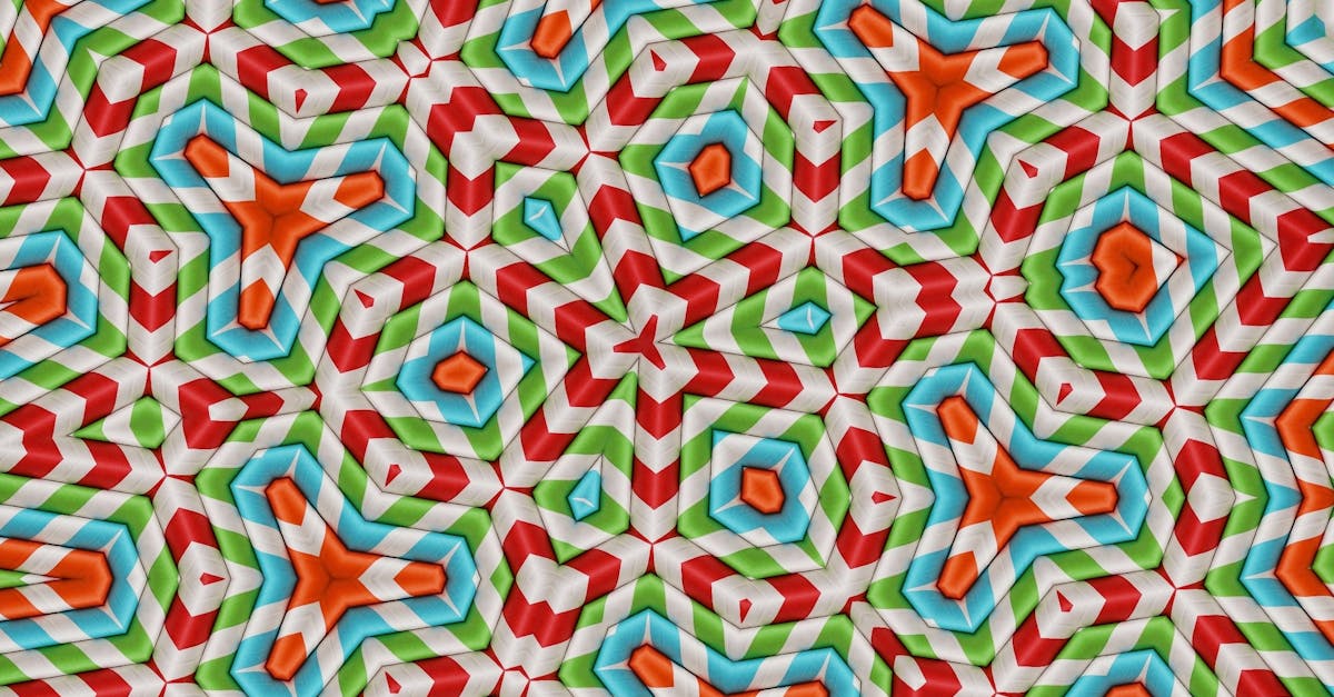
Radial balance arranges elements around a central point, like spokes on a wheel. You see this in logos, mandalas, and circular infographics. Radial balance draws the eye inward and creates a strong focal point at the center of the composition.
Practical Tips for Balance
- Squint at your design. Blurring the details helps you see the overall distribution of visual weight.
- If a composition feels heavy on one side, try adding a smaller element with high contrast — a bold accent color or a dense block of text — to the lighter side.
- Remember that empty space has weight too. A generous margin on one side can balance a cluster of elements on the other.
Contrast
Contrast is the engine of visual interest. It is the difference between elements — the degree to which they stand apart from one another. Without contrast, a design is flat, monotonous, and difficult to navigate. With well-deployed contrast, a composition comes alive and communicates clearly at a glance.
Contrast is not limited to color, though color contrast is the most immediately recognizable form. The design principles of contrast extend across every visual property available to you.
Forms of Contrast
Size contrast is one of the most powerful tools in your arsenal. A headline set at 72 points against body copy at 16 points creates instant hierarchy. A massive product image next to a compact block of specifications tells the viewer where to look first.
Color contrast goes beyond light versus dark. Warm against cool, saturated against muted, complementary colors placed side by side — each pairing creates a different kind of tension and energy. High color contrast improves readability, while low contrast can create a sophisticated, subdued mood.
Weight contrast in typography is the difference between a light and a bold typeface. Pairing a thin sans-serif with a heavy slab serif creates immediate visual separation. This kind of contrast is central to effective font pairing.
Type contrast refers to mixing fundamentally different categories — a serif with a sans-serif, a geometric font with a humanist one, an ornamental display face with a clean body font. The greater the structural difference, the stronger the contrast.
Practical Tips for Contrast
- If two elements are not the same, make them clearly different. Subtle differences — a font that is slightly larger, a color that is slightly darker — read as mistakes, not as intentional design choices.
- Test your color contrast for accessibility. A minimum contrast ratio of 4.5:1 for body text ensures readability for users with visual impairments.
- Use contrast to guide attention. The element with the highest contrast in a composition will be the first thing viewers see.
Hierarchy
Visual hierarchy determines the order in which a viewer processes information. It answers the question: “Where do I look first, and where do I go next?” Without a clear hierarchy, a design becomes a visual democracy where every element demands equal attention — and the viewer, overwhelmed, looks away entirely.
Hierarchy is not a single technique; it is the result of multiple graphic design fundamentals working in concert. You establish hierarchy through size, weight, color, position, spacing, and contrast. Each of these tools adjusts the perceived importance of an element relative to everything else on the page.
Tools for Establishing Hierarchy
Size is the most direct signal. Larger elements are perceived as more important. This is why headlines are bigger than subheadings, which are bigger than body text. It is intuitive and universal.
Weight and style offer more nuanced control. A bold word within a paragraph catches the eye. Italics suggest emphasis or distinction. Uppercase text, used sparingly, signals authority or importance.
Position matters more than most designers realize. Elements placed at the top of a composition or at the top-left of a left-to-right reading culture receive attention first. Placing a key message at the optical center — slightly above the mathematical center — gives it prominence without making it feel forced.
Color and value can elevate or suppress elements. A bright call-to-action button against a neutral background rises to the top of the visual hierarchy. Grey text on a white background recedes, signaling secondary or tertiary information.
Practical Tips for Hierarchy
- Limit your hierarchy to three or four levels. A primary element, a secondary element, body content, and metadata is usually sufficient. More levels create confusion.
- Ask yourself what the single most important thing on the page is. If you cannot answer that question immediately, your hierarchy needs work.
- Test your hierarchy by stepping back from the screen. At arm’s length, the most important element should still be the first thing you notice.
Alignment
Alignment creates visual connections between elements. When a headline, an image, and a block of text all share a common left edge, they feel related and organized. When elements are scattered without a shared reference line, the result looks careless — even if every individual element is well-designed.
Alignment is one of the most underappreciated principles of graphic design. It operates quietly in the background, and its presence is felt more through its absence. You rarely notice good alignment, but you always notice bad alignment.
Grid Systems and Invisible Lines
Professional designers use grid systems to maintain alignment across complex layouts. A grid divides the page into columns and rows, providing anchor points for every element. The most common web grids use 12 columns, which can be subdivided into halves, thirds, quarters, and sixths.
Even without a formal grid, alignment relies on invisible lines — shared edges or centers that connect elements across a composition. A caption aligned to the left edge of the image above it. A logo aligned to the left margin of the page. A centered headline sitting directly above a centered paragraph. These invisible lines create order and cohesion.
Deliberate vs. Accidental Misalignment
There is a critical difference between intentional misalignment and sloppy placement. A designer might deliberately break alignment to create tension, draw attention, or inject energy into a composition. A poster for a punk rock show might scatter text at angles. An editorial layout might let a pull quote break out of the grid to create visual surprise.
The key is that deliberate misalignment is obvious and confident. If an element is off-grid by two pixels, it looks like a mistake. If it is off-grid by fifty pixels, it looks intentional. Go big or stay on the grid.
Practical Tips for Alignment
- Choose one primary alignment — left, right, center, or justified — and use it consistently throughout a design. Mixing alignment types without a clear reason creates visual noise.
- Turn on grid lines or guides in your design software and check every element against them before finalizing.
- Centered alignment works well for short, formal compositions (invitations, title pages) but becomes difficult to read in longer text blocks. Default to left alignment for body copy.
Repetition
Repetition is the principle that ties a design together across multiple pages, screens, or touchpoints. It is the consistent use of colors, typefaces, spacing, graphic elements, and stylistic treatments throughout a body of work. Repetition builds recognition, reinforces identity, and creates rhythm.
In branding, repetition is everything. A company uses the same logo, the same color palette, and the same typographic voice across its website, business cards, packaging, and advertisements. Each repetition strengthens the association between those visual elements and the brand itself. This is why brand guidelines exist — they are essentially repetition manuals.
Repetition as Rhythm
Within a single composition, repetition creates visual rhythm. A series of blog post cards with identical layouts — image on top, headline below, excerpt beneath that — establishes a pattern the viewer can follow comfortably. A magazine that uses the same pull-quote style on every spread builds a cadence that pulls the reader through the content.
Rhythm can be regular (identical intervals and sizes) or progressive (gradually increasing or decreasing). Regular rhythm feels stable and predictable. Progressive rhythm creates a sense of movement and growth, drawing the eye along a path.
Practical Tips for Repetition
- Create a style guide for every project, even a small one. Define your colors (exact hex codes), typefaces (including sizes and weights for each use), and spacing values. Refer to it constantly.
- If you introduce a new visual element — a decorative line, a background shape, an icon style — use it at least three times in the design. A one-off element looks accidental.
- Repetition does not mean monotony. Vary the scale, rotation, or color of a repeated element to keep it interesting while maintaining the pattern.
Proximity
Proximity is the principle that related elements should be grouped together and unrelated elements should be separated. It sounds simple, and it is — but it is violated constantly. A business card where the phone number is closer to the company name than it is to the email address creates confusion about what belongs together.
Proximity is rooted in Gestalt psychology, specifically the Law of Proximity: objects that are near each other are perceived as belonging to the same group. Your brain does this automatically and involuntarily. Designers who understand this can use spatial relationships to communicate structure without needing lines, boxes, or labels.
Gestalt Principles in Practice
Beyond proximity, several related Gestalt principles inform how viewers group visual elements. The Law of Similarity says that elements that look alike are perceived as related. The Law of Enclosure says that elements inside a shared boundary are grouped together. The Law of Continuity says the eye follows smooth paths and curves.
In practice, proximity often works alongside these other principles. A navigation bar groups menu items through proximity (they sit close together) and similarity (they share the same typographic treatment). A form groups related input fields through proximity and enclosure (a subtle background color or a border defines each section).
Practical Tips for Proximity
- When laying out information, start by identifying the logical groups. What elements belong together? Group them spatially before worrying about any other design decisions.
- The space between groups should be noticeably larger than the space between items within a group. A good rule of thumb: inter-group spacing should be at least 1.5 to 2 times the intra-group spacing.
- Resist the urge to fill every gap. If two elements are not related, do not push them together just because there is empty space between them.
White Space
White space — also called negative space — is the empty area between and around elements in a design. It is not wasted space. It is one of the most powerful visual design principles at your disposal, and it is the one most frequently sacrificed by clients who want to “use all the space we’re paying for.”
White space does not have to be white. It is any area of a composition that is free of text, images, or other visual elements. It can be black, colored, textured, or patterned — as long as it provides breathing room for the elements around it.
Active vs. Passive White Space
Passive white space is the natural result of formatting decisions: the space between lines of text (leading), the space between letters (tracking), and the margins around a block of content. It improves readability and prevents the design from feeling cramped. Most designers handle passive white space intuitively through good typographic practice.
Active white space is an intentional design choice. It is the generous margin around a hero headline. It is the empty half of a spread in a high-end fashion magazine. It is the vast expanse of the Google homepage, where a single search bar floats in a sea of nothing. Active white space communicates confidence, sophistication, and clarity. It says: this content is important enough to stand on its own.
White Space and Luxury
There is a well-documented association between white space and perceived value. Luxury brands consistently use more white space than budget brands. Compare the website of a haute couture fashion house with a discount retailer: the luxury site will feature fewer elements per page, larger margins, more breathing room. The discount site will pack in as many products, banners, and calls-to-action as possible.
This is not coincidental. White space implies that a brand can afford to leave space empty — that it does not need to cram in every possible message. It signals restraint, curation, and taste.
Practical Tips for White Space
- When in doubt, add more space. Crowded designs are far more common than overly sparse ones, and adding breathing room almost always improves the result.
- Use white space to reinforce hierarchy. The most important element on the page should have the most space around it.
- Defend your white space. When stakeholders ask you to fill empty areas with additional content, explain that the space is not empty — it is working.
Unity
Unity is the principle that brings all the others together. A unified design feels complete, cohesive, and intentional. Every element looks like it belongs. Nothing feels tacked on, out of place, or disconnected from the whole. Unity is not a single technique — it is the result of balance, contrast, hierarchy, alignment, repetition, proximity, and white space all working in concert.
Think of unity as the difference between a curated outfit and a pile of clothes thrown together at random. Both might contain attractive individual pieces. But the curated outfit has a coherent color palette, consistent proportions, and a clear intention. The random pile does not — and no amount of expensive fabric can compensate for the lack of a unifying vision.
How to Achieve Unity
Consistent visual language. Choose a limited set of colors, typefaces, and graphic treatments, and apply them consistently throughout the design. If your palette is navy and gold, every element should draw from that palette. If your typography system uses a geometric sans-serif for headings and a classic serif for body text, stick with that pairing everywhere.
Shared stylistic DNA. If your icons are flat and minimal, your illustrations should be too. If your photography is moody and desaturated, your color palette should reflect that mood. A design that mixes hand-drawn illustrations with photorealistic renders and flat vector icons will struggle to feel unified, no matter how strong the individual elements are.
A clear conceptual thread. The strongest designs are built on a central idea or theme that informs every creative decision. A conference poster inspired by brutalist architecture might use raw concrete textures, exposed grid structures, and heavy monospaced typography. Every choice reinforces the same concept, and the result feels inevitable.
Practical Tips for Unity
- Before starting a design, write down three adjectives that describe the desired tone. Every creative decision should serve those adjectives.
- Periodically zoom out and review the full composition. Does every element look like it belongs in the same design? If something feels foreign, adjust it or remove it.
- Ask someone unfamiliar with the project to describe the design in a few words. If their description does not match your intended tone, unity has broken down somewhere.
How to Apply These Principles: A Practical Checklist
Understanding the graphic design principles intellectually is one thing. Applying them consistently to real work is another. Use this checklist when reviewing any design, whether it is your own or someone else’s.
Before You Start
- Define the goal. What should the viewer do, feel, or understand after seeing this design? Every principle serves this goal.
- Know your constraints. What is the format, size, and medium? What content must be included? Constraints are not obstacles — they are the boundaries within which creative solutions emerge.
- Establish your visual system. Choose your color palette, typefaces, and spacing values before placing a single element. A system prevents ad hoc decisions that undermine unity.
During the Design Process
- Check hierarchy first. Can you identify the primary, secondary, and tertiary elements at a glance? If not, increase the contrast between levels.
- Audit alignment. Turn on grid lines and check every element. Are edges and centers lined up where they should be? Is any misalignment intentional?
- Group by proximity. Are related elements close together? Are unrelated elements separated by enough space to prevent false groupings?
- Evaluate balance. Step back and squint. Does the composition feel stable, or does it tip to one side?
- Assess white space. Is every element given enough breathing room? Would adding more space improve clarity?
Before You Finalize
- Test repetition. Are your stylistic choices consistent throughout? Would someone looking at any section of the design recognize it as part of the same project?
- Verify contrast. Is there enough differentiation between elements? Are accessibility standards met for text and background combinations?
- Judge unity. Does the design feel like a cohesive whole? Does every element serve the overall concept and tone?
- Get a fresh perspective. Show the design to someone who has not been staring at it for hours. First impressions reveal hierarchy and unity issues that familiarity can hide.
If you are just starting your design journey, our guide to what graphic design is provides useful context on the field as a whole. For inspiration on how these principles manifest in different movements and eras, explore our overview of graphic design styles.
Frequently Asked Questions
What are the most important graphic design principles?
The core graphic design principles are balance, contrast, hierarchy, alignment, repetition, proximity, white space, and unity. No single principle is more important than the others — they work as an interconnected system. However, if you are new to design, focusing on hierarchy and contrast first will produce the most immediate improvement in your work, because they directly control how viewers read and navigate a composition.
How many principles of graphic design are there?
Different educators and design texts list different numbers, typically ranging from five to twelve. The eight principles covered in this guide — balance, contrast, hierarchy, alignment, repetition, proximity, white space, and unity — represent the most widely recognized set. Some frameworks combine or subdivide these differently. For example, some lists include “emphasis” as a separate principle, while others consider it a function of contrast and hierarchy. The exact count matters less than understanding how the concepts work together in practice.
Can you break graphic design principles and still create good work?
Yes, but only if you break them intentionally and with a clear purpose. David Carson’s deconstructivist magazine layouts deliberately violated alignment and hierarchy to create an emotional, almost anti-design aesthetic — and they were groundbreaking precisely because Carson understood the conventions he was subverting. If you break a principle by accident, the result looks like a mistake. If you break it on purpose, with confidence and consistency, it becomes a creative statement. Master the rules before you bend them.
How do graphic design principles apply to web design?
Every principle of graphic design translates directly to web design, with some additional considerations. Hierarchy is critical for guiding users through page content and toward calls-to-action. Contrast must meet Web Content Accessibility Guidelines (WCAG) for readability. Alignment typically follows responsive grid systems that adapt to different screen sizes. Proximity helps organize interactive elements like forms and navigation menus. White space improves both aesthetics and usability by reducing cognitive load. The principles are universal — only the medium changes.


