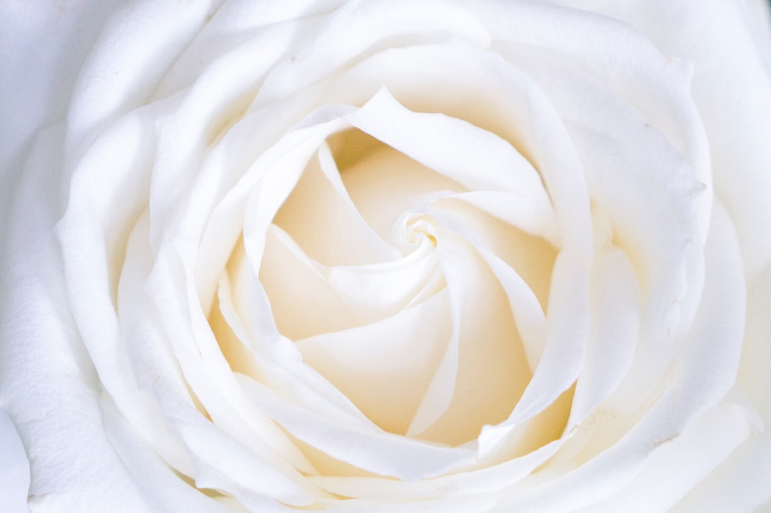
White Color Meaning and Symbolism
The white color meaning is defined by what it lacks: with no hue and maximum lightness, white reads as clean, open, and pure. It is the color of fresh starts, simplicity, and space, which is why it underpins so much minimalist design. Yet its symbolism flips dramatically across cultures, marking weddings in the West and funerals in much of Asia. Below we unpack what white symbolizes, how brands use it, and how its meaning shifts around the world.
What does white symbolize?
White is the color of purity, cleanliness, and simplicity. It evokes fresh snow, blank pages, and clean surfaces, which is why it dominates healthcare, hygiene, and minimalist branding. White also carries connotations of peace, innocence, and new beginnings, seen in the white wedding dress and the white flag of truce. In design, white is less an active color than an enabler: it creates the negative space that lets everything else breathe. For a wider view of how colors carry emotional weight, see our guide to color psychology in design.
Positive and negative associations of white
White’s openness can read as pristine or as empty, depending on context.
- Positive: purity, cleanliness, simplicity, peace, innocence, clarity, spaciousness, new beginnings
- Negative: emptiness, coldness, sterility, isolation, blandness, in some cultures mourning and loss
A white space can feel luxurious and calm or clinical and barren. The difference lies in warmth, texture, and the accents placed against it. A gallery wall and a hospital corridor are both white, yet one reads as elevated and the other as sterile, proof that white takes most of its meaning from context rather than from the color itself.
White in branding
White is the foundation of minimalist, premium branding. Apple built its design language on white space and clean product surfaces, making white shorthand for simplicity and sophistication. Tesla uses white to signal a clean, futuristic, technology-forward identity. Countless luxury and beauty brands rely on white packaging because it reads as pure, modern, and uncluttered.
White works in branding precisely because it gets out of the way. It frames a logo, amplifies a single accent color, and communicates confidence through restraint. Brands that want to feel modern, honest, and premium almost always lean on generous white space. When you are mapping a palette, our walkthrough on how to choose brand colors shows how white anchors the rest.
There is a strategic risk worth naming: because white is so widely used in minimalist and tech branding, an all-white identity can blend in rather than stand out. The brands that succeed with white tend to differentiate through everything around it, a distinctive logo, considered typography, a single confident accent color, and above all the quality of their photography and product surfaces. White rewards craft. With weak execution it reads as cheap or unfinished; with strong execution it reads as the most expensive option in the room.
White across cultures
White carries one of the sharpest cultural divides in all of color symbolism. In Western cultures, white means purity, weddings, peace, and new beginnings. In much of East and South Asia, including China, India, and Korea, white is the traditional color of mourning and death, worn at funerals rather than celebrations. In Japan, white signifies purity and is central to Shinto ritual, yet also appears in mourning. In many Middle Eastern cultures, white connotes purity and peace.
This split has real consequences for designers. A white-heavy “celebration” theme that feels joyful in New York may read as funereal in parts of Asia. Because color meaning is cultural convention rather than fixed fact, the safest approach is to test palettes against the actual audience.
Shades of white and their meanings
Pure white is rarely the right answer; warmer and cooler off-whites carry distinct moods and are easier on the eyes.
| Shade | Swatch | Hex | Meaning / use |
|---|---|---|---|
| Pure white | #FFFFFF | Crisp, clinical, maximum brightness; can feel harsh in large areas | |
| Off-white | #F7F5F0 | Softer, warmer, comfortable for long-form reading | |
| Ivory | #FFFFF0 | Warm, classic, elegant; common in luxury and bridal | |
| Cream | #FFFDD0 | Cozy, vintage, organic and approachable | |
| Cool white | #F2F6F9 | Fresh, modern, tech-forward and clean |
Choosing between a true white and a warmer off-white changes the entire feel of a layout. Our comparison of off-white vs white covers when each is the better call, and ivory vs cream vs off-white goes deeper on the warm neutrals.
Using white in design
White is the most powerful tool you are not consciously using: the negative space that gives a design its clarity. A few principles:
- Use white space deliberately. Generous margins and padding make content feel premium and readable.
- Avoid pure #FFF backgrounds for body text. A slight off-white reduces glare and eye strain.
- Match the white to the mood. Warm off-whites feel inviting; cool whites feel clinical and modern.
- Let white amplify one accent. Against white, a single brand color becomes the focal point, the inverse of how black works as a dominant ground.
- Mind temperature. Whites lean warm or cool, which interacts with the rest of your palette per our guide to warm vs cool colors.
One practical note for digital work: white is the most energy-relevant background color on emissive screens, and it is also the hardest to keep accessible. High-brightness white behind small gray text frequently fails contrast guidelines, and pure white in dark environments can feel glaring. Designing a thoughtful “light mode,” with a softened white surface, sufficient text contrast, and restrained pure-white highlights, is what separates a clean interface from a fatiguing one.
As a dominant choice, white signals minimalism and premium clarity. As a structural element, it organizes everything else. Mastering white space is one of the clearest markers of considered design.
Frequently Asked Questions
What does the color white symbolize?
White symbolizes purity, cleanliness, simplicity, peace, and new beginnings in Western culture. It also conveys minimalism and clarity in design. In parts of Asia, however, white traditionally symbolizes mourning and death, so its meaning depends heavily on cultural context.
Is white a positive or negative color?
White is mostly positive, conveying purity, peace, and cleanliness, but it can read as cold, sterile, or empty. In several Asian cultures it also carries the negative association of mourning. Context, warmth, and accent colors decide whether white feels pristine or barren.
Why does white mean mourning in some cultures?
In China, India, Korea, and other parts of Asia, white is the traditional color of mourning and is worn at funerals. This stems from long-standing cultural and religious traditions rather than the Western link between white and celebration, making color meaning a matter of convention.
Why do brands like Apple use white?
Apple, Tesla, and many luxury brands use white because it signals simplicity, cleanliness, and premium modernity. White space frames products and logos, communicates confidence through restraint, and reads as honest and uncluttered, reinforcing a minimalist, design-forward identity.
Should I use pure white in web design?
Often not for large areas. Pure #FFFFFF backgrounds can cause glare and eye strain during long reading. A subtle off-white such as #F7F5F0 is gentler on the eyes while preserving the clean, bright feel that makes white so effective.