Colors That Go With Burgundy
Burgundy is a deep, wine-dark red that brings instant richness to a palette, but its depth means it needs the right partners to avoid feeling heavy. The best colors that go with burgundy range from soft blush and cream to jewel-toned navy, gold, and forest green. Below are exact hex codes, ready palettes, and notes on using burgundy in branding versus interiors.
What colors go with burgundy?
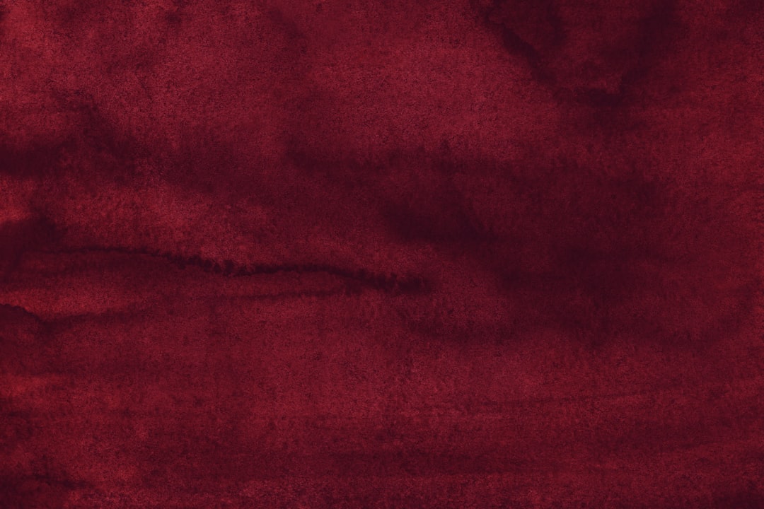
Burgundy (around #800020) is a dark, slightly muted red. Because it’s so saturated and deep, it pairs beautifully with soft tints, neutrals, and other rich jewel tones. The strongest matches are:
- Blush pink (#F4C9C2) — a lighter tint of burgundy’s own red family, so it harmonizes while softening the intensity.
- Navy (#1B2A4A) — a deep cool blue that balances burgundy’s warmth for a moody, sophisticated pairing.
- Gold (#C9A227) — warm metallic that makes burgundy read luxurious and celebratory.
- Forest green (#228B22) — a near-complementary jewel tone for a deep, festive, heritage feel.
- Cream (#F5EFE6) — a warm light neutral that gives burgundy room to breathe.
- Gray (#9E9E9E) — a quiet modern neutral that keeps burgundy from feeling old-fashioned.
Best color combinations for burgundy
Burgundy is a dark red, so pairing it with blush keeps things in one warm family for a tonal, harmonious effect. Forest green sits near the opposite side of the wheel, acting as burgundy’s complementary color for a rich, festive contrast. Navy and gold are timeless because cool blue and warm metal both flatter deep red, while cream and gray provide the neutral breathing room every saturated palette needs. Understanding warm vs cool colors helps you decide whether to lean warm (gold, cream) or cool (navy, gray).
Burgundy + blush + cream (soft romantic)
Tonal and elegant. Burgundy as the anchor, blush as the mid-tone, cream as the light — a favorite for weddings, beauty, and editorial.
Burgundy + navy + gold (luxe classic)
Deep, moody, and premium. Two dark jewel tones grounded by gold accents reads heritage and high-end.
Burgundy + forest green + cream (festive)
The richest contrast here. Complementary red and green stay sophisticated when both are deep and muted rather than bright.
Burgundy color palettes (with hex codes)
| Pairing color | Hex | Why it works / mood |
|---|---|---|
| Blush pink | #F4C9C2 | Same warm family; softens intensity |
| Navy | #1B2A4A | Cool balance; moody and sophisticated |
| Gold | #C9A227 | Warm metallic; luxurious and festive |
| Forest green | #228B22 | Complementary jewel tone; heritage feel |
| Cream | #F5EFE6 | Warm light neutral; breathing room |
| Gray | #9E9E9E | Modern neutral; keeps it current |
| Camel | #C19A6B | Warm tan; cozy and grounded |
Three ready palettes to copy:
- Soft romantic: Burgundy #800020 · Blush #F4C9C2 · Cream #F5EFE6 · Gold #C9A227
- Luxe classic: Burgundy #800020 · Navy #1B2A4A · Gold #C9A227 · Gray #9E9E9E
- Festive: Burgundy #800020 · Forest green #228B22 · Cream #F5EFE6 · Camel #C19A6B
How to build a balanced burgundy palette
Burgundy is deep and saturated, so the biggest risk is heaviness. The fix is restraint: let burgundy be the accent or the anchor, not the whole room or page. A reliable structure is roughly 10–30% burgundy, 60% light neutral (cream, gray, or white), and 10% a metallic or second deep tone (gold or navy). Used in that proportion, burgundy reads luxurious rather than oppressive.
Burgundy’s undertone changes its partners. A true wine burgundy (around #800020) sits clearly in the warm red family and loves gold and cream. A cooler, more purple-leaning burgundy pairs better with gray, navy, and blush. Check yours against both a warm gold and a cool gray swatch to see which direction it leans before committing the rest of the palette.
Lighting and material matter as well. Burgundy looks almost black in low light and richest under warm light, which is why it reads so well in velvet and matte textures. For digital and brand use, burgundy makes an excellent dark anchor with cream or white text on top — just verify contrast, since burgundy text on a mid-tone background often falls short of accessibility standards.
Colors to avoid with burgundy
Burgundy is rich, so a few pairings clash or muddy it:
- Bright orange or true red — too close to burgundy’s hue and far brighter, so they compete and look unbalanced.
- Black as the only partner — both are dark; burgundy can disappear and the mood turns gloomy. Add cream or gold to lift it.
- Neon brights — electric tones cheapen burgundy’s deep, classic character.
Using burgundy in branding vs interiors
In branding, burgundy signals heritage, quality, and indulgence, which is why it suits wine, beauty, fashion, and premium food brands. Pair it with cream and one metallic or a navy for legibility and depth. Use blush as a soft secondary. For a full process, see how to choose brand colors.
In interiors, burgundy adds drama on walls, velvet upholstery, or an accent chair. Keep it from feeling dated by pairing with modern gray, cream, and warm wood rather than heavy golds alone. Navy accents and brass hardware push it toward contemporary luxury. If you want softer companions, our colors that go with blush guide shows how blush and burgundy build a tonal scheme, and our neutral color palette guide covers grounding neutrals.
Frequently Asked Questions
What is the best color to pair with burgundy?
Blush pink (#F4C9C2) and navy (#1B2A4A) are the two best partners for burgundy. Blush sits in burgundy’s own warm-red family and softens its intensity, while navy provides a cool, sophisticated balance. Add gold or cream as accents to complete a polished, classic palette.
Does burgundy go with navy?
Yes. Burgundy and navy are a refined pairing of two deep jewel tones, one warm and one cool, which creates a moody, premium look without harsh contrast. Ground the combination with cream or gray and add gold accents so neither dark color overwhelms the other.
What color goes with burgundy for a wedding?
Blush, cream, and gold are the most popular burgundy wedding colors, creating a soft, romantic, and luxurious palette. For a more dramatic autumn or festive look, pair burgundy with forest green and gold. Both schemes keep burgundy elegant rather than heavy.
Is burgundy a warm or cool color?
Burgundy is a warm color because it’s a deep red, though its darkness and slight blue undertone give it more depth than a pure warm red. That balance is why it pairs successfully with both warm partners like gold and cream and cool ones like navy and gray.


