Colors That Go With Teal: The Complete Pairing Guide
The best colors that go with teal balance its cool blue-green depth with a warm or neutral counterweight. Because teal sits between blue and green on the color wheel, it pairs naturally with warm accents like coral and gold, and grounds beautifully against navy, white, and gray. Below you will find exact hex codes, three ready-made palettes, and guidance for using teal in branding versus interiors.
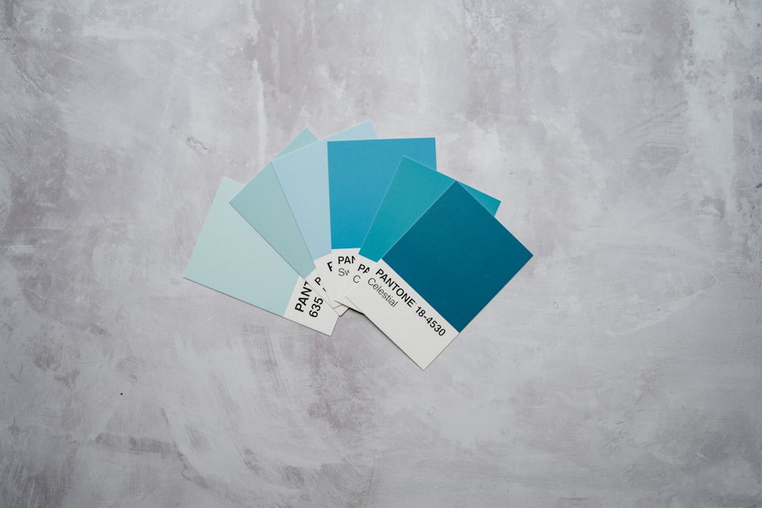
What colors go with teal?
Teal (#008080) is a desaturated blue-green. The fastest way to find partners is to apply two rules from color theory: complementary pairing (opposite the wheel, which lands near coral and warm orange) and analogous pairing (its neighbors blue and green). Add neutrals like white and gray and you have a complete, flexible scheme.
- Coral — teal’s warm near-complement; instant, lively contrast.
#FF7F50 - White — opens up teal and keeps it crisp and clean.
#FFFFFF - Gold — adds warmth and a premium, jewel-tone feel.
#D4AF37 - Navy — a deep analogous anchor for a moody, confident scheme.
#1B2A4A - Warm gray — a quiet neutral that lets teal lead.
#9E9E9E - Mustard — an earthy warm accent for a retro, 70s-leaning palette.
#E1B12C
Best teal color combinations
Not every pairing does the same job. Use this quick logic to pick:
- Teal + coral — the highest-contrast, most energetic combination. Great for playful brands and feature accents.
- Teal + gold + navy — reads luxurious and editorial. Ideal for beauty, hospitality, and premium packaging.
- Teal + white + gray — clean and modern; the safest choice for SaaS, healthcare, and minimal interiors.
- Teal + mustard — warm, vintage, and confident; a strong mid-century pairing.
If you only remember one rule: pair teal with one warm accent (coral, gold, or mustard) and let neutrals carry the rest. Two competing warm accents at full saturation will fight.
How to build a balanced teal palette
A dependable way to assemble any teal scheme is the 60-30-10 rule. Give 60% of the space to a dominant color, 30% to a secondary, and 10% to an accent. With teal there are two common ways to apply it:
- Teal-led: 60% teal, 30% neutral (white or warm gray), 10% warm accent (coral or gold). This is bold and best for hero sections, feature walls, or statement packaging.
- Neutral-led: 60% white or cream, 30% teal, 10% accent. This is calmer and more versatile — the safer default for body-heavy web pages and everyday rooms.
Whichever you pick, keep your accent to roughly 10% of the surface. Teal is saturated enough that small doses of coral or gold read as intentional highlights rather than competing colors. If a palette feels busy, the usual fix is to demote one color to a neutral rather than to add another hue.
Teal color meaning and when to use it
Teal blends the calm, trustworthy associations of blue with the balanced, refreshing associations of green. The result reads as composed, modern, and quietly premium — which is why it appears so often in finance, healthcare, wellness, and technology. Compared with bright cyan or turquoise, teal is deeper and more serious, so it suits brands that want to feel established rather than playful.
Reach for teal when you want a color that is distinctive without being loud. It stands apart from the sea of corporate blue while still signaling reliability. Pair it with coral or gold when you need warmth and energy, and lean on navy and gray when the goal is restraint and authority.
Teal palettes with hex codes
Three copy-ready palettes. Each uses teal as the anchor, one accent, and supporting neutrals.
| Pairing color | Hex | Why it works |
|---|---|---|
| Teal (anchor) | #008080 | Cool blue-green base that reads calm and trustworthy. |
| Coral | #FF7F50 | Near-complement; warm pop that makes teal feel vibrant. |
| Warm white | #FFF8F0 | Softens the contrast and adds breathing room. |
| Gold | #D4AF37 | Metallic warmth for a jewel-tone, premium scheme. |
| Navy | #1B2A4A | Deep analogous anchor for depth and contrast. |
| Warm gray | #9E9E9E | Neutral bridge that prevents the palette feeling cold. |
Palette 1 — Coastal pop: Teal #008080, Coral #FF7F50, Warm white #FFF8F0, Warm gray #9E9E9E.
Palette 2 — Jewel luxe: Teal #008080, Gold #D4AF37, Navy #1B2A4A, Cream #F5EBDD.
Palette 3 — Calm modern: Teal #008080, White #FFFFFF, Warm gray #9E9E9E, Charcoal #36454F.
Colors to avoid with teal
Teal is forgiving, but a few pairings work against it:
- Bright purple at full saturation (#8E44AD) — both are cool and saturated, so they vibrate and muddy each other. Tint or desaturate one first.
- Lime green (#A8E10C) — sits too close to teal’s green side and looks accidental rather than chosen.
- Pure black as a large field — can deaden teal’s richness. Use charcoal (#36454F) instead for a softer, more intentional dark.
If you want a warm partner, check whether you are leaning warm or cool overall — our guide to warm vs cool colors explains how to keep a teal palette balanced.
Teal in branding vs interiors
In branding and web design, teal signals calm competence, which is why it is common in finance, healthcare, and tech. Pair it with white and one warm accent for accessible UI; reserve coral or gold for calls-to-action so contrast guides the eye. For accessibility, darken teal toward #006666 when placing white text on top to meet WCAG contrast. See how to choose brand colors for a full workflow.
In interiors, teal is a confident wall or cabinetry color. Ground it with cream, tan, and natural wood, then add brass or gold hardware for warmth. Coral and mustard make excellent cushion or art accents. Because teal and turquoise are often confused, our teal vs turquoise comparison clarifies which one you actually want before you commit to paint.
Frequently Asked Questions
What is the complementary color of teal?
Teal’s complementary color sits opposite it on the color wheel, in the warm red-orange range — practically, that means coral (#FF7F50) or a soft orange. This is why teal-and-coral feels so balanced: the warm and cool tones offset each other for maximum, comfortable contrast.
Does gold go with teal?
Yes. Gold (#D4AF37) is one of the strongest partners for teal. The metallic warmth contrasts teal’s cool depth and creates a jewel-tone, premium feel used widely in beauty, hospitality, and packaging. Pair the two with navy or cream to complete the scheme.
What neutral goes best with teal?
Warm gray (#9E9E9E) and warm white (#FFF8F0) are the most reliable neutrals for teal. They keep the palette from feeling cold, give the eye a place to rest, and let teal stay the star. Cream and tan also work well, especially in interiors.
Is teal a warm or cool color?
Teal is a cool color — a blue-green hybrid. That coolness is exactly why warm accents like coral, gold, and mustard pair so effectively with it, restoring balance. For a deeper breakdown, see our colors that go with navy guide, which covers a closely related cool anchor.


