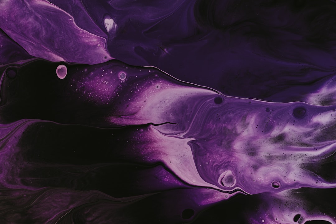
Shades of Purple: Names and Hex Codes
There are dozens of recognized shades of purple, from pale lavenders to deep royal violets and dusty mauves. Below is a practitioner reference: each shade with its name, hex code, RGB value, and a note on where it works best. Use it as a swatch library when building a palette, and pair it with our guide to what the color purple means when you need the symbolism behind the swatch.
A quick note on terminology, because it matters when you specify color precisely. A shade technically means a hue mixed with black (darker), a tint is a hue mixed with white (lighter), and a tone is a hue mixed with gray (more muted). In everyday design language — and throughout this guide — “shades of purple” covers every named variation, from a pale lavender tint to a deep aubergine shade to a dusty mauve tone. Purple sits between blue and red on the color wheel, so it has two distinct personalities depending on which neighbor it leans toward: a blue-purple like indigo reads cool and mysterious, while a red-purple like plum reads warm and romantic. Historically purple was the rarest and most expensive dye to produce, which is the root of its lasting association with royalty and luxury. The hex codes below are established web, X11, and common values you can copy straight into your tools.
Each entry below gives three values so you can use it anywhere: the hex code (for CSS, HTML, and most design tools), the RGB triplet (for screen-based tools that ask for red, green, and blue channels separately), and a short note on the mood and best use of that shade. If you need a Pantone or CMYK match for print, convert from the hex value in your design software — purples are notoriously hard to reproduce in CMYK and often print duller and more muted than they appear on screen, so always check a physical proof before signing off.
Light shades of purple
Light purples feel soft, dreamy, and elegant — ideal for beauty, wellness, and pastel branding.
| Shade name | Hex | RGB | Notes / use |
|---|---|---|---|
| Lavender | #E6E6FA | 230, 230, 250 | Pale soft purple; calming, gentle. |
| Mauve | #E0B0FF | 224, 176, 255 | Soft pink-purple; vintage, romantic. |
| Periwinkle | #CCCCFF | 204, 204, 255 | Blue-purple pastel; trend-forward. |
| Thistle | #D8BFD8 | 216, 191, 216 | Muted dusty purple; soft, elegant. |
| Pale Lavender | #DCD0FF | 220, 208, 255 | Light tint; airy backgrounds. |
| Lilac | #C8A2C8 | 200, 162, 200 | Soft floral purple; gentle, fresh. |
Dark shades of purple
Dark purples signal luxury, royalty, and mystery — the default for premium beauty, spirits, and creative brands.
| Shade name | Hex | RGB | Notes / use |
|---|---|---|---|
| Indigo | #4B0082 | 75, 0, 130 | Deep blue-purple; mysterious, rich. |
| Dark Purple | #301934 | 48, 25, 52 | Near-black purple; dramatic, luxe. |
| Byzantium | #702963 | 112, 41, 99 | Deep red-purple; regal, historic. |
| English Violet | #534B62 | 83, 75, 98 | Muted gray-purple; understated. |
| Dark Aubergine | #3D0734 | 61, 7, 52 | Deep eggplant; moody, sophisticated. |
| Russian Violet | #311432 | 49, 20, 50 | Very dark purple; rich, premium. |
Bright and vivid purples
Saturated purples lead a palette with creativity and confidence — strong for tech, gaming, and bold identities.
| Shade name | Hex | RGB | Notes / use |
|---|---|---|---|
| Violet | #7F00FF | 127, 0, 255 | Pure blue-purple; vivid, energetic. |
| Purple (Web) | #800080 | 128, 0, 128 | CSS named purple; balanced, classic. |
| Amethyst | #9966CC | 153, 102, 204 | Jewel purple; elegant, calming. |
| Blue Violet | #8A2BE2 | 138, 43, 226 | Vivid blue-purple; modern, bold. |
| Dark Violet | #9400D3 | 148, 0, 211 | Saturated deep violet; striking. |
| Electric Purple | #BF00FF | 191, 0, 255 | Neon purple; digital, high-energy. |
Red-purple and plum shades
Where purple warms toward red you get plums, magentas, and orchids — rich, romantic, and slightly playful.
| Shade name | Hex | RGB | Notes / use |
|---|---|---|---|
| Plum | #8E4585 | 142, 69, 133 | Deep red-purple; rich, refined. |
| Orchid | #DA70D6 | 218, 112, 214 | Bright pink-purple; lively, floral. |
| Magenta / Fuchsia | #FF00FF | 255, 0, 255 | Pure pink-purple; bold, electric. |
| Fuchsia Pink | #C154C1 | 193, 84, 193 | Soft magenta; playful, modern. |
| Pomp and Power | #86608E | 134, 96, 142 | Muted mid purple; sophisticated. |
| Antique Fuchsia | #915C83 | 145, 92, 131 | Dusty mauve-purple; vintage. |
Blue-purple and muted shades
Cool and desaturated purples feel calm and contemporary — versatile neutrals with a creative edge.
| Shade name | Hex | RGB | Notes / use |
|---|---|---|---|
| Slate Blue | #6A5ACD | 106, 90, 205 | Muted blue-purple; calm, modern. |
| Medium Purple | #9370DB | 147, 112, 219 | Soft mid-purple; friendly, versatile. |
| Dark Slate Blue | #483D8B | 72, 61, 139 | Deep blue-purple; dependable accent. |
| Lavender Floral | #B57EDC | 181, 126, 220 | Bright lavender; cheerful, soft. |
| Dusty Purple | #967BB6 | 150, 123, 182 | Grayed mid-purple; understated. |
What are the most popular shades of purple?
The most-used named purples in design are violet, lavender, plum, amethyst, and indigo. Lavender and lilac dominate soft, feminine, and wellness branding; violet and electric purple bring creative energy to tech and entertainment; plum and amethyst convey jewel-toned luxury; indigo anchors deep, mysterious palettes. The deeper psychology is covered in our color psychology guide.
Purple’s modern role in branding is split between two extremes. On one end, soft tints — lavender, lilac, thistle — have become the signature of beauty, wellness, and self-care products, where they read as calming and gently feminine. On the other, saturated violets and electric purples have been adopted by streaming, gaming, and fintech brands that want to feel imaginative and disruptive, precisely because purple is rare in nature and therefore reads as distinctive and forward-looking. That rarity is an asset: a confident purple stands out in categories crowded with blue.
How to use shades of purple in design
Purple carries strong associations with luxury and creativity, so let one shade lead. Pair a deep indigo or plum with soft lavender tints for a sophisticated tonal palette, and add a metallic gold or warm neutral to keep it from feeling cold. Purple’s complementary yellow creates striking contrast for accents.
Practical guidance: purple can easily tip into looking dated or garish if the saturation is too high across large areas, so use vivid violets as accents and let muted or deep purples carry the heavy lifting. For accessible text, deep values like indigo (#4B0082) and dark purple work on light backgrounds, while pale lavender should stay in backgrounds and decorative roles. Be deliberate about undertone consistency — mixing a cool blue-purple like slate blue with a warm red-purple like byzantium in the same layout can feel muddy, so commit to one temperature. Explore neighboring families in our reference on shades of blue and shades of pink.
Frequently Asked Questions
How many shades of purple are there?
There is no fixed number — screens can render millions of purple gradations. In practical design terms, around 30 to 40 named shades of purple are widely recognized, from pale lavender and lilac through amethyst, violet, plum, indigo, and aubergine.
What is the hex code for lavender?
The standard web hex code for lavender is #E6E6FA, which is RGB 230, 230, 250. It is a very pale, slightly blue purple defined as a CSS named color, often used for soft backgrounds and gentle accents.
What is the difference between violet and purple?
Violet (#7F00FF) is a spectral color that leans bluer and brighter, sitting near blue on the spectrum. Purple (#800080) is a mix of red and blue that leans warmer and more muted. In short, violet is cooler and more vivid; purple is redder and more balanced.
Which shade of purple is best for a logo?
For luxury and beauty, deep purples like plum (#8E4585) or amethyst (#9966CC) feel premium. For creative or tech brands, bright violet (#7F00FF) and blue violet (#8A2BE2) feel innovative. Soft lavender suits wellness and lifestyle. Match saturation to the prestige versus playfulness you want.
What colors go well with purple?
Purple pairs elegantly with gold, cream, and soft gray for a luxurious feel. For contrast, use its complementary yellow or warm mustard. Green and teal complement deeper purples, while blush pink and white keep light lavenders soft and fresh.


