Shades of Black: Names and Hex Codes
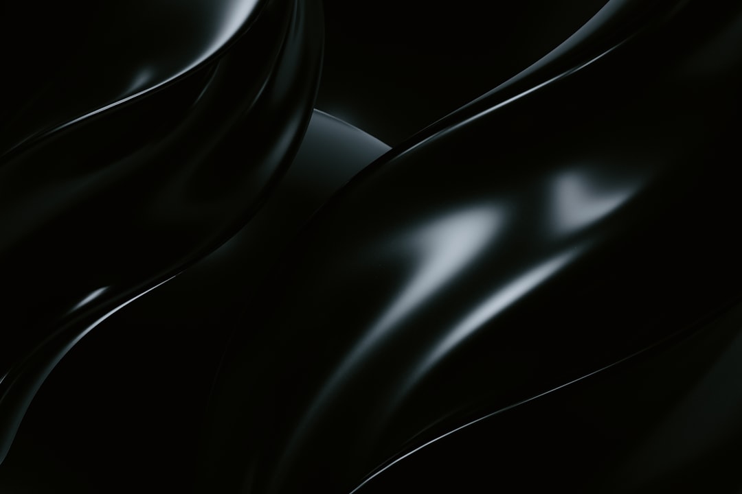
This is a designer’s reference for the most useful shades of black, with accurate hex codes, RGB values, and notes on undertone. Pure black (#000000) is rarely the right choice on screen — it can look harsh and create jarring contrast — so most professional work uses a near-black with a subtle warm or cool bias. Use the table below as a citable palette, then read on for how the shades group.
For symbolism, see black color meaning; for pairing deep neutrals, see colors that go with charcoal. The lighter neutral families are covered in our shades of gray and shades of white references.
Shades of black: full table
| Shade name | Hex | RGB | Notes |
|---|---|---|---|
| Pure Black | #000000 | 0, 0, 0 | Absolute black; zero brightness. |
| Onyx | #353839 | 53, 56, 57 | Soft near-black with a gray cast. |
| Jet | #343434 | 52, 52, 52 | Deep neutral black; slightly soft. |
| Ebony | #555D50 | 85, 93, 80 | Dark green-tinged near-black. |
| Charcoal | #36454F | 54, 69, 79 | Deep blue-gray; near-black neutral. |
| Obsidian | #0B1215 | 11, 18, 21 | Very dark cool black; glassy depth. |
| Ink | #1B1B1B | 27, 27, 27 | Soft true black; great for body text. |
| Pitch Black | #0C0C0C | 12, 12, 12 | Near-absolute black; deep and flat. |
| Raisin Black | #242124 | 36, 33, 36 | Warm dark near-black; faint purple. |
| Black Olive | #3B3C36 | 59, 60, 54 | Warm green-gray near-black. |
| Licorice | #1A1110 | 26, 17, 16 | Warm red-tinged dark black. |
| Smoky Black | #100C08 | 16, 12, 8 | Warm near-black with brown undertone. |
| Carbon | #0A0A0A | 10, 10, 10 | Deep neutral black; sleek. |
| Soft Black | #2B2B2B | 43, 43, 43 | Eased black; comfortable for UI. |
| Rich Black (Cool) | #0D1B1E | 13, 27, 30 | Print-style rich black; blue depth. |
| Graphite | #1C1C1C | 28, 28, 28 | Very dark neutral; near-black. |
| Bistre Black | #251607 | 37, 22, 7 | Very dark warm brown-black. |
| Eerie Black | #1B1B1B | 27, 27, 27 | Subtle off-black; muted depth. |
| Gunmetal Black | #2C3539 | 44, 53, 57 | Dark metallic blue-black. |
| Charcoal Brown | #322C2B | 50, 44, 43 | Warm dark near-black; earthy. |
| Vantablack (Approx) | #0F0F0F | 15, 15, 15 | Screen approximation of ultra-black. |
| Night | #171717 | 23, 23, 23 | Deep neutral black; modern UI dark. |
| Midnight | #191970 | 25, 25, 112 | Very dark blue; “midnight blue” black. |
| Material Black | #212121 | 33, 33, 33 | Common UI dark-surface black. |
Soft, neutral blacks
The most-used blacks in interface and brand work are the soft neutrals: Ink (#1B1B1B), Jet (#343434), Soft Black (#2B2B2B), Material Black (#212121), Carbon (#0A0A0A), and Night (#171717). They read as black to the eye but reduce the harsh contrast of pure #000000, which is why they dominate dark-mode surfaces and premium typography. Material Black (#212121) became a de facto standard because Google’s Material Design recommended it over pure black for exactly this reason — text set in a near-black is easier to read for long stretches and looks more considered. Ink (#1B1B1B) is an excellent body-text color on light backgrounds, dark enough for strong contrast yet soft enough to avoid the harsh “vibration” that pure black produces against white. These neutral blacks have no perceptible undertone, which makes them the safest default when you simply need black without a temperature bias.
Cool, blue-leaning blacks
Charcoal (#36454F), Obsidian (#0B1215), Gunmetal Black (#2C3539), Rich Black (#0D1B1E), and Midnight (#191970) carry a blue undertone. They feel technical, glassy, and sophisticated, and pair naturally with cool grays and silvers for a sleek, modern palette. Obsidian and Rich Black are especially useful for dark-mode backgrounds because their slight blue depth reads as “expensive” and recedes cleanly behind brighter content. Midnight is really a very dark blue rather than a true black, but it functions as one in practice and brings a nautical, premium quality that pure black lacks. In print, a “rich black” mixes black ink with cyan to produce a deeper, cooler black than ink alone can achieve, which is the origin of these blue-leaning tones.
Warm, earthy blacks
Smoky Black (#100C08), Licorice (#1A1110), Charcoal Brown (#322C2B), Raisin Black (#242124), and Bistre Black (#251607) carry brown or red undertones. They feel softer and more organic than cool blacks and work well alongside creams, tans, and golds in heritage or craft-oriented brands. Where a cool black feels clinical, a warm black feels grounded and human, which is why it suits coffee, leather, and artisanal packaging. Black Olive (#3B3C36) and Ebony (#555D50) add a faint green warmth that edges them toward a very dark gray, making them gentle alternatives when a full near-black would feel too heavy.
Print, screen, and the limits of black
Black behaves differently across media, and naming a shade does not always capture that. On screen, every black above is just a set of RGB values, and pure #000000 represents a pixel emitting no light — which is why it looks so deep on OLED displays and can feel flat or harsh on LCDs. In print, “black” is rarely a single ink: a true rich black combines black with cyan, magenta, and yellow to reach a deeper tone than black ink alone. Real-world ultra-blacks like Vantablack, which absorbs nearly all visible light, cannot be reproduced on a screen at all — the closest a display can manage is a near-black like #0F0F0F, included above only as an approximation. The practical takeaway is to treat black as a family of near-blacks with intent: pick the undertone and depth that suit the medium, and reserve pure black for the rare cases that truly call for maximum contrast.
Most popular shades of black
The blacks designers reach for most are Onyx (#353839) for a soft gray-black, Jet (#343434) for a deep neutral, Charcoal (#36454F) for a cool blue-black, Ink (#1B1B1B) for body text, and Obsidian (#0B1215) for maximum depth without going pure black. Together they cover warm to cool and soft to deep.
How to use shades of black in design
Reserve pure #000000 for situations that genuinely need maximum contrast; for most text and surfaces, a near-black like Ink or Material Black is more comfortable and looks more refined. Match the undertone to your palette — cool blacks with grays and blues, warm blacks with creams and golds — so the black feels intentional rather than accidental. In dark mode, layer several near-blacks to create depth without relying on borders: a darkest base (around #121212 to #0A0A0A), a slightly lighter surface for cards, and an even lighter elevated tone for menus and modals. This layered approach is how modern dark interfaces communicate hierarchy, since shadows are far less visible against a dark background than a light one. Black makes other colors pop, so use it to frame and anchor brighter accents — a single saturated hue against near-black reads as bold and luxurious. Be deliberate about contrast in the other direction too: white text on pure black can shimmer uncomfortably, so a soft off-white on a soft near-black is usually the more polished pairing. For how black signals power, elegance, and authority, see color psychology, and for combining it with deep neutrals see colors that go with charcoal.
Frequently Asked Questions
What is the hex code for jet black?
A common hex code for jet black is #343434 (RGB 52, 52, 52), a deep neutral near-black that is slightly softer than pure black. The gemstone jet is sometimes rendered even darker; #0A0A0A works when you want it closer to absolute black while keeping a hint of softness.
Why not just use pure black (#000000)?
Pure black creates harsh, high-contrast edges on screens and can cause eye strain and a “vibrating” effect against white. Near-blacks like #1B1B1B or #212121 read as black but feel smoother and more premium, which is why most professional interfaces and brands avoid #000000 for large areas.
What is the difference between onyx and charcoal?
Onyx (#353839) is a soft, near-neutral gray-black, while charcoal (#36454F) carries a distinct blue undertone and reads slightly lighter and cooler. Onyx is the more neutral choice; charcoal suits palettes that want a subtle cool, technical feel.
How many shades of black are there?
Blacks are distinguished by undertone and slight lightness rather than hue, so the practical set is in the dozens. Designers usually reference 20 to 30 named blacks. This list includes 24, spanning soft neutrals, cool blue-blacks, and warm earthy blacks.


