Colors That Go With Cream
Cream is a warm off-white — it carries the softness of white without the clinical edge, which makes it one of the most flexible base colors in design. The best colors that go with cream are deep cool anchors like navy and charcoal for contrast, earthy accents like terracotta and sage for warmth, and burgundy or brown when you want richness. Below are exact hex codes, ready palettes, and how cream differs from plain white and beige.
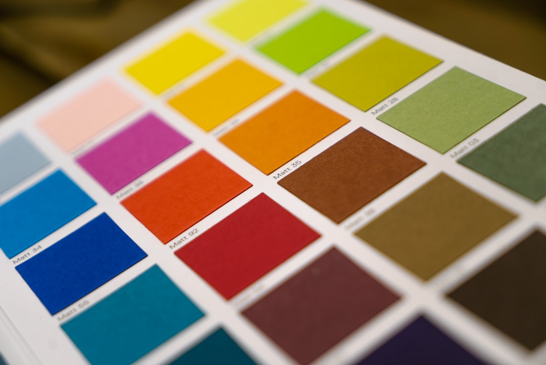
What colors go with cream?
Because cream is a low-saturation warm neutral, it flatters both deep contrasts and earthy mid-tones. It reads softer than white, so dark anchors look less stark beside it. Here are the strongest matches:
- Navy (#1B2A4A) — a deep cool anchor that gives cream crisp, classic contrast without harshness.
- Sage green (#9CAF88) — an organic, muted partner that keeps cream calm and natural.
- Terracotta (#E2725B) — a warm earthy accent that pops gently against cream for a Mediterranean feel.
- Charcoal (#36454F) — a softer-than-black anchor that grounds cream in a modern, minimal way.
- Burgundy (#800020) — a deep wine red that adds richness and warmth against cream’s lightness.
- Brown (#7B5E48) — a tonal partner; brown and cream is the most natural warm-neutral pairing there is.
Best color combinations for cream
Cream works as a warm base, so the strongest schemes layer one deep anchor and one earthy accent against it. As a warm neutral, cream harmonizes with other warm tones (terracotta, brown, burgundy) for a cozy analogous feel, while cool anchors like navy and charcoal supply the contrast that keeps a soft palette from feeling flat. Because cream is so low in saturation, it rarely clashes — the main job is choosing whether the overall mood leans cool-and-crisp or warm-and-earthy.
Cream + navy + terracotta (balanced)
A versatile scheme that balances a cool anchor (navy) with a warm accent (terracotta) on a cream base. Reads sophisticated and inviting at once — strong for hospitality and editorial.
Cream + sage + brown (organic calm)
An earthy, biophilic palette. Cream lightens, sage adds living freshness, and brown grounds. Ideal for wellness, food, and natural-product brands.
Cream + burgundy + charcoal (rich elegant)
A deeper, more luxurious scheme. Burgundy brings warmth and richness while charcoal anchors — a favorite for boutique hospitality and heritage brands.
Cream palettes with hex codes
| Pairing color | Hex | Why it works / mood |
|---|---|---|
| Navy | #1B2A4A | Crisp cool contrast; classic |
| Sage green | #9CAF88 | Organic, calm, natural |
| Terracotta | #E2725B | Warm earthy pop; Mediterranean |
| Charcoal | #36454F | Soft dark anchor; modern minimal |
| Burgundy | #800020 | Rich, warm, elegant depth |
| Brown | #7B5E48 | Tonal warm neutral; grounded |
| Gold | #C9A227 | Warm metallic; refined accent |
Three ready palettes to copy:
- Balanced: Cream #F5EFE6 · Navy #1B2A4A · Terracotta #E2725B · Camel #C19A6B
- Organic calm: Cream #F5EFE6 · Sage #9CAF88 · Brown #7B5E48 · Off-white #FAF8F3
- Rich elegant: Cream #F5EFE6 · Burgundy #800020 · Charcoal #36454F · Gold #C9A227
How to build a balanced cream palette
The first step is knowing exactly what cream you have. Cream is warmer and softer than white but lighter and less gray than beige. A true cream (#F5EFE6 to #FFFDD0) has a faint yellow undertone; beige leans gray-tan; ivory sits between cream and white. Our beige vs cream comparison shows how these warm neutrals differ and why the distinction changes your accents.
Use cream as the dominant base at roughly 60% of the composition, a deep anchor (navy, charcoal, burgundy) at 30%, and one warm accent (terracotta, gold, sage) at 10%. Because cream is warm, it pairs most cohesively with warm whites and warm accents — pairing it with a cool blue-white nearby will make the cream look slightly yellow or dirty, so keep your light neutrals in the same temperature.
Cream’s quiet warmth is its strength: it makes a space feel relaxed and lived-in where pure white feels clinical. To preserve that, keep saturation low across the palette and let texture (linen, paper, plaster, wood) do some of the work. For more on flexible warm-neutral foundations, see our neutral color palette guide.
Colors to avoid with cream
Cream is gentle, but a few combinations weaken it:
- Pure cool white — placed beside cream, a blue-white makes the cream look dingy or yellowed. Pair cream with warm whites instead.
- Bright, icy pastels — cool baby blue or mint can clash with cream’s warmth and look mismatched. Choose muted, warmer versions.
- Neon or highly saturated brights — fight cream’s soft, understated character. If you need a pop, use a muted version like terracotta rather than pure orange.
Cream in branding vs interiors
In branding, cream signals warmth, craft, calm, and understated luxury, which is why beauty, wellness, and artisan brands favor it over stark white. It feels more premium and tactile than white on packaging and paper. Our guide on how to choose brand colors covers building an identity on a soft neutral base with one or two earthy accents.
In interiors, cream walls and textiles create a warm, restful envelope that flatters natural light. Layer cream with wood, linen, and one earthy accent (terracotta, sage) for an organic look, or add navy and burgundy for something richer. If you are deciding between cream and a stark white as your base, our piece on colors that go with white contrasts the cooler, crisper approach.
Frequently Asked Questions
What is the best color to pair with cream?
Navy (#1B2A4A) is the best all-purpose partner for cream because it provides crisp, classic contrast while staying softer than a black-and-white scheme. For a warmer, more organic look, terracotta or sage green are the strongest accents. Burgundy adds richness. The ideal choice depends on whether you want cool contrast or earthy warmth.
What is the difference between cream and beige?
Cream is a warm off-white with a faint yellow undertone, while beige is a slightly darker tan-gray neutral. Cream reads softer and more buttery; beige reads more earthy and muted. The distinction matters because cream pairs best with warm accents, while beige can lean either warm or cool depending on its undertone.
Does cream go with gray?
It can, but match the temperatures carefully. Cream is warm, so it pairs best with warm or greige grays rather than cool blue-grays, which can make the cream look yellowed by contrast. A warm taupe-gray bridges the two beautifully. When in doubt, use charcoal instead of mid-gray for a cleaner anchor.
Is cream a good color for walls?
Yes. Cream walls create a warm, restful backdrop that flatters natural light and feels less clinical than pure white. It pairs well with wood, linen, and earthy accents, making it a popular choice for living rooms and bedrooms. Choose a warm white trim rather than a cool bright white to keep the scheme cohesive.


