Colors That Go With Blue
Blue is the most universally liked color in design, and it behaves almost like a neutral while still carrying a clear cool mood. The best colors that go with blue range from high-contrast whites and grays to warm complements like coral, orange, and gold. Below you’ll find exact hex codes, ready-to-use palettes, and guidance for using blue in branding versus interiors.
What colors go with blue?
A true mid blue (around #1E5FB0) is a cool, confident hue. Because it sits on the cool side of the wheel, it pairs cleanly with warm accents that pop against it and with light neutrals that give it room to breathe. Here are the strongest matches:
- White (#FFFFFF) — the cleanest partner for blue. White sharpens the hue and keeps a scheme feeling crisp, open, and trustworthy.
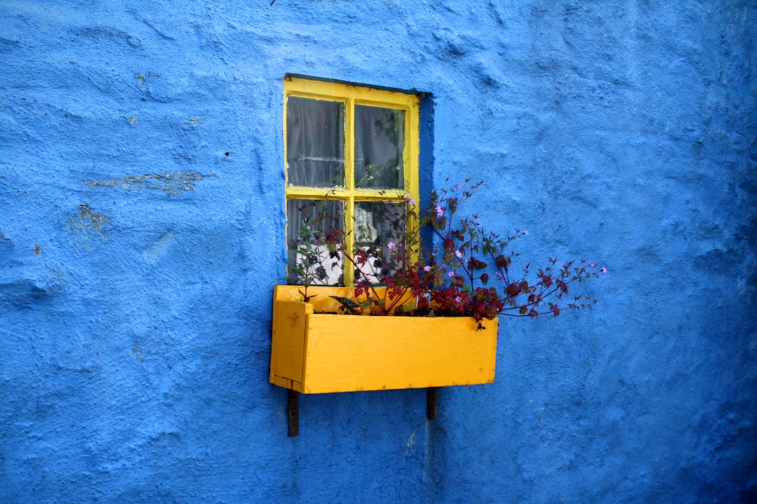
- Coral / orange (#FF6F4D) — blue’s complementary partner. Orange sits opposite blue on the wheel, so it creates lively, balanced contrast.
- Gold (#C9A227) — a warm metallic that reads premium and editorial against clear blue.
- Gray (#B0BEC5) — a quiet neutral that lets blue lead. Ideal for UI, backgrounds, and corporate systems.
- Blush pink (#F4C9C2) — a soft warm tint that humanizes blue and gives it a modern, friendly feel.
- Navy (#1B2A4A) — a deeper analogous blue that adds weight and a layered, tonal look.
- Mustard (#D4A017) — a muted warm yellow for a confident, retro-modern contrast.
Best color combinations for blue
Why these work comes down to basic color theory. Blue is cool, so warm accents (coral, orange, gold, mustard) create satisfying warm-vs-cool contrast. Orange is the direct opposite of blue on the wheel, making it a textbook complementary color. White and gray act as breathing room, while navy and teal stay close to blue for a calmer analogous palette. For more on blue’s psychology, see our guide to blue color meaning.
Blue + white + gray (clean corporate)
The default “trustworthy and modern” combination. Use blue as the base, white for space, and gray for secondary UI and text.
Blue + coral + white (fresh contrast)
The most energetic option. Coral’s warmth against blue’s cool depth reads youthful and confident — ideal for tech, editorial, and DTC brands.
Blue + gold + blush (elevated warm)
Softer and more premium. Gold and blush warm blue into something inviting rather than purely corporate.
Blue palettes with hex codes
| Pairing color | Hex | Why it works / mood |
|---|---|---|
| White | #FFFFFF | Max contrast; crisp, clean, trustworthy |
| Coral / orange | #FF6F4D | Complementary pop; energetic and modern |
| Gold | #C9A227 | Premium, editorial, warm metallic |
| Gray | #B0BEC5 | Quiet neutral for UI and backgrounds |
| Blush pink | #F4C9C2 | Warm, soft, approachable contrast |
| Navy | #1B2A4A | Tonal depth; layered and grounded |
| Mustard | #D4A017 | Retro-modern warm contrast |
Three ready palettes to copy:
- Clean corporate: Blue #1E5FB0 · White #FFFFFF · Gray #B0BEC5 · Navy #1B2A4A
- Fresh contrast: Blue #1E5FB0 · Coral #FF6F4D · White #FFFFFF · Charcoal #2E3440
- Elevated warm: Blue #1E5FB0 · Gold #C9A227 · Blush #F4C9C2 · Cream #F5EFE6
How to build a balanced blue palette
Start by deciding which blue you mean. A bright azure (#1E5FB0) feels energetic and tech-forward; a softer sky blue reads calm and airy; a deep navy is nearly a neutral. The accents that land change with that choice, so lock your blue first, then test it against both a warm accent (coral) and a cool one (gray) to see which direction it wants to go.
A reliable rule: warm accents (coral, gold, mustard, blush) make blue feel lively and human, while cool accents (white, gray, navy) keep it crisp and corporate. Most strong blue palettes use one dominant accent direction plus neutrals rather than mixing several loud warm pops at once. Use blue as roughly 60% of the composition, a light neutral as 30%, and your accent as the final 10% — the classic 60-30-10 split that keeps a saturated color from overwhelming a layout.
Blue also shifts with light and screen calibration. A blue that looks confident on white can feel cold on a dark UI, so test it on both backgrounds and confirm text contrast — blue on white is highly legible, but mid blue text on gray often fails accessibility checks. If you want a tonal-only scheme, pair your blue with navy and white for a calm, layered look.
Colors to avoid with blue
Blue is forgiving, but a few combinations fight it:
- Muddy greens — olive or khaki next to a clear blue can look murky and accidental rather than intentional. Pick a cleaner teal instead.
- Equal-strength red — a fully saturated primary red against primary blue vibrates and feels juvenile. Shift the red toward coral or burgundy to calm it.
- Too many cool tones at once — blue, purple, and teal together with no warm accent or neutral reads flat and chilly. Add white or a warm pop for balance.
Blue in branding vs interiors
In branding, blue signals trust, competence, and calm, which is why finance, healthcare, and tech default to it. Pair it with white and one warm accent (coral or gold) to avoid looking generic. If you’re building a system from scratch, our guide on how to choose brand colors walks through anchoring on one blue and layering accents.
In interiors, blue works as a calming color on walls, cabinetry, and textiles. Warm woods, brass, and camel leather keep blue rooms from feeling cold, while white trim keeps everything crisp. For a flexible base around your blue, see our neutral color palette guide. If you’re choosing a warm partner, our piece on colors that go with yellow shows how blue and yellow balance cool and warm beautifully.
Frequently Asked Questions
What is the best color to pair with blue?
White is the single best color to pair with blue because it delivers maximum contrast and keeps the scheme clean and trustworthy. For warmth and energy, coral or orange (#FF6F4D) is the next strongest choice, since it sits opposite blue on the color wheel and creates lively complementary contrast.
What is the complementary color of blue?
Orange is the complementary color of blue, sitting directly opposite it on the color wheel. In practice, designers often soften that pairing to coral (#FF6F4D) or warm gold for a more refined look. The blue-orange contrast is one of the most reliable, high-impact combinations in design.
Does blue go with gray?
Yes. Blue and gray (#B0BEC5) are a quiet, modern pairing common in UI design and corporate branding. Gray steps back and lets blue lead, providing neutral structure for text and backgrounds. For warmth, add a single accent like gold or coral so the scheme doesn’t feel too cool.
What two colors go well with blue?
White and coral are the two strongest companions for blue: white provides clean contrast and space, while coral adds a warm, complementary pop. For a more premium feel, swap coral for gold. This three-color base of blue, a neutral, and one warm accent works across branding, web, and interiors.


