Texture in Graphic Design: Adding Depth and Character
Texture in graphic design refers to the surface quality of a visual element, whether it appears smooth, rough, gritty, soft, or anything in between. It is the design element that gives flat compositions a sense of physicality, transforming two-dimensional layouts into something that feels tangible, lived-in, and real. In a discipline that increasingly exists on screens, texture is the bridge between the digital and the physical.
Every surface in the natural world has texture. Wood grain, woven fabric, cracked concrete, brushed metal — these surfaces communicate information before a single word is read. Designers harness this instinct by introducing texture into their work, adding layers of meaning, warmth, and visual complexity that flat colors and clean vectors alone cannot achieve. Whether applied subtly as background noise or prominently as a central design feature, texture shapes how audiences perceive and emotionally respond to visual communication. Graphic design principles like contrast, balance, and hierarchy all benefit when texture enters the equation.
What Is Texture as a Design Element?
Texture is one of the foundational elements of visual design, alongside line, shape, color, space, and form. While those other elements describe what something looks like in terms of geometry and color, texture describes how something appears to feel. It adds a sensory dimension that operates on a different register from purely visual properties.
In graphic design, texture functions on two distinct levels: tactile and visual. Understanding the difference, and knowing when to deploy each, is essential for using texture effectively.
Tactile Texture
Tactile texture is physical texture that can be touched and felt. It exists in the material world of print design, packaging, and environmental graphics. The rough surface of an uncoated paper stock, the raised lettering of a letterpress-printed business card, the smooth gloss of a UV-coated brochure cover, the soft-touch finish on a luxury cosmetics box — these are all examples of tactile texture.
Tactile texture engages the sense of touch directly, creating a multisensory brand experience that purely visual design cannot replicate. Research in consumer psychology consistently shows that tactile qualities influence perceived value. A business card printed on thick, textured cotton stock feels more substantial and trustworthy than the same design on thin, smooth card. Packaging with embossed details or debossed logos communicates craftsmanship and attention to detail.
Print designers and packaging designers have long understood this principle. Choosing paper stocks, finishes, binding methods, and production techniques are all texture decisions that shape how audiences experience a physical design object.
Visual Texture
Visual texture is the illusion of texture created through graphic means. It exists on flat surfaces but tricks the eye into perceiving depth, roughness, softness, or other tactile qualities. Visual texture is the form most relevant to digital and screen-based design, though it also plays a major role in print layouts, posters, and illustrations.
A photograph of a brick wall placed as a background introduces the visual texture of rough masonry without any physical surface change. A halftone dot pattern applied to an illustration gives it the texture of vintage print. A subtle noise overlay on a gradient prevents the banding that makes digital gradients look artificial. In each case, the viewer perceives texture through visual cues rather than physical touch.
Visual texture is the primary focus of this guide, because it is the form of texture in graphic design that designers at every level can apply to their work immediately, regardless of whether the final output is digital or print.
Why Flat Digital Design Benefits from Texture
The flat design movement that dominated digital interfaces from the early 2010s stripped away skeuomorphic textures, gradients, and shadows in favor of clean geometric shapes and solid colors. The result was cleaner, faster-loading, and more legible — but also, in many cases, sterile and impersonal.
As flat design matured, designers began reintroducing texture to solve several problems that pure flatness creates.
Texture adds warmth and humanity. Solid colors and geometric shapes feel precise and mechanical. Adding even a subtle grain or paper texture introduces organic imperfection that makes designs feel more approachable and human. This is particularly valuable for brands that want to communicate authenticity, craftsmanship, or personal connection.
Texture creates visual interest without clutter. A flat color background is functional but visually inert. Adding texture to that same background introduces complexity and depth without adding new structural elements or competing with the content. It enriches the visual experience while respecting the underlying simplicity of the layout.
Texture differentiates. When every website and app uses the same flat color blocks and clean sans-serif type, texture becomes a point of distinction. A brand identity that incorporates thoughtful texture immediately stands apart from competitors relying on identical design systems. Different graphic design styles use texture in distinct ways, and choosing the right textural approach helps define a brand’s visual personality.
Texture guides perception. Different textures carry different associations. A paper texture suggests print heritage and literary credibility. A concrete texture suggests industrial strength. A watercolor texture suggests creativity and artistry. These associations allow designers to communicate brand values through surface quality alone, before the viewer reads a single word.
Types of Texture in Graphic Design
Texture is not a single technique but a broad category encompassing many distinct approaches. Understanding the major types allows you to choose the right texture for each project’s tone, audience, and purpose.
Photographic Texture
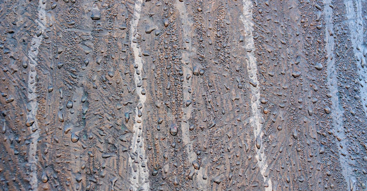
Photographic textures are images of real-world surfaces used as design elements. Photographs of wood grain, marble, fabric, rust, concrete, sand, water, foliage, and countless other materials provide ready-made texture that carries the full visual richness of the physical world.
Photographic texture is especially effective in packaging, branding, and editorial design where natural or material associations matter. A coffee brand might use a burlap sack texture to communicate its artisanal sourcing. An architecture firm might use a concrete texture to reinforce its connection to built environments. The specificity of photographic texture makes it powerful for storytelling, but it also carries risk: overly literal textures can feel heavy-handed or cliched if not applied with restraint.
Illustrated and Hand-Drawn Texture
Hand-drawn textures — cross-hatching, stippling, pencil shading, ink washes, brushstrokes, charcoal marks — introduce the visible evidence of a human hand into a design. This category of texture is valued precisely because it is imperfect. Each mark is unique, carrying the slight irregularities and organic variation that distinguish handmade work from digital precision.
Illustrated texture is widely used in editorial illustration, children’s book design, craft branding, food and beverage packaging, and any context where warmth, personality, and artisanal quality are desired. It pairs particularly well with hand-lettered type and organic color palettes. The key consideration is consistency: the style of hand-drawn texture should match the overall illustration style and brand voice rather than feeling like a disconnected overlay.
Geometric Patterns
Geometric patterns — grids, stripes, chevrons, tessellations, Islamic-inspired tile patterns, Art Deco motifs — create texture through repetition of shapes. Unlike photographic or illustrated textures, geometric patterns are precise and structured, lending a sense of order and intentionality to the compositions they inhabit.
Geometric texture functions differently at different scales. At large scale, geometric patterns become dominant visual features — the eye reads individual shapes and their relationships. At small scale, the same patterns merge into a unified texture that the eye perceives as a surface quality rather than discrete elements. This scale-dependent behavior makes geometric patterns versatile: a single pattern can serve as both a bold design feature and a subtle background texture depending on how it is sized and colored.
Grain and Noise
Grain and noise textures add a fine, random pattern of light and dark pixels or dots across a surface. The effect resembles the grain of photographic film or the natural variation found in printed materials. It is one of the most universally useful textures in contemporary design because it is subtle enough to enhance without overwhelming.
Grain solves a specific technical problem in digital design: banding. When software renders a gradient, the transition between colors can appear as visible stepped bands rather than a smooth shift. Adding noise breaks up these bands, creating the perception of a smoother, more natural transition. Beyond this functional benefit, grain adds organic warmth to digital illustrations, photographs, and UI elements. It is the texture equivalent of analog audio warmth: a subtle imperfection that makes the result feel more alive.
Film grain has seen a significant resurgence in branding and web design, partly driven by nostalgia for analog media and partly because it provides an easy way to add depth to minimalist compositions. The effect is most successful when kept subtle. Heavy grain becomes distracting and can reduce readability, while light grain enriches the visual experience without calling attention to itself.
Paper and Material Textures
Paper textures simulate the surface quality of various paper stocks: smooth bond paper, rough watercolor paper, recycled kraft paper, aged parchment, cardboard. These textures are among the most commonly used in digital design because they carry strong cultural associations with print, publishing, and physical craft.
A kraft paper texture beneath a logo and hand-lettered tagline immediately signals a handmade, artisanal brand identity. A watercolor paper texture behind painted illustrations reinforces the medium’s authenticity. An aged, yellowed paper texture communicates history, heritage, or vintage character. These associations are so well established that paper textures function almost as visual shorthand for specific brand personalities.
Paper textures work particularly well as full-page backgrounds in web design, replacing flat white or solid-colored backgrounds with something warmer and more inviting. They also serve as container textures for cards, panels, and callout boxes, adding depth and separation to layout elements.
Typographic Texture
Typography itself creates texture. A dense block of body text, viewed from a distance or at a reduced size, reads not as individual words but as a gray texture with a specific density, rhythm, and pattern. This is sometimes called typographic color — the overall tonal value that a block of text produces.
Designers can manipulate typographic texture through font choice, size, weight, line height, letter spacing, and alignment. A tightly set block of bold sans-serif type creates a dense, dark texture. The same text set in a light-weight typeface with generous line spacing creates a light, airy texture. These textural differences affect the mood and perceived formality of the content before any actual reading begins.
At a macro level, the arrangement of text blocks, headlines, pull quotes, and captions across a page or spread creates a pattern of dense and open areas that functions as texture at the layout level. Editorial designers carefully orchestrate this typographic texture to create visually engaging page rhythms that draw readers through the content.
Techniques for Adding Texture to Your Designs
Understanding types of texture is one thing; knowing how to apply them effectively is another. The following techniques are practical methods for introducing texture in graphic design using standard design tools.
Overlay Blending Modes
The most common method for adding texture in Photoshop, Illustrator, or any graphic design software that supports layers is to place a texture image on a layer above your design and change its blending mode. Overlay, Soft Light, and Multiply are the most frequently used modes for texture application.
Overlay blends the texture with the underlying colors while preserving both highlights and shadows from the texture. It is effective for adding visible surface quality without drastically altering the color palette. Soft Light produces a more subtle version of the same effect, ideal for light textures that should be felt more than seen. Multiply darkens the underlying image wherever the texture is dark, producing a more dramatic, weathered effect suited to grunge and distressed aesthetics.
Adjusting the opacity of the texture layer controls the intensity of the effect. Most successful texture applications use low opacity — between 5% and 30% — allowing the texture to enrich the surface without competing with the primary content.
Grain and Noise Effects
Most design applications include built-in noise or grain filters. In Photoshop, the Add Noise filter (Filter > Noise > Add Noise) applies random grain to any layer. Choosing Gaussian distribution and enabling the Monochromatic option produces the most natural-looking film grain. In Figma, the noise fill option on shapes provides similar functionality for UI and web design work.
For more refined grain effects, dedicated film grain textures or Lightroom-style grain controls offer greater control over grain size, roughness, and intensity. These parameters allow you to simulate specific film stocks or achieve exactly the quality of grain that suits your design’s mood.
Paper and Material Backgrounds
Placing a scanned or photographed paper texture as the bottom layer of your composition instantly transforms the feel of the entire design. This technique works for both digital and print-intended layouts. Scanned textures from actual paper stocks produce the most authentic results, though high-quality texture libraries also provide excellent options.
The color and condition of the paper texture set the tone. Clean white linen paper suggests elegance and formality. Yellowed, creased parchment suggests age and history. Brown kraft paper suggests craft and sustainability. Speckled recycled paper suggests environmental consciousness. Each choice communicates before any other design element is considered.
Halftone Patterns
Halftone textures, which convert continuous-tone images into patterns of dots at varying sizes, replicate the look of traditional offset printing and newspaper reproduction. The effect is inherently retro, evoking mid-20th century commercial printing, pop art, and comic book illustration.
Halftone can be applied globally to an image or selectively to specific areas. Applied to shadows only, it creates a vintage illustration quality while keeping highlights clean. Applied to photographs, it transforms them into stylized graphic elements that integrate more naturally with vector artwork and typography. The dot frequency (dots per inch) and dot shape (round, square, diamond, line) can be adjusted to produce different visual qualities ranging from coarse newspaper reproduction to refined decorative patterning.
Distress and Grunge Effects
Distress textures simulate wear, aging, and physical deterioration. Scratches, scuffs, ink splatter, peeling paint, cracked surfaces — these textures are applied to make designs look weathered and imperfect. The technique is common in music industry graphics, street fashion branding, vintage-inspired design, and any context where a polished, pristine appearance would feel inauthentic.
Distress textures are typically applied using multiply or screen blending modes over existing designs, selectively erasing parts of the texture to control where the distressed effect appears. The most convincing results come from using real scanned textures, such as photocopied surfaces, worn paper, or scratched metal, rather than digitally generated patterns.
Texture in Branding and Identity Design
Texture plays a particularly significant role in branding, where every visual element contributes to the overall perception of a company, product, or service. The textural choices in a brand identity system communicate values and personality as powerfully as the logo, color palette, or typography.
Craft and Artisanal Brands
Brands that position themselves as handmade, small-batch, or artisanal lean heavily on texture to reinforce authenticity. Paper textures, hand-drawn illustrations, ink splatter, rough edges, and visible print imperfections all signal that a human hand was involved in the making. Craft breweries, specialty coffee roasters, bakeries, natural skincare lines, and independent bookshops frequently use this textural vocabulary to differentiate themselves from mass-market competitors.
The texture does not need to be literal. A digital illustration with a hand-drawn texture overlay communicates craft without requiring actual hand production. What matters is the perception of human involvement and organic imperfection that the texture creates.
Luxury and Premium Brands
Luxury brands use texture to signal quality, exclusivity, and sensory richness. In physical applications, this means premium paper stocks, foil stamping, embossing, debossing, spot UV varnish, and soft-touch coatings. These tactile textures create a multisensory unboxing experience that reinforces the premium positioning of the product inside.
In digital contexts, luxury brands often employ subtle, refined textures: a barely perceptible linen texture on a background, fine grain on photographic imagery, or a delicate pattern inspired by their physical materials. The restraint is itself a textural choice. Where craft brands use visible, assertive texture, luxury brands use texture so subtle it registers as feeling rather than seeing — an almost subliminal layer of quality that distinguishes the design from something merely clean and flat.
Organic and Natural Brands
Brands in the organic, natural, and sustainability space use texture to establish a connection to the natural world. Leaf patterns, wood grain, earthy paper textures, watercolor washes, and botanical illustrations create a visual environment that feels rooted in nature rather than manufactured in a design studio.
These textural choices work because they leverage existing cultural associations between natural textures and environmental values. A brand that packages its product in kraft paper with a simple stamped logo communicates sustainability through material texture alone, before any written messaging is read. The contrast between natural textures and clean typography can also create a sophisticated visual balance that prevents the design from feeling unsophisticated or generic.
Texture in Web and Digital Design
Texture has a growing presence in web design and digital interfaces, where it provides visual depth and personality to screen-based experiences. The challenge in digital contexts is balancing textural richness with performance, readability, and usability.
Subtle Background Textures
The most common application of texture in web design is the subtle background texture. A faint noise pattern, a barely visible paper texture, or a soft geometric pattern applied to a page background or section background adds warmth and depth without affecting readability or load performance.
CSS and SVG techniques allow designers to generate noise and pattern textures without loading image files, eliminating the performance cost entirely. For image-based textures, small tileable texture images can be repeated across a background, keeping file sizes minimal while covering the full viewport.
The key word is subtle. Background textures in web design should be felt rather than noticed. If a user consciously perceives the texture, it is likely too strong and risks competing with the content. The texture should simply make the background feel warmer or more interesting than a flat solid color, operating below the threshold of conscious attention.
Hover States and Interactive Texture
Texture can also function as a dynamic, interactive element. A card that reveals a texture on hover, a button that shifts from smooth to grained when pressed, or a background that transitions between textural states as the user scrolls — these interactions add a tactile dimension to the digital experience that reinforces interactivity and engagement.
CSS filters and blend modes make it possible to add grain, noise, and pattern effects to elements dynamically, without multiple image assets. The mix-blend-mode property in CSS mirrors the blending modes in Photoshop, enabling texture overlays that respond to the underlying content in real time.
Texture in Digital Illustration and Social Media
Social media graphics and digital illustrations are spaces where texture can be used more boldly than in UI design. Instagram carousels, editorial illustrations for online publications, promotional graphics for events and launches — these formats welcome visible texture because they function as standalone visual pieces rather than functional interface elements.
Grain effects, paper textures, halftone patterns, and hand-drawn marks all perform well in these contexts, adding visual interest that stops the scroll. The key is ensuring that texture enhances the composition’s message and mood rather than functioning as decoration for its own sake.
When to Use Restraint with Texture
Texture is powerful, but like any design element, it must be used with intention and control. Knowing when to hold back is as important as knowing when to apply it.
Readability comes first. Texture should never compromise the legibility of text. If a background texture makes body copy harder to read, the texture is too strong, too detailed, or too high in contrast. Reduce the opacity, simplify the texture, or confine it to areas that do not contain text. Maintaining balance between textural richness and functional clarity is a non-negotiable requirement.
One or two textures per composition is usually enough. Combining photographic texture with halftone dots with grain with a paper background creates visual noise that overwhelms the viewer. The most effective textured designs commit to a single textural approach and apply it consistently. If a second texture is introduced, it should contrast clearly with the first, serving a distinct purpose rather than layering complexity for its own sake.
Consider the context. A gritty, distressed texture is appropriate for a concert poster but not for a hospital website. A kraft paper texture suits an organic food brand but feels forced on a fintech platform. The texture must align with the brand, the audience, and the content. Applying texture because it looks interesting, without considering whether it serves the communication goal, is one of the most common texture mistakes.
Performance matters in digital contexts. High-resolution texture images increase page load times and consume bandwidth. In web and app design, optimize textures aggressively: use compressed formats, CSS-generated patterns where possible, and small tileable images rather than full-screen texture files. A beautiful texture that slows the page by two seconds is not worth the trade-off.
Trends are not strategies. Texture trends come and go. The grunge textures of the early 2000s gave way to the clean flatness of the 2010s, which in turn has given way to the current grain-and-noise aesthetic. Following a texture trend without understanding its communicative purpose leads to designs that feel dated once the trend passes. Choose textures based on what they communicate, not on what is fashionable at the moment.
Real-World Examples of Texture in Graphic Design
Examining how leading brands and designers use texture reveals the range and power of this design element in practice.
Mailchimp
Mailchimp’s brand identity, redesigned by Collins in 2018, makes extensive use of hand-drawn illustration with visible texture. The illustrations feature pencil-like shading, paper-grain backgrounds, and organic, imperfect lines that contrast deliberately with the brand’s clean sans-serif typography and structured layouts. The texture communicates approachability and creativity — qualities that help an email marketing platform feel less corporate and more human. The textural choices differentiate Mailchimp from competitors whose visual identities remain purely digital and polished.
Oatly
Oatly’s packaging and marketing materials embrace a distinctly hand-made textural quality. Marker-drawn type, rough brush strokes, visible paper texture, and intentionally imperfect layouts create a brand personality that feels rebellious, transparent, and anti-corporate. The texture is central to the brand’s positioning: it signals that Oatly values honesty and directness over slick production values. Every textural choice reinforces the brand’s voice.
Apple Music and Spotify
Streaming platforms have increasingly adopted grain and noise textures in their editorial and promotional graphics. Artist spotlights, playlist covers, and event promotions frequently layer film grain over photographs, creating a nostalgic, analog quality that contrasts with the inherently digital nature of streaming music. The texture bridges the gap between the physicality of vinyl records and CD packaging and the intangibility of a digital music library.
Independent Magazine Design
Independent magazines like Kinfolk, Cereal, and Monocle use paper stock as a primary textural element. The choice of uncoated, tactile paper stocks creates a reading experience that feels fundamentally different from glossy mainstream publications. Combined with generous white space, restrained typography, and carefully considered photography, the paper texture itself becomes a statement about the publication’s values: quality, intentionality, and a slower, more considered approach to media consumption.
Texture and Other Design Principles
Texture does not operate in isolation. It interacts with and supports other graphic design principles to create cohesive, effective compositions.
Texture and contrast. Smooth surfaces against rough surfaces, glossy against matte, fine grain against coarse grain — these textural oppositions create contrast that adds depth and visual interest. Textural contrast is one of the seven types of contrast available to designers, and it is particularly effective for creating tactile variety in compositions that might otherwise feel visually flat.
Texture and balance. Textured areas carry more visual weight than untextured areas of the same size and color. A heavily textured element on one side of a composition needs to be balanced by a larger untextured area or a different weighty element on the other side. Understanding the visual weight of texture helps maintain equilibrium in asymmetrical layouts.
Texture and hierarchy. Texture can reinforce visual hierarchy by differentiating levels of importance. A textured background recedes behind smooth, clean foreground elements, creating depth that separates content from its environment. Conversely, a textured element against a smooth background draws the eye forward. These textural depth cues complement size, color, and weight in establishing reading order.
Frequently Asked Questions
What is the difference between visual texture and tactile texture in graphic design?
Tactile texture is physical surface quality that can be touched and felt, such as the roughness of uncoated paper, the raised surface of embossed lettering, or the smoothness of a glossy laminate. Visual texture is the illusion of surface quality created through graphic techniques — a photograph of concrete, a halftone dot pattern, or a digital grain overlay that makes a flat surface appear textured. Tactile texture exists in print and physical design, while visual texture can exist in any medium, including digital screens where physical touch is not possible. Both types of texture in graphic design serve the same fundamental purpose: adding depth, character, and sensory richness to visual communication.
How do I add texture to a design in Photoshop or Figma?
In Photoshop, the most common method is to place a texture image on a layer above your design, then change the layer’s blending mode to Overlay, Soft Light, or Multiply and reduce the opacity to control the intensity. You can also use the Add Noise filter (Filter > Noise > Add Noise) to apply grain directly. In Figma, you can add a noise fill to any shape by selecting the layer, going to the Fill section, and choosing Noise as the fill type. For image-based textures in Figma, place the texture image in a frame, set it to fill the frame, and adjust the layer opacity and blending mode. In both tools, the principle is the same: layer the texture over your design and adjust its visibility until it enhances without overwhelming.
When should I avoid using texture in a design?
Avoid texture when it compromises readability, particularly over body text or small UI elements where legibility is critical. Avoid it when the brand or context demands clinical precision, such as medical interfaces, data dashboards, or technical documentation where visual noise could be confused with meaningful information. Avoid heavy texture in responsive web design where the texture may render differently across screen sizes and resolutions. And avoid texture when you cannot articulate why it belongs — if the only reason to add texture is that the design feels “boring,” the real problem is likely in the layout, typography, or color choices, not the absence of surface treatment.
What are the best free resources for finding design textures?
Several high-quality free resources exist for sourcing textures. Unsplash and Pexels offer searchable libraries of high-resolution photographic textures including wood, stone, fabric, metal, and paper surfaces. Lost and Taken specializes in free, high-resolution textures curated specifically for designers. Subtle Patterns provides small, tileable patterns optimized for web backgrounds. For grain and noise, many designers create their own using the noise filters built into Photoshop, Figma, or free alternatives like GIMP and Photopea. Scanning your own paper, fabric, or found materials produces unique textures that no other designer will have, which is an advantage when originality matters.


