What Font Does Burger King Use?
The Burger King font is one of the most talked-about pieces of fast-food typography because the chain’s 2021 rebrand leaned hard into warm, retro, hand-drawn-feeling type. If you are trying to identify or recreate that look, the short version is that Burger King uses a proprietary typeface called Flame Sans plus a custom wordmark — neither is available for public licensing. Below we break down exactly what is used where, and which free fonts get you closest. For more brand breakdowns, see our hub on famous brand fonts.
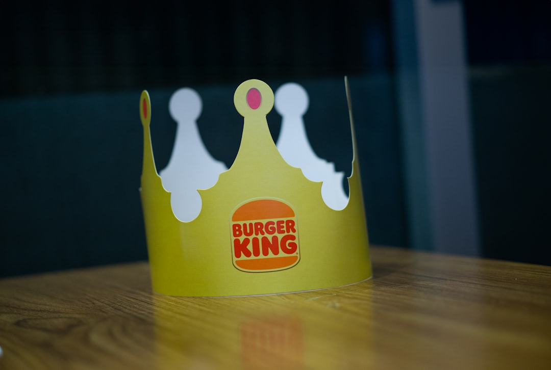
What font is the Burger King logo?
The Burger King logo wordmark is custom lettering, not a stock font. The 2021 identity — which revived the bun-and-burger emblem the brand used from 1969 to 1999 — pairs that retro logo with thick, rounded letterforms that look like they were squeezed between two buns. The curves are deliberately soft and the spacing is tight, giving the mark its friendly, appetizing character. Because it is drawn artwork registered as a trademark, you cannot download “the Burger King logo font”; you can only approximate its feel.
What is Flame Sans, Burger King’s brand typeface?
Flame Sans is the bespoke typeface the agency Jones Knowles Ritchie designed to carry the rest of the system — menus, packaging, signage, advertising, and digital. It shares the wordmark’s DNA: chunky weights, rounded terminals, and a slightly retro, 1970s-flavored warmth meant to feel handmade and craveable rather than corporate. Flame Sans comes in a range of weights so it can handle everything from a giant in-store headline to small packaging copy. Like the logo, it is proprietary to the brand and is not sold to the public.
Why did Burger King choose this style?
The rebrand was a deliberate move away from the glossy, blue-accented, gradient-heavy logo Burger King had used since 1999. The goal was to look more natural and food-forward — the kind of typography you might expect on a craft burger joint’s hand-painted sign. Rounded, bold type reads as approachable and nostalgic, and it photographs well on packaging and social media. This is a common strategy in food branding: soft, rounded letterforms feel warm and edible, where sharp geometric type can feel cold. If you want to understand why brands commission their own faces instead of licensing one, our font licensing guide explains the trade-offs.
Free fonts that look like the Burger King font
You cannot legally use Flame Sans or the logo lettering yourself, but several free Google Fonts capture the same chunky, rounded, retro warmth. Match the role first — a heavy display weight for headlines, a friendlier rounded sans for body.
| Use case | Burger King uses | Free alternative |
|---|---|---|
| Logo / big headlines | Custom wordmark + Flame Sans (bold) | Fredoka (heavy, rounded) |
| Packaging & menu display | Flame Sans | Baloo 2 |
| Body / supporting copy | Flame Sans (regular) | Nunito (soft, rounded sans) |
| Playful retro accent | Custom lettering | Chango or Bowlby One SC |
Baloo 2 is the closest single free match — a bold, rounded, friendly sans with the same squeezed warmth. Fredoka (formerly Fredoka One) gives you the heavy, bubbly display weight for big headlines. For longer copy, Nunito keeps the rounded feel while staying readable at small sizes. All three are free on Google Fonts and licensed for commercial use under the SIL Open Font License.
How to recreate the Burger King look
If you are building a retro, food-forward identity in the same spirit, the recipe is straightforward. Start with a heavy, rounded display weight for your main wordmark or headline — Fredoka in its boldest weight or Baloo 2 ExtraBold both read as warm and craveable. Tighten the letter-spacing slightly so the letters nestle together the way Burger King’s do; that snug fit is a big part of the “squeezed between two buns” feeling. Keep your color palette warm — reds, oranges, browns, and cream rather than cool blues — because Burger King’s 2021 system deliberately leaned into appetizing, natural tones to match the rounded type.
For everything below the headline, step down to a lighter rounded sans like Nunito so menus and packaging copy stay readable at small sizes. Resist the urge to mix in a second display face; the strength of the Burger King look is its restraint — essentially one rounded family used across every weight. If you need a genuinely custom wordmark rather than a font, hand-drawn lettering based on these shapes is the route Burger King itself took, and it is what makes a logo defensible as a trademark.
Can I use the Burger King font for my own project?
No — not the real one. Both Flame Sans and the wordmark lettering are proprietary brand assets, and the logo is a registered trademark. Using them outside of official Burger King materials risks both a licensing and a trademark issue. For your own restaurant or brand, pick a free rounded sans from the table above and draw your own wordmark, or commission custom lettering. If you are working on food or menu typography more broadly, our sibling guides on what font KFC uses and what font Dunkin’ uses cover the same rounded, appetite-driven approach.
Frequently Asked Questions
What font does Burger King use in its logo?
The Burger King logo uses custom-drawn lettering created for the 2021 rebrand, not a downloadable font. It is thick, rounded, and retro, designed to sit inside the revived bun emblem. Because it is trademarked artwork, the exact logo font is not available to the public.
What is Flame Sans?
Flame Sans is Burger King’s proprietary brand typeface, designed by Jones Knowles Ritchie for the 2021 rebrand. It is a chunky, rounded, slightly retro sans-serif used across packaging, menus, signage, and advertising. It is not sold or licensed for outside use.
What free font looks most like Burger King?
Baloo 2 is the closest free match — a bold, rounded, friendly sans available on Google Fonts. For heavier display headlines, Fredoka works well, and Nunito handles body text while keeping the soft, rounded character. All are free for commercial use.
Can I download the Burger King font?
No. Flame Sans and the logo lettering are proprietary to Burger King and not available for download or licensing. Any “Burger King font” you find on a free-font site is an unofficial imitation. Use a legitimate free alternative like Baloo 2 or Fredoka instead.
Why did Burger King change its font in 2021?
Burger King moved to warm, rounded, retro type to look more natural and food-focused, replacing the glossy blue gradient logo it had used since 1999. Soft, chunky letterforms feel appetizing and approachable, which suits food branding and performs well on packaging and social media.


