Best Bubble Fonts: 25+ Playful Picks for Fun Design (2026)
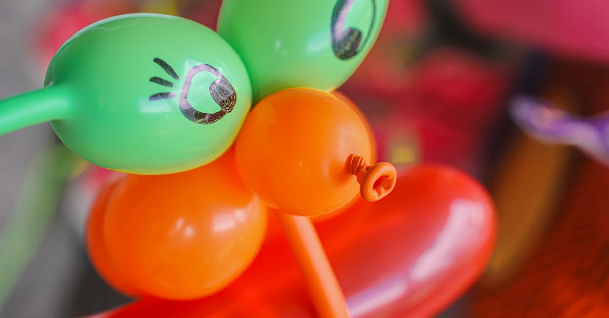
Bubble fonts are rounded, inflated, playful letterforms that look like they have been filled with air. The strokes are thick, the corners are soft, and every letter feels like it could float away or bounce off the page. They sit at the intersection of display typography and pure fun, making them one of the most recognizable categories in type design.
Bubble fonts have surged in popularity for good reason. They are a staple of children’s products and party invitations, a go-to choice for eye-catching social media graphics, and a key visual ingredient in the Y2K revival and Gen Z aesthetics that continue to dominate design trends in 2026. The inflated, tactile quality of bubble lettering taps into something almost universal: the sense that type can be playful, physical, and joyful rather than merely functional.
This guide covers more than twenty-five of the best bubble fonts available today, organized into categories so you can find exactly the right style for your project. We include classic balloon lettering, 3D inflatable styles, rounded sans-serifs that read as bubbly, graffiti-inspired bubble letters, and a strong selection of free options from Google Fonts. For each font, you will find a short description, best use cases, and pricing information.
What Makes a Bubble Font
Bubble fonts share a set of visual characteristics that set them apart from other rounded or display typefaces. Understanding these traits will help you choose the right bubble font for your project and recognize the subtle differences between subcategories.
The defining feature is inflation. Where a standard rounded font simply softens its terminals, a bubble font makes every stroke look swollen, as if air pressure is pushing the letterforms outward from the inside. Stroke widths are heavy and uniform. Counters (the enclosed spaces inside letters like “o” and “d”) are often small relative to the overall letter size, because the inflated strokes consume most of the available space. Corners and junctions are always smooth and curved, never sharp. Many bubble fonts add highlights, shadows, or glossy effects to reinforce the three-dimensional, inflated illusion.
Bubble fonts are almost exclusively display typefaces. They are designed for headlines, posters, logos, and short bursts of text where visual impact matters more than sustained readability. Setting a full paragraph in a bubble font is rarely a good idea, which is why pairing them with a clean body font is essential for any project that involves more than a few words.
Classic Bubble and Balloon Fonts
These fonts deliver the quintessential bubble letter look: inflated, cheerful, and unmistakably playful. They are the fonts most people picture when they hear the term “bubble font.”
Ballooney
Ballooney lives up to its name with letterforms that look like they were inflated from actual balloons. The strokes are thick and uniformly rounded, with a subtle highlight effect that gives each character a glossy, three-dimensional appearance. The font includes uppercase and lowercase characters, numerals, and basic punctuation, all maintaining the same buoyant personality.
Best for: Birthday party invitations, children’s event posters, toy packaging, festive social media posts.
Price: Premium; available from creative marketplaces such as Creative Market and MyFonts.
Bubble Bobble
Bubble Bobble takes the classic bubble letter aesthetic and pushes it toward maximum roundness. Every character is an exercise in circular geometry, with strokes that swell outward like inflated tubes. The font has a retro charm that references arcade game typography from the 1980s and 1990s, making it a natural fit for gaming-related design and nostalgic projects.
Best for: Retro gaming graphics, arcade-themed branding, playful packaging, poster headlines.
Price: Premium; available from font marketplaces.
Balonku
Balonku is a clean, well-executed balloon font with consistent stroke weight and generous rounding across the entire character set. The design is slightly more restrained than some of its peers, which makes it versatile enough for professional contexts that still need a playful edge. It includes multiple weights, giving you flexibility to use it for both bold headlines and lighter accent text.
Best for: Children’s branding, educational materials, casual product packaging, greeting cards.
Price: Free for personal use; commercial license available.
Comfy
Comfy earns its name with letterforms that feel pillowy and soft. The design splits the difference between a rounded sans-serif and a true bubble font, with strokes that are inflated enough to read as bubbly but controlled enough to maintain legibility in longer text strings. This balance makes Comfy one of the more practical options in the classic bubble category.
Best for: App interfaces for children, casual branding, social media headers, packaging for soft or comfort products.
Price: Premium; available from font distributors.
Cream Soda
Cream Soda evokes the sweetness its name suggests. The letterforms are bubbly and full, with rounded terminals and a slight bounce in the baseline that gives text a lively, energetic rhythm. The font works particularly well at large sizes where its personality can shine, and it pairs naturally with pastel color palettes and illustrated design elements.
Best for: Food and beverage branding, ice cream shop signage, sweet-themed packaging, playful display headlines.
Price: Premium; available from Creative Market and similar platforms.
3D and Inflatable Style Bubble Fonts
These fonts push the bubble concept into three dimensions. They use shading, gradients, highlights, and perspective to create letterforms that look like physical inflatable objects. This subcategory has exploded in popularity alongside the Y2K design revival, where glossy, dimensional, and hyper-tactile aesthetics are central to the visual language.
Inflated
Inflated is a display typeface that makes each letter look like a freshly inflated pool float. The 3D rendering is convincing, with realistic light reflections, soft shadows, and a sense of material weight that grounds the playfulness in something that feels tangible. The font is designed for maximum visual impact and works best at large sizes where the dimensional details are fully visible.
Best for: Social media graphics, summer campaign visuals, Y2K-inspired branding, poster headlines, event promotions.
Price: Premium; typically available from creative marketplaces.
Jelly Belly
Jelly Belly creates the impression of soft, gelatinous letterforms that wobble and shine. The design incorporates translucent highlights and rounded edges that make each character look like it is made of candy or jelly. The effect is simultaneously playful and tactile, triggering an almost physical response in the viewer. It works best as a headline font in contexts where sweetness and fun are the primary message.
Best for: Candy and confectionery branding, children’s entertainment, food packaging, whimsical display text.
Price: Premium; available from font marketplaces.
Marshmallow
Marshmallow delivers exactly the texture its name promises. The letterforms are thick, soft, and pillowy, with subtle shading that suggests the surface of an actual marshmallow. The font avoids over-rendering and keeps its 3D effect tasteful, which allows it to work in a wider range of design contexts than some of the more extreme inflatable fonts. The character set is comprehensive, including alternates and ligatures that add variety to longer text strings.
Best for: Bakery and dessert branding, cozy lifestyle brands, children’s book titles, seasonal campaign graphics.
Price: Premium; available from creative marketplaces.
Chubby Cheeks
Chubby Cheeks is a bold, puffy display font with an exaggerated roundness that makes every letter feel squeezable. The 3D effect is achieved through careful shading and stroke weight variation that suggests volume without relying on heavy rendering. The result is a font that feels dimensional and physical but remains clean enough to work in digital and print contexts alike.
Best for: Kids’ brands, toy packaging, party invitations, playful logos, casual gaming interfaces.
Price: Premium; available from font distributors and creative marketplaces.
Rounded Sans-Serifs That Read as Bubbly
Not every bubble font needs to look like an inflatable toy. The following sans-serif typefaces use generous rounding, thick strokes, and open letterforms to achieve a bubbly feel while maintaining enough structure for broader design applications. These are the fonts to reach for when you want bubble energy without full-on balloon aesthetics.
Nunito
Nunito, designed by Vernon Adams and expanded by Jacques Le Bailly, is one of the most popular rounded sans-serifs on Google Fonts. Its uniformly rounded terminals and generous x-height give it a naturally bubbly quality that works across a wide range of contexts. With fourteen weights from ExtraLight to Black and matching italics, Nunito offers the versatility that most true bubble fonts lack.
Best for: Web and app interfaces that need a friendly tone, children’s educational platforms, lifestyle branding, any project requiring a bubbly feel with professional range.
Price: Free; available on Google Fonts.
Quicksand
Quicksand is a geometric rounded sans-serif with a light, airy personality. The circular letter shapes and rounded terminals create a bubbly impression, especially in heavier weights where the strokes fill more space. The design is clean and modern, which makes it a strong choice for projects where playfulness needs to coexist with contemporary aesthetics.
Best for: Lifestyle and wellness brands, creative portfolios, app interfaces, social media templates.
Price: Free; available on Google Fonts.
Varela Round
Varela Round is a single-weight rounded sans-serif that achieves a bubbly feel through its consistent rounding and open, friendly counters. The letters feel approachable without becoming cartoonish, which makes it useful for projects that want a soft, inflated quality without the overt playfulness of a display bubble font. The single-weight limitation restricts its use in complex typographic systems, but it works well for simpler layouts.
Best for: Landing pages, casual app interfaces, social media graphics, simple branding projects.
Price: Free; available on Google Fonts.
Comfortaa
Comfortaa is a geometric rounded sans-serif with wide, circular letterforms and consistent stroke widths that give it a distinctly bubbly character. The high degree of geometric regularity makes it feel polished and intentional rather than casually playful. Comfortaa works best at display sizes where its round, bouncy proportions can make an impact. Extended body text can feel monotonous due to the extreme regularity of the curves.
Best for: Tech startup branding, modern display headlines, logo design, UI elements and buttons.
Price: Free; available on Google Fonts.
Baloo 2
Baloo 2, from EK Type, combines rounded terminals with a slightly playful posture to create one of the most naturally bubbly fonts on Google Fonts. What sets it apart is its multilingual support: the family covers Latin, Devanagari, Tamil, Bengali, and Gujarati scripts, making it an exceptional choice for internationalized projects that need a bubble-inspired tone. Five weights from Regular to ExtraBold provide solid range.
Best for: Multilingual children’s content, educational platforms, friendly web interfaces, casual branding with international reach.
Price: Free; available on Google Fonts.
Graffiti and Street Bubble Fonts
Bubble letters have deep roots in graffiti and street art culture, where inflated, overlapping letterforms became a signature style in the 1970s and 1980s. These fonts translate that urban energy into usable type, bridging the gap between street culture and graphic design.
Grafitti Classic
Grafitti Classic captures the look of throw-up style graffiti lettering, where speed and impact matter more than fine detail. The letters are thick, rounded, and built for visibility, with the kind of bold, overlapping presence that graffiti writers aim for when painting in public spaces. The font works well for streetwear branding, urban event posters, and any design that needs authentic street culture energy.
Best for: Streetwear brands, urban event promotion, hip-hop related design, bold poster headlines.
Price: Premium; available from font marketplaces.
Throwup
Throwup takes its name directly from graffiti terminology, where a “throw-up” is a quickly executed bubble letter style designed for maximum coverage in minimum time. The font translates this urgency into digital type, with letters that feel fast, bold, and unapologetically loud. The strokes are heavy and inflated, with minimal interior detail, exactly like the real-world style it references.
Best for: Street art-inspired graphics, music industry branding, skate and surf culture design, rebellious marketing campaigns.
Price: Premium; available from creative marketplaces.
Bombing
Bombing rounds out the graffiti bubble subcategory with letterforms inspired by the “bombing” style of graffiti, where writers cover as much surface area as possible with quick, oversized bubble letters. The font has a raw, energetic quality that feels authentically urban. Each character is thick, inflated, and slightly irregular, preserving the hand-painted feel of actual street work while remaining functional as a digital typeface.
Best for: Street culture branding, festival and concert posters, skateboard graphics, urban lifestyle marketing.
Price: Premium; available from font distributors.
Best Free Bubble Fonts
The following fonts are entirely free, primarily available through Google Fonts. They offer genuine bubble personality without any licensing costs, making them ideal for personal projects, student work, and budget-conscious professional design.
Bungee
Bungee, designed by David Jonathan Ross, is a display font family inspired by urban signage and the vertical, compressed lettering found on buildings in dense neighborhoods. Its thick, rounded strokes and bold weight give it a bubbly, inflated quality that works well for attention-grabbing headlines. The Bungee family includes Bungee Inline, Bungee Shade, and Bungee Hairline variants, providing surprising stylistic range for a free typeface.
Best for: Urban-themed designs, bold poster headlines, social media banners, event graphics, signage-inspired branding.
Price: Free; available on Google Fonts.
Luckiest Guy
Luckiest Guy, designed by Brian J. Bonislawsky for Astigmatic, is one of the most popular free display fonts for a reason. Its thick, rounded, cartoon-style letterforms have a bubbly exuberance that immediately injects energy into any headline. The design references mid-century advertising lettering and comic book typography, making it a natural fit for anything that needs to feel bold, cheerful, and slightly retro.
Best for: Comic-inspired designs, children’s content, game UI, promotional banners, poster headlines that need high energy.
Price: Free; available on Google Fonts.
Bubblegum Sans
Bubblegum Sans, designed by Sudtipos, delivers exactly the personality its name suggests. The letterforms are rounded, slightly bouncy, and full of character, with a casual warmth that makes text feel hand-drawn and personal. Unlike many display bubble fonts, Bubblegum Sans maintains decent readability at smaller sizes, which extends its usability beyond pure headline work into subheadings, labels, and short paragraphs.
Best for: Children’s brands, casual food and beverage design, playful web headers, informal invitation design.
Price: Free; available on Google Fonts.
Fredoka
Fredoka (formerly Fredoka One) is a rounded, bold display font that has been expanded into a full variable font family. The letterforms are thick and bubbly, with a clean, geometric foundation that keeps the playfulness from becoming chaotic. The variable font version offers a weight range from Light to Bold, which significantly improves its versatility compared to the original single-weight release. Fredoka is one of the best free options for designers who want a bubble feel with some typographic control.
Best for: Children’s apps and websites, educational platforms, playful branding, game interfaces, packaging for kids’ products.
Price: Free; available on Google Fonts.
Shrikhand
Shrikhand, designed by Jonny Pinhorn for the Indian Type Foundry, is a bold, high-contrast display font with thick, rounded strokes that give it a distinctly bubbly presence. Originally designed for Gujarati script and extended to Latin, Shrikhand has a unique flavor that sets it apart from Western-centric bubble fonts. The heavy weight and rounded forms create an inflated, larger-than-life impression that commands attention in any layout.
Best for: Bold display headlines, food and restaurant branding, attention-grabbing social media posts, multicultural design projects.
Price: Free; available on Google Fonts.
When to Use Bubble Fonts
Bubble fonts are not for every project, but in the right context they are unbeatable. The following scenarios represent the strongest use cases for bubbly, inflated typography.
Children’s Brands and Products
Bubble fonts are a natural match for anything aimed at children. The inflated, rounded letterforms feel safe, fun, and non-threatening, which makes them effective for toy packaging, kids’ apps, children’s books, educational materials, and youth-oriented branding. The playful quality of bubble type helps establish an immediate emotional connection with young audiences and reassures parents that a product is age-appropriate.
Party and Event Design
Birthday invitations, celebration banners, event posters, and festive social media graphics all benefit from the celebratory energy of bubble fonts. The balloon-like quality of many bubble fonts creates a direct visual association with parties and celebration, making them an obvious choice for any design that needs to communicate fun, excitement, and festivity.
Social Media and Digital Content
Bubble fonts thrive in the attention economy of social media. Their bold, inflated forms are impossible to scroll past, which makes them effective for Instagram posts, TikTok thumbnails, YouTube titles, and any digital content that needs to stop thumbs and capture attention within milliseconds. The current dominance of Gen Z aesthetics and Y2K-inspired visuals on social platforms has only amplified the demand for bubbly, dimensional type.
Casual Gaming
Mobile games, casual browser games, and family-friendly video games frequently use bubble fonts for logos, UI elements, and in-game text. The playful, approachable quality of bubble type signals that a game is fun and accessible rather than serious or competitive. Fonts in this style also render well at the range of sizes typically needed in game interfaces, from large title screens to smaller button labels.
Y2K Aesthetics and Retro Revival
The Y2K design revival has brought bubble fonts back into the mainstream with full force. The glossy, inflatable, hyper-tactile visual language of early-2000s design depends heavily on bubbly, dimensional type. If your project references Y2K aesthetics, whether sincerely or ironically, bubble fonts are essential to achieving an authentic look.
Pairing Tips for Bubble Fonts
Bubble fonts are high-personality typefaces that need careful pairing to work in complete designs. The wrong companion font will create visual chaos, while the right one will give your layout structure and readability. Here are the most effective strategies for pairing bubble fonts.
Pair with a Clean Sans-Serif Body Font
The single most reliable pairing strategy for bubble fonts is to combine them with a clean, neutral sans-serif for body text. The bubble font handles headlines, logos, and display text where personality matters, while the sans-serif provides comfortable readability for everything else. Effective combinations include Fredoka headlines with Inter body text, Luckiest Guy headlines with Open Sans body text, or Bubblegum Sans headlines with Roboto body text. The contrast between the playful display font and the restrained body font creates clear hierarchy and visual balance.
Avoid Pairing Two Bubble Fonts Together
Using two different bubble fonts in the same design almost always creates confusion. Both fonts compete for attention with similar levels of personality, and the subtle differences between them read as inconsistency rather than intentional contrast. If you need variation within bubble-style type, look for a single font family that offers multiple weights or styles rather than combining unrelated bubble fonts.
Use Bubble Fonts Sparingly
Bubble fonts are at their best when used for a few words at a time: a headline, a logo, a call-to-action button. The more text you set in a bubble font, the more its impact diminishes and the harder it becomes to read. Treat bubble fonts as seasoning rather than the main course. A single word in a bold bubble font surrounded by clean, quiet typography will always be more effective than an entire layout drowning in bubbly letterforms.
Consider Color Carefully
Bubble fonts respond strongly to color choices. Bright, saturated colors amplify their playful quality, while muted or monochrome palettes can make them feel more sophisticated. If your project needs to feel fun and energetic, pair your bubble font with bold colors. If you want the bubbly form language but a more restrained overall tone, use the font in black, white, or a neutral color and let the shape of the letters do the work.
Frequently Asked Questions
What is a bubble font?
A bubble font is a display typeface with rounded, inflated letterforms that look like they have been filled with air. The strokes are thick and uniformly rounded, the corners are always smooth and curved, and the overall effect is playful, cheerful, and attention-grabbing. Bubble fonts range from simple rounded sans-serifs to elaborate 3D inflatable styles with glossy highlights and shadows. They are primarily used for headlines, logos, posters, and short display text rather than body copy, because their exaggerated forms reduce readability over longer passages. The style has roots in both graffiti culture and commercial display lettering.
Are bubble fonts appropriate for professional design work?
Bubble fonts are appropriate for professional work in the right context. Children’s brands, entertainment companies, food and beverage packaging, casual gaming, party and event businesses, and social media content all use bubble fonts professionally and effectively. The key is matching the font’s tone to the project’s audience and purpose. A bubble font would be wrong for a law firm or financial institution, but it would be entirely appropriate for a children’s toy company or a Y2K-inspired fashion brand. Many professional designers keep several bubble fonts in their toolkit for projects where playfulness is a strategic asset rather than a liability.
What are the best free bubble fonts available?
The strongest free bubble fonts available through Google Fonts include Fredoka (a variable-weight rounded display font ideal for children’s design), Luckiest Guy (a bold, cartoon-style display font with high energy), Bubblegum Sans (a casual, hand-drawn bubbly font with decent smaller-size readability), Bungee (a signage-inspired display family with multiple stylistic variants), and Shrikhand (a bold, high-contrast display font with multilingual support). For fonts that are not strictly bubble fonts but read as bubbly, Nunito, Quicksand, Comfortaa, Varela Round, and Baloo 2 are all excellent free options with rounded, inflated character that suits many of the same use cases.
How do I pair a bubble font with other typefaces?
The most effective approach is to use the bubble font exclusively for headlines and display text, then pair it with a clean, neutral sans-serif for body text and supporting content. Fonts like Inter, Open Sans, Roboto, and Source Sans work well as body text companions because their simplicity provides a calm foundation for the bubble font’s personality. Avoid pairing two bubble fonts together, as the competing levels of playfulness create visual confusion. Also avoid overly decorative serif fonts as companions, since the combined ornamentation will overwhelm the viewer. The goal is contrast: one font that provides energy and personality, and another that provides clarity and readability. For detailed guidance on combining typefaces, see our complete font pairing guide.


