What Font Does Wikipedia Use?
The Wikipedia font is unusual among famous brands because its logo is set in a typeface you can actually download for free. The “WIKIPEDIA” wordmark uses an open-source serif, while the encyclopedia’s articles and interface rely on system fonts for speed and universal availability. Below we break down the logo, the body text, and the UI — and explain why Wikipedia’s choices are a model of accessibility-first typography. For how other brands handle their type, see our hub on famous brand fonts.
What font is the Wikipedia logo?
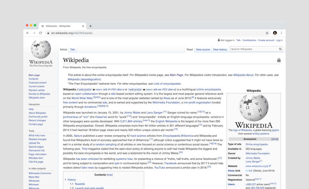
The “WIKIPEDIA” wordmark beneath the globe puzzle is set in Linux Libertine, a free and open-source serif typeface released under the SIL Open Font License and GPL. It is a classic, readable book serif with old-style proportions — and crucially, the lowercase tagline (“The Free Encyclopedia”) and the wordmark both draw on this family. This is a strongly documented fact and one of the most-cited answers in brand typography: unlike Coca-Cola, Netflix, or most logos, Wikipedia’s logo font is one anyone can legitimately download and use, because Linux Libertine is genuinely free. The small-caps “WIKIPEDIA” treatment is part of why the mark reads as authoritative and encyclopedic.
What font does Wikipedia use for article text?
Wikipedia’s article body has historically been served in a system serif — meaning the typeface depends on your device. For years that commonly resolved to Georgia or Times New Roman, and the current approach uses a serif system stack that falls back to whatever quality serif your operating system provides. Serifs were chosen for long-form reading because their bracketed strokes and clear letterforms guide the eye across dense reference text. We should be precise here: Wikipedia does not ship a single bundled body font — it requests a serif and lets your device supply it, which keeps pages fast and universally legible. Our breakdown of the Georgia font covers the screen serif most associated with Wikipedia’s classic reading experience.
What font does the Wikipedia interface use?
The chrome around articles — menus, tabs, sidebars, and the search bar — uses a system sans-serif stack, historically resolving to Helvetica, Arial, or the platform’s native UI sans. The split is deliberate: a serif for the reading column where you spend the most time, and a neutral sans for navigation and controls so the interface stays out of the way. This sans/serif division is a textbook accessibility pattern. For the grotesque that anchors so many UI stacks, see our guide to the Helvetica font.
Can you download the Wikipedia font for free?
Yes — and this is what makes Wikipedia special. Linux Libertine, the logo font, is free and open-source under the SIL OFL and GPL, so you can download it from the Libertine Open Fonts project and use it commercially at no cost. The body and UI fonts are system fonts (Georgia, Times, Helvetica, Arial), which ship with your operating system but are not yours to redistribute. So the genuinely free, downloadable piece is the logo typeface itself. Reproducing Wikipedia’s actual logo is still a trademark matter separate from the font — our font licensing guide explains the difference between an open-font license and trademark protection.
Free fonts that match the Wikipedia look
Because the logo font is already free, recreating Wikipedia’s typography is easy and almost entirely no-cost. Match the role: an old-style serif for headings or logo-like display, a readable serif for body, and a neutral sans for UI.
| Use case | Wikipedia uses | Free / paid alternative |
|---|---|---|
| Logo / wordmark | Linux Libertine | Linux Libertine (free!) |
| Article body serif | Georgia / system serif | Georgia (system) / Source Serif 4 (free) |
| Old-style book serif | Libertine lineage | EB Garamond (free) |
| Interface sans | Helvetica / Arial / system | Arimo (free) / Inter (free) |
For the logo look, just use Linux Libertine itself — it’s free and it’s literally the typeface Wikipedia uses. For body text, Source Serif 4 or EB Garamond give you a clean, readable old-style serif on Google Fonts, while Georgia (a system font) most closely matches the classic Wikipedia reading feel. For the interface sans, Arimo is a free, metric-compatible Helvetica/Arial substitute, and Inter is an excellent modern alternative. All are free for commercial use.
Why does Wikipedia use these fonts?
Wikipedia’s choices are driven by accessibility, openness, and performance. An open-source logo font fits a project built on free knowledge — the mark is reproducible by anyone, in keeping with its mission. Serif body text aids sustained reading of long reference articles, while system fonts for body and UI mean pages load instantly on any device, anywhere in the world, without downloading custom files. It is typography optimized for billions of readers on every kind of connection. For other media and reference brands, see our siblings on what font Shopify uses and what font Stripe uses.
Frequently Asked Questions
What font does the Wikipedia logo use?
The “WIKIPEDIA” wordmark is set in Linux Libertine, a free, open-source serif released under the SIL Open Font License and GPL. The tagline uses the same family. Because Linux Libertine is genuinely free, Wikipedia’s is one of the few major logo fonts anyone can legally download and use.
Is the Wikipedia font free?
The logo font, Linux Libertine, is free and open-source — you can download it and use it commercially at no cost. Wikipedia’s article body and interface rely on system fonts (Georgia, Times, Helvetica, Arial) that ship with your device but cannot be redistributed. So the logo typeface is the genuinely free, downloadable piece.
What font does Wikipedia use for article text?
Wikipedia serves its article body in a system serif stack, historically resolving to Georgia or Times New Roman and now to your device’s native serif. It does not bundle a single body font; it requests a serif and lets your operating system supply one, keeping pages fast and readable for long-form text.
Where can I download Linux Libertine?
Linux Libertine is available for free from the Libertine Open Fonts project and various open-font repositories, licensed under the SIL OFL and GPL. It is free for personal and commercial use. Reproducing Wikipedia’s actual logo, however, still involves trademark considerations separate from the font license.
What font is most like Wikipedia’s body text?
Georgia, a system serif, most closely matches Wikipedia’s classic reading experience. For a free, downloadable alternative, Source Serif 4 or EB Garamond on Google Fonts offer similar readable, old-style serif character suited to long-form articles. All are free for commercial use.


