What Font Does GoPro Use? The GoPro Font Explained
Wondering what the GoPro font is? The “GoPro” wordmark is custom bold lettering with a distinctive squarish, engineered feel, while the brand’s wider communications use custom and proprietary type. Neither is a font you can simply install. This guide explains the wordmark, the brand type, and the free fonts that get you closest to GoPro’s rugged, action-ready look.
GoPro is a strong example of an action-sports brand using bold, blocky type to signal durability and adventure. For the wider picture, browse our overview of fonts used by famous brands.
What font is the GoPro logo?
The “GoPro” letters are custom bold lettering — a trademarked wordmark rather than characters typed from a stock font. The letterforms are heavy, squarish, and tightly built, with a slightly engineered, technical feel that suits a rugged camera brand. The squared corners and even stroke weight give it a tough, durable presence that reads clearly etched into product housings, screen-printed on mounts, and scaled across video overlays. Because the lettering is bespoke and protected, it cannot be legally reproduced, though its blocky character is straightforward to approximate.
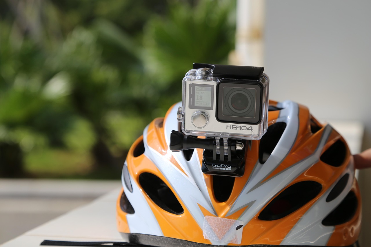
What is the GoPro brand typeface?
For everything beyond the wordmark — advertising, product UI, packaging, and app overlays — GoPro uses custom and proprietary sans-serif faces built around bold, sturdy, slightly squared weights that echo the wordmark’s engineered look. The brand voice is energetic and rugged, matching its action-camera positioning, so the type carries weight and structure rather than softness. Where the exact corporate specimen is not publicly documented, treat the GoPro brand type as a bold squarish/grotesque sans rather than a single named retail font you can buy.
Why does GoPro use a bold squarish sans?
A heavy, squarish sans communicates exactly what GoPro wants: toughness, durability, and adventure. The cameras get strapped to helmets, surfboards, and drones, so the brand has to feel rugged and capable on a product, a screen overlay, and a billboard alike. That places GoPro alongside other action and outdoor identities that favour structural, engineered type. For a different take on bold consumer-tech branding, compare our breakdown of the Beats font.
Can I use the GoPro font?
No. Both the wordmark lettering and GoPro’s corporate type are proprietary brand assets, so you cannot license or reuse them for your own projects. The bold, squarish look is easy to approximate with free fonts, though. Before you publish, confirm the terms of whatever you choose — our font licensing guide explains desktop, web, and app licensing so you stay compliant.
Free and paid alternatives to the GoPro font
You cannot license GoPro’s corporate faces, but several bold squarish and condensed sans-serifs deliver the same rugged, engineered feel. Eurostile (paid) is a strong paid reference for the squared, technical character. For free options, Saira, Archivo, and Oswald are excellent stand-ins depending on how condensed you want the result.
| Use case | Font (paid reference) | Free alternative |
|---|---|---|
| GoPro-style bold wordmark / headline | Eurostile Bold (paid) | Saira (free) |
| Sturdy body / marketing text | DIN Next (paid) | Archivo (free) |
| Condensed signage / overlays | Bank Gothic (paid) | Oswald (free) |
| UI / camera app text | Akkurat (paid) | Inter (free) |
If you license a paid squarish face such as Eurostile or DIN Next, confirm your tier covers web embedding and app use as well as desktop, especially for video overlays and product interfaces.
How do I get the GoPro look in my own design?
Set headlines in a bold, squarish Saira or Archivo, keep the weight heavy and the spacing tight, and lean on high-contrast imagery, bold colour blocks, and a structural grid. The toughness comes from squared, engineered letterforms plus energetic visuals — keep it bold and confident. For a friendlier electronics identity built on rounder geometry, see our breakdown of the LG font.
How has the GoPro identity evolved?
GoPro grew from founder Nick Woodman’s 2002 wrist-strap camera idea into the defining brand of the action-camera category, and its bold, squarish wordmark has carried that rugged spirit throughout. The blocky, engineered lettering signals exactly what the product promises: a tough little camera that survives surf, snow, and dirt. As GoPro expanded from hardware into editing apps, subscriptions, and a huge user-generated video ecosystem, it refined its type and digital design system toward cleaner, sturdier sans cuts that hold up in on-screen overlays and small app UI. Through every refresh the squarish, bold character of the wordmark stayed central, because it carries the brand’s durability story. The constant is structure: an action-sports brand has to look tough and capable on a helmet mount, a phone screen, and a campaign billboard alike, and bold, squared type delivers exactly that. That balance of a fixed, characterful wordmark plus a practical evolving brand face is a pattern you will spot across our famous brand fonts roundup.
Saira, Archivo, or Oswald: which alternative fits?
All three approximate the bold, structural character of the GoPro wordmark. Saira is the most squarish and engineered, making it the closest free match for GoPro’s technical feel across headlines and branding. Archivo is a sturdy grotesque with strong bold cuts, ideal for marketing copy and UI where you still want weight. Oswald is condensed and tall, perfect when you need impactful, space-efficient overlays on video. For most new projects chasing the GoPro look, Saira for display and Archivo for body is a reliable pairing.
Frequently Asked Questions
What font does the GoPro logo use?
The “GoPro” wordmark is custom bold lettering — heavy, squarish, tightly built letters drawn specifically for the brand with an engineered feel. It is a trademarked, bespoke mark, not a downloadable retail font, so it cannot be legally reproduced.
What is GoPro’s brand font?
Beyond the wordmark, GoPro uses custom and proprietary bold sans-serif faces with a sturdy, slightly squared character. Where the exact specimen is not publicly documented, treat the brand type as a bold squarish grotesque rather than a named retail font.
Is the GoPro font free?
No. The wordmark lettering and GoPro’s corporate type are proprietary and not publicly available. For a free, legal substitute with the same bold, squarish feel, use Saira, Archivo, or Oswald, or license Eurostile or DIN Next for a closer reference.
What kind of font is the GoPro logo?
The GoPro wordmark is a bold, squarish custom sans-serif — engineered and technical rather than rounded or decorative. Its closest off-the-shelf relatives are squared faces like Eurostile and DIN, or free options such as Saira and Archivo.
Can I use the GoPro font for commercial work?
You cannot use the GoPro wordmark lettering or its corporate type commercially, as they are protected brand assets. You can use free alternatives like Saira, Archivo, and Oswald, or a licensed Eurostile, for your own projects as long as you hold the correct license.


