Shades of Lavender: Names and Hex Codes
There are many recognized shades of lavender, from the barely-there pale classic to dusty mauves and vivid heliotropes. Below is a practitioner reference: each shade with its name, hex code, RGB value, and a note on where it works best. Use it as a swatch library when building a palette, and pair it with our guide to color psychology when you need the symbolism behind the swatch.
A quick note on terminology, because lavender lives in a soft-purple zone full of near-synonyms. Lavender — the web standard is #E6E6FA — is a pale, slightly blue-tinted purple named after the flower. Lilac leans pinker, periwinkle leans bluer, and mauve is grayer and dustier. If you need those distinctions, see our comparisons of lilac vs lavender and periwinkle vs lavender. Throughout this guide, “shades of lavender” covers every named variation in that light-purple family.
Each entry below gives three values so you can use it anywhere: the hex code (for CSS, HTML, and most design tools), the RGB triplet (for screen-based tools that ask for red, green, and blue channels separately), and a short note on the mood and best use of that shade. If you need CMYK or a Pantone match for print, convert from the hex value in your design software — pale lavenders in particular can wash out or shift toward gray on press, so always proof.
Pale and classic lavenders
These are the soft, airy lavenders most people picture — gentle, calming, and slightly cool, ideal for wellness, beauty, and minimal palettes.
| Shade name | Hex | RGB | Notes / use |
|---|---|---|---|
| Lavender | #E6E6FA | 230, 230, 250 | Web-standard pale purple; soft, calming. |
| Lavender Blush | #FFF0F5 | 255, 240, 245 | Web-standard near-white pink-lavender; delicate. |
| Pale Lavender | #DCD0FF | 220, 208, 255 | Soft light lavender; airy, gentle. |
| Lavender Mist | #E6E6FF | 230, 230, 255 | Very pale blue-lavender; clean background. |
| Mauve | #E0B0FF | 224, 176, 255 | Bright pale purple; vivid, fresh. |
| Light Pastel Purple | #B19CD9 | 177, 156, 217 | Mid pastel lavender; balanced, soft. |
Blue-leaning lavenders
Where lavender cools toward blue you get periwinkle and wisteria tones — serene, dreamy, and a touch sophisticated.
| Shade name | Hex | RGB | Notes / use |
|---|---|---|---|
| Periwinkle | #CCCCFF | 204, 204, 255 | Pale blue-lavender; dreamy, serene. |
| Wisteria | #C9A0DC | 201, 160, 220 | Soft floral lavender; romantic, gentle. |
| Blue Violet | #8A2BE2 | 138, 43, 226 | Vivid blue-purple; bold, electric. |
| Lavender Indigo | #9683EC | 150, 131, 236 | Mid blue-lavender; modern, calm. |
| Medium Slate Blue | #7B68EE | 123, 104, 238 | Web-standard blue-lavender; vibrant. |
| Light Steel Lavender | #B0C4DE | 176, 196, 222 | Cool gray-blue lavender; muted, refined. |
Pink-leaning lavenders
Where lavender warms toward pink you get lilac, orchid, and heliotrope tones — playful, floral, and feminine.
| Shade name | Hex | RGB | Notes / use |
|---|---|---|---|
| Lilac | #C8A2C8 | 200, 162, 200 | Soft pink-purple; floral, classic. |
| Heliotrope | #DF73FF | 223, 115, 255 | Bright pink-lavender; vivid, energetic. |
| Orchid | #DA70D6 | 218, 112, 214 | Web-standard pink-purple; lively, floral. |
| Pink Lavender | #E0B0E6 | 224, 176, 230 | Pale rosy lavender; sweet, gentle. |
| Pale Lilac | #CC99CC | 204, 153, 204 | Muted pink-lavender; vintage, soft. |
| Mauve Taupe | #915F6D | 145, 95, 109 | Dusty pink-mauve; muted, sophisticated. |
Deep and muted lavenders
Richer, grayer lavenders that feel grown-up and editorial — great for sophisticated branding and moody palettes.
| Shade name | Hex | RGB | Notes / use |
|---|---|---|---|
| Medium Purple | #9370DB | 147, 112, 219 | Web-standard rich lavender; confident. |
| Lavender Purple | #967BB6 | 150, 123, 182 | Deeper muted lavender; refined, calm. |
| French Lilac | #86608E | 134, 96, 142 | Dusty deep lilac; vintage, elegant. |
| Heather Gray-Purple | #8B7B8B | 139, 123, 139 | Muted gray-lavender; neutral, subtle. |
| Slate Blue | #6A5ACD | 106, 90, 205 | Deep blue-lavender; web-standard, bold. |
| Dusk Lavender | #75617B | 117, 97, 123 | Smoky deep lavender; moody, editorial. |
What are the most popular shades of lavender?
The most-used named lavenders in design are lavender (#E6E6FA), lilac (#C8A2C8), periwinkle (#CCCCFF), mauve (#E0B0FF), and wisteria (#C9A0DC). Pale lavender dominates wellness, beauty, and minimal branding; lilac and wisteria bring soft floral warmth; periwinkle adds a dreamy blue calm; mauve reads brighter and more modern. Pale lavenders feel serene and gentle, while deeper ones project creativity and quiet luxury.
Lavender’s appeal is that it softens purple’s regal intensity into something calming and approachable. That makes it a favorite for self-care, sleep, and beauty brands that want to feel soothing, and for weddings and stationery that want romance without bright pink. Because it sits between blue and pink, lavender also reads as gently gender-neutral, which is why it has surged in contemporary minimal and tech-adjacent design. Choosing a lavender is really choosing how pink, how blue, or how gray you want that softness to lean.
The flower lends lavender its other great asset: an instant association with relaxation and sleep. Few colors carry such a specific sensory cue, which is why it appears so consistently on candles, bath products, sleep aids, and spa packaging — the color does marketing work before a single word is read. That same softness is also lavender’s main constraint. Pale lavenders have very little contrast against white, so they fail accessibility checks for text and can disappear on bright screens. The fix is to treat pale tones as decorative and reserve the deeper shades in the tables above for anything that must be legible, then let the lighter values carry mood in backgrounds and large graphics.
How to use shades of lavender in design
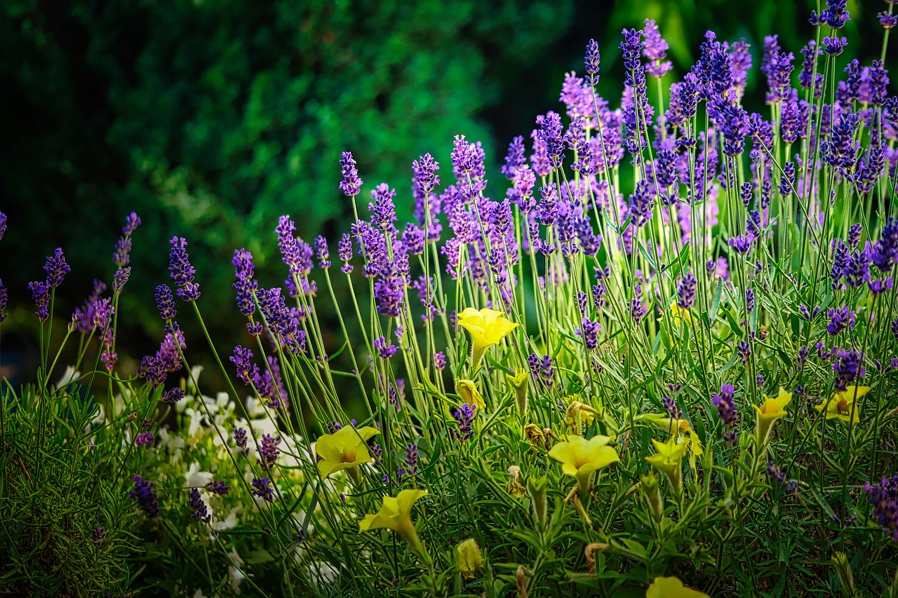
Lavender works best as a soft primary or a calming accent. Pair pale lavender with white and warm gray for an airy minimal palette, or layer lilac and periwinkle together for a dreamy gradient. For contrast, lavender’s near-complement is a soft yellow or chartreuse, which keeps an otherwise gentle palette from feeling flat.
Practical guidance: pale lavenders are too light for body text on white — reserve them for backgrounds, fills, and large headings, and switch to deeper tones like medium purple (#9370DB) when you need readable colored type. To keep lavender from feeling overly sweet, ground it with charcoal, deep plum, or warm taupe rather than more pastels. Lavender also pairs beautifully with sage and dusty olive for an earthy, grown-up palette — see our reference on shades of olive for that combination, and explore its cool cousin in shades of turquoise.
Frequently Asked Questions
What is the hex code for lavender?
The standard web and X11 hex code for lavender is #E6E6FA, which is RGB 230, 230, 250. It is a very pale, slightly blue-tinted purple named after the flower. It is one of the lightest named purples in the CSS color set.
What is the difference between lavender and lilac?
Lavender (#E6E6FA) is a pale, slightly blue-leaning purple, while lilac (#C8A2C8) is a soft purple that leans noticeably pinker and is a touch more saturated. Lavender feels cool and calming; lilac feels warmer and more floral. See our full lilac vs lavender comparison.
What is the difference between lavender and periwinkle?
Periwinkle (#CCCCFF) leans clearly toward blue, while lavender (#E6E6FA) is paler and more neutral purple. Periwinkle reads as a soft blue-violet; lavender reads as a gentle purple. See our periwinkle vs lavender comparison for examples.
Which shade of lavender is best for a brand?
For calming wellness and beauty, pale lavender (#E6E6FA) or lilac (#C8A2C8) work beautifully. For a more confident, creative identity, medium purple (#9370DB) or wisteria (#C9A0DC) hold up better as primary brand colors and remain legible at smaller sizes.
What colors go well with lavender?
Lavender pairs beautifully with white, warm gray, and cream for an airy palette, and with sage green or dusty olive for an earthy, grown-up look. For contrast, soft yellow brings it to life, while charcoal or deep plum ground it and add sophistication.


