Wedding Color Palette: Hex Codes and Ideas
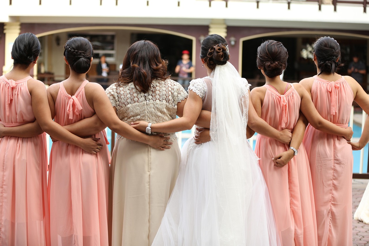
A wedding color palette is built from soft, low-saturation tones — blush pinks, sage greens, dusty blues — grounded by ivory and champagne neutrals and lifted with metallic gold. The restraint is the point: muted colors photograph beautifully, mix without clashing, and read as elegant rather than loud. Use the named palettes and hex table below as a ready reference, then read on for how to combine them.
If you want the theory behind why these gentle tones feel calm and romantic, see our guide to color psychology, and our shades of cream reference covers the ivory and champagne neutrals in depth. For related elegant schemes, the Christmas color palette shares the cream-and-gold formula, and the baby color palette uses the same soft pastels.
What colors are in a wedding palette?
A wedding palette is defined by softness: every color is desaturated so it reads as gentle and refined. The romantic accents are blush (#F4C2C2), a barely-there pink; sage (#B2AC88), a grayed green that pairs with real greenery; and dusty blue (#8AA0B0), a muted slate-blue that feels both fresh and timeless. The neutrals do most of the structural work — ivory (#FFFFF0), a warm off-white for backgrounds and linens, and champagne (#F7E7CE), a slightly deeper warm neutral. Gold (#D4AF37) is the metallic accent that adds shine to invitations, frames, and details.
| Color name | Hex | RGB | Role |
|---|---|---|---|
| Blush | #F4C2C2 | 244, 194, 194 | Primary accent |
| Ivory | #FFFFF0 | 255, 255, 240 | Background / neutral |
| Sage | #B2AC88 | 178, 172, 136 | Secondary |
| Dusty Blue | #8AA0B0 | 138, 160, 176 | Secondary / cool accent |
| Champagne | #F7E7CE | 247, 231, 206 | Neutral / warm base |
| Gold | #D4AF37 | 212, 175, 55 | Accent / metallic |
5 wedding palettes with hex codes
Each of these is a ready-to-use scheme organized loosely by season. Copy the hex codes directly; every palette is anchored by ivory or champagne so the accents stay soft.
1. Blush & Gold (timeless)
The most popular wedding combination — romantic, warm, and elegant year-round.
Blush #F4C2C2 Ivory #FFFFF0 Champagne #F7E7CE Gold #D4AF37 Rose Mauve #C99DA3
2. Sage & Cream (spring/garden)
Fresh and botanical — pairs perfectly with real greenery and eucalyptus.
Sage #B2AC88 Ivory #FFFFF0 Blush #F4C2C2 Olive #7C8A6A Gold #D4AF37
3. Dusty Blue & Silver (winter)
Cool, serene, and modern — ideal for winter and waterfront weddings.
Dusty Blue #8AA0B0 Ivory #FFFFF0 Silver #C0C0C0 Slate Navy #4F6272 Champagne #F7E7CE
4. Terracotta & Sage (autumn/boho)
Warm, earthy, and relaxed — a modern bohemian palette for fall celebrations.
Terracotta #C66B3D Sage #B2AC88 Champagne #F7E7CE Rust #A6584F Ivory #FFFFF0
5. Burgundy & Champagne (formal)
Rich and dramatic — a deep jewel tone softened by champagne and gold for black-tie events.
Burgundy #6E1423 Champagne #F7E7CE Gold #D4AF37 Ivory #FFFFF0 Mauve Rose #9C5D6E
Which wedding colors go together?
Wedding colors combine easily because they are all desaturated — the “pop” is pulled out, so pairings that would clash at full strength sit comfortably together. The most reliable approach is one soft accent plus one neutral plus one metallic. Blush (#F4C2C2) and gold (#D4AF37) is the timeless classic, warm and romantic. Sage (#B2AC88) and blush create a gentle, garden-fresh pairing of grayed green and grayed pink. Dusty blue (#8AA0B0) and champagne (#F7E7CE) balance a cool accent against a warm neutral for a serene, modern look.
For neutrals, ivory (#FFFFF0) is the universal background that lets every accent breathe, while champagne (#F7E7CE) is a slightly warmer, richer alternative for linens and stationery. A practical rule: choose one or two accent colors maximum, then let ivory and champagne carry the bulk of the design. This keeps a wedding scheme cohesive across invitations, florals, attire, and reception décor rather than scattered. A helpful approach is to assign each color a clear job before the day: one hue for the dominant linens and backdrops, one for bridesmaid attire and florals, and the metallic strictly for small details. Locking those roles early stops the palette from drifting as vendors and DIY elements are added.
How to use a wedding palette in design
Restraint is everything: a wedding palette should feel calm, so resist adding a third or fourth saturated accent. Build with the 60-30-10 rule: 60% ivory (#FFFFF0) or champagne (#F7E7CE) neutral, 30% your primary accent (blush, sage, or dusty blue), and 10% metallic gold (#D4AF37). This split scales from a single invitation to a full reception.
For invitations and signage, set warm ivory or champagne as the paper color and use a soft deep tone — slate navy, burgundy, or olive — for text rather than pure black, which can feel harsh against the gentle palette. Reserve gold for foil details and small flourishes. To match the temperature of your accents to your season and venue, see warm vs cool colors, and pair the palette with elegant typography from our wedding fonts roundup.
Wedding palette for invitations, florals, and décor
For invitations and stationery, the palette translates directly: ivory or champagne card stock, blush or dusty-blue ink, and gold foil for names and borders. Keep the color count low so the suite feels intentional and the typography stays legible.
For florals, the soft palette is designed to work with real flowers and greenery — blush ranunculus and roses, sage eucalyptus, and dusty-blue thistle or delphinium all map to these exact tones. For reception décor, carry ivory linens as the base, layer in your accent through napkins, ribbon, and candles, and use gold flatware or frames as the metallic thread that ties tables together. If you are coordinating wedding colors with a couple’s broader brand or event identity, our guide to how to choose brand colors offers a useful framework for building a cohesive palette.
Frequently Asked Questions
What are the most popular wedding colors?
Blush (#F4C2C2), sage (#B2AC88), and dusty blue (#8AA0B0) are among the most popular wedding accent colors, almost always paired with ivory (#FFFFF0) and champagne (#F7E7CE) neutrals and gold (#D4AF37) accents. These soft, desaturated tones read as romantic and timeless and photograph beautifully.
How many colors should a wedding palette have?
A wedding palette works best with one or two accent colors plus two neutrals and one metallic — roughly four to five hues total. More than that becomes hard to coordinate across invitations, florals, attire, and décor. Keeping the count low is what makes the day feel cohesive and intentional.
What colors go with blush for a wedding?
Blush (#F4C2C2) pairs beautifully with gold (#D4AF37) for a classic look, with sage (#B2AC88) for a garden feel, and with dusty blue (#8AA0B0) for a soft cool-warm contrast. Ivory and champagne neutrals tie any blush combination together and keep it elegant.
What are good wedding colors by season?
Spring suits sage and blush; summer favors dusty blue and ivory; autumn leans into terracotta, rust, and sage; and winter looks elegant in dusty blue with silver, or burgundy with champagne and gold. Matching your accent’s temperature to the season keeps the palette feeling natural.


