Ocean Color Palette: Hex Codes and Ideas
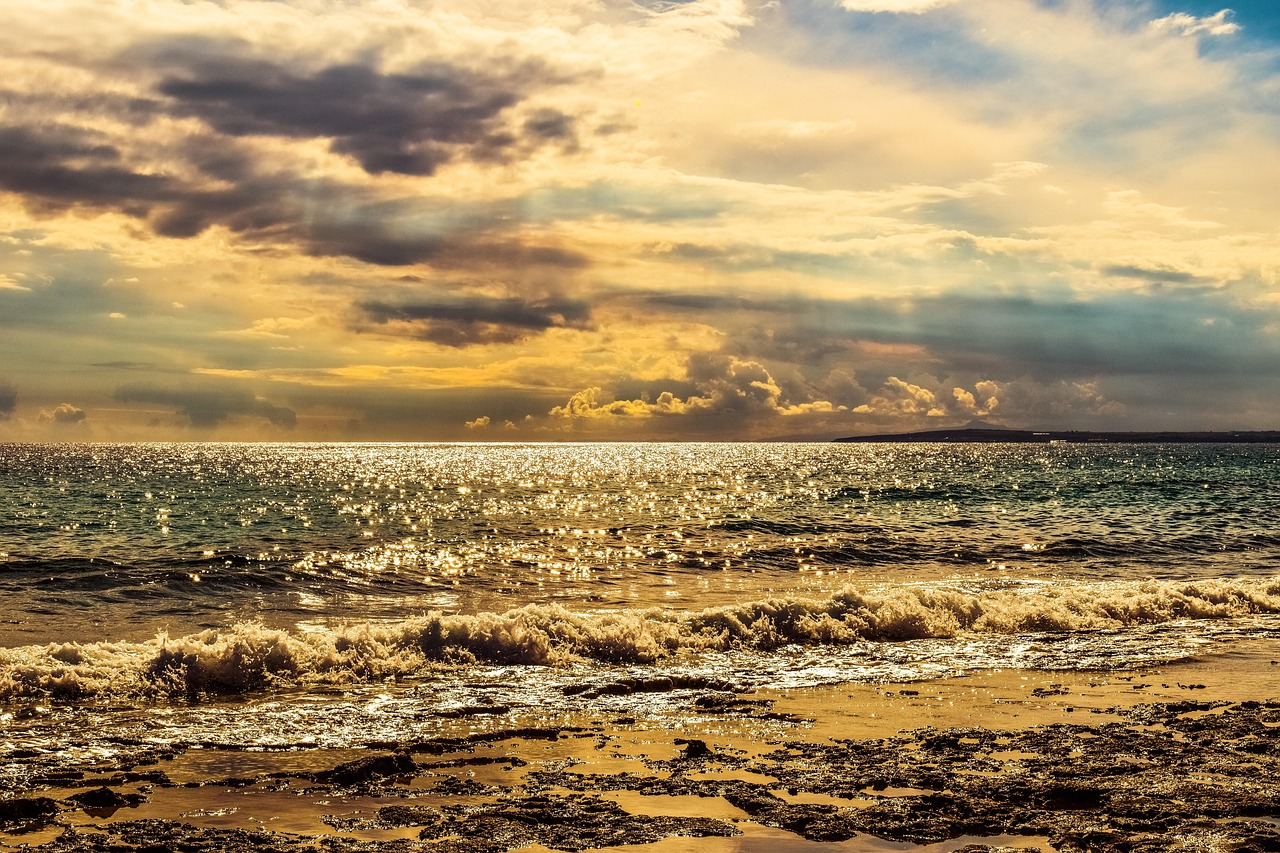
An ocean color palette moves from the deep, dark water of the open sea up through teal and bright aqua to pale seafoam, then grounds the cool tones with warm sand. It captures depth and movement — darker and richer than a breezy beach scheme — which makes it a strong choice for designs that need both calm and substance. The named palettes and hex table below are ready to use, followed by guidance on combining them.
For why blues and greens read as calm and trustworthy, see our color psychology guide. An ocean scheme sits firmly in the cool color palette family, overlaps the breezier coastal color palette, and shares its deep, cool character with our forest color palette guide. To extend any part of the water gradient, see our shades of blue reference.
What colors are in an ocean palette?
An ocean palette is a gradient of water from deep to shallow, plus a sandy ground. At the bottom is deep blue (#003F5C), the dark water of depth; above it sits oceanic teal (#2A9D8F), where blue meets green; then bright aqua (#48CAE4), the clear shallow water; and pale seafoam (#90E0C8), the foam at the surface. Warm sand (#E9D8A6) grounds the cool tones, and a dark navy (#1B263B) provides the deepest anchor for text and structure. The full depth range — from near-black navy to pale seafoam — is what makes an ocean palette feel three-dimensional rather than flat.
| Color name | Hex | RGB | Role |
|---|---|---|---|
| Deep Blue | #003F5C | 0, 63, 92 | Primary |
| Teal | #2A9D8F | 42, 157, 143 | Secondary |
| Aqua | #48CAE4 | 72, 202, 228 | Accent / highlight |
| Seafoam | #90E0C8 | 144, 224, 200 | Light surface |
| Sand | #E9D8A6 | 233, 216, 166 | Warm neutral |
| Navy | #1B263B | 27, 38, 59 | Anchor / text |
5 ocean palettes with hex codes
Each scheme moves through the depths of the sea. Copy the hex codes directly.
1. Classic Ocean
The full water gradient grounded by sand — deep, fresh, and calming.
Deep Blue #003F5C Teal #2A9D8F Aqua #48CAE4 Seafoam #90E0C8 Sand #E9D8A6
2. Deep Sea
Dark, moody blues for depth, mystery, and the open ocean.
Abyss #0B1E2D Navy #1B263B Deep Blue #003F5C Sea Blue #2C7DA0 Pale Surface #A9D6E5
3. Tropical Ocean
Bright turquoise and aqua for clear, shallow, vacation water.
Deep Teal #006D77 Teal #2A9D8F Aqua #48CAE4 Seafoam #90E0C8 Pale Sand #FDFCDC
4. Ocean Sunset
Sea blues warmed with a coral-and-sand sunset over the water.
Deep Blue #003F5C Teal #2A9D8F Sand #E9D8A6 Sunset Coral #F4A261 Burnt Coral #E76F51
5. Ocean Mist
Soft, muted, foggy sea tones — quiet and atmospheric.
Steel Blue #5C7A8A Misty Teal #88A9A3 Sea Glass #B8D0CC Foam #DDE5E3 Slate #2F3E46
Which ocean colors go together?
Ocean pairings work by stacking the depths — moving from dark deep water up to pale surface foam, so the palette reads as a vertical slice of the sea. Deep Blue (#003F5C) and Aqua (#48CAE4) are the foundational pairing — dark depth against bright shallows — and that contrast is the core of any ocean scheme. Navy (#1B263B) provides the darkest anchor for text and structure, while Seafoam (#90E0C8) gives the lightest, freshest surface tone.
Teal (#2A9D8F) is the connective mid-tone where blue meets green, tying the whole gradient together. The warm note — Sand (#E9D8A6) or a sunset coral — keeps an all-cool scheme from feeling cold; it is the optional but valuable counterweight. A reliable formula: deep blue and navy anchor the design, teal and aqua carry the mid and accent, seafoam lifts the light areas, and a small amount of sand grounds it all. Skip the warm note only if you specifically want a cold, deep-sea mood.
How to use an ocean palette in design
The defining move in ocean design is using depth as hierarchy — darker blues feel heavier and recede, lighter aquas and seafoams feel lighter and advance. Build backgrounds on Seafoam (#90E0C8) or pale surfaces, set primary elements in Deep Blue (#003F5C) and Teal (#2A9D8F), reserve bright Aqua (#48CAE4) for highlights and links, and anchor text in Navy (#1B263B).
The crucial detail is balancing temperature: ocean palettes lean strongly cool, so a touch of warm Sand (#E9D8A6) or coral prevents the scheme from feeling clinical. A 50-30-20 split works well — 50% light/seafoam, 30% mid teal and aqua, 20% deep blue and navy plus a small warm accent. Confirm aqua and seafoam meet contrast requirements before using them for text, since both are light. For more water-toned options, see our shades of blue reference, and use warm vs cool colors to judge how much warmth to add.
Ocean palette for branding, web, and interiors
In branding, ocean palettes signal depth, trust, calm, and freshness, which suits wellness, travel, marine and environmental causes, finance, and tech that wants to feel both serious and approachable. Deep blue carries credibility while aqua and teal add energy and life. See how to choose brand colors for matching an ocean scheme to brand voice — it reads dependable yet fresh.
On the web, ocean palettes create cool, calming, content-friendly interfaces: seafoam or pale backgrounds, navy text for strong contrast, and aqua for interactive accents. Gradients from deep blue to aqua are a natural fit and evoke water directly. For interiors, ocean tones bring a deeper, richer alternative to breezy coastal decor — navy and deep teal textiles, aqua glass accents, and sandy neutrals create rooms that feel calm and grounded. For the lighter, airier cousin of this scheme, see our coastal color palette guide.
Frequently Asked Questions
What colors are in an ocean palette?
An ocean palette combines deep blue (#003F5C), teal (#2A9D8F), bright aqua (#48CAE4), pale seafoam (#90E0C8), warm sand (#E9D8A6), and dark navy (#1B263B). The blues and greens move from deep water to shallow surface, grounded by sandy neutrals for a deep, fresh, calming feel.
What is the difference between ocean and coastal palettes?
Ocean palettes are deeper and richer — built on dark blues, teal, and navy to evoke open, deep water. Coastal palettes are lighter and airier, dominated by white and sand with softer blues for a relaxed beach feel. Ocean reads as depth and substance; coastal reads as bright and breezy.
What is the best blue for an ocean palette?
Deep blue (#003F5C) is the most versatile ocean blue — dark and rich like deep water — paired with teal (#2A9D8F) and bright aqua (#48CAE4) to suggest shallower water. Together they create the depth gradient that makes a palette read unmistakably as the sea.
What warm color goes with an ocean palette?
Warm sand (#E9D8A6) is the classic ground, and sunset coral (#F4A261) or burnt coral (#E76F51) work as a brighter warm accent. Because ocean palettes lean strongly cool, a small amount of warmth keeps them inviting rather than cold — though a deep-sea scheme can skip it for a colder mood.


