What Font Does Zara Use?
The Zara font is one of the most discussed cases in fashion branding because the 2019 logo redesign was divisive — the letters were squeezed so close they overlap. The short answer: Zara uses a custom Didone (modern serif) wordmark with extreme thick-to-thin contrast, very much in the Didot tradition, and it’s bespoke artwork rather than a font you can download. Below we break down what’s used where and which free fonts get you closest. For more brand breakdowns, see our hub on famous brand fonts.
What font is the Zara logo?
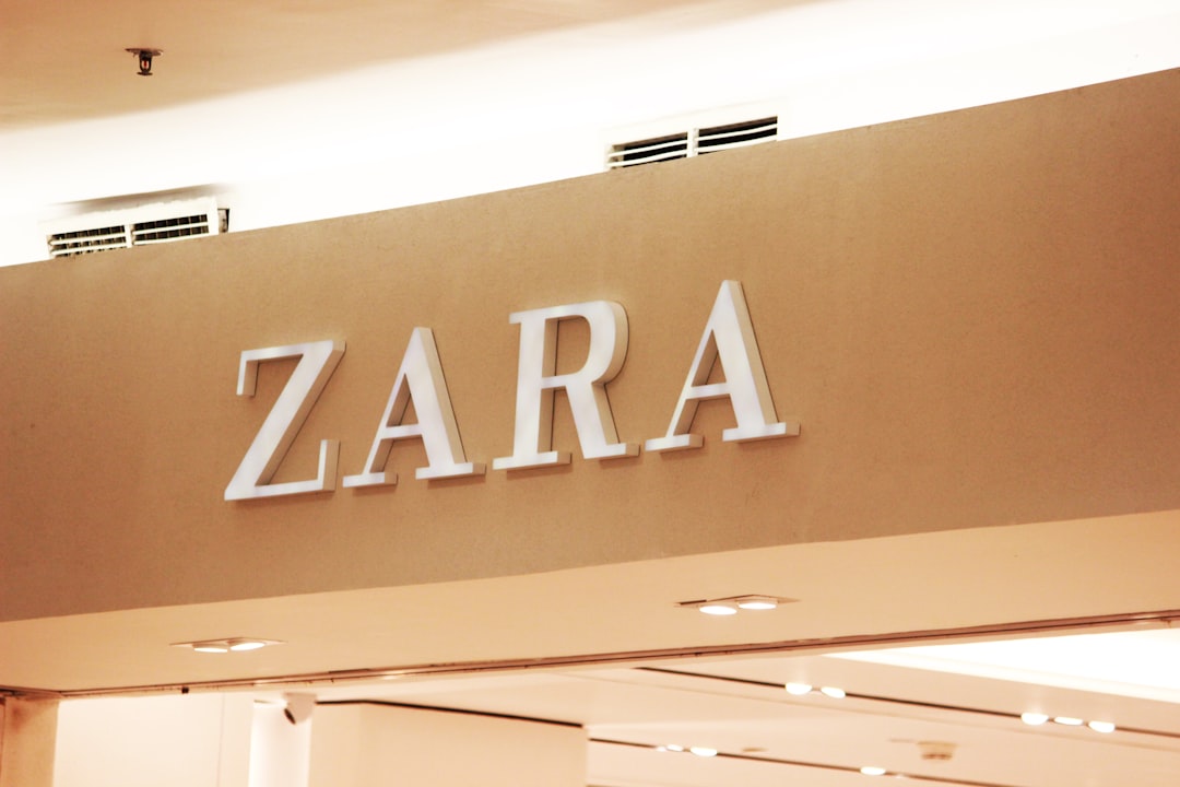
The Zara logo wordmark is a custom Didone serif — a “modern” serif style defined by dramatic contrast between thick vertical strokes and hairline thins, with flat, unbracketed serifs. Introduced in 2019 and created by the agency Baron & Baron (known for high-fashion identities), the redesign tightened the kerning so aggressively that the letters touch and overlap, a deliberate, polarizing choice meant to feel editorial and luxury-coded. The style is consistently and accurately likened to Didot, the classic French Didone associated with fashion mastheads like Vogue and Harper’s Bazaar. The exact letterforms are custom, so there’s no downloadable “Zara logo font.”
Is the Zara font Didot?
Not literally, but it’s the right family to reach for. The Zara wordmark is a custom Didone, not the off-the-shelf Didot typeface — but Didot (and its cousin Bodoni) are the closest classical references, which is why nearly every analysis describes Zara’s logo as “Didot-style.” If you want the authentic high-fashion contrast, study our breakdowns of the Didot font and the Bodoni font; both are the lineage Zara’s mark belongs to. The key visual cue is the extreme stroke contrast plus those flat hairline serifs — that’s what reads as “expensive.”
What typeface does the Zara brand use?
Beyond the logo, Zara’s broader system pairs the Didone wordmark with clean, understated supporting type for product pages, navigation, and editorial layouts — typically minimal serifs or neutral sans-serifs that stay out of the way so imagery and the wordmark dominate. Publicly documented specimens of an exact named body font are limited, so we’d treat any single “official Zara body font” claim with caution. What’s consistent is the contrast in roles: a dramatic Didone for identity, quiet and minimal type for everything functional.
Why did Zara choose this style?
High-contrast Didone serifs are the default visual language of luxury fashion because they evoke heritage magazine mastheads and couture. By overlapping the letters, Baron & Baron pushed the wordmark toward something more avant-garde and editorial — a signal that fast fashion can look high-fashion. It was controversial precisely because the tight kerning sacrifices some legibility for attitude. If you want to understand why brands commission their own faces instead of licensing one, our font licensing guide explains the trade-offs.
Free fonts that look like the Zara font
You can’t use the Zara wordmark itself, but several free Google Fonts capture the same Didone, high-fashion contrast. Match the role first — a dramatic Didone for the logo and headlines, quiet type for body.
| Use case | Zara uses | Free alternative |
|---|---|---|
| Logo / wordmark | Custom Didone (Didot-style) | Playfair Display (bold) |
| Editorial headlines | Didone serif | Bodoni Moda or Cormorant |
| Body / product copy | Minimal serif / neutral sans | EB Garamond or Inter |
| Small UI & navigation | Neutral sans | Inter (regular) |
Playfair Display is the closest free match for the Zara wordmark feel — a high-contrast Didone with elegant thick-to-thin strokes, free on Google Fonts. For an even sharper, more compressed Didone look, Bodoni Moda leans closer to the classic Didot/Bodoni contrast. For body and UI, drop to a quiet EB Garamond or neutral Inter so the headline serif stays the star. All are free for commercial use under the SIL Open Font License.
How to recreate the Zara look
If you’re building a luxury-fashion identity in the same spirit, set your wordmark in a high-contrast Didone like Playfair Display or Bodoni Moda, in a bold weight at a generous size. To echo Zara specifically, tighten the kerning dramatically — even to the point where letters nearly touch — but test legibility, since that’s exactly the trade-off Zara was criticized for. Keep the palette minimal: black on white or cream, with no decorative flourishes competing with the serif’s contrast.
For everything else, go quiet. Use a restrained serif or a neutral sans for product copy and navigation, and let whitespace and photography carry the brand. The power of the Zara look comes from one dramatic typographic gesture surrounded by silence. For more fashion typography, see our sibling guides on what font Uniqlo uses and the Didot font breakdown.
Can I use the Zara font for my own project?
No — not the real one. The Zara wordmark is custom artwork and a registered trademark. Using it outside official Zara materials risks both a licensing and a trademark issue. For your own brand, set a free Didone like Playfair Display and draw your own wordmark, or commission custom lettering. Any “Zara font” download you find on a free-font site is an unofficial imitation.
Frequently Asked Questions
What font does Zara use in its logo?
Zara’s 2019 logo uses a custom high-contrast Didone serif with tightly kerned, overlapping letters, created by agency Baron & Baron. It is bespoke artwork registered as a trademark, so it is not downloadable. Playfair Display is the closest free alternative.
Is the Zara logo Didot?
Not the exact Didot typeface, but it is a custom Didone in the Didot tradition — which is why analysts consistently describe it as “Didot-style.” Didot and Bodoni are its closest classical references. For a free version of that look, Playfair Display or Bodoni Moda work well.
What free font looks most like Zara?
Playfair Display is the closest free match — a high-contrast Didone serif available on Google Fonts. For a sharper, more compressed feel, Bodoni Moda leans closer to classic Didot. Pair either with a quiet body font and tighten the kerning to echo Zara’s overlapping letters.
Why was the Zara logo so controversial?
The 2019 redesign squeezed the letters so close they overlap, sacrificing some legibility for an editorial, avant-garde feel. Critics found it cramped while supporters saw it as bold and high-fashion. The polarizing kerning is the defining feature of the current Zara wordmark.
Can I download the Zara font?
No. The Zara wordmark is proprietary custom lettering and a registered trademark, not available for download. Any “Zara font” on a free-font site is an unofficial imitation. Use a legitimate free Didone like Playfair Display or Bodoni Moda instead.