Ivory vs White: What’s the Difference?
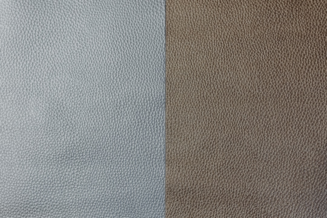
The ivory vs white question comes down to a faint yellow warmth. White is the pure, neutral, maximally bright color with no tint at all. Ivory is an off-white that lowers the blue channel just slightly, adding a soft, creamy yellow warmth named after the color of elephant tusk. That gentle yellow tint is the whole difference, and it is the reason ivory feels softer and cozier than crisp white.
What color is white?
White is the purest, brightest neutral, created when all color channels are at maximum. Its hex is #FFFFFF, with red, green, and blue all at 255, meaning no hue dominates and the color reflects light evenly. White carries strong associations of cleanliness, simplicity, purity, and modernity, which is why it anchors minimalist design, clinical settings, and contemporary branding. It is the ultimate blank canvas and the brightest color a screen or surface can show.
Because true white has no tint, it reads as crisp, cool, and neutral. In practice, surfaces called “white” often carry faint undertones, but pure #FFFFFF is the reference point with none. For the symbolism and the wide range of off-whites, see our guide to white color meaning.
What color is ivory?
Ivory is a soft, warm off-white named after the natural color of elephant and walrus tusk. A representative hex is #FFFFF0, where red and green stay maxed but blue drops slightly to about 240, which removes a touch of coolness and leaves a faint yellow warmth. The result is a creamy, gentle white that feels softer and more inviting than pure white. Ivory reads as elegant, classic, and timeless, which is why it is a staple in weddings, stationery, and refined interiors.
Because ivory is white with just a hint of yellow, it sits at the lightest, palest end of the off-white family, near cream and off-white but lighter and less yellow than both. The slightly lowered blue channel is what separates it from pure white. For close cousins, see our comparisons of ivory vs cream vs off-white and off-white vs white.
Ivory vs white: side-by-side comparison
Exact values vary across brands, paints, and screens, but these representative specs show the warm-versus-pure split clearly.
| Attribute | Ivory | White |
|---|---|---|
| Hex code | #FFFFF0 | #FFFFFF |
| RGB | 255, 255, 240 | 255, 255, 255 |
| CMYK (approx) | 0, 0, 6, 0 | 0, 0, 0, 0 |
| Undertone | Warm, faint yellow | Neutral, none |
| Hue family | Off-white (warm) | Pure neutral |
| Best used for | Weddings, stationery, classic interiors | Minimal, clinical, modern, high-contrast |
| Mood / feel | Soft, warm, elegant, timeless | Crisp, clean, modern, neutral |
How can you tell ivory and white apart?
The reliable test is to compare them side by side against a true white reference, like a sheet of bright printer paper. Next to pure white, ivory reveals its warmth and looks faintly creamy or yellow, while the white looks crisp and cool. In isolation, ivory can pass for white, which is exactly why the comparison matters; the difference only becomes obvious in direct contrast. A second cue is feel: white reads as clean and clinical, ivory as soft and inviting.
The numbers confirm it. Pure white at 255, 255, 255 has all three channels maxed and perfectly balanced, so no hue shows. Ivory at 255, 255, 240 keeps red and green maxed but drops blue, and because yellow is what remains when you remove blue from white, that small reduction produces the warm tint. Whenever an off-white’s blue channel sits below its red and green, it is leaning warm toward ivory or cream rather than staying pure white.
Where do ivory and white sit on the color spectrum?
Strictly, pure white is not a single hue but the presence of all wavelengths reflected evenly, which is why it is the brightest, most neutral point on the spectrum. Ivory steps just off that point by removing a sliver of blue, which nudges it into the warm, yellow side of the off-white family. So ivory is not a hue family of its own; it is white with a whisper of yellow. That tiny shift is enough to change its temperature and mood without changing how light it is.
The second axis is warmth, which is the entire story here. Both ivory and white are at near-maximum lightness, so brightness does not separate them; temperature does. White is perfectly neutral, while ivory is warm. Understanding that off-whites split mainly by undertone, warm toward ivory and cream, cool toward shades with a blue or gray cast, is the key to choosing between them. For the broader framing, see warm vs cool colors.
How do ivory and white perform in branding and interiors?
In branding, white signals minimalism, clarity, and modernity, which is why it anchors tech, healthcare, and contemporary brands that want to feel clean and uncluttered. It maximizes contrast and lets other elements lead. Ivory softens that, reading as elegant, classic, and warm, which is why it appears in luxury, beauty, wedding, and heritage branding that wants refinement without coldness. Ivory signals timeless sophistication where pure white signals crisp modernity.
In interiors, pure white walls feel bright, clean, and contemporary but can read as stark or cold, especially in low light. Ivory walls keep a space light while adding cozy warmth, which is why many designers prefer a warm off-white over true white for living spaces. Against ivory, woods and textiles feel harmonious; against bright white, they can feel slightly cooler. A white room feels modern and gallery-like, while an ivory room feels warm, inviting, and timeless.
When should you use ivory vs white?
Choose white when you want maximum brightness, crispness, and modernity. Its pure neutrality suits minimalist design, clinical and tech contexts, high-contrast layouts, and anything that should feel clean and contemporary. White is the ultimate blank, modern canvas. Choose ivory when you want warmth and elegance: weddings, luxury packaging, stationery, and refined interiors lean on ivory because it feels soft, classic, and inviting without sacrificing lightness.
Ivory also works as a warmer, gentler substitute when pure white feels too stark or cold for a brand or a room. For a related comparison among the warm off-whites, see rose gold vs gold for another case where a subtle warm tint changes the whole feel, and to understand why white reads as clean and ivory as warm, read our guide to color psychology.
Frequently Asked Questions
Is ivory just a warmer white?
Essentially, yes. Ivory is white with a faint yellow undertone that makes it warmer and softer. It stays at near-maximum lightness, so it is not darker than white, just less cool. The small drop in the blue channel is what adds the warmth, which is why ivory reads as creamy and inviting next to crisp, neutral white.
What are the hex codes for ivory and white?
Pure white is #FFFFFF (RGB 255, 255, 255), with all channels maxed and no tint. Ivory is commonly #FFFFF0 (RGB 255, 255, 240), where blue drops slightly to add warmth. Exact ivory values vary by brand and paint, but the signature is always red and green at or near maximum with blue a step lower.
Is ivory the same as cream or off-white?
They are close but not identical. Ivory is the lightest and least yellow of the warm off-whites. Cream carries more yellow and reads noticeably warmer and softer, while “off-white” is a broad umbrella that can lean warm or cool. In order of warmth, ivory is subtle, cream is stronger, and off-white depends on its specific undertone.
Which is better for a wedding, ivory or white?
Both are popular, and the choice often comes down to skin tone and mood. Pure white reads as crisp and modern but can look stark in photos and against warmer skin. Ivory is softer and more flattering, with a timeless, elegant warmth, which is why many wedding dresses and stationery use ivory rather than bright white.
Why do white walls sometimes look cold?
Pure white reflects light evenly with no warmth, so in cool or dim lighting it can read as gray, blue, or clinical. Ivory and other warm off-whites avoid this by carrying a faint yellow tint that keeps the space feeling cozy. This is why many interior designers favor a warm white over true #FFFFFF for living areas.


