Art Deco Graphic Design: The Glamorous Movement That Still Inspires
There is a design language that makes everything it touches feel expensive. It turns a poster into a jewel. It transforms a building facade into a declaration of ambition. It wraps geometric precision in gold leaf and says, with absolute confidence, that the future will be beautiful. This is art deco graphic design — the movement that defined the visual culture of the 1920s and 1930s, and whose influence has never truly faded.
Art Deco did not whisper. It announced itself with sunburst motifs, chrome lettering, and compositions so symmetrical they felt almost architectural. It was glamour given geometric form, luxury expressed through razor-sharp lines. And among the many graphic design styles that have emerged over the past century, few have proven as enduring or as instantly recognizable.
Understanding Art Deco is not just a historical exercise. The movement’s principles — its marriage of ornamentation and structure, its bold confidence, its insistence that design should dazzle — remain remarkably useful for anyone working in visual communication today.
Historical Context: The World That Built Art Deco
Art Deco did not appear from nowhere. It emerged from a specific moment in history — one defined by both trauma and extraordinary optimism.
The First World War had ended. Europe was devastated but rebuilding. The United States was entering a period of unprecedented economic expansion. Industrialization was transforming daily life at a pace that felt intoxicating. Automobiles, ocean liners, skyscrapers, and airplanes were reshaping not just how people moved and lived, but how they imagined the future. The Jazz Age was in full swing. There was money, momentum, and a collective hunger for something new.
The crystallizing moment came in 1925, at the Exposition Internationale des Arts Decoratifs et Industriels Modernes in Paris. The exhibition brought together architects, designers, craftspeople, and manufacturers from across the globe, all showcasing work that fused fine art with industrial production. The name “Art Deco” itself derives from this exposition, though the term was not widely used until the 1960s when historians needed a label for the movement they were rediscovering.
What the 1925 Paris Exposition made clear was that a new aesthetic language had arrived — one that embraced the machine age rather than resisting it. Where the preceding Art Nouveau movement had looked to nature for its curving, organic forms, Art Deco looked to the factory, the engine, and the geometry of modern construction. It celebrated technology and progress. It was the visual expression of a world that believed it was moving forward and wanted its surroundings to reflect that confidence.
The movement drew from a dizzying range of sources: Egyptian art following the 1922 discovery of Tutankhamun’s tomb, Cubist painting, Bauhaus functionalism, Futurist dynamism, African sculpture, Aztec temple forms, and the streamlined shapes of modern machinery. Art Deco absorbed all of these influences and refined them into something cohesive — a style that could be applied to everything from jewelry to skyscrapers, from fashion illustrations to the posters that papered the walls of Paris and New York.
Key Visual Elements of Art Deco Design
Art Deco is one of the most visually distinctive movements in design history. Its vocabulary of forms is specific, consistent, and immediately identifiable. Understanding these elements is essential for anyone looking to work with the style or simply to recognize it in the world.
Geometric Shapes and Symmetry
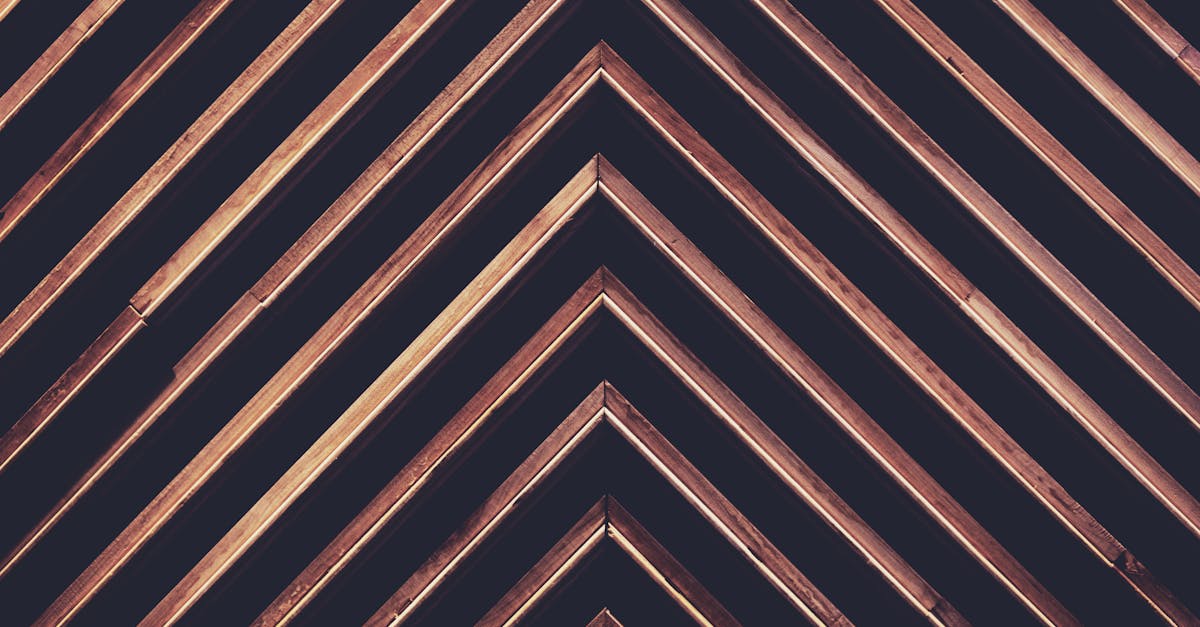
Geometry is the skeleton of Art Deco. Circles, triangles, chevrons, and hexagons appear everywhere — in building facades, textile patterns, poster compositions, and typographic ornaments. These shapes are arranged with strict symmetry, creating compositions that feel balanced, authoritative, and often monumental. Where Art Nouveau let its lines wander organically, Art Deco kept every element in precise geometric order.
Sunburst and Fan Motifs
The sunburst — radiating lines spreading outward from a central point — is perhaps the single most iconic Art Deco motif. It appears on everything from the spire of the Chrysler Building to the covers of 1930s fashion magazines. The related fan motif, with its semicircular array of lines, carries the same sense of radiating energy and forward movement. Both suggest dawn, optimism, and expansion.
Zigzag Patterns and Stepped Forms
Zigzag lines, often stacked in repeating bands, are a signature Art Deco pattern. Stepped forms — shapes that ascend in a series of setbacks, like a ziggurat or a Manhattan skyscraper silhouette — appear constantly in both architecture and two-dimensional design. These stepped profiles give Art Deco compositions their characteristic sense of upward aspiration.
Metallic Color Palettes
Art Deco loves metal. Gold, silver, chrome, and bronze are the movement’s defining colors, often set against deep blacks, rich navies, and emerald greens. The palette communicates luxury and modernity simultaneously — the gleam of precious metals combined with the sheen of industrial chrome. Even in print, where actual metallic inks were expensive, Art Deco designers used color to suggest reflective surfaces and polished materials.
Bold Outlines and Lavish Ornamentation
Art Deco outlines are strong and definitive. Shapes are bounded by thick, confident lines that give compositions a graphic clarity visible from a distance — an essential quality for the poster designs that were central to the movement. Within those bold outlines, ornamentation flourishes: intricate geometric patterns, decorative borders, stylized floral motifs, and repeating linear details. The genius of Art Deco is that this ornamentation never feels chaotic. It operates within the geometric discipline, creating richness without disorder.
Art Deco Typography: Letters as Architecture
The relationship between Art Deco and typography is one of the most productive in design history. Art Deco typefaces do not merely display text — they construct it. Each letter feels like a small building, assembled from geometric components with the same precision and ambition that shaped the era’s architecture.
Geometric Display Faces
Art Deco typography is dominated by geometric display typefaces — fonts built from circles, straight lines, and consistent stroke widths. These faces prioritize visual impact over reading ease. They are designed to be seen large, on posters and building facades, where their geometric purity can register from a distance. The influence of these designs echoes through later geometric typefaces, including Futura, which was released in 1927 during the height of Art Deco’s influence.
Inline and Outline Styles
Many Art Deco typefaces feature inline treatments — thin lines running through the center of each stroke — or outline forms where only the edges of the letterforms are drawn. These techniques give type a sense of dimension and material quality, suggesting engraving, metalwork, or architectural relief. The letters look as though they have been carved from stone or cast in metal, reinforcing the era’s fascination with craftsmanship and industry.
Broadway: The Quintessential Art Deco Typeface
No typeface captures the Art Deco spirit more completely than Broadway, designed by Morris Fuller Benton in 1929. With its extreme contrast between thick and thin strokes, its circular counters, and its unmistakable glamour, Broadway became the typographic voice of the Jazz Age. It remains one of the most referenced Art Deco typefaces, appearing whenever designers want to evoke 1920s sophistication. Its high-contrast structure shares a philosophical kinship with the elegance of Bodoni, though Broadway pushes that contrast into distinctly decorative territory.
Bifur by A.M. Cassandre
The legendary poster designer A.M. Cassandre created Bifur in 1929, and it remains one of the most radical typographic experiments of the Art Deco era. Bifur splits each letterform into two elements: a bold structural component and a lighter decorative fill. The effect is startling — the letters look like they have been partially disassembled, revealing the geometric scaffolding beneath their surfaces. Bifur was never meant for body text. It was pure display typography, designed to arrest the eye on a poster or advertisement. It embodies the Art Deco principle that letters should be visual events, not merely carriers of meaning.
Avant Garde Predecessors
The geometric sans-serif sensibility that Art Deco pioneered would continue to influence type design for decades. The clean circles and precise geometry of Art Deco lettering laid groundwork that later culminated in typefaces like ITC Avant Garde Gothic in the 1970s. The connection is clear: that same belief in perfect geometric forms as the basis for beautiful letterforms runs from Art Deco’s display faces through the entire lineage of geometric sans-serifs.
Iconic Examples of Art Deco Graphic Design
Art Deco produced some of the most celebrated visual work of the twentieth century. Its influence touched every medium, but certain examples stand as defining achievements of the style.
A.M. Cassandre’s Posters
Adolphe Mouron Cassandre was, by any measure, one of the famous graphic designers whose work transcended their era. His posters for the Nord Express railway, the ocean liner Normandie, and the aperitif Dubonnet are masterpieces of Art Deco graphic design. Cassandre combined geometric simplification with a sense of speed and dynamism that made his subjects — trains, ships, bottles — feel monumental. His Nord Express poster reduces a locomotive to a series of geometric planes converging on a vanishing point, creating an image that communicates velocity as powerfully as any photograph. His Normandie poster transforms the bow of an ocean liner into a towering geometric form, shot from below, that makes the ship look like a cathedral of the machine age.
Cassandre understood something essential about typographic posters and visual communication: a poster is not a painting. It must communicate instantly, from a distance, to a moving viewer. His Art Deco work achieved this with a combination of bold geometry, limited color palettes, and compositions stripped to their most essential forms.
Tamara de Lempicka’s Paintings
While not a graphic designer in the commercial sense, Tamara de Lempicka created paintings that are inseparable from Art Deco visual culture. Her portraits of glamorous women — with their sculpted, almost metallic skin, their geometric drapery, and their cool, self-possessed gazes — defined the human face of Art Deco. Works like Autoportrait (Tamara in the Green Bugatti) and Young Lady with Gloves translate the movement’s love of geometry and luxury into figurative art. Her influence on Art Deco poster design, fashion illustration, and contemporary visual culture remains substantial.
The Chrysler Building
Completed in 1930, the Chrysler Building in New York City is Art Deco in three dimensions. Its crown of stainless steel arches, its eagle gargoyles, and its sunburst-patterned lobby ceiling represent the movement at its most ambitious. For graphic designers, the Chrysler Building is significant because its decorative vocabulary — the sunbursts, the chevrons, the radiating steel triangles — translates directly into two-dimensional design. The building is essentially a giant Art Deco poster rendered in steel and stone.
The Great Gatsby Aesthetic
F. Scott Fitzgerald’s 1925 novel The Great Gatsby has become so thoroughly associated with Art Deco that the two are almost inseparable in popular culture. Every edition of the book, every film adaptation, every themed party draws on Art Deco’s visual vocabulary — the gold, the geometric patterns, the Jazz Age glamour. Baz Luhrmann’s 2013 film adaptation made the connection explicit, drenching every frame in Art Deco ornamentation. The Gatsby aesthetic has become a gateway through which millions of people encounter Art Deco design, often without knowing the movement’s name.
Art Deco vs. Art Nouveau: Geometry Against Nature
Art Deco is often confused with Art Nouveau, and the two movements do share a commitment to decorative richness. But their underlying philosophies could hardly be more different. Understanding the distinction is essential for anyone working in graphic design, where the two styles demand entirely different approaches.
Art Nouveau, which flourished from roughly 1890 to 1910, drew its forms from the natural world. Its signature lines are curving, flowing, and organic — tendrils, vines, flower petals, insect wings, and the sinuous contours of the human body. Art Nouveau sought to dissolve the boundary between art and nature. Its most celebrated practitioners, like Alphonse Mucha and Hector Guimard, created work that felt alive, as though the designs themselves were growing and unfurling.
Art Deco rejected this organic approach entirely. Where Art Nouveau curved, Art Deco straightened. Where Art Nouveau looked to the forest, Art Deco looked to the factory. Art Deco’s lines are sharp, angular, and machined. Its symmetry is rigid. Its patterns derive from geometry and industry, not from botany and biology.
The shift was not merely aesthetic — it was philosophical. Art Nouveau emerged during a period of anxiety about industrialization, and its organic forms represented a retreat into the natural world. Art Deco emerged during a period of excitement about industrialization, and its geometric forms represented an embrace of the machine. Art Nouveau was nostalgic. Art Deco was futuristic. Art Nouveau whispered. Art Deco declared.
In practical terms, the distinction matters for designers. Art Nouveau ornamentation is fluid and asymmetrical, requiring freehand drawing and organic composition. Art Deco ornamentation is precise and symmetrical, built from geometric primitives and repeating patterns that lend themselves to mechanical reproduction. Art Nouveau is the hand; Art Deco is the machine.
The Modern Art Deco Revival
Art Deco has never entirely gone away, but it has experienced waves of revival that keep its visual language fresh and commercially relevant.
Film and Popular Culture
Baz Luhrmann’s 2013 The Great Gatsby triggered a massive resurgence of Art Deco in popular culture. The film’s lavish production design — all gold, geometric patterns, and Jazz Age excess — introduced Art Deco aesthetics to a generation that might not have otherwise encountered the movement. The visual language spread rapidly through fashion, interior design, wedding planning, and graphic design. Art Deco-themed invitations, branding, and social media graphics proliferated in the film’s wake.
Beyond Gatsby, Art Deco has appeared in the production design of films like Fantastic Beasts and Where to Find Them (set in 1920s New York), television series like Boardwalk Empire, and video games like BioShock, whose underwater city of Rapture is an Art Deco fever dream. Each appearance reinforces the style’s cultural presence and generates fresh design interest.
Luxury Branding
Art Deco’s association with glamour and sophistication makes it a natural fit for luxury brands. Hotels, restaurants, cocktail bars, and fashion houses regularly draw on Art Deco visual language to communicate exclusivity and refinement. The geometric patterns, metallic palettes, and bold typography of Art Deco signal a particular kind of high-end experience — one that is both classic and confident.
Contemporary luxury branding frequently borrows Art Deco elements: geometric monograms, gold-on-black color schemes, serif typefaces with high contrast, and decorative borders with sunburst or fan motifs. These elements work because Art Deco’s visual vocabulary is so strongly associated with quality, craftsmanship, and timeless elegance.
Hotel and Restaurant Design
The hospitality industry has been one of the most enthusiastic adopters of Art Deco revival. Boutique hotels from Miami’s South Beach to Shanghai’s Bund feature Art Deco interiors, signage, and branding. Restaurants and cocktail bars use Art Deco typography and decorative patterns on menus, coasters, and wall treatments. The style creates an atmosphere of occasion — a sense that you have stepped into a space where things matter, where attention has been paid to every detail.
How to Create Art Deco-Inspired Designs
Working in an Art Deco style requires an understanding of the movement’s core principles. Here is a practical guide to creating designs that capture the spirit of Art Deco without becoming pastiche.
Build Your Color Palette Around Metallics
Start with gold, silver, or chrome as your primary accent color. Set these metallics against deep, saturated backgrounds — black, navy, emerald green, burgundy, or royal purple. The contrast between the luminous metallic and the rich dark ground is fundamental to the Art Deco look. Avoid pastels, muted tones, and anything that reads as understated. Art Deco color is confident and unapologetic.
Use Geometric Patterns as Structure
Develop a geometric pattern vocabulary for your design. Sunbursts, fan shapes, chevrons, zigzags, and repeating linear borders are all authentic Art Deco elements. Use these patterns as frames, dividers, backgrounds, and decorative accents. The patterns should feel precise and mechanical — drawn with rulers and compasses, not freehand. Repetition and symmetry are essential.
Choose Typography Carefully
Select typefaces that reflect Art Deco’s geometric display tradition. Look for fonts with uniform stroke widths, circular geometry, high contrast, or inline and outline treatments. Broadway, Poiret One, and Metropolis are strong starting points. For body text, a clean geometric sans-serif or a high-contrast serif will maintain the Art Deco tone without sacrificing readability. Avoid anything that looks organic, handwritten, or informal.
Compose with Strict Symmetry
Art Deco compositions are almost always symmetrical. Center your key elements. Use mirrored layouts. Align decorative borders and ornamental details with mathematical precision. The symmetry communicates order, authority, and intentionality. If you must break the symmetry, do so with a single focal element — a photograph, an illustration, or a headline — that serves as the composition’s anchor point.
Add Ornamentation Within Geometric Discipline
Art Deco is decorative, but never chaotic. Add ornamental details — borders, corner pieces, divider lines, background patterns — but keep everything within a strict geometric framework. Every decorative element should feel like it belongs to the same system. If your sunburst has twelve rays, your border pattern should relate to that same geometric logic. Consistency is what separates Art Deco elegance from random decoration.
Embrace Verticality
Art Deco loves height. Stepped forms that climb upward, tall narrow compositions, and vertically oriented typography all reinforce the movement’s association with skyscrapers and ambition. When designing in an Art Deco style, let your compositions reach upward. Use vertical rules, stacked type, and graduated stepped shapes to create a sense of ascent.
Frequently Asked Questions
What is Art Deco graphic design?
Art Deco graphic design is a visual style that emerged in the 1920s and 1930s, characterized by geometric shapes, bold symmetry, sunburst and fan motifs, zigzag patterns, stepped forms, and metallic color palettes featuring gold, silver, and chrome. The movement originated in the decorative arts and architecture, taking its name from the 1925 Exposition Internationale des Arts Decoratifs et Industriels Modernes in Paris. In graphic design, Art Deco manifests as poster art, typography, branding, and decorative patterns that combine geometric precision with lavish ornamentation. The style communicates glamour, luxury, modernity, and confidence, and it remains one of the most recognizable and frequently revived design movements in history.
What is the difference between Art Deco and Art Nouveau?
Art Nouveau and Art Deco are fundamentally different in their visual language and philosophy. Art Nouveau, which preceded Art Deco by roughly two decades, drew its forms from nature — flowing curves, organic lines, floral motifs, and asymmetrical compositions inspired by plants, insects, and the human body. Art Deco, by contrast, drew its forms from geometry and industry — straight lines, angular shapes, rigid symmetry, and patterns derived from machines and architecture. Art Nouveau was a reaction against industrialization, seeking refuge in natural forms. Art Deco embraced industrialization, celebrating the machine age with mechanical precision and streamlined geometry. In practical design terms, Art Nouveau requires fluid, freehand composition, while Art Deco is built from precise geometric construction.
What fonts are used in Art Deco design?
Art Deco typography features geometric display typefaces built from circles, straight lines, and consistent or high-contrast stroke widths. The most iconic Art Deco typeface is Broadway, designed by Morris Fuller Benton in 1929, known for its extreme thick-thin contrast and glamorous character. Other notable Art Deco typefaces include Bifur by A.M. Cassandre, which deconstructs letterforms into bold structural and decorative components, and various inline and outline display faces that suggest engraved or metallic lettering. Modern typefaces that work well in Art Deco-inspired designs include Poiret One, Metropolis, and Futura, as well as high-contrast serifs that echo the era’s elegance. Art Deco type is almost exclusively used at display sizes — headlines, titles, and poster lettering — rather than for body text.
How can I use Art Deco style in modern design projects?
To incorporate Art Deco into contemporary work, focus on the movement’s core principles rather than copying period pieces directly. Build color palettes around metallic accents — gold, silver, or rose gold — set against deep, saturated backgrounds like black, navy, or emerald. Use geometric patterns including sunbursts, fan motifs, chevrons, and stepped forms as structural and decorative elements. Choose typography with geometric construction or high contrast, and compose layouts with strict symmetry. Art Deco works particularly well for luxury branding, event invitations, hospitality design, editorial headers, and any context where you want to communicate sophistication and confidence. The key is maintaining geometric discipline: every decorative element should feel precise and intentional, never random or organic. Modern Art Deco design succeeds when it captures the movement’s spirit of glamorous precision without becoming a costume.


