Violet vs Purple: What’s the Difference?
People use the words interchangeably, but the violet vs purple distinction is real and rooted in physics. Violet is an actual wavelength of light at the far blue end of the visible spectrum, which makes it appear bluer and more luminous. Purple has no single wavelength — your eye creates it when red and blue light combine — so it skews warmer and redder. Once you know which way each leans, telling them apart becomes easy.
What is violet?
Violet is a genuine spectral color — the shortest visible wavelength, sitting just past blue at roughly 380–450 nanometers. A representative digital value is #7F00FF (sometimes given as #8F00FF for “electric violet”). Because it’s anchored near blue, violet appears cooler, brighter, and more vivid than purple. It’s the color of the last band in a rainbow and the bloom it’s named after.
Violet’s defining trait is its blue lean. That cool cast is why violet feels electric and slightly futuristic on screen, and why it pairs so naturally with blues, indigos, and other cool tones. For the closely related blue-purple boundary, see our indigo versus violet comparison.
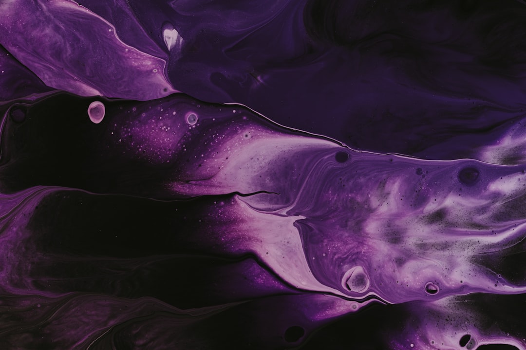
What is purple?
Purple is a composite color with no single wavelength — it exists only as a mixture of red and blue light. The classic web value “purple” is #800080, an even, deep red-blue. Because red is in the mix, purple reads warmer, richer, and more regal than violet. Historically it was the costliest dye (Tyrian purple), which is why it still signals luxury and royalty. Explore the full family on our purple color meaning page.
If you want every named variation from mauve to plum, our shades of purple guide collects them with hex codes.
What’s the difference between violet and purple?
The core difference is hue position: violet leans blue, purple leans red. Violet is a true spectral color that appears brighter and cooler; purple is a red-blue mixture that appears deeper and warmer. Here’s the side-by-side with representative values, since neither name is rigidly standardized in design use.
| Property | Violet | Purple |
|---|---|---|
| Hex code | #7F00FF | #800080 |
| RGB | 127, 0, 255 | 128, 0, 128 |
| CMYK | 50, 100, 0, 0 | 0, 100, 0, 50 |
| Undertone | Cool blue | Warm red |
| Hue family | Blue-purple (spectral) | Red-purple (composite) |
| Best used for | Tech, futuristic, creative, cool palettes | Luxury, royalty, premium, regal branding |
| Mood/feel | Electric, vivid, cool, imaginative | Rich, regal, deep, warm |
Why is violet bluer than purple?
Because violet is a single wavelength of light at the blue end of the spectrum, while purple is a perceptual blend your brain assembles from red and blue. Violet has more blue “in” it by physics; purple has substantial red mixed in by design. This is the same reason violet appears in a rainbow but purple never does — there’s no purple wavelength to bend through a prism. On a color wheel, violet sits between blue and purple, and purple sits between violet and red, edging toward magenta.
This relationship mirrors the warm-versus-cool logic that governs most color decisions; our guide to warm vs cool colors explains how undertone shifts a hue’s temperature even within a single family.
When should you use each?
Use violet when you want energy, brightness, and a cool, modern edge. Its electric blue lean suits tech and SaaS brands, creative and entertainment identities, gradients, and anything aiming to feel forward-looking. Violet pops on dark UIs and pairs cleanly with cyan, blue, and magenta.
Use purple when you want richness, depth, and a sense of premium quality. Its red warmth gives it gravitas, which is why it anchors luxury, beauty, and heritage branding. Purple reads more grounded and traditional than violet, making it the safer choice for elegance over energy. To see how it compares to a gemstone purple, check amethyst versus purple.
How do violet and purple show up in design?
In branding, purple’s regal history makes it the default for luxury, wellness, and premium products, while violet’s electric character suits technology, gaming, and creative tools that want to feel current. In UI and digital, violet shines in gradients and accent colors because its blue lean reads vividly on screens, whereas purple works well for considered, sophisticated palettes. In print, purple is easier to reproduce accurately; pure spectral violet is hard to render in CMYK, so printed “violet” is usually a bright blue-purple approximation. For sideways context within this batch, compare the paler end in lilac versus purple.
Frequently Asked Questions
Is violet just a lighter purple?
No. Violet isn’t simply a tint of purple — it’s a different hue position. Violet is a true spectral color that leans blue, while purple is a red-blue mixture that leans red. They can be similar in lightness; the real distinction is that violet is bluer and purple is redder.
Why isn’t purple in the rainbow?
Because purple has no single wavelength. A rainbow shows the spectrum of individual wavelengths, ending in violet at the blue side. Purple only appears when red and blue light combine, so it can’t be produced by a prism and never shows up as its own band in a rainbow.
What is the hex code for violet versus purple?
A representative violet is #7F00FF (some use #8F00FF for electric violet), which leans distinctly blue. The classic web purple is #800080, an even red-blue that reads warmer and deeper. Neither name is rigidly standardized, but those values capture the core difference well.
Which is more regal, violet or purple?
Purple. Its red warmth and historical link to Tyrian dye and royalty give it a regal, luxurious feel. Violet’s cooler, brighter, more electric character reads as modern and energetic rather than traditional, so designers reach for purple when the goal is heritage or premium prestige.
Do violet and purple go together?
Yes. Because they’re neighbors on the color wheel, violet and purple form an easy analogous pairing. Use purple as the deeper anchor and violet as the brighter accent, then add a cool blue or a soft neutral to keep the combination from feeling too saturated.


