Lilac vs Purple: What’s the Difference?
Lilac and purple belong to the same hue family, but they sit at opposite ends of it. Lilac is a delicate, pale purple — soft, slightly grayed, and gentle — named after the spring flower. Purple is the bold, fully saturated color the whole family is named for. In the lilac vs purple comparison, the deciding factors are lightness and saturation, not hue: both are purple, but one whispers and the other commands.
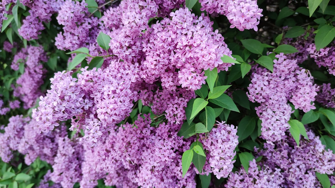
What is lilac?
Lilac is a pale, soft purple with a faint pink-gray cast, named after the lilac blossom. A representative value is #C8A2C8. Its low saturation and high lightness give it an airy, romantic, slightly vintage quality. Lilac sits very close to lavender — both are light purples — but lilac usually carries a touch more pink, while lavender leans slightly bluer. For that subtle split, see lilac versus lavender.
Lilac’s defining trait is softness. Because it’s so light and muted, it functions almost like a tinted neutral, which makes it easy to use across large areas without overwhelming a design.
What is purple?
Purple is the deep, saturated red-blue color at the heart of the family. The classic web value is #800080, an even, rich red-purple. It’s bold, dramatic, and historically tied to royalty and luxury thanks to the rare Tyrian dye. Where lilac recedes, purple dominates — it carries weight, depth, and a sense of premium occasion. Read more on the purple color meaning page, and browse the whole spectrum in shades of purple.
What’s the difference between lilac and purple?
The difference is value and saturation. Lilac is a light, low-saturation purple with a soft pink-gray cast; purple is a dark, high-saturation red-blue. Put simply: lilac is purple with a lot of white and a little gray mixed in. Here’s the side-by-side with representative values, since lilac in particular varies by source.
| Property | Lilac | Purple |
|---|---|---|
| Hex code | #C8A2C8 | #800080 |
| RGB | 200, 162, 200 | 128, 0, 128 |
| CMYK | 0, 19, 0, 22 | 0, 100, 0, 50 |
| Undertone | Soft pink-gray | Balanced red-blue |
| Hue family | Light purple (pastel) | Deep purple (saturated) |
| Best used for | Soft, romantic, calm, feminine palettes | Luxury, regal, dramatic, premium branding |
| Mood/feel | Gentle, airy, nostalgic, calming | Rich, regal, bold, confident |
Is lilac just light purple?
Essentially yes, with a nuance. Lilac is what you get when you add a lot of white to purple to lighten it and a touch of gray to mute it, plus a slight pink lean. So lilac is a tint of purple — same hue family, much lighter and softer. The reason it gets its own name is that the pink-gray cast and pastel value give it a distinct character that “light purple” doesn’t fully capture. Understanding how lightening and graying shift a color’s feel ties into broader color psychology — pale tints read calm and approachable, while deep saturated hues read powerful.
When should you use each?
Use lilac when you want softness, calm, and a gentle, romantic mood. It excels in wellness, beauty, wedding, and lifestyle branding, in spacious UI backgrounds, and in pastel palettes for spring and feminine themes. Because it’s so light, lilac works as a quiet backdrop or a low-contrast accent that won’t fight your primary color.
Use purple when you want impact, depth, and a premium or regal feel. Its saturation makes it ideal for hero colors, logos, and accents that need to command attention. Purple suits luxury, creative, and heritage brands that want drama rather than delicacy.
A simple decision rule: if the color should set a calm, supporting mood, choose lilac; if it should be the focal point that carries authority, choose purple. Because they share a hue, you rarely have to pick only one — lilac as the soft field and purple as the deep accent gives you both restraint and richness in a single palette. That light-and-deep relationship is the most dependable way to build a layered purple scheme that still has clear contrast and hierarchy.
How do lilac and purple work in design?
In branding, lilac signals approachability, calm, and care, which suits beauty, wellness, and lifestyle identities, while purple signals luxury, creativity, and authority for premium and heritage brands. In UI design, lilac makes a gentle background tint or hover state that keeps interfaces feeling light, whereas purple works as a strong primary or call-to-action color. In interiors and fashion, lilac reads fresh and nostalgic on walls and fabrics, while purple makes a bold, saturated statement. The two also pair beautifully together — lilac as the soft field, purple as the deep anchor. For a related comparison from this batch, see violet versus purple.
Frequently Asked Questions
What is the hex code for lilac?
A representative lilac is #C8A2C8 — a pale purple with a soft pink-gray cast. Because lilac isn’t standardized, you’ll see values ranging from #C8A2C8 to lighter, pinker, or bluer variants. The constant is that lilac is a light, low-saturation purple, distinctly paler than the deep #800080 of standard purple.
Is lilac more pink or more purple?
Lilac is fundamentally a light purple, but it carries a subtle pink lean that distinguishes it from the bluer lavender. So it reads as purple first, with a soft pink-gray warmth underneath. That gentle pink cast is part of what gives lilac its romantic, vintage character.
Can lilac and purple be used together?
Yes, and they pair very well. Because they share the same hue family, lilac and purple form a natural monochromatic scheme. Use lilac as the light field or background and purple as the deep accent or anchor, then add white or a soft neutral to balance the saturation contrast.
Is lilac a warm or cool color?
Lilac is essentially cool, since it’s a purple, but its pink lean and grayed softness make it read as a gentle, near-neutral cool rather than an icy one. This is why lilac feels calming and versatile, working in both warm-leaning and cool-leaning palettes.
Why does purple look so much richer than lilac?
Because purple is fully saturated and dark, while lilac is heavily lightened and slightly grayed. Saturation and depth are what give purple its regal richness; removing them by adding white and gray produces the soft, airy lilac. Same hue, very different intensity.


