Bauhaus Graphic Design: The Movement That Shaped Modern Design
Nearly every clean sans-serif logo, every grid-based layout, every piece of design that favors function over ornament carries the DNA of a single German art school that operated for just fourteen years. The Bauhaus — founded in 1919 and forced to close in 1933 — spent barely more than a decade reshaping visual culture, yet its influence on bauhaus graphic design and design thinking at large has proven more durable than almost any other movement in the twentieth century.
What the Bauhaus proposed was radical for its time: that art, craft, and technology were not separate disciplines but interconnected forces that, when unified, could reshape everyday life. That idea — applied to architecture, furniture, textiles, and visual communication — produced a design philosophy so potent that it survived the school’s destruction and went on to define the look of the modern world.
Understanding graphic design styles without understanding the Bauhaus is like studying physics without mentioning Newton. The school did not just influence modern design. In many ways, it invented it.
What Was the Bauhaus?
The Bauhaus was a state-funded art school in Germany, founded in 1919 by architect Walter Gropius in the city of Weimar. Its full name — Staatliches Bauhaus — translates roughly to “State Building House,” and even the name carried a manifesto. Gropius believed that the fine arts and the applied arts should not exist in separate worlds. Painters should understand materials. Craftspeople should think like artists. And all of them should engage with the industrial technologies transforming society.
This was a direct response to the fractures of post-World War I Europe. The old hierarchies — between high art and craft, between the artist in the studio and the worker in the factory — seemed bankrupt. Gropius envisioned a new kind of creative education that would dissolve those boundaries, training designers who could work across disciplines and apply aesthetic thinking to mass production.
The school’s founding manifesto, illustrated with a woodcut of a cathedral by Lyonel Feininger, declared: “The ultimate aim of all creative activity is the building.” Everything — painting, sculpture, typography, furniture, architecture — was oriented toward a single, integrated vision of how people should live.
Three Cities, Three Directors
The Bauhaus existed in three cities under three directors, and each phase had a distinct character.
Weimar (1919-1925), under Walter Gropius. The founding phase was idealistic and experimental. The curriculum blended Expressionist art with craft workshops. Students studied under “masters of form” (artists like Wassily Kandinsky and Paul Klee) alongside “masters of craft” (skilled artisans). The emphasis was on hands-on experimentation with materials — wood, metal, glass, textiles, and clay. Typography and graphic design were not yet central disciplines, but the seeds were being planted.
Dessau (1925-1932), under Gropius and then Hannes Meyer. Political pressure forced the school to relocate to Dessau, where Gropius designed the iconic Bauhaus building — a glass-and-steel structure that became a manifesto in itself. This was the school’s most productive and influential period. The curriculum shifted toward industrial design and architecture. A dedicated typography and advertising workshop was established, and graphic design became a core output. When the socially minded architect Hannes Meyer replaced Gropius as director in 1928, he pushed the school further toward functionalism and political engagement, though his Marxist leanings created friction with local authorities. Meyer was dismissed in 1930.
Berlin (1932-1933), under Ludwig Mies van der Rohe. Mies van der Rohe, the renowned architect of minimalist precision, took over a school already under siege. Political hostility from the rising Nazi party forced the Bauhaus out of Dessau. Mies relocated it to a disused telephone factory in Berlin and tried to run it as a private institution. The effort lasted less than a year. Under sustained Nazi pressure — the school was raided by police and students were arrested — Mies closed the Bauhaus permanently in July 1933.
Key Figures in Bauhaus Graphic Design
While the Bauhaus is often associated with architecture and product design, several of its masters and students produced work that fundamentally changed how graphic design is practiced. Four figures stand out.
Herbert Bayer
If one person embodies Bauhaus graphic design, it is Herbert Bayer. A student at the Weimar Bauhaus who became a master in Dessau, Bayer led the school’s typography and advertising workshop from 1925. He was fanatical about clarity. He stripped ornament from page layouts, insisted on asymmetric composition, and championed sans-serif typefaces at a time when most German printing still used heavy blackletter scripts.
Bayer’s most famous contribution was the Universal typeface — a geometric alphabet designed in 1925 that used only lowercase letters. His reasoning was straightforward and characteristically Bauhaus: since we do not speak in two alphabets (one for capital letters, one for lowercase), why should we write in two? The Universal alphabet was a statement of radical simplification. Though it was never widely adopted as a functional typeface, it became an icon of Bauhaus design philosophy and anticipated the geometric sans-serif typefaces — like Futura — that would define modernist typography for decades.
After emigrating to the United States, Bayer brought Bauhaus principles to American corporate design, working with Container Corporation of America and eventually serving as a design consultant for the Aspen Institute.
Laszlo Moholy-Nagy
The Hungarian artist and educator Laszlo Moholy-Nagy was one of the most versatile figures at the Bauhaus. He taught the foundational preliminary course, worked across painting, photography, film, sculpture, and graphic design, and pushed relentlessly for the integration of technology into artistic practice.
In graphic design, Moholy-Nagy’s most significant contribution was his advocacy for photography as a design element. He championed “typophoto” — the integration of photographic images with typographic layouts — arguing that photographs communicated more directly than illustrations and that combining them with bold typography created a new, more powerful form of visual communication. His designs for Bauhaus books and publications demonstrated this principle, mixing angled photographs, geometric shapes, and dynamic type arrangements into compositions that still look strikingly modern.
Moholy-Nagy also experimented extensively with photograms (cameraless photographs made by placing objects on light-sensitive paper), exploring the interaction between light, shadow, and form in ways that influenced both fine art and commercial design.
Josef Albers
Josef Albers came to the Bauhaus as a student and eventually taught its famous preliminary course, succeeding Johannes Itten. His contributions to graphic design were less about specific visual outputs and more about the foundational thinking that underlies all design work.
Albers was obsessed with perception — specifically, with how colors interact and how materials behave. His teaching methodology emphasized direct experimentation: students manipulated paper, folding and cutting it to understand three-dimensional form; they placed colors next to each other to see how context changed perception. This approach — learning by doing, testing assumptions through physical engagement with materials — became a cornerstone of modern design education.
After the Bauhaus closed, Albers emigrated to the United States and taught at Black Mountain College and then Yale University, where his course on color theory influenced generations of American designers and artists. His book Interaction of Color (1963) remains one of the most important texts on color in design education.
Joost Schmidt
Joost Schmidt is less widely known than Bayer or Moholy-Nagy, but his contributions to Bauhaus graphic design were substantial. He succeeded Bayer as head of the typography workshop in 1928 and created some of the school’s most iconic visual artifacts, including the celebrated poster for the 1923 Bauhaus exhibition in Weimar.
That poster — a geometric composition of circles, rectangles, and angled type rendered in red, blue, black, and white — is one of the most reproduced images in design history. It distills the Bauhaus graphic approach into a single sheet: geometric precision, limited color palette, asymmetric balance, sans-serif typography, and the integration of text as a visual element rather than a mere carrier of information.
Bauhaus Typography: A Revolution in Letterforms
The Bauhaus approach to typography was nothing short of revolutionary. In early twentieth-century Germany, most printed matter still used blackletter typefaces — the heavy, ornate Gothic scripts that had dominated German publishing for centuries. The Bauhaus rejected this tradition entirely, advocating for a typographic language that was clean, geometric, and universal.
The Case for Sans-Serif
Bauhaus typographers argued that serif typefaces — with their decorative strokes and historical associations — were relics of a pre-industrial age. Sans-serif faces, by contrast, were honest. They did not pretend to be something they were not. Their forms were reducible to basic geometry: circles, straight lines, and consistent stroke widths. In this view, a typeface like Futura (designed by Paul Renner in 1927, closely aligned with Bauhaus thinking though Renner was not formally part of the school) was not just a stylistic preference. It was a moral position — a commitment to clarity over tradition, function over decoration.
This advocacy for sans-serif type had lasting consequences. The preference for clean, geometric letterforms that the Bauhaus championed became the default of modernist design and eventually produced typefaces like Helvetica, which would dominate corporate and institutional communication for the rest of the century.
The Lowercase Experiment
Several Bauhaus designers, Bayer most prominently, experimented with all-lowercase typography. The logic was functional: capital letters, they argued, were redundant. They added visual complexity without adding meaning. A single alphabet — all lowercase — would be simpler to learn, simpler to typeset, and more efficient to read.
The all-lowercase experiment never achieved widespread adoption, but it left a permanent mark on design thinking. The willingness to question something as fundamental as capitalization — to ask whether a convention that everyone accepted was actually necessary — exemplified the Bauhaus spirit of radical re-examination.
Bayer’s Universal Typeface
Herbert Bayer’s Universal typeface, designed in 1925, took the Bauhaus typographic philosophy to its logical extreme. Every letter was constructed from a minimal set of geometric elements: circles, arcs, straight lines, and right angles. There were no serifs, no variation in stroke width, and no uppercase forms. The typeface was intended to be a universal standard — stripped of national character, historical association, and decorative intent.
As a functional typeface, Universal had limitations. Its rigid geometry made some letters difficult to distinguish at small sizes, and its lack of uppercase forms created practical problems in conventional typesetting. But as a design statement, it was enormously influential. It demonstrated that type design could be approached as a problem of engineering — that letterforms could be constructed from first principles rather than inherited from calligraphic tradition.
Geometric Construction of Letterforms
Beyond specific typeface designs, the Bauhaus contributed a broader idea that proved immensely productive: the notion that letterforms could be analyzed and constructed using geometric principles. Circles, squares, triangles, and their combinations formed the basis of letter construction. This approach influenced not only type design but also logo design, monogram creation, and the broader field of visual identity — a thread that runs directly through to contemporary brand design.
Bauhaus Graphic Design Principles
The Bauhaus did not just produce specific artifacts. It articulated a set of graphic design principles that continue to underpin professional practice today. These principles were not arbitrary aesthetic preferences. They were logical consequences of the school’s central belief that design should serve function, embrace technology, and pursue clarity above all else.
Grid Systems and Structured Layout
Bauhaus designers were among the first to use systematic grid structures as the organizing principle of page layout. Rather than arranging elements by intuition or historical convention, they divided the page into a mathematical framework of columns, rows, and modules. Every element — headline, body text, image, caption — had a defined position within the grid.
This was not rigidity for its own sake. The grid was a tool for achieving consistency across multiple pages, for creating visual rhythm, and for making the underlying logic of a layout legible. It allowed designers to produce complex compositions that remained ordered and navigable. The grid systems pioneered at the Bauhaus evolved directly into the Swiss grid methodology of the 1950s and remain the foundation of layout design in print and digital media.
Asymmetric Composition
Before the Bauhaus, most European printed matter was symmetrically composed: centered headlines, justified text blocks, balanced margins. The Bauhaus broke decisively with this tradition, embracing asymmetric layouts that created dynamic visual tension. Headlines were placed off-center. Text blocks were pushed to one side of the page. Images were cropped and positioned to create diagonal movement across the composition.
Asymmetry was not disorder. It was a different kind of order — one that guided the eye through the layout along a deliberate path rather than letting it settle passively at the center. Jan Tschichold, who was deeply influenced by Bauhaus thinking, codified these ideas in his 1928 book Die Neue Typographie (The New Typography), which became a foundational text for modernist layout design.
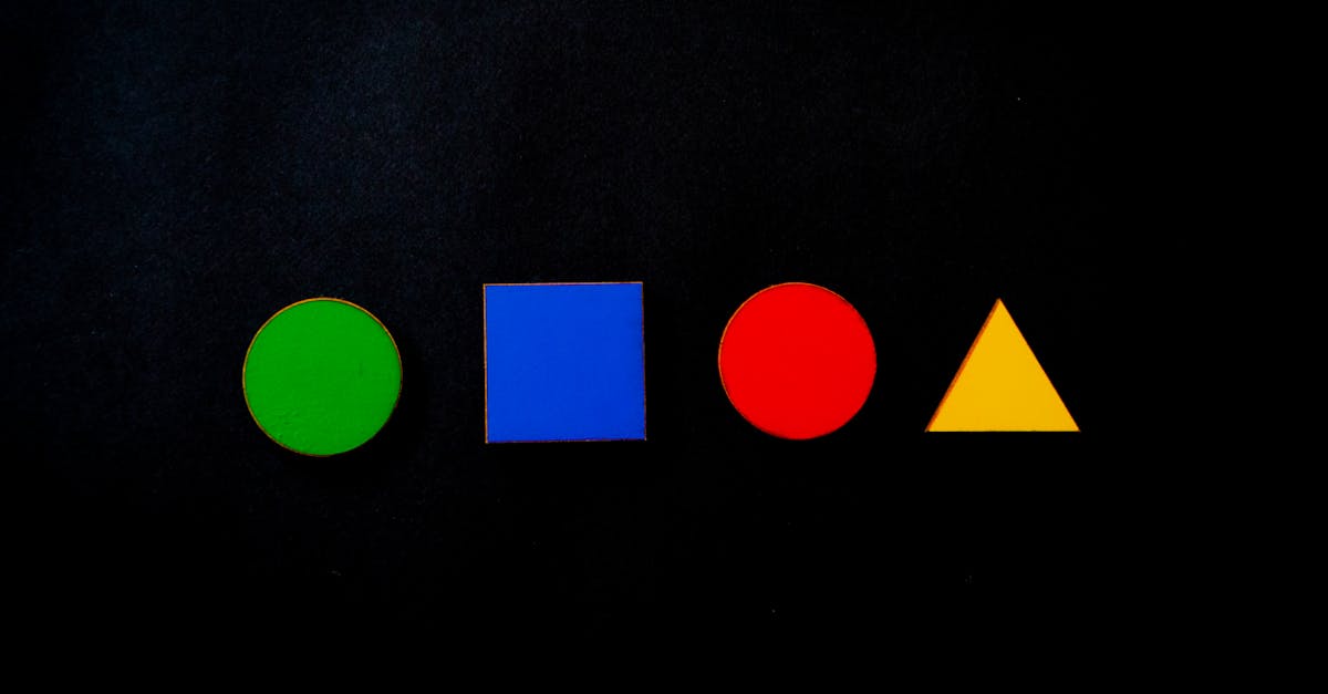
Primary Colors and Black and White
The Bauhaus color palette was deliberately restricted. Red, yellow, blue, black, and white — these were the essential colors, the building blocks from which all other colors derived. Using a restricted palette was both a philosophical statement and a practical one. Philosophically, it aligned with the school’s pursuit of universality: primary colors were elemental, not culturally specific. Practically, limiting the palette forced designers to create impact through composition and contrast rather than chromatic complexity.
This restraint produced a visual language of remarkable clarity. A Bauhaus poster using only red, black, and white against a cream background achieves more visual power than most designs employing dozens of colors. The lesson — that limitation breeds creativity and impact — has never been superseded.
Geometric Forms
Circles, squares, triangles, and rectangles were the fundamental vocabulary of Bauhaus visual language. These forms were considered universal — recognizable across cultures, irreducible, and inherently balanced. Bauhaus designers used them as compositional building blocks, as frames for content, as decorative elements (to the extent that anything at the Bauhaus was decorative), and as structural devices for organizing information on a page.
Kandinsky, who taught at the Bauhaus, famously associated each primary geometric form with a primary color: yellow with the triangle, red with the square, blue with the circle. Whether or not this specific correspondence holds any objective validity, the broader principle — that simple geometric forms carry inherent visual and emotional weight — became a permanent fixture in design thinking.
Photography Integrated with Typography
Before the Bauhaus, illustrations dominated printed visual communication. Moholy-Nagy and others argued forcefully that photography — as a mechanical, objective medium — was more appropriate for a technological age. They did not treat photographs as standalone images to be placed beside text. Instead, they integrated photographs directly into typographic compositions, layering type over images, cropping photographs into geometric shapes, and using photomontage to create hybrid visual-textual communications.
This integration of photography and type — what Moholy-Nagy called “typophoto” — anticipated the visual language of modern advertising, editorial design, and typographic posters. The assumption that photographs and type belong in the same compositional space, which now seems obvious, was a Bauhaus innovation.
Function Over Decoration
If there is a single principle that unifies all of Bauhaus graphic design, it is this: every element must serve a purpose. Borders, ornaments, decorative rules, and embellishments that do not aid communication should be eliminated. White space is not wasted space — it is functional, giving the eye room to navigate. Typography is not decorative — it is the primary vehicle of meaning. Color is not ornamental — it directs attention and creates hierarchy.
This principle, applied consistently, produced designs of remarkable clarity and force. It also established the philosophical foundation for modernist design as a whole: the belief that good design is not about adding beauty to an object but about finding the most direct and effective way to communicate.
Iconic Works of Bauhaus Graphic Design
The principles described above were not abstract theories. They were realized in a body of work — posters, publications, advertisements, and institutional materials — that defined the visual identity of the Bauhaus and established templates that designers still follow.
Bauhaus Exhibition Posters
The posters created for Bauhaus exhibitions are among the most celebrated artifacts of twentieth-century graphic design. Joost Schmidt’s 1923 Weimar exhibition poster, with its bold geometric composition and limited color palette, established the visual template. Subsequent exhibition posters by Bayer, Moholy-Nagy, and others continued to refine the approach: asymmetric layouts, sans-serif type, geometric forms, integrated photography, and a restricted palette of primary colors plus black and white.
These posters were not just advertisements for events. They were manifestos in visual form, demonstrating exactly what the Bauhaus believed graphic communication could and should look like.
Bauhaus Publications
The school published a series of fourteen Bauhaus Books (Bauhausbücher) between 1925 and 1930, designed primarily by Moholy-Nagy. These books covered topics ranging from Mondrian’s neoplasticism to Gropius’s architectural theories. Their cover designs and interior layouts became reference points for modernist book design: clean sans-serif type, generous white space, photographic illustrations, and grid-based page structures.
The school also published the bauhaus journal (printed entirely in lowercase, naturally), which served as both an internal communication tool and a public platform for Bauhaus ideas. The journal’s designs showcased experimental typography, photomontage, and the integration of multiple visual media on a single page.
Bayer’s Universal Alphabet
Though it was never produced as a functional metal typeface during the Bauhaus era, Bayer’s Universal alphabet became one of the school’s most enduring visual icons. Its geometric precision and radical lowercase-only approach encapsulated the Bauhaus belief that design could — and should — be rethought from first principles. The alphabet has been revived and reinterpreted numerous times, most notably as the digital typeface Architype Bayer, and it remains a touchstone for discussions about the relationship between form, function, and ideology in type design.
Advertising and Promotional Materials
Bayer’s advertising workshop produced commercial work for both the school and external clients. These designs applied Bauhaus principles to practical communication problems: posters for local businesses, letterheads, catalogs, and advertisements. They demonstrated that the Bauhaus approach was not limited to cultural or institutional contexts but could be applied to everyday commercial communication — a proof of concept that made the school’s ideas more accessible and more influential.
The Closure and the Diaspora
The Nazis viewed the Bauhaus with deep suspicion. Its internationalism, its association with leftist politics (particularly under Hannes Meyer), its embrace of abstraction, and its rejection of traditional German aesthetics made it a target. The school was labeled degenerate. Its funding was cut. Its staff were harassed. When Mies van der Rohe finally closed the school in 1933, it was an act of resignation in the face of political violence.
But closing the school did not kill the ideas. It scattered them across the world.
Many Bauhaus faculty and students emigrated, primarily to the United States and the United Kingdom. Gropius became chairman of the architecture department at Harvard. Mies van der Rohe headed the architecture school at the Illinois Institute of Technology in Chicago. Albers taught at Black Mountain College and then Yale. Moholy-Nagy founded the New Bauhaus in Chicago in 1937 (later renamed the Institute of Design, now part of IIT), directly transplanting the Bauhaus pedagogical model onto American soil.
Bayer settled in the United States and brought Bauhaus design principles to American corporate identity and advertising. His influence, combined with that of other emigres, ensured that Bauhaus thinking permeated American design education and professional practice throughout the mid-twentieth century.
The diaspora, paradoxically, gave the Bauhaus a global reach it might never have achieved as a single school in Germany. By scattering its famous graphic designers and educators across multiple institutions and countries, the Nazi persecution ensured that Bauhaus principles were taught, practiced, and propagated far more widely than the school’s founders could have imagined.
The Lasting Legacy of Bauhaus Design
The Bauhaus has been closed for over ninety years. Its influence has not diminished. If anything, it has deepened, permeating design education, professional practice, and visual culture so thoroughly that many of its principles are now invisible — accepted as self-evident truths rather than recognized as radical innovations.
Swiss International Typographic Style
The Swiss Style (also known as the International Typographic Style) that dominated graphic design from the 1950s through the 1970s was a direct descendant of Bauhaus thinking. Swiss designers like Josef Muller-Brockmann, Max Bill (a former Bauhaus student), and Armin Hofmann took the grid systems, sans-serif typography, photographic integration, and functional clarity pioneered at the Bauhaus and codified them into a comprehensive design methodology. The Swiss grid, the preference for Helvetica, the emphasis on objective communication — all of these trace directly back to the Bauhaus workshops of the 1920s.
Modernist Corporate Identity
The clean, systematic approach to visual identity that defined mid-century corporate design — from IBM to Lufthansa to the New York City subway signage — drew heavily on Bauhaus principles. The idea that a corporation’s visual communications should be unified under a coherent system of typography, color, and layout was fundamentally a Bauhaus concept, transmitted to American and European corporations through designers who had been trained in or influenced by the school’s methods.
Design Education
The Bauhaus model of design education — a preliminary course teaching fundamental principles of form, color, and materials, followed by specialized workshops — became the template for design schools worldwide. The foundation year (or “basic design” course) that most art and design programs still require is a direct descendant of the Bauhaus Vorkurs developed by Itten, Moholy-Nagy, and Albers. The idea that designers should learn by making — through hands-on experimentation with materials and processes — remains the pedagogical norm, and that norm is a Bauhaus inheritance.
Digital Design
The Bauhaus emphasis on geometric form, systematic layout, functional clarity, and the integration of text and image maps remarkably well onto digital design. User interface design, with its grids, sans-serif type, restrained color palettes, and emphasis on usability, operates within a framework that the Bauhaus would recognize as its own. The principle that every design element must serve a communicative function — no ornament for ornament’s sake — is as central to UX design in the 2020s as it was to Bauhaus poster design in the 1920s.
Bauhaus Revival and Influence Today
The Bauhaus has never truly gone away, but certain moments have brought it back into explicit focus. The school’s centenary in 2019 triggered a global wave of exhibitions, publications, and retrospectives. The Bauhaus Museum in Dessau, which opened that year, brought renewed attention to the school’s material legacy. Design publications and online platforms revisited Bauhaus principles, and a new generation of designers discovered (or rediscovered) the movement’s relevance.
In contemporary practice, Bauhaus influence appears in multiple forms. The ongoing popularity of geometric sans-serif typefaces in branding and web design reflects the Bauhaus typographic legacy. The prevalence of grid-based layout systems — from print editorial design to CSS grid in web development — echoes the structured approach the Bauhaus pioneered. The trend toward “flat design” in digital interfaces, which strips away skeuomorphic textures and drop shadows in favor of clean geometric forms and solid colors, is essentially a Bauhaus argument made with pixels instead of ink.
Perhaps more significantly, the Bauhaus philosophy — that design is not decoration but a way of thinking about how people interact with objects, spaces, and information — has become the dominant paradigm of design education and practice globally. When a contemporary designer argues that form should follow function, that visual communication should be clear and direct, or that design should serve human needs rather than merely satisfy aesthetic preferences, they are articulating ideas that the Bauhaus first championed a century ago.
The school’s broader cultural ambition — to unite art and technology in service of a better society — also resonates with current conversations about design’s role in addressing social and environmental challenges. The Bauhaus believed that good design could improve everyday life. That belief, whether expressed in a 1925 exhibition poster or a 2026 sustainability-focused design sprint, remains the animating spirit of the profession.
Frequently Asked Questions
What is Bauhaus graphic design?
Bauhaus graphic design refers to the visual communication principles and practices developed at the Bauhaus, a German art school that operated from 1919 to 1933 in Weimar, Dessau, and Berlin. It is characterized by the use of sans-serif typography, geometric forms, grid-based layouts, asymmetric composition, a restricted palette of primary colors plus black and white, and the integration of photography with type. The overarching philosophy is functionalism: every design element must serve a communicative purpose, and decoration without function should be eliminated. Key figures include Herbert Bayer, Laszlo Moholy-Nagy, Josef Albers, and Joost Schmidt. The Bauhaus approach to graphic design directly influenced the Swiss International Typographic Style, modernist corporate identity, and contemporary digital design.
Why was the Bauhaus so influential on modern design?
The Bauhaus was influential for several interconnected reasons. First, it articulated a coherent philosophy — the unity of art, craft, and technology in service of function — that proved adaptable across media and eras. Second, when the Nazis forced the school to close in 1933, its faculty and students dispersed to universities and design practices across the United States and Europe, spreading Bauhaus principles far more widely than a single school could have. Third, the Bauhaus established an educational model (the foundation course followed by specialized workshops) that became the template for design schools worldwide. And fourth, its core ideas — functionalism, geometric clarity, systematic layout, sans-serif typography — aligned perfectly with the needs of postwar industrial society and later with digital design, giving them an enduring practical relevance.
What is the difference between Bauhaus design and Art Deco?
Though they overlapped chronologically (both flourished in the 1920s and 1930s), Bauhaus design and Art Deco are fundamentally different in philosophy. The Bauhaus prioritized function over form, rejected ornamentation, and pursued universal, culturally neutral design solutions. It was ideological — committed to the idea that good design could improve society. Art Deco, by contrast, was primarily decorative. It embraced luxury materials, rich ornamentation, symmetry, and stylized geometric patterns. Where the Bauhaus sought to strip design down to its functional essence, Art Deco sought to make it glamorous and visually sumptuous. The Bauhaus produced clean sans-serif typography and spare layouts; Art Deco produced ornate lettering, gilded surfaces, and lavish compositions. Both were responses to modernity, but they responded in opposite directions.
How can I apply Bauhaus principles to my own design work?
Start with restraint. Limit your color palette to two or three colors — primary colors plus black and white are a good starting point. Choose a clean sans-serif typeface and use it consistently. Build your layout on a visible or invisible grid, and let that grid dictate where elements sit on the page. Embrace asymmetry: move your headline off-center, push your text block to one side, and use white space deliberately rather than filling every available area. Integrate photography directly into your compositions rather than treating images as separate from your typographic layout. Most importantly, question every element: does this border serve a purpose? Does this color guide the viewer’s attention? Does this ornament communicate anything, or is it just decoration? If an element does not serve the design’s function, remove it. That discipline — the willingness to eliminate anything that does not earn its place — is the essence of Bauhaus thinking.


