Japanese Graphic Design: Tradition, Innovation, and Visual Poetry
There is something about Japanese graphic design that stops you mid-scroll. It might be a poster where a single geometric shape commands an entire composition. It might be a package where negative space does more communicative work than the text itself. It might be the way Japanese designers combine calligraphic fluidity with Swiss-grid precision, creating work that feels simultaneously ancient and futuristic.
Japan occupies a singular position in the global design landscape. It is the only major design culture that draws equally from Eastern and Western traditions without fully belonging to either. The result is a visual language that Western designers find endlessly fascinating and often try to imitate, usually without understanding the cultural principles that make it work.
This is the story of how Japan built one of the most distinctive and influential graphic design traditions in the world — and what designers everywhere can learn from it.
Historical Roots: From Woodblock Prints to Western Influence
Japanese graphic design did not begin in the twentieth century. Its roots reach back to the Edo period (1603-1868), when ukiyo-e woodblock prints established visual principles that still shape Japanese design today. Artists like Katsushika Hokusai and Kitagawa Utamaro created images using flat planes of color, bold outlines, asymmetric compositions, and a profound sensitivity to the relationship between figure and ground. These were not merely artworks. They were mass-produced prints — advertisements for kabuki actors, guides to the pleasure districts, illustrations for popular literature. They were, in every meaningful sense, proto-graphic design.
Ukiyo-e prints accomplished something remarkable. They demonstrated that flatness was not a limitation but a design choice. They showed that cropping a figure dramatically — cutting off a face at the edge of the frame — could be more powerful than showing the whole form. They proved that empty space was not absence but presence. When these prints reached Europe in the late nineteenth century, they transformed Western art. Impressionists and Art Nouveau designers devoured them. But in Japan, these principles were not revolutionary. They were simply how images worked.
The Meiji Restoration of 1868 opened Japan to Western commerce, technology, and visual culture. Japanese designers began absorbing European typography, layout conventions, and printing techniques. But this was not a one-way exchange. Japanese designers did not abandon their own traditions. They layered Western methods on top of existing aesthetic principles, creating a hybrid visual language that would become Japan’s greatest design strength. By the early twentieth century, Japanese commercial art was already developing its distinctive character — a fusion of Eastern spatial sensibility with Western typographic structure.
The Post-War Explosion: 1950s Through 1970s
The golden age of Japanese graphic design began in the rubble of World War II. As Japan rebuilt itself into an industrial powerhouse, its designers emerged as some of the most inventive and technically accomplished in the world. The 1964 Tokyo Olympics became the catalyst. Japan needed to present itself to the global stage, and its designers rose to the occasion with work that was bold, modern, and unmistakably Japanese.
Yusaku Kamekura
Often called the father of modern Japanese graphic design, Kamekura brought a rigorous geometric clarity to everything he touched. His poster for the 1964 Tokyo Olympics — a rising sun rendered as a deep red circle above bold gold typography — is one of the most iconic pieces of graphic design ever produced. Kamekura’s work demonstrated that Japanese design could be international in its reach while remaining rooted in Japanese visual culture. The red circle was simultaneously the Japanese flag, the Olympic ideal, and a pure geometric form. That ability to layer cultural meaning into abstract shapes defined his practice.
Ikko Tanaka
Where Kamekura pursued geometric precision, Tanaka found the space between abstraction and figuration. His portraits of geisha and kabuki actors reduced human forms to arrangements of colored planes and curves — instantly recognizable as faces while remaining purely graphic. Tanaka’s work for the Hanae Mori fashion house, his poster designs, and his later collaboration with MUJI proved that Japanese aesthetic principles could drive commercial design without compromise. He understood something essential: that simplification is not the same as simplicity. His reduced forms contained more visual information than most designers could pack into a complex illustration.
Shigeo Fukuda
Fukuda was Japan’s master of visual wit. His posters used optical illusions, impossible objects, and graphic paradoxes to deliver messages with devastating economy. His anti-war poster Victory 1945 — a bullet returning to the barrel of a gun — communicated more in a single image than most campaigns achieve in an entire series. Fukuda proved that Japanese poster design could compete with the best Polish and Swiss work on its own terms, using humor and conceptual sharpness as primary tools.
Tadanori Yokoo
If Kamekura represented Japan’s modernist discipline, Yokoo represented its psychedelic liberation. His posters from the late 1960s and 1970s exploded with collaged imagery, garish colors, rising suns, samurai, and references to both traditional Japanese art and American pop culture. Yokoo rejected the clean modernism of his peers in favor of visual overload — and in doing so, created some of the most memorable Japanese graphic design of the twentieth century. His work influenced the emerging psychedelic poster movement internationally and proved that maximalism could be as distinctly Japanese as minimalism.
Japanese Design Principles: The Cultural Foundation
What makes Japanese design feel different from Western design is not technique. It is philosophy. Japanese designers draw on centuries of aesthetic thinking that shapes how they approach space, form, imperfection, and restraint. Understanding these principles is essential to understanding why Japanese graphic design looks and feels the way it does.
Ma: The Power of Negative Space
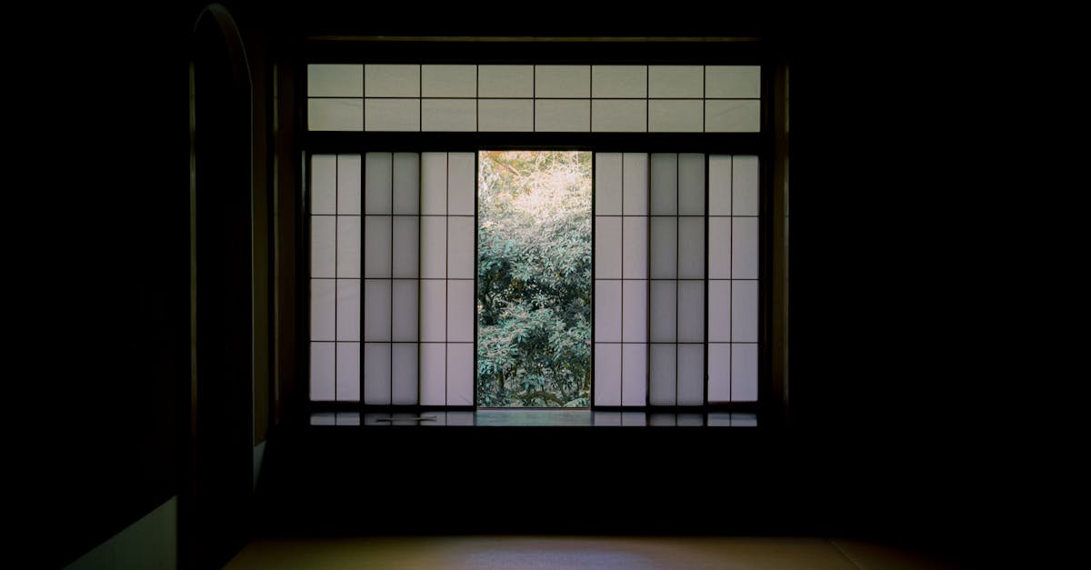
Ma is the Japanese concept of negative space — but calling it negative space undersells it. In Western design, negative space is what is left over after you place the elements. In Japanese thinking, ma is an active, deliberate presence. It is the pause between notes that gives music its rhythm. It is the silence in a conversation that carries meaning. In graphic design, ma is the empty area that gives the composed elements their power.
This is why so much Japanese design feels spacious even when it is communicating complex information. The space is not wasted. It is working. A Japanese poster with a single character floating in a field of white is not lazy. It is using ma to create tension, focus, and breathing room. Western designers who try to imitate this approach often fail because they treat the emptiness as decoration rather than structure. In Japanese design, the space is the structure. Understanding balance in graphic design through the lens of ma fundamentally changes how you think about composition.
Wabi-Sabi: Beauty in Imperfection
Wabi-sabi is the acceptance — even the celebration — of imperfection, impermanence, and incompleteness. A cracked ceramic bowl repaired with gold. A weathered wooden surface. A hand-drawn line that wavers slightly from the ruler-straight path. In graphic design, wabi-sabi manifests as a tolerance for irregularity that Western modernism often suppresses. A Japanese designer might choose a typeface with subtle organic inconsistencies, or allow a printed texture to show its grain, or leave a composition slightly asymmetric rather than forcing perfect geometric balance.
This does not mean Japanese design is sloppy. It means there is an aesthetic space between machine perfection and human imperfection that Japanese designers occupy with particular skill. The best Japanese design feels made rather than manufactured — even when it is produced with extraordinary technical precision.
Kanso: Simplicity and Elimination of Clutter
Kanso is the principle of simplicity — specifically, simplicity achieved through the elimination of everything unnecessary. It is related to but distinct from Western minimalism. Where minimalism is often an aesthetic choice (things look cleaner with less), kanso is a philosophical commitment. You remove elements not because it looks better, but because what remains becomes truer to its essential nature. Every element in a kanso-driven composition must earn its place. If something can be removed without losing meaning, it must go.
Fukinsei: Asymmetric Balance
Western classical design leans heavily on symmetry. Japanese design does not. Fukinsei is the principle of asymmetric balance — the idea that a composition can be balanced without being symmetrical. A heavy element in the lower left can be balanced by a small, intense element in the upper right. A large area of empty space can balance a dense cluster of information. This principle draws directly from natural forms, where perfect symmetry is rare. It gives Japanese design its characteristic feeling of dynamic equilibrium — compositions that feel balanced but also alive, as though they might shift at any moment.
These principles do not operate in isolation. They work together, reinforcing and modifying each other. A composition guided by ma, wabi-sabi, kanso, and fukinsei simultaneously will have spaciousness, organic warmth, economy, and dynamic balance. That combination is what gives the Japanese design aesthetic its distinctive character — and why it is so difficult to imitate without understanding the philosophy underneath.
Japanese Typography: Three Scripts, Infinite Possibilities
Japanese typography presents challenges and opportunities that have no equivalent in Western design. The Japanese writing system uses three distinct scripts — kanji (logographic characters borrowed from Chinese), hiragana (a syllabary for native Japanese words), and katakana (a syllabary primarily for foreign words and emphasis). A single sentence might contain all three, plus Arabic numerals and Latin letters. This complexity is not a burden. It is a typographic resource.
The Visual Richness of Mixed Scripts
Each Japanese script has a different visual character. Kanji characters are dense and angular, with complex stroke structures that create strong visual weight. Hiragana is flowing and curvilinear, with organic shapes that feel calligraphic. Katakana is geometric and sharp, with an almost mechanical crispness. When these scripts appear together in a single line of text, the visual texture shifts constantly — dense, flowing, angular, flowing, dense — creating a rhythmic variety that monoscript languages cannot achieve.
Japanese designers exploit this variety deliberately. A headline might use kanji for its visual density, switch to katakana for a brand name (giving it a foreign, modern feeling), and use hiragana for connecting particles. The result is a line of text that is visually varied without any change in font, size, or weight. The scripts themselves provide the contrast.
Vertical and Horizontal Text
Japanese can be written vertically (top to bottom, right to left) or horizontally (left to right). This dual capability gives Japanese designers a compositional tool that Western typographers lack entirely. A poster can combine vertical Japanese text with horizontal Latin text, creating a grid of intersecting reading directions that is both functional and visually dynamic. The choice between vertical and horizontal orientation is not just practical — it carries cultural connotations. Vertical text feels traditional, literary, and formal. Horizontal text feels modern, technical, and international.
Bilingual Design: The Challenge and the Beauty
Much Japanese commercial design is bilingual, combining Japanese and English text. This is not a concession to globalization — it is a deliberate aesthetic strategy. English text in a Japanese composition adds visual variety, international sophistication, and a specific kind of cool that Japanese popular culture has cultivated for decades. The English does not always need to be understood. Sometimes it functions as a graphic element — a line of Latin characters providing textural contrast to Japanese script.
The challenge of bilingual design is real. Japanese and Latin typefaces have different proportional systems, different baselines, different stroke weights, and different optical sizes. Making them coexist harmoniously in a single composition requires extraordinary skill. Japanese type designers have developed typeface families that include both Japanese and Latin characters designed to work together — something Western type designers rarely have to consider. The resulting typographic compositions achieve a visual complexity that is uniquely Japanese.
Contemporary Japanese Design: Quietness as Strategy
If the post-war era was defined by bold experimentation, contemporary Japanese graphic design is increasingly defined by strategic restraint. The most influential Japanese designers working today have taken the cultural principles of ma, kanso, and wabi-sabi and applied them to commercial contexts with remarkable discipline.
Kenya Hara and MUJI
Kenya Hara, as art director of MUJI since 2001, has created what may be the most successful application of Japanese design philosophy to global branding. MUJI — whose full name, Mujirushi Ryohin, means “no-brand quality goods” — presents products with almost no visual noise. Packaging is beige, white, or transparent. Typography is restrained. Imagery, when it exists, is vast and empty — horizons, skies, deserts. Hara’s concept of “emptiness” as a design strategy — creating a vessel that the consumer fills with their own meaning — is a direct application of ma to commercial design. The brand communicates not by saying more, but by saying almost nothing.
Hara’s book Designing Design articulated a philosophy that has influenced designers worldwide: that design’s highest purpose is not to add beauty to objects but to help people see the world more clearly. This is Japanese design thinking at its most refined — design as a form of attention rather than decoration.
Kashiwa Sato
Kashiwa Sato has become Japan’s most prominent brand designer, responsible for identities ranging from Uniqlo to the National Museum of Art, Osaka. His approach combines geometric clarity with cultural precision. The Uniqlo logo — bold katakana characters in a red rectangle — is a masterclass in using Japanese typography as a global brand mark. It is legible, distinctive, and unmistakably Japanese without relying on cliches. Sato’s work demonstrates that Japanese design principles can drive world-class commercial branding without dilution or compromise.
Studio Culture and Collective Practice
Japanese design has a strong studio culture that differs from the Western emphasis on individual star designers. Studios like groovisions, Nippon Design Center, and Draft Co. produce work that reflects collective sensibilities rather than individual egos. This collaborative approach — rooted in Japanese cultural values of group harmony — often produces design that is more consistent and refined than work driven by a single personality. The studio model also fosters a distinctive approach to craft, where production quality is not an afterthought but an integral part of the design process. Printing, paper selection, binding, and finishing are treated with the same creative attention as concept and composition.
Distinctive Visual Elements of Japanese Design
Across eras and individual styles, certain visual elements recur in Japanese graphic design with enough consistency to form a recognizable vocabulary. These are not rules — Japanese designers break them constantly — but they represent tendencies that give the tradition its visual coherence.
Bold, Flat Color
Japanese design has a long relationship with flat, saturated color that predates Western modernism by centuries. The ukiyo-e tradition established color as a compositional element — not a representation of light and shadow, but a graphic force in its own right. Contemporary Japanese design continues this tradition. Posters, packaging, and brand identities frequently use bold, unmodulated color fields. Gradients are rare. Shadows are rarer. Color is used to define areas, create contrast, and establish mood — not to simulate three-dimensional form.
Geometric Abstraction
From Kamekura’s circles to Sato’s squares, Japanese design has a deep affinity for pure geometric forms. But where Western geometric design often feels mechanical, Japanese geometric design retains a quality of organic precision. Circles feel like moons or suns. Squares feel like rooms or frames. The geometry references the natural and built environments of Japan — the round windows of tea houses, the rectangular tatami mats, the circular family crests. Abstraction in Japanese design always carries a faint echo of the concrete world.
Nature Motifs
Nature has been the central subject of Japanese art for over a millennium, and this carries directly into graphic design. Cherry blossoms, waves, mountains, bamboo, and seasonal references appear throughout Japanese commercial and cultural design. But these motifs are rarely rendered realistically. They are stylized, abstracted, and reduced to their essential graphic forms — a wave becomes a pattern of curves, a cherry blossom becomes five overlapping circles. This approach transforms natural forms into graphic symbols without losing their emotional resonance.
Calligraphic Energy
Even in the most geometric Japanese designs, there is often an undercurrent of calligraphic energy — a sense that the forms were made by a moving hand rather than a plotting machine. This quality comes from Japan’s calligraphic tradition, where the brush stroke is valued not just for its shape but for its energy, speed, and the state of mind it reveals. Japanese designers carry this sensibility into digital work, creating compositions that feel kinetic and human even when they are constructed entirely with software.
Minimal Compositions with Maximum Impact
The most characteristic quality of Japanese graphic design may be its ability to create maximum visual and emotional impact from minimal means. A single shape. A single word. A vast field of white with one precise element. This economy is not austerity — it is concentration. Every element carries enormous weight because there is nothing else to distract from it. Western design often communicates through accumulation. Japanese design communicates through distillation. The core graphic design principles of hierarchy, contrast, and emphasis operate differently when every element is essential and nothing is filler.
Influence on Western Design
Japanese graphic design has influenced Western visual culture in waves. The first wave came with ukiyo-e prints in the nineteenth century, transforming European art and design. The second wave arrived in the 1960s and 1970s, when Japanese poster design gained international recognition through competitions and exhibitions. Famous graphic designers in the West began paying close attention to how their Japanese counterparts handled space, color, and composition.
The third and perhaps most significant wave is ongoing. Japanese aesthetic principles — particularly the emphasis on negative space, material honesty, and restrained communication — have become deeply embedded in contemporary design thinking. Apple’s product design philosophy under Jony Ive owed a significant debt to Japanese ideas about simplicity and materiality. The entire field of user experience design draws on concepts related to ma and kanso, even when practitioners do not know the Japanese terms. The global rise of brands like MUJI and Uniqlo has made Japanese design sensibility accessible to consumers worldwide.
There is also a less positive side to this influence. Western designers sometimes reduce Japanese design to a set of surface-level aesthetics — zen minimalism, cherry blossom motifs, brush-stroke typography — without engaging with the philosophical depth that gives those choices their meaning. The result is pastiche rather than influence. Genuine engagement with Japanese design requires understanding its cultural roots, not just copying its visual outputs.
How to Learn from Japanese Design Principles
You do not need to be Japanese to benefit from Japanese design thinking. The principles that drive Japanese graphic design are universal in their applicability, even if they are specific in their cultural origin. Here is how to start integrating them into your practice.
Practice Radical Subtraction
Take a finished composition and remove elements one at a time. Each time you remove something, ask whether the design still communicates its essential message. Keep removing until it breaks. Then add back the last element you removed. What you are left with is closer to the kanso ideal — a design where nothing is unnecessary. This exercise trains you to distinguish between elements that serve the design and elements that serve your anxiety about empty space.
Design the Space, Not Just the Objects
Before placing any element on a canvas, consider the empty space itself as your primary material. Where will the breathing room be? How will the negative space flow around and between elements? This inverts the typical Western approach of placing objects and hoping the remaining space looks acceptable. Designing with ma means the space is designed first and the elements are placed in relationship to it.
Embrace Asymmetry
Challenge your instinct to center elements and create mirror symmetry. Place a dominant element off-center and find a smaller element that can balance it from an unexpected position. Study how Japanese compositions achieve equilibrium without symmetry. This approach creates compositions that feel more dynamic, natural, and visually interesting than centered layouts typically allow.
Study the Relationship Between Craft and Concept
Japanese design treats execution with the same seriousness as ideation. Pay attention to the materials, the printing technique, the paper weight, the binding method. These are not afterthoughts. They are part of the design. A concept that is brilliantly conceived but carelessly produced is, in the Japanese tradition, only half designed.
Look Beyond the Surface
The most important lesson Japanese design offers is that visual decisions should be rooted in deeper principles. Every choice about space, color, typography, and composition should connect to a larger idea about what the design is trying to communicate and how it relates to its audience. This depth of intention is what separates work that looks Japanese from work that thinks Japanese.
Frequently Asked Questions
What makes Japanese graphic design different from Western graphic design?
Japanese graphic design draws on cultural principles that have no direct equivalent in Western design traditions. Concepts like ma (meaningful negative space), wabi-sabi (beauty in imperfection), and kanso (simplicity through elimination) shape how Japanese designers approach composition, space, and form. Japanese design also benefits from a unique typographic system that combines three scripts — kanji, hiragana, and katakana — with Latin characters, creating visual textures and compositional possibilities unavailable to designers working in single-script languages. The result is work that tends to be more spatially considered, more comfortable with emptiness, and more attuned to the relationship between object and surrounding space than typical Western design.
Who are the most important Japanese graphic designers?
The post-war period produced the foundational figures: Yusaku Kamekura (geometric modernism and the 1964 Olympics identity), Ikko Tanaka (abstracted figuration and cultural branding), Shigeo Fukuda (visual wit and conceptual posters), and Tadanori Yokoo (psychedelic maximalism and pop art). In contemporary practice, Kenya Hara (MUJI, design philosophy) and Kashiwa Sato (Uniqlo, brand identity) are the most internationally recognized. Other significant figures include Kazumasa Nagai, Koichi Sato, Shin Matsunaga, and Taku Satoh. Japan’s studio culture also means that influential work often comes from collectives rather than individuals.
How does Japanese typography differ from Western typography?
Japanese typography operates with a fundamentally different set of constraints and possibilities. The writing system uses three scripts simultaneously — kanji (thousands of logographic characters), hiragana (a cursive syllabary), and katakana (an angular syllabary) — often within a single sentence. Text can run vertically or horizontally, giving designers a compositional flexibility that Latin-script typography lacks. Japanese type design must also accommodate a vastly larger character set: a functional Japanese font requires thousands of glyphs compared to the few hundred needed for a Latin typeface. Bilingual design — combining Japanese and Latin text — adds another layer of complexity, requiring typefaces from two different typographic traditions to coexist in a single composition.
How can I incorporate Japanese design principles into my own work?
Start with space. Train yourself to see negative space as an active design element rather than a leftover. Practice removing elements from your compositions until only the essential remains. Embrace asymmetric balance by placing elements off-center and finding equilibrium through visual weight rather than mirror symmetry. Pay attention to craft and production quality as integral parts of the design process, not afterthoughts. Study actual Japanese design work — not Western interpretations of it — to understand how these principles operate in practice. Most importantly, engage with the philosophy behind the aesthetic. Japanese design looks the way it does because of how Japanese designers think about space, imperfection, and the relationship between object and environment. Understanding that thinking matters more than imitating the visual surface.


