Rainbow Color Palette: Hex Codes and Ideas
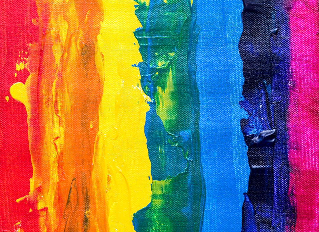
A rainbow color palette follows the natural order of the visible spectrum — the seven ROYGBIV colors that appear when white light splits through a prism. The classic set is red (#FF0000), orange (#FF7F00), yellow (#FFFF00), green (#00FF00), blue (#0000FF), indigo (#4B0082), and violet (#8B00FF). The named palettes and hex table below are ready to copy; the guidance underneath shows how to use a rainbow scheme without overwhelming a design.
Rainbow schemes are the most energetic part of the color psychology spectrum, and they bridge the warm vs cool colors divide in a single sweep. For a softer take, see our cottagecore color palette; for a darker contrast, the gothic color palette.
What colors are in a rainbow palette?
A rainbow palette is defined by ROYGBIV — the acronym for the seven colors Isaac Newton named in the visible spectrum, ordered by wavelength from longest (red) to shortest (violet). At full saturation each color sits at a pure point on the color wheel, which is why the set looks vivid and balanced rather than muddy. The core members are red (#FF0000), the warmest and most attention-grabbing; orange (#FF7F00), warm and friendly; yellow (#FFFF00), the brightest; green (#00FF00), the balance point between warm and cool; blue (#0000FF), calm and cool; indigo (#4B0082), a deep blue-purple; and violet (#8B00FF), the coolest, shortest wavelength.
| Color name | Hex | RGB | Role |
|---|---|---|---|
| Red | #FF0000 | 255, 0, 0 | Warm anchor |
| Orange | #FF7F00 | 255, 127, 0 | Warm |
| Yellow | #FFFF00 | 255, 255, 0 | Highlight |
| Green | #00FF00 | 0, 255, 0 | Balance |
| Blue | #0000FF | 0, 0, 255 | Cool anchor |
| Indigo | #4B0082 | 75, 0, 130 | Cool deep |
| Violet | #8B00FF | 139, 0, 255 | Cool accent |
5 rainbow palettes with hex codes
From the pure spectrum to softer pastel and bold modern variations, each set below is ready to copy.
1. Classic Spectrum (ROYGBIV)
The pure, full-saturation rainbow in spectral order.
Red #FF0000 Orange #FF7F00 Yellow #FFFF00 Green #00FF00 Blue #0000FF Indigo #4B0082 Violet #8B00FF
2. Pastel Rainbow
The same spectral order at low saturation — soft, friendly, nursery-and-wellness ready.
Pastel Red #FFB3BA Pastel Orange #FFD9A6 Pastel Yellow #FFF7B3 Pastel Green #B5E8B0 Pastel Blue #AEC6F0 Pastel Violet #C9B6E4
3. Modern Vivid
A slightly desaturated, screen-friendly rainbow that avoids the harshness of pure RGB.
Coral Red #E63946 Amber #F4A261 Gold #E9C46A Teal Green #2A9D8F Deep Blue #264653 Muted Violet #6D597A
4. Neon Rainbow
High-energy, electric tones for music, gaming, and event branding.
Neon Pink-Red #FF2D55 Neon Orange #FF9500 Neon Yellow #FFE600 Neon Green #00E676 Neon Blue #00B0FF Neon Violet #D500F9
5. Pride Rainbow (6-color flag)
The six-stripe rainbow flag order, widely used for inclusive and community branding.
Red #E40303 Orange #FF8C00 Yellow #FFED00 Green #008026 Blue #004DFF Violet #750787
Which rainbow colors go together?
Because a rainbow contains every hue, the question is less about which colors clash and more about which subsets read well together. Adjacent spectral colors — Red (#FF0000) into Orange (#FF7F00) into Yellow (#FFFF00) — form a smooth analogous warm run, while Blue (#0000FF), Indigo (#4B0082), and Violet (#8B00FF) make a cool analogous trio. These shorter runs are far easier to use in branding than the full seven, because they carry the rainbow’s energy without the visual overload.
The strongest contrast pairs come from opposite ends of the spectrum: Red against Green (#00FF00) and Blue against Orange are near-complementary and create maximum vibration — striking in moderation, exhausting at scale. For a balanced rainbow, the reliable rule is to keep the spectral order intact so the eye reads a deliberate gradient, and to anchor the set with a single neutral. That neutral — white, light gray, or near-black — is what stops seven competing hues from fighting, giving the palette somewhere to rest. Equal-saturation versions also matter: mixing one pure color with six muted ones makes the saturated one look like an error, so adjust the whole set together.
How to use a rainbow palette in design
The challenge with a rainbow palette is that seven full-saturation colors compete for attention, so structure is everything. The most reliable approach is to let the rainbow appear as data, illustration, or a single graphic element against a neutral background — white, light gray, or near-black — rather than coloring large interface areas. This keeps the energy while preserving legibility.
When you do need a rainbow to feel intentional rather than chaotic, keep the spectral order intact (ROYGBIV) so the eye reads a smooth gradient instead of random colors. Lowering saturation uniformly, as in the Modern Vivid set above, makes a rainbow far easier to live with in UI and branding. For text and structural elements, pair the rainbow with a true neutral; the contrast between warm and cool ends of the spectrum is what makes the palette read as a complete spectrum rather than a pile-up — see warm vs cool colors for why that warm-to-cool sweep works.
Rainbow palette for branding, data, and kids’ products
In branding, a rainbow signals inclusivity, creativity, and approachability, which is why tech, education, and community brands use it — though usually as an accent system rather than a logo’s only colors. To match a multi-color scheme to a brand’s personality, see how to choose brand colors; a rainbow works best for brands that want to feel open and playful rather than premium or restrained.
In data visualization, the spectral order makes rainbow palettes intuitive for ordered or categorical data, though designers increasingly prefer perceptually uniform gradients for accuracy. For kids’ products, education, and events, the rainbow is unbeatable: it reads as fun and welcoming instantly. Use the pastel set for younger audiences and softer contexts, and the neon set where you want maximum energy. Whatever the use, always test color contrast for accessibility, since pure yellow and green are hard to read as text on white.
Frequently Asked Questions
What are the 7 rainbow colors in order?
The seven rainbow colors in order are red (#FF0000), orange (#FF7F00), yellow (#FFFF00), green (#00FF00), blue (#0000FF), indigo (#4B0082), and violet (#8B00FF) — remembered by the acronym ROYGBIV. They run from the longest wavelength (red) to the shortest (violet) in the visible light spectrum.
What are the hex codes for a rainbow?
The standard full-saturation rainbow hex codes are #FF0000 red, #FF7F00 orange, #FFFF00 yellow, #00FF00 green, #0000FF blue, #4B0082 indigo, and #8B00FF violet. For screen design, slightly desaturated versions are easier to read and look less harsh than these pure RGB values.
Is indigo a real rainbow color?
Yes — indigo (#4B0082) is the deep blue-violet Newton included between blue and violet. Some modern color models drop it because it is hard to distinguish from blue and violet, leaving a six-color rainbow, but ROYGBIV remains the traditional seven-color sequence.
What colors make a rainbow look professional?
Lower the saturation uniformly and pair the spectrum with a strong neutral. A muted, modern rainbow against white, light gray, or charcoal looks intentional and sophisticated, while seven pure RGB colors at full strength tend to read as childlike or chaotic in branding and UI.


