Bohemian Color Palette: Hex Codes and Ideas
A bohemian color palette mixes grounded earth tones with richer jewel accents to create a warm, collected, well-traveled feeling. Think terracotta clay, mustard spice, deep teal and plum — the colors of woven rugs, pottery and dried flowers. Below are real hex codes, five copy-and-paste palettes, and a reference table you can drop straight into a brand, a website, or a print layout.
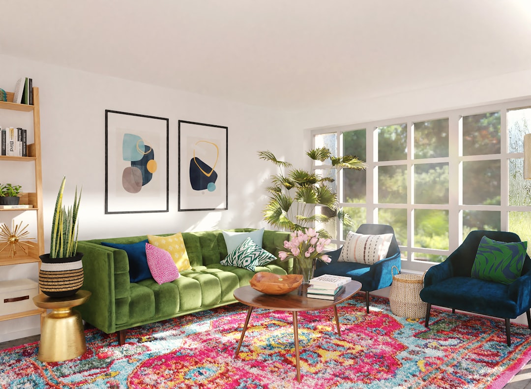
Boho is the rare palette that thrives on a controlled clash. Its character comes from mixing warm earths with cooler jewels in a way that feels gathered over time rather than designed in one sitting. The skill is making that eclecticism look intentional, not accidental.
What colors are in a bohemian color palette?
The bohemian family is built from warm earthy clays plus a few saturated jewel tones, all kept slightly muted so they feel natural. The core members are terracotta , mustard , teal , burnt orange , plum and cream .
The palette mixes warm earths with cooler jewels — see warm vs cool colors for why that contrast feels lively, and our color psychology notes for why terracotta and teal read as grounded yet expressive. Boho overlaps two neighboring families: for the muted base see our earthy color palette, and for the richer accents see our jewel tone color palette.
Core bohemian colors (with hex codes)
| Color name | Hex | RGB | Role |
|---|---|---|---|
| Terracotta | #C36F4E | 195, 111, 78 | Primary |
| Mustard | #D4A017 | 212, 160, 23 | Accent |
| Teal | #2A9D8F | 42, 157, 143 | Accent |
| Burnt orange | #CC5500 | 204, 85, 0 | Secondary |
| Plum | #6A2E5D | 106, 46, 93 | Accent |
| Cream | #F2E8D5 | 242, 232, 213 | Neutral |
5 bohemian color palettes (with hex codes)
Desert Boho
The everyday boho scheme: terracotta #C36F4E, mustard #D4A017, burnt orange #CC5500, olive #6B7A3F and cream #F2E8D5. Warm, earthy and sunbaked — the safe default for lifestyle brands, ceramics, and wellness.
Jewel Boho
Teal #2A9D8F, plum #6A2E5D, terracotta #C36F4E, mustard #D4A017 and cream. The richest, most maximalist option — the cooler jewels lift the earths, ideal for textiles, packaging, and eclectic interiors.
Spice Market
Burnt orange #CC5500, mustard #D4A017, deep red #8B0000, plum #6A2E5D and cream. Warm and saturated like ground spices — energetic and bold, great for food brands, festivals, and craft goods.
Dusty Boho
Terracotta #C36F4E, dusty rose #B98C7A, sage gray #7A8B7F, mustard #D4A017 and cream. The softest, most muted take — calm and modern, suited to interiors, stationery, and minimalist boho brands.
Plum & Teal
Plum #6A2E5D, teal #2A9D8F, terracotta #C36F4E, charcoal #2B2B2B and cream. The most dramatic, jewel-forward option — deep and luxe, good for fashion, beauty, and evening-mood brands.
Why these bohemian colors work together
The bohemian palette works on a principle most schemes avoid: a controlled clash. Terracotta and teal are near-complementary — orange and blue-green sit close to opposite each other on the wheel — so pairing them creates lively contrast rather than quiet harmony. Boho leans into that tension deliberately, the way a well-collected room mixes pieces from different places. The reason it does not feel chaotic is that every color is slightly muted, sharing a dusty, earthen quality even when the hues are far apart.
That shared desaturation is the unifying thread. Terracotta is orange knocked back toward clay; mustard is yellow pulled toward ochre; the teal and plum are jewel tones but matte rather than glossy. Because they all carry a touch of brown or gray, they read as belonging to the same sun-faded, well-traveled world, which lets very different hues coexist. Pure, glossy versions of the same colors would simply fight.
Cream is the binder. A warm, slightly yellow cream (#F2E8D5) — not stark white — acts as the woven-textile background that every boho color sits against. It softens the contrasts, ties the warm and cool accents together, and supplies the light value the deeper jewels need to stay legible. Without that warm neutral, the palette would feel busy; with it, the eclecticism reads as curated.
How to use a bohemian palette in design
Choose one earth tone to dominate — usually terracotta or burnt orange — and let it cover the largest areas. Layer mustard as a secondary, then use teal or plum as the jewel accent that provides contrast, keeping it to roughly 10% so it sparks rather than competes. Cream carries backgrounds and text. The boho look comes from layering several colors, but a 60-30-10 discipline underneath keeps the eclecticism from collapsing into noise.
Texture and pattern are inseparable from boho. Woven rugs, macramé, rattan, dried botanicals and block-printed patterns reinforce the palette far more than flat color. On screen, photography of textiles and craft objects lets the colors feel gathered rather than digital.
A useful test for whether your boho mix is working: squint at it. If the colors blur into one warm, dusty haze with a couple of cooler sparks, the balance is right. If one jewel tone jumps out as a hard, glossy patch, it is too saturated for the rest — knock it back toward the muted, sun-faded register the other colors share, and the eclecticism settles into harmony.
Bohemian palette for branding, web and interiors
Branding: boho schemes suit ceramics, textiles, wellness, lifestyle, plant and home-goods brands, and anything trading on craft and warmth. Anchor on terracotta, layer mustard and an earth neutral, and reserve teal or plum for the accent. Run the choice through how to choose brand colors to confirm the jewel accent fits your category.
Web: use cream as the page background, a deep brown or plum for body text, terracotta for buttons and links, and teal or mustard for secondary highlights. Check that terracotta and mustard meet contrast standards as text — both are mid-value and often need darkening for small type.
Interiors: bohemian palettes are perennial for relaxed, layered spaces — terracotta walls or pottery, cream textiles, mustard cushions, and teal or plum as the jewel accent in art and rugs. For the muted base direction, see our earthy color palette.
Frequently Asked Questions
What are the main bohemian colors?
The defining bohemian colors are terracotta (#C36F4E), mustard (#D4A017), burnt orange (#CC5500) and jewel accents of teal (#2A9D8F) and plum (#6A2E5D), tied together by a warm cream (#F2E8D5). They blend earthy clay tones with richer, slightly muted jewel hues.
What is the hex code for terracotta?
Terracotta is commonly written as #C36F4E (RGB 195, 111, 78), a muted clay orange named after fired earthenware. It anchors most boho palettes and pairs naturally with mustard, cream and a cooler jewel accent such as teal for the signature eclectic contrast.
What is the difference between bohemian and earthy palettes?
Earthy palettes stay muted and warm — clay, olive, brown and sand throughout. Bohemian builds on that earthy base but adds saturated jewel accents like teal and plum, plus more pattern and contrast. Boho is essentially an earthy palette with jewel tones layered in for energy.
How many colors should a bohemian palette have?
Boho tolerates more colors than most styles — five to six is common: two earth dominants, a secondary, one or two jewel accents, and a cream neutral. The trick is keeping every color slightly desaturated and using cream generously so the layered mix reads as curated rather than chaotic.


