Roobert Font: The Friendly Geometric for Digital Products
The Roobert font occupies a rare and valuable position in the geometric sans-serif landscape. Designed by Martin Wecke at Displaay Type Foundry and released in 2019, Roobert manages to feel both rigorously geometric and genuinely warm — a combination that most geometric sans-serifs fail to achieve. Where Futura can feel rigid and Circular can feel slick, Roobert feels approachable. Named after a robot, the typeface was built specifically for digital-first applications, and it has quietly become a favorite among tech startups, SaaS companies, and product designers who want geometric clarity without sacrificing personality. [LINK: /futura-font/]
Roobert is part of a growing wave of high-quality indie type that challenges the traditional foundry model. Displaay offers it free for personal use, lowering the barrier for experimentation while maintaining a commercial licensing structure for businesses. This guide covers everything you need to know about the Roobert typeface: its history, design characteristics, how it compares to Circular and Inter, the best pairings, licensing details, and the strongest alternatives.
Quick Facts About the Roobert Font
- Designer: Martin Wecke
- Foundry: Displaay Type Foundry
- Year Released: 2019
- Classification: Geometric sans-serif
- Weights: Light, Regular, Medium, Semi-Bold, Bold, Heavy (6 weights + matching italics)
- Cost: Free for personal use via Displaay; commercial license required for business use
- Best For: Digital products, app UI, tech branding, web design, SaaS interfaces
- Notable Users: Tech products, SaaS companies, digital-first brands
The History of Roobert: Indie Type for a Digital-First Era
Displaay Type Foundry and Martin Wecke
Displaay is an independent type foundry based in Berlin that has built a reputation for releasing typefaces that are both aesthetically distinctive and technically sound. Unlike the major commercial foundries — Monotype, Linotype, or even newer players like Klim — Displaay operates on a model that prioritizes accessibility. Many of their typefaces are available for free personal use, with commercial licenses offered at reasonable rates. This approach has made them a favorite among independent designers, early-stage startups, and creative studios who want professional-quality type without enterprise-level budgets.
Martin Wecke, the designer behind Roobert, created the typeface with a specific gap in mind. By 2019, the geometric sans-serif space was dominated by two poles: the historical rigidity of Futura (designed by Paul Renner in 1927) and the polished corporate smoothness of Circular (designed by Laurenz Brunner for Lineto). Plenty of designers wanted something geometric but neither cold nor corporate. Wecke set out to create a geometric sans-serif that felt human — something that could power a digital product’s entire interface while still feeling like it was designed by people, for people.
The Name: Named After a Robot
The name “Roobert” is a playful nod to robots — fitting for a typeface designed for digital products and interfaces. But the irony is intentional. Despite its robotic name, Roobert is one of the warmest geometric sans-serifs available. The name captures the typeface’s core tension: it is built on the precise, mathematical foundations of geometric type design, yet it communicates with a friendliness that feels distinctly un-mechanical. That tension between structure and warmth is what makes the Roobert font distinctive.
Part of the New Wave of Free-to-Try Indie Type
Roobert arrived at a moment when the type industry was shifting. Foundries like Indian Type Foundry (with Fontshare), Atipo, and Displaay were experimenting with free-for-personal-use models that let designers test typefaces in real projects before committing to commercial licenses. This approach benefits both sides: designers get access to high-quality type without financial risk, and foundries build awareness and loyalty that converts to commercial sales when projects scale. Roobert’s free personal license has been instrumental in its adoption — designers discover it in personal projects and then purchase commercial licenses when they bring it into client work or product launches.
Design Characteristics of the Roobert Font
What makes Roobert stand out in a crowded field of geometric sans-serifs? The answer lies in a series of deliberate design decisions that balance geometric precision with organic warmth.
Rounded Geometric Forms
Roobert’s letterforms are built on geometric foundations — circles, straight lines, and consistent stroke widths — but the execution is softer than strict geometry would dictate. The curves are slightly rounded beyond pure mathematical arcs, giving the typeface a gentleness that strict geometrics like Futura lack. This rounding is subtle enough that Roobert still reads as geometric, but it removes the sterile quality that makes some geometric sans-serifs feel unwelcoming in digital product contexts where users spend hours reading text.
Distinctive Letterforms: The R and G
Two letters immediately identify Roobert: the uppercase “R” and the uppercase “G.” The “R” features a distinctive leg that extends with a subtle curve, giving it a personality that more neutral geometrics suppress. The “G” has a characterful construction that avoids the generic roundness of most geometric G forms. These letterforms are quirky enough to give Roobert recognizable personality in headlines and logos, but restrained enough that they do not distract in body text. It is a difficult balance, and Roobert handles it well.
Warm Without Being Childish
Many geometric sans-serifs that aim for warmth overshoot into territory that feels juvenile or excessively playful — rounded terminals, exaggerated curves, and bubbly proportions that work for children’s apps but not for serious software products. Roobert avoids this trap entirely. Its warmth comes from proportion and subtle curve adjustments rather than from decorative features. The result is a typeface that feels friendly and approachable in a fintech dashboard just as comfortably as it does in a consumer app. This maturity is a significant part of why tech companies and SaaS products have gravitated toward Roobert.
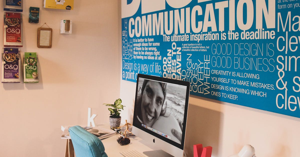
Excellent Screen Rendering
Roobert was designed for screens first. Its stroke weights are calibrated for pixel rendering, its proportions are tuned for common UI text sizes (14-18 pixels), and its spacing is optimized for digital reading environments. The typeface renders cleanly across operating systems and browsers, maintaining its character whether displayed on a high-density Retina screen or a standard 1080p monitor. This screen-first design philosophy separates Roobert from geometric classics like Futura, which were designed for print and can feel awkward at small screen sizes.
The Balance Between Futura and Circular
Perhaps the most useful way to understand Roobert’s design position is to place it between two poles. On one side is Futura — the original geometric sans-serif, with its strict adherence to geometric construction, its sharp angles, and its occasionally rigid rhythm. On the other side is Circular — Lineto’s hugely popular contemporary geometric, with its polished, corporate-friendly smoothness that has become the default voice of well-funded tech companies. Roobert sits between these two, borrowing Futura’s structural honesty while incorporating some of Circular’s refinement, and then adding its own warmth on top. The result is a geometric sans-serif that feels neither retro nor corporate — just genuinely contemporary.
Roobert vs. Circular vs. Inter: How They Compare
Choosing between Roobert, Circular, and Inter is one of the most common decisions facing product designers today. All three are excellent sans-serifs for digital products, but they serve different aesthetic and practical needs. [LINK: /circular-font/] [LINK: /inter-font/]
Roobert vs. Circular
Circular, designed by Laurenz Brunner and released by Lineto, is the geometric sans-serif that defined the aesthetic of the 2010s tech boom. Spotify, Airbnb (before their custom typeface), and countless startups adopted Circular for its clean, confident, premium feel. Circular is polished to an almost clinical degree — every curve is perfect, every proportion is measured, and the overall effect is one of quiet corporate authority.
Roobert shares Circular’s geometric DNA but trades some of that polish for personality. Where Circular feels like a typeface designed for a brand guidelines document, Roobert feels like a typeface designed for a product someone actually uses. Roobert’s slightly quirkier letterforms and warmer curves give it more character at the cost of some of Circular’s restrained elegance. Practically speaking, Circular requires a commercial license from Lineto (which is expensive), while Roobert’s personal-use license makes it accessible for experimentation. For funded companies building premium brands, Circular remains a strong choice. For startups and products that want geometric clarity with more humanity, Roobert is often the better fit.
Roobert vs. Inter
Inter, designed by Rasmus Andersson, is a humanist sans-serif — a fundamentally different classification from Roobert’s geometric construction. Inter was engineered for maximum screen readability, with features like tabular figures by default, open apertures, and extensive OpenType support. It is a technical achievement in UI typography.
The aesthetic difference is significant. Inter is neutral and functional — it disappears into the interface, letting content speak. Roobert is geometric and characterful — it adds a layer of personality to every screen it appears on. Choosing between them often comes down to whether you want your typeface to be invisible (Inter) or to contribute to your product’s visual identity (Roobert). Inter is also completely free and open source, while Roobert requires a commercial license for business use. For pure utility, Inter wins. For products where brand expression matters at the typographic level, Roobert has the edge.
When to Choose Which
- Choose Roobert when you want geometric clarity with warmth and personality — ideal for consumer-facing tech products, creative tools, and brands that want to feel approachable without being casual.
- Choose Circular when you want polished, premium geometric minimalism for established brands with the budget for Lineto licensing.
- Choose Inter when maximum readability and utility matter more than typographic personality — data-dense dashboards, developer tools, and open-source projects. [LINK: /inter-font/]
Weights and Styles of the Roobert Font
Roobert offers six weights, each with a matching italic, giving designers a total of twelve styles to work with:
- Light — A refined, airy weight suited for large display text, hero headings, and elegant UI elements where lightness is desired.
- Regular — The standard text weight, optimized for body copy and interface text at common screen sizes.
- Medium — A versatile in-between weight ideal for labels, navigation items, and subtle emphasis without the heaviness of bold.
- Semi-Bold — A strong emphasis weight that works well for subheadings, section titles, and interactive elements like buttons.
- Bold — The primary weight for headings, calls to action, and strong typographic hierarchy.
- Heavy — The darkest weight, best suited for impactful display text, hero sections, and branding applications where maximum visual weight is needed.
Six weights may seem modest compared to Inter’s nine or some variable font families that offer continuous weight ranges, but Roobert’s six weights cover the practical needs of most digital product design. The jump from Light to Heavy provides a wide enough range for clear typographic hierarchy, and the Medium and Semi-Bold weights fill the critical middle ground that UI designers use most frequently.
Best Pairings for the Roobert Font
Roobert’s geometric warmth makes it a flexible pairing partner. Its personality is strong enough to anchor a design system but not so dominant that it clashes with companion typefaces. Here are the strongest pairings. [LINK: /font-pairing/]
Roobert + Libre Baskerville
Libre Baskerville’s warm, screen-optimized serifs provide a classical counterpoint to Roobert’s modern geometry. Use Roobert for headings and UI elements, and Libre Baskerville for long-form body text. This pairing works especially well for editorial platforms, content-driven products, and marketing websites that need to balance approachability with substance.
Roobert + Source Serif Pro
Adobe’s Source Serif Pro shares Roobert’s commitment to screen readability, making this a technically harmonious pairing. Source Serif Pro’s sturdy construction and generous x-height complement Roobert’s geometric forms without competing for attention. This combination is well suited for documentation sites, knowledge bases, and SaaS product blogs.
Roobert + Playfair Display
For maximum contrast and visual impact, pairing Roobert with Playfair Display creates a striking tension between geometric modernity and high-contrast classical elegance. Use Playfair Display sparingly — hero headings and pull quotes — while Roobert handles subheadings, body text, and interface elements. This pairing works for landing pages, creative portfolios, and editorial contexts that demand drama. [LINK: /playfair-display-font/]
Roobert + Inter
An unconventional pairing that works in practice: use Roobert for display text and branding elements where you want personality, and Inter for dense UI text and data-heavy interface components where readability trumps character. This combination lets a product feel distinctive in its marketing surfaces while remaining functionally optimized in its working interface. [LINK: /inter-font/]
Roobert + Lora
Lora’s calligraphic serif forms bring an organic, handcrafted quality that complements Roobert’s warmth. Together, they create a pairing that feels contemporary and human — suitable for lifestyle brands, wellness products, and consumer applications that want to feel personal rather than corporate.
Roobert + DM Mono
For tech products and developer-facing tools, pairing Roobert with DM Mono (a free monospace typeface from Colophon Foundry) creates a clean technical aesthetic. Roobert provides the warmth and personality in headings and prose, while DM Mono handles code blocks, terminal output, and technical data. The shared geometric sensibility between the two creates visual cohesion.
Roobert + General Sans
For a sans-serif-only system with subtle differentiation, pairing Roobert (for display and brand elements) with General Sans (for body text and functional UI) creates a layered typographic hierarchy within the same broad classification. General Sans is slightly more neutral, allowing Roobert’s personality to shine in headlines without creating a jarring contrast.
Roobert + Newsreader
Google’s Newsreader is a contemporary serif designed for digital editorial contexts. Its sharp, modern serifs and robust screen rendering pair naturally with Roobert’s digital-first geometry. This combination is particularly effective for blogs, newsletters, and content platforms where both typefaces perform at their best.
Where to Get the Roobert Font and Licensing Details
Roobert is available directly from Displaay Type Foundry’s website (displaay.net). The licensing model is straightforward:
- Personal use: Free. You can download Roobert at no cost for personal, non-commercial projects. This includes student work, personal websites, portfolio pieces, and experimental design.
- Commercial use: Requires a paid license from Displaay. Commercial licenses cover business use cases including client projects, product interfaces, marketing materials, and brand identity work. Pricing varies based on the scope of use.
This model is typical of the new wave of indie foundries. It removes friction for discovery and experimentation while ensuring that commercial applications — where the typeface generates business value — contribute revenue back to the foundry and designer. If you are evaluating Roobert for a product or client project, budget for the commercial license from the start.
Roobert Font Alternatives
If Roobert does not fit your project — whether due to licensing, aesthetic preference, or technical requirements — these alternatives occupy similar territory. [LINK: /best-sans-serif-fonts/]
Inter (Free)
The most practical alternative for teams that need a free, open-source sans-serif for digital products. Inter lacks Roobert’s geometric personality but exceeds it in technical features and screen optimization. It is the utilitarian choice. [LINK: /inter-font/]
Satoshi (Free)
Available through Fontshare (Indian Type Foundry’s free font platform), Satoshi is a contemporary geometric sans-serif with a friendly character similar to Roobert’s. It offers nine weights plus italics and is free for both personal and commercial use — making it the closest free alternative to Roobert in both aesthetics and spirit.
General Sans (Free)
Also from Fontshare, General Sans is a slightly more neutral geometric sans-serif that shares Roobert’s digital-first design philosophy. It works well for the same product design contexts as Roobert but with less distinctive personality. Free for personal and commercial use.
Circular
Lineto’s Circular is the premium alternative — more polished and corporate than Roobert, with a significantly higher price tag. Choose Circular when the project demands maximum geometric refinement and the budget supports Lineto’s licensing fees. [LINK: /circular-font/]
Gilroy
Radomir Tinkov’s Gilroy is a geometric sans-serif with a modern, clean aesthetic and a wide weight range (ten weights plus italics). It occupies a similar warmth level as Roobert but with a slightly different geometric construction. Gilroy is available through various font distributors with commercial licensing options that tend to be more affordable than Circular.
Frequently Asked Questions About the Roobert Font
Is the Roobert font free?
Roobert is free for personal use. You can download it from the Displaay Type Foundry website (displaay.net) at no cost for non-commercial projects such as personal websites, student work, and design experimentation. However, commercial use — including client projects, product interfaces, marketing materials, and any application that generates business value — requires a paid license from Displaay. This free-for-personal, paid-for-commercial model is increasingly common among independent type foundries and provides a low-risk way to evaluate the typeface before committing to a license.
What is the difference between Roobert and Circular?
Both are geometric sans-serifs designed for modern digital applications, but they differ in character and cost. Circular, designed by Laurenz Brunner for Lineto, is more polished, more neutral, and more corporate in feel — it is the typeface of well-funded tech branding. Roobert, designed by Martin Wecke for Displaay, is warmer, slightly quirkier, and more approachable. Roobert’s distinctive letterforms (particularly the R and G) give it more personality than Circular’s studied restraint. Circular commands a premium price through Lineto, while Roobert’s commercial license is more accessible. Choose Circular for refined corporate geometry; choose Roobert for friendly product personality.
What are the best fonts to pair with Roobert?
Roobert pairs well with serif typefaces that provide classical contrast to its geometric modernity. Strong options include Libre Baskerville (warm, screen-optimized serif), Source Serif Pro (sturdy editorial serif), Playfair Display (high-contrast display serif), and Lora (calligraphic humanist serif). For sans-serif pairings, Inter works well as a functional complement to Roobert’s personality, and General Sans provides a more neutral companion within the same geometric family. For technical contexts, DM Mono makes an effective monospace partner. See the pairings section above for detailed guidance on each combination. [LINK: /font-pairing/]
Can I use Roobert for my startup’s product?
Yes, but you will need a commercial license from Displaay. The free version of Roobert is limited to personal, non-commercial use. If you are building a product, designing marketing materials, or using Roobert in any context that generates revenue or serves a business purpose, a commercial license is required. Visit displaay.net to review licensing options and pricing. The commercial license is reasonably priced compared to premium foundry alternatives like Circular, making it accessible for startups and small businesses. [LINK: /what-is-typography/]


