Burgundy vs Red: What’s the Difference?
Burgundy and red share the same warm root, but they feel worlds apart. Burgundy is a rich, dark red with a distinct purple cast, named after the deep red wines of the Burgundy region. Red is the pure primary — the brightest, most saturated form of the hue. The burgundy vs red difference comes down to two things: value (burgundy is much darker) and undertone (burgundy leans purple, while pure red is neutral and balanced).
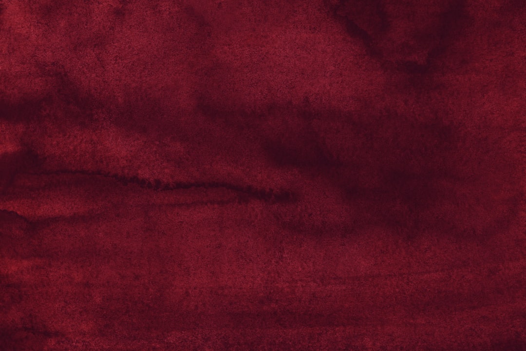
What is burgundy?
Burgundy is a deep, dark red with a purple undertone, named after the wine of the same name. A representative value is #800020. Its darkness and slight purple lean give it a refined, luxurious, and slightly somber character — burgundy reads as sophisticated and mature rather than loud. It’s a staple of autumn palettes, formalwear, and premium branding that wants the energy of red without the brashness.
Burgundy sits close to maroon and wine, and the distinctions are subtle. For those neighbors, see maroon versus burgundy and wine versus burgundy. To understand the symbolism that burgundy inherits from its parent, visit our red color meaning page.
What is red?
Red is the pure primary color — the brightest, most saturated warm hue. The standard digital value is #FF0000. Red is the most attention-grabbing color in the spectrum, signaling energy, urgency, passion, and excitement. It’s the color of stop signs, sale tags, and bold branding precisely because it commands immediate attention. Unlike burgundy’s restraint, pure red is loud, direct, and impossible to ignore.
What’s the difference between burgundy and red?
The difference is value and undertone. Burgundy is a dark, purple-leaning red; pure red is bright, saturated, and neutral. Both trace to the same warm hue, but burgundy adds depth and a violet cast that pure red lacks. Here’s the side-by-side with representative values, since burgundy in particular covers a range.
| Property | Burgundy | Red |
|---|---|---|
| Hex code | #800020 | #FF0000 |
| RGB | 128, 0, 32 | 255, 0, 0 |
| CMYK | 0, 100, 75, 50 | 0, 100, 100, 0 |
| Undertone | Cool purple-red | Neutral, balanced warm red |
| Hue family | Deep red (wine) | Pure primary red |
| Best used for | Luxury branding, autumn palettes, refined accents | High-energy CTAs, alerts, bold branding |
| Mood/feel | Sophisticated, rich, mature, refined | Energetic, urgent, passionate, bold |
Is burgundy just a dark red?
Mostly, but not entirely. Burgundy is what you get when you darken red and shift it slightly toward purple, so it’s a dark red with a violet undertone rather than a simple low-value version of pure red. That purple lean is the detail that separates burgundy from a plain deep red: it cools the color and adds the wine-like richness burgundy is known for. The added darkness also changes its psychological weight — where pure red shouts, burgundy speaks quietly and reads as refined. This shift from loud to sophisticated as a color deepens is a recurring theme in our color psychology guide.
When should you use each?
Use burgundy when you want warmth and richness without brashness. Its depth and refinement make it ideal for luxury branding, formalwear, autumn and holiday palettes, and editorial design that wants sophistication. Burgundy carries red’s emotional warmth while reading as mature and premium.
Use red when you want maximum energy and immediate attention. Pure red is the right call for calls to action, sale banners, alerts, and bold, youthful branding. Its saturation makes it impossible to ignore, which is exactly what you want when urgency or excitement is the goal.
A simple way to choose: if you want the color to feel refined and grounded, pick burgundy; if you want it to feel urgent and electric, pick red. The two can also work together, with burgundy as a deep backdrop and a touch of pure red as a sharp accent, giving a palette both depth and a jolt of energy.
How do burgundy and red work in design?
In branding, red dominates fast food, retail, and entertainment because its energy drives action, while burgundy suits wine, fashion, beauty, and premium identities that want warmth with sophistication. In web and UI design, red is the standard for error states, alerts, and high-priority buttons, whereas burgundy works as a rich background or heading color that feels upscale. In fashion and interiors, burgundy is a seasonal staple for autumn and winter while pure red is a bold statement accent. For a related warm-color comparison from this batch, see rust versus brown, and for the broader temperature framework see warm vs cool colors.
The consistent thread is that red supplies energy and burgundy supplies refinement. Whether you’re designing packaging, a site, or a wardrobe, choosing red for the elements that should excite and burgundy for the elements that should feel premium keeps a warm palette from reading either too aggressive or too muted.
How can you tell burgundy from red at a glance?
The fastest test is brightness: pure red is vivid and luminous, almost glaring, while burgundy is dark and subdued, like red seen in low light. The second test is the purple lean — tilt a burgundy swatch next to a pure red and burgundy visibly cools toward wine and plum, whereas red stays neutral and fiery. A simple mental shortcut is the source imagery: if a color reminds you of a stop sign, a fire truck, or a fresh strawberry, it’s pure red; if it reminds you of red wine, oxblood leather, or autumn foliage, it’s burgundy. Because burgundy is essentially red darkened and shifted toward violet, the two read as completely different in mood even though they trace to the same hue family.
Frequently Asked Questions
What is the hex code for burgundy versus red?
A representative burgundy is #800020, a deep purplish-red. Pure red is #FF0000, the brightest saturated primary. Both trace to the same warm hue, but those values capture the core contrast: burgundy is dark and purple-leaning, while red is vivid and neutral.
Is burgundy a shade of red or purple?
Burgundy is a shade of red with a purple undertone, so the most accurate label is a dark, purple-leaning red. It belongs to the red family but the violet cast pulls it cooler than a plain deep red, which is what gives burgundy its distinctive wine-like character.
Can burgundy and red be used together?
Yes, though carefully. Because burgundy is essentially a deep version of red, the two share a family and can layer for a rich monochromatic effect. Use burgundy as the deep base and a small amount of pure red as a sharp accent, balanced with a neutral like cream or charcoal.
What undertone does burgundy have?
Burgundy has a cool purple-red undertone, inherited from the wine it’s named after. That violet lean is what separates it from warmer deep reds like brick or maroon, and it’s the reason burgundy reads as refined and slightly cool rather than fiery.
Which is better for luxury branding?
Burgundy is the stronger choice for luxury branding because its depth and purple undertone read as sophisticated, mature, and premium. Pure red is energetic and attention-grabbing but can feel loud or budget-oriented, so it suits high-energy retail rather than understated luxury.


