Ivory vs Beige: What’s the Difference?
Ivory and beige are both warm, light neutrals, but ivory sits much closer to white. Ivory is a soft warm white with a barely-there yellow tint, named after elephant tusk. Beige is a pale, sandy tan — deeper and more obviously colored than ivory. The ivory vs beige distinction is mostly value: ivory is an off-white that reads as “white with warmth,” while beige carries enough tan to read as a light neutral color in its own right.
What is ivory?
Ivory is a warm white with a very faint yellow tint, named after the natural color of elephant tusk and bone. A representative value is #FFFFF0. It’s barely distinguishable from pure white but feels softer, warmer, and more inviting — the warmth takes the clinical edge off white without becoming a true color. Ivory is a favorite for wedding palettes, luxury packaging, and editorial backgrounds that want elegance with a gentle glow.
Ivory sits right next to white. For that close comparison, see ivory versus white. To understand where these warm whites sit on the temperature scale, our warm vs cool colors guide provides the framework.
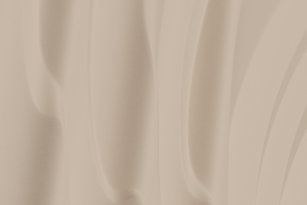
What is beige?
Beige is a pale, warm tan — a light neutral with a clear sandy, yellow-beige character. A representative value is #F5F5DC. Beige is deeper than ivory and unmistakably a color rather than a near-white; it reads as soft, organic, and understated. It’s one of the most-used neutrals in interiors, fashion, and branding because it adds warmth and calm without demanding attention. Beige sits close to cream, and the two are easy to confuse — see beige versus cream.
What’s the difference between ivory and beige?
The difference is value. Ivory is a warm white that’s almost indistinguishable from white; beige is a noticeably deeper, sandy tan. Both share a warm yellow undertone, so the contrast is lightness rather than temperature. Here’s the side-by-side with representative values, since both names cover a range.
| Property | Ivory | Beige |
|---|---|---|
| Hex code | #FFFFF0 | #F5F5DC |
| RGB | 255, 255, 240 | 245, 245, 220 |
| CMYK | 0, 0, 6, 0 | 0, 0, 10, 4 |
| Undertone | Warm, very faint yellow | Warm yellow-tan |
| Hue family | Warm white (off-white) | Pale tan (light neutral) |
| Best used for | Elegant backgrounds, weddings, luxury packaging | Warm neutral fields, interiors, understated branding |
| Mood/feel | Soft, elegant, clean, warm-white | Calm, organic, understated, cozy |
Is ivory lighter than beige?
Yes, clearly. Ivory is a warm white that sits just a hair off pure white, while beige is a noticeably deeper, sandy tan. Place the two swatches together and ivory looks like a gentle white while beige reads as a soft, light color. They share the same warm yellow undertone, so the difference between them is almost entirely value — ivory is the near-white end of the warm-neutral range and beige is a step deeper into tan. That small jump in lightness changes how each behaves: ivory reads as an elegant white substitute, while beige reads as a true neutral background color. The way value shifts a neutral’s role is a theme explored in our color psychology guide.
When should you use each?
Use ivory when you want the cleanliness of white with a touch of warmth. Its near-white softness makes it ideal for elegant backgrounds, wedding and luxury palettes, fine packaging, and editorial layouts where stark white feels too cold. Ivory keeps a design feeling light and airy while removing the clinical edge.
Use beige when you want a warm neutral with a bit more presence. Its deeper tan makes it ideal for backgrounds that should feel cozy rather than bright, interiors, fashion, and understated branding. Beige adds organic warmth and grounds a palette without dominating it.
A simple way to choose: if you want something that behaves like a warm white, pick ivory; if you want a soft, light neutral with visible color, pick beige. The two also layer well together, with ivory as the lightest highlight and beige as the warm mid-neutral, building a calm tonal palette.
How do ivory and beige work in design?
In branding, ivory signals elegance and luxury — common in beauty, fashion, and premium packaging — while beige signals calm, natural simplicity, popular in wellness, lifestyle, and minimalist identities. In web and editorial design, ivory makes a warm off-white background that’s softer than pure white, and beige works as a slightly deeper section background that adds cozy warmth. In interiors and fashion, the two are a classic neutral layering, with ivory for the brightest surfaces and beige for walls and textiles. For a related neutral comparison from this batch, see charcoal versus gray.
The consistent thread is that ivory behaves like a warm white while beige behaves like a light warm neutral. Whether you’re designing packaging, a website, or a room, leaning on ivory for the surfaces that should feel light and elegant and beige for the fields that should feel warm and grounded keeps a neutral palette soft and cohesive.
How can you tell ivory from beige at a glance?
The quickest test is to compare each against pure white. Ivory sits so close to white that it only reveals its warmth when placed beside a true white, where it looks gently creamy; beige is obviously deeper, reading as a soft tan even on its own. A second test is whether the swatch functions as a white or as a color — ivory still does the job of white in a layout, while beige clearly acts as a light neutral color. If a sample reminds you of bone, eggshell, or a wedding dress, it’s ivory; if it reminds you of sand, oatmeal, or unbleached linen, it’s beige. Since the two share the same warm undertone, the deciding factor is almost always lightness.
Frequently Asked Questions
What is the hex code for ivory versus beige?
A representative ivory is #FFFFF0, a warm white with a faint yellow tint. A representative beige is #F5F5DC, a pale warm tan. Both share a warm undertone, but those values capture the core contrast: ivory is almost white, while beige is a noticeably deeper light neutral.
Is ivory a shade of white or beige?
Ivory is best described as a warm white — an off-white with a faint yellow tint. It sits between pure white and beige, closer to white. Beige is a step deeper into tan, so ivory functions as a white substitute while beige functions as a soft neutral color.
Can ivory and beige be used together?
Yes, beautifully. Because they share the same warm undertone, they layer naturally in a tonal neutral palette. Use ivory as the lightest highlight or background and beige as the slightly deeper warm field, then add a darker neutral like taupe or brown for contrast.
What undertone do ivory and beige share?
Both share a warm yellow undertone, which is what makes them read as warm rather than cool neutrals. In ivory that warmth is very faint, keeping it near-white; in beige it’s more pronounced, giving beige its sandy tan character. The shared warmth is why they pair so easily.
Which is better for a warm, airy background?
Ivory is better for a light, airy background because it reads almost as white while softening the coldness of pure white. Beige is the better choice when you want the background to feel cozier and more grounded, since its deeper tan adds visible warmth and presence.


