Amethyst vs Violet: What’s the Difference?
The amethyst vs violet difference comes down to brightness and hue lean. Amethyst is a soft, medium purple named after the gemstone, with a balanced, slightly muted body. Violet is a true spectral color at the blue end of visible light, so it reads bluer and more vivid. Both sit in the purple family, but amethyst reads gentle and jewel-soft where violet reads electric.
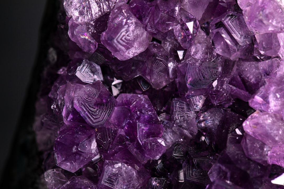
What is amethyst?
Amethyst is a soft, medium purple taking its name from the violet-colored quartz gemstone. A representative web value is #9966CC, a balanced purple that sits between blue and red leans without committing strongly to either. What defines amethyst is its gentle, slightly muted quality: it is bright enough to read clearly as purple but soft enough to feel calming and refined, like the translucent stone it is named for. As a gemstone name, amethyst carries connotations of serenity, spirituality, and understated luxury, which is why it reads softer and more sophisticated than a saturated purple.
For how this purple registers emotionally, our purple color meaning guide covers the creativity, royalty, and spirituality the whole purple family conveys.
What is violet?
Violet is a genuine spectral color — the shortest visible wavelength, sitting just past blue at roughly 380–450 nanometers. A representative digital value is #7F00FF (sometimes #8F00FF for “electric violet”). Because it is anchored near blue, violet appears cooler, brighter, and more vivid than amethyst. It is the color of the last band in a rainbow and the bloom it is named after. Compared with amethyst’s gentle, balanced body, violet reads electric and blue-leaning, with a luminous, almost neon quality on screen.
Violet’s defining trait is its blue lean and vividness, which is why it feels futuristic and energetic where amethyst feels calm and refined.
What’s the difference between amethyst and violet?
The defining difference is brightness and hue lean. Amethyst is a softer, more muted mid-purple that sits balanced between blue and red; violet is a vivid spectral color that leans distinctly blue and reads brighter and cooler. Here is a side-by-side with representative values — neither name is rigidly standardized in design use, so treat these as reference points.
| Property | Amethyst | Violet |
|---|---|---|
| Hex code | #9966CC | #7F00FF |
| RGB | 153, 102, 204 | 127, 0, 255 |
| CMYK | 25, 50, 0, 20 | 50, 100, 0, 0 |
| Undertone | Balanced, soft and slightly muted | Cool blue, vivid |
| Hue family | Medium purple (amethyst) | Blue-purple (spectral violet) |
| Best used for | Wellness, beauty, calm, refined accents | Tech, futuristic, creative, cool palettes |
| Mood/feel | Calm, serene, soft, jewel-refined | Electric, vivid, cool, imaginative |
Why is violet bluer than amethyst?
Because violet is a single wavelength of light at the blue end of the spectrum, while amethyst is a mixed pigment purple that sits more balanced between blue and red. Violet has more blue “in” it by physics, so it reads cooler and more luminous; amethyst carries a touch more red and is softened with gray, so it reads gentler and warmer by comparison. This is why violet appears electric on screen while amethyst stays calm and refined. On a color wheel, violet sits closer to blue, and amethyst sits more centrally in the purple range.
This relationship mirrors the warm-versus-cool logic that governs most color decisions; our guide to warm vs cool colors explains how undertone and saturation shift a hue’s temperature even within a single family.
When should you use each?
Use amethyst when you want a purple that is calm, refined, and approachable. Its soft, jewel-like quality suits wellness and beauty branding, spa and lifestyle design, and palettes that should feel serene and premium rather than loud. Amethyst pairs beautifully with soft gray, cream, gold, and dusty pink.
Use violet when you want energy, brightness, and a cool, modern edge. Its electric blue lean suits tech and SaaS brands, creative and entertainment identities, gradients, and anything aiming to feel forward-looking. Violet pops on dark UIs and pairs cleanly with cyan, blue, and magenta. For the broader purple boundary, compare violet vs purple.
How do amethyst and violet show up in design?
In branding, amethyst’s gentle, gemstone character makes it a favorite for wellness, beauty, and spiritual products that want calm sophistication, while violet’s electric character suits technology, gaming, and creative tools that want to feel current. In UI and digital, violet shines in gradients and accent colors because its blue lean reads vividly on screens, whereas amethyst works well for considered, soothing palettes. In print, amethyst is easier to reproduce accurately; pure spectral violet is hard to render in CMYK, so printed “violet” is usually a bright blue-purple approximation. For how amethyst relates to the broader purple family, see amethyst vs purple, and browse the wider range in our shades of purple guide.
How can you tell amethyst and violet apart?
The defining test is to look at brightness and the blue lean. Amethyst shows a softer, more balanced body with a gentle, slightly muted quality — held next to violet, it reads calmer and a touch warmer, like the translucent gemstone it is named for. Violet leans distinctly blue and reads vivid and electric, with a luminous glow that amethyst lacks. If a swatch looks soft and refined, it is amethyst; if it looks bright and almost neon, it is violet.
A second check is association and context. Amethyst evokes gemstones, wellness, and quiet luxury — gentle and serene. Violet evokes rainbows, neon gradients, and technology — vivid and energetic. Place both side by side and amethyst will appear to settle into a calmer, more grounded purple while violet jumps forward as the brighter, bluer of the two. The easiest tell is to imagine each as a light: violet glows electric and cool, while amethyst holds a softer, jewel-like calm.
Do amethyst and violet go together?
Yes — because both sit within the purple family, pairing them creates a layered, tonal palette with depth. Amethyst works as the softer, grounding base while violet adds a brighter, electric accent, a combination that feels both serene and current. Add a cool blue or a soft neutral to keep the pairing from feeling too saturated. Amethyst provides the calm refinement while violet provides the spark. Read color psychology for why purples feel creative, spiritual, and luxurious.
Frequently Asked Questions
Is amethyst the same as violet?
No. Amethyst is a soft, medium purple named after the gemstone (around #9966CC) with a balanced, slightly muted body, while violet is a vivid spectral color (around #7F00FF) that leans distinctly blue. Amethyst is gentler and more refined; violet is brighter, cooler, and more electric. The difference is brightness and blue lean.
Is amethyst warmer or cooler than violet?
Amethyst is warmer. It carries a touch more red and is softened with gray, so it reads gentle and balanced, while violet’s blue spectral lean makes it cooler and more luminous. That cooler, more electric quality is what separates violet from the calmer, jewel-soft amethyst.
What is the hex code for amethyst?
A common reference is #9966CC, a balanced medium purple with a soft, slightly muted quality. Because amethyst describes a gemstone purple rather than one fixed standard, it spans a range — from paler, lavender-leaning amethysts to deeper, more saturated versions that edge toward royal purple.
What colors go with amethyst?
Amethyst pairs beautifully with soft gray, cream, gold, dusty pink, and sage green. Its gentle richness reads as a calming, premium statement against neutrals, while gold amplifies its jewel-like quality, making amethyst a versatile accent in wellness, beauty, and interior palettes.
Which is more vivid, amethyst or violet?
Violet. As a true spectral color anchored near blue, violet reads electric and luminous, especially on screen. Amethyst is softer and slightly muted by comparison, with a calmer, more refined character. Designers reach for violet when they want energy and amethyst when they want serene sophistication.


