Pearl vs White: What’s the Difference?
The pearl vs white difference comes down to warmth and softness. Pearl is a soft, warm off-white named after the gemstone, with a creamy body and a hint of luster. White is the pure, neutral, maximum-bright value. Both read as light and clean, but pearl reads warm and luxurious where pure white reads crisp and absolute.
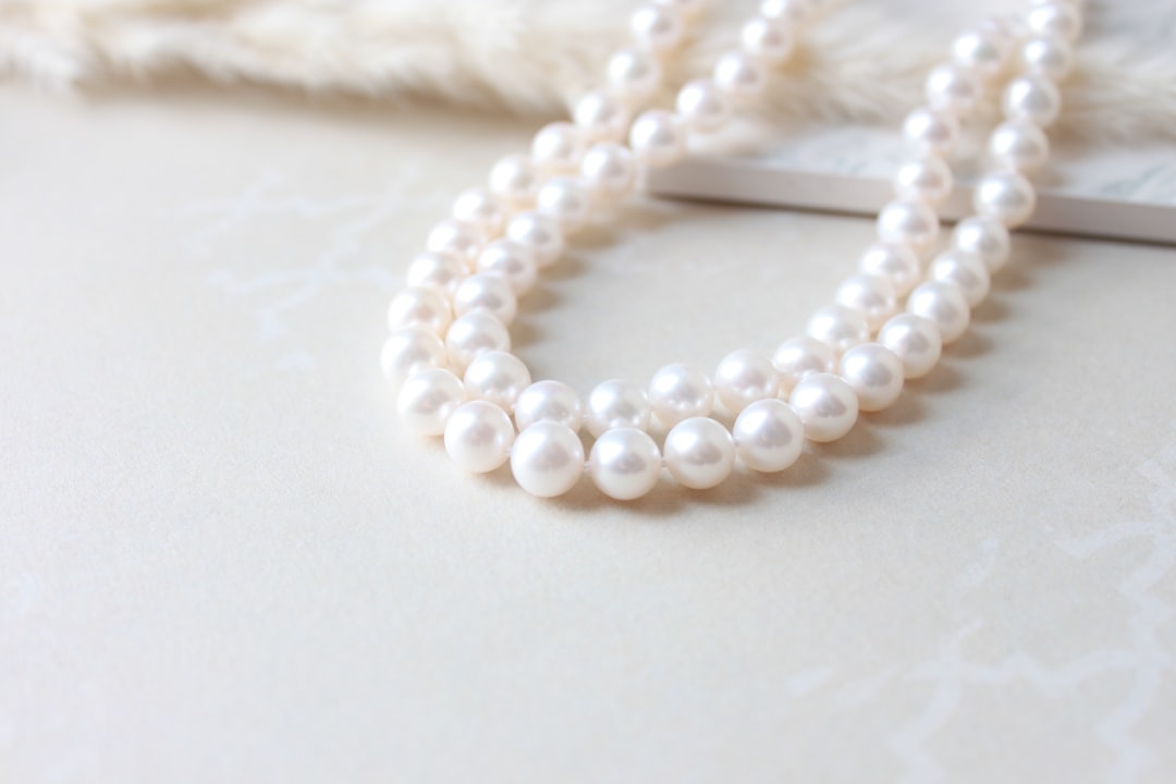
What is pearl?
Pearl is a soft, warm off-white taking its name from the gemstone, which is prized for its creamy color and iridescent luster. A representative web value is #EAE0C8, a gentle off-white with a warm, slightly golden-cream cast. What defines pearl is that warmth and softness: it is white pulled toward cream and warmth, with an associated sense of luster and glow that pure white lacks. As a gemstone name, pearl carries connotations of elegance, purity, and quiet luxury, which is why it reads softer and more refined than a stark pure white.
For how this soft neutral registers emotionally, our white color meaning guide covers the purity, cleanliness, and simplicity the whole white family conveys.
What is white?
White is the pure, neutral, maximum-bright value — the reflection of all light. The pure digital white is #FFFFFF, full red, green, and blue. Compared with pearl, pure white has no warmth, no cream, and no tint, so it reads as a crisp, clean, absolute light. It is the universal white of paper, backgrounds, and minimalist design — direct, neutral, and maximally bright. White is the broad family that pearl belongs to on its warmer, softened side.
Where pearl feels creamy and luxurious, pure white feels crisp and clinical, which is why the two read differently despite both reading as “white” at a glance.
What’s the difference between pearl and white?
The defining difference is warmth and luster. Pearl carries a warm, creamy cast and an associated soft glow; pure white has none, so it reads crisper, brighter, and more neutral. Here is a side-by-side with representative values — pearl spans a range, so treat these as reference points.
| Property | Pearl | White |
|---|---|---|
| Hex code | #EAE0C8 | #FFFFFF |
| RGB | 234, 224, 200 | 255, 255, 255 |
| CMYK | 0, 4, 15, 8 | 0, 0, 0, 0 |
| Undertone | Warm, creamy and slightly golden | None (neutral, absolute) |
| Hue family | Warm off-white (pearl) | Pure white |
| Best used for | Luxury, weddings, soft backgrounds, refined neutrals | Minimalism, clean UIs, maximum brightness, crisp backgrounds |
| Mood/feel | Warm, soft, elegant, lustrous | Crisp, clean, neutral, absolute |
When should you use each?
Use pearl when you want a white that feels warm and elegant rather than stark. Its creamy softness and luster suit luxury branding, wedding and beauty design, premium packaging, and backgrounds that should feel inviting rather than clinical. Pearl pairs beautifully with gold, blush, soft gray, and deep jewel tones that complement its warmth.
Use white when you want maximum brightness, neutrality, and crisp clarity. Pure white suits minimalist design, clean digital interfaces, high-contrast backgrounds, and any design where a neutral, maximally bright base is the goal. White pairs with everything — every accent and dark tone reads crisply against it.
To tell them apart in practice, look for warmth: if the white reads soft, creamy, and slightly golden, it is pearl; if it reads crisp, bright, and neutral, it is pure white. Our guide to warm vs cool colors explains how even a near-white carries a temperature.
How are pearl and white used across design?
In branding, pure white signals clarity, minimalism, and modernity — it dominates tech, healthcare, and clean editorial identities that want to feel crisp and neutral. Pearl signals refined, soft luxury, appearing in beauty, wedding, and premium brands that want a white with warmth and a sense of luster. Pure white reads clinical; pearl reads elegant.
In fashion and interiors, pearl is a warm, creamy off-white that reads soft and luxurious, flattering as a backdrop, fabric, or finish that avoids the coldness of pure white. Pure white is the crisp, modern absolute — the clean shirt, the gallery wall. Pearl adds warmth and softness; pure white adds sharpness.
In UI and digital, designers often choose a warm off-white like pearl for backgrounds because a true #FFFFFF can feel harsh and high-glare, especially in long-form reading. Pearl’s gentle warmth reads softer on the eye while still feeling light and clean. Pure white remains the choice for maximum-contrast, minimalist interfaces. Designers reach for pure white when they need crisp neutrality and pearl when they want a softer, more premium light. For related off-white boundaries, see our ivory vs white and off-white vs white comparisons.
How can you tell pearl and white apart?
The defining test is to look for warmth. Pearl shows a creamy, slightly golden cast — held next to pure white, it reads visibly warmer and softer, with a gentle glow. White has no tint, so it reads crisp, bright, and neutral by comparison. If a swatch looks soft and creamy with a hint of warmth, it is pearl; if it looks like clean printer paper or a bright screen, it is pure white.
A second check is association and context. Pearl evokes the gemstone, candlelight, and soft luxury — warm and lustrous. Pure white evokes paper, minimalism, and clinical clarity — crisp and neutral. Place both side by side and pearl will read as the warmer, softer of the two while pure white reads as the brighter, cleaner. The easiest tell is to set each against pure white directly: pearl will immediately reveal its creamy warmth, while a true white will disappear into the comparison.
Do pearl and white go together?
Yes — because pearl is essentially a warmer, softened member of the white family, pairing the two creates a layered, tonal light palette with depth. Pearl as a background with pure-white highlights reads elegant and soft, especially with gold or blush added to warm them further. Pearl provides the creamy warmth while pure white provides the crisp lift. Explore the wider range in our shades of white guide, see the dark-side gemstone equivalent in our onyx vs black comparison, and read color psychology for why whites feel pure, clean, and calm.
Frequently Asked Questions
Is pearl the same as white?
No. Pearl is a soft, warm off-white with a creamy, lustrous quality (around #EAE0C8), while pure white (#FFFFFF) is a crisp, neutral, maximum-bright value with no tint. Pearl is warmer and softer; pure white is cleaner and more absolute. The creamy warmth and luster are the defining differences.
Is pearl a warm or cool white?
Pearl leans warm. Its off-white body carries a creamy, slightly golden cast that gives it softness and an associated luster, unlike pure white, which is fully neutral. That warmth is what makes pearl read as an elegant, inviting off-white rather than a crisp, clinical white.
What is the hex code for pearl?
A common reference is #EAE0C8, a warm off-white with a creamy, slightly golden cast. Because pearl describes a soft gemstone white with luster rather than one fixed standard, it spans a range — from paler, near-white pearls to deeper, creamier versions that edge toward ivory or champagne.
Why use pearl instead of pure white in design?
A warm off-white like pearl often reads softer and easier on the eye than pure #FFFFFF, especially for backgrounds and long-form reading, where true white can feel harsh and high-glare. Pearl’s gentle warmth keeps a design feeling light and premium while reducing visual harshness and adding a sense of luxury.
What colors go with pearl?
Pearl pairs beautifully with gold, blush, soft gray, navy, and deep jewel tones like emerald. Its creamy warmth reads as an elegant backdrop that flatters metallics and rich colors, making pearl a versatile soft neutral in beauty, wedding, and luxury interior palettes.


