Citrine vs Yellow: What’s the Difference?
The citrine vs yellow question is a category-versus-member comparison: citrine is a particular golden shade, while yellow is the whole hue family. Citrine is a warm, golden-yellow tied to the quartz gemstone; pure yellow is the brightest primary-adjacent hue with maximum lightness. Side by side, citrine looks deeper and more golden, while pure yellow looks electric and neutral.
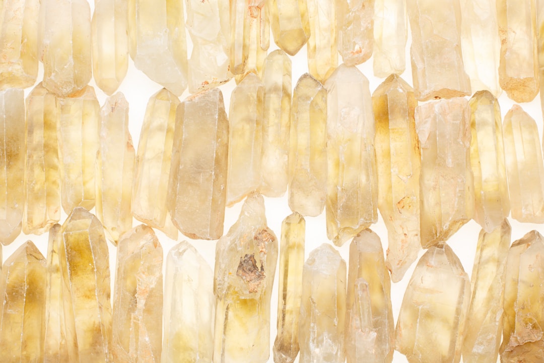
What is citrine?
Citrine is a warm, golden-yellow named after the citrine quartz gemstone, whose color ranges from pale lemon to rich amber. A widely cited value is #E4D00A, a saturated golden yellow with a slight green-gold cast and a hint of warmth that pure yellow lacks. That golden depth gives citrine a sunny, autumnal, slightly precious feel — richer and more grounded than electric yellow. It pairs naturally with warm neutrals, browns, deep greens, and gold.
If you are weighing citrine against neighboring warm yellows and golds, our comparison of amber vs gold covers how warmth and metallic shimmer change a golden hue.
What is yellow?
Yellow in its pure form is the brightest hue on the color wheel, made at full red and green with no blue. The HTML/CSS keyword “yellow” is #FFFF00 — maximum saturation and lightness, neither warm nor cool but simply intense. As a hue family, “yellow” spans everything from pale butter and lemon to mustard and gold; citrine is one warm, golden point within it. Pure yellow is foundational and attention-grabbing, which is why it reads as energy, caution, and optimism.
The defining contrast: citrine is one specific, warm, golden shade, while yellow is the entire hue category. For the underlying associations, our yellow color meaning guide explains how yellows signal optimism, warmth, and attention.
What’s the difference between citrine and yellow?
The defining differences are scope and warmth. Citrine is a narrow, golden, slightly amber shade; pure yellow is the broad, electric parent hue. Citrine glows warm and precious; pure yellow reads bright and neutral. Here is a side-by-side with representative values — neither is a fixed brand standard, so exact hexes vary.
| Property | Citrine | Yellow |
|---|---|---|
| Hex code | #E4D00A | #FFFF00 |
| RGB | 228, 208, 10 | 255, 255, 0 |
| CMYK | 0, 9, 96, 11 | 0, 0, 100, 0 |
| Undertone | Warm, golden/amber lean | Neutral, pure and electric |
| Hue family | Yellow (golden jewel tone) | Yellow (the parent hue) |
| Best used for | Warm/luxury accents, autumn palettes, packaging | Alerts, energetic branding, high-visibility design |
| Mood/feel | Warm, golden, rich, sunny | Bright, energetic, bold, attention-grabbing |
When should you use each?
Use citrine when you want warmth, richness, and a golden glow. Its amber-leaning depth suits luxury and beauty packaging, autumnal palettes, warm interiors, and designs where the yellow should feel precious rather than loud. Citrine pairs beautifully with deep green, brown, cream, and gold.
Use pure yellow when you want maximum brightness, energy, and visibility. Its electric intensity suits alerts and warnings, playful and youthful branding, call-to-action elements, and high-visibility signage where the yellow should grab attention. Pure yellow pairs sharply with black, white, and bold primaries.
To tell them apart in practice, check warmth and depth. Citrine is clearly more golden and slightly muted; pure yellow is brighter and cooler-feeling because of its neutrality. If you are balancing citrine against cool accents, our guide to warm vs cool colors explains how to keep a warm-yellow palette balanced.
How are citrine and yellow used across design?
In branding, citrine signals warmth, optimism with sophistication, and a touch of luxury — it appears in beauty, wellness, and premium food brands that want a golden, inviting identity. Pure yellow signals energy, friendliness, and attention, favored by playful, youthful, and value brands that want to feel approachable and bold. The choice maps onto whether a brand wants to read warm-refined or bright-energetic, a distinction explored in our color psychology guide.
In fashion and jewelry, citrine is a warm, flattering golden tone for autumn collections and statement gemstone jewelry. Pure yellow is a bold, playful color for summer pieces and standout accents that command attention. Both are yellows, but citrine reads rich while pure yellow reads vivid.
In interiors and web design, citrine warms a space as a golden accent — cushions, ceramics, or a feature detail — that glows against neutral surroundings. Pure yellow is harder to use at scale because its intensity can fatigue the eye, so it works best as a small, energetic pop. Print behavior differs too: pure yellow is a process primary that prints cleanly, while citrine’s golden cast may need careful CMYK or spot adjustment to hold its warmth.
Do citrine and yellow go together?
Yes — because citrine is a member of the yellow family, it harmonizes naturally with pure yellow in a tonal scheme. Pure yellow provides a bright highlight while citrine adds golden depth, creating contrast without clashing. Add brown, cream, or deep green to ground the combination, and keep a clear hierarchy: use citrine for richer areas and reserve pure yellow for small energetic accents. The result reads warm, sunny, and cohesive.
Frequently Asked Questions
Is citrine the same as yellow?
No. Citrine is a specific warm, golden-yellow (around #E4D00A) with an amber lean, while “yellow” is the broad hue family and its pure reference value (around #FFFF00). Citrine is always yellow, but most yellows are not citrine. The difference is scope and warmth: citrine is one golden, jewel-toned member of the larger yellow category.
Is citrine warm or cool?
Citrine is a warm yellow. Its golden, slightly amber undertone places it firmly on the warm side, giving it a rich, sunny character. Pure yellow is neutral — neither warm nor cool — but reads electric because of its full saturation. In comparison, citrine looks noticeably warmer and deeper than pure yellow.
What is the hex code for citrine?
A commonly cited value is #E4D00A, a saturated golden yellow with a slight green-gold cast. Citrine is not a fixed color standard, so gemstone and brand versions vary from pale lemon to rich amber. The CSS keyword “yellow” is the separate, brighter #FFFF00. Always confirm against brand guidelines for production.
Which is better for backgrounds?
Citrine is generally better for larger areas because its golden, slightly muted tone is easier on the eye than electric yellow. Pure yellow is so intense it can cause visual fatigue and reduce text legibility, so it works best reserved as a small, energetic accent rather than a full background.
Do citrine and yellow go together?
Yes, very well. Because citrine belongs to the yellow family, the two form a natural tonal pairing. Pure yellow adds a bright highlight while citrine adds golden depth. The combination reads warm and cohesive; ground it with brown, cream, or deep green and keep a clear hierarchy between the two yellows.


