Obsidian vs Black: What’s the Difference?
The obsidian vs black question is about the difference between a near-black with character and absolute black. Obsidian is a deep, glassy off-black named after volcanic glass — it carries a subtle cool, blue-gray undertone and a sense of depth, like polished stone. Pure black is #000000: zero light, fully neutral, with no undertone at all. Side by side, obsidian looks richer and slightly softer, while pure black looks flat and absolute.
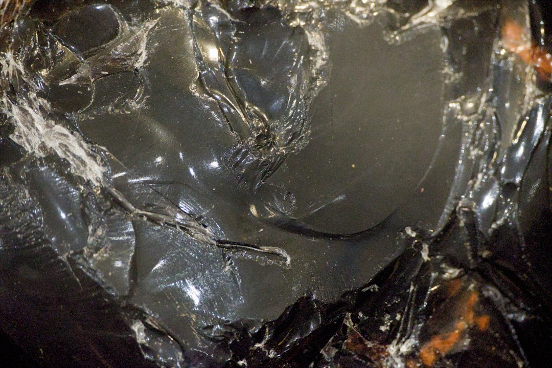
What is obsidian?
Obsidian is a very dark, glassy near-black named after the naturally occurring volcanic glass. A representative value is #0B1215 — almost black, but with a faint cool blue-gray cast that gives it depth and a polished, dimensional quality. The defining trait is that subtle undertone: obsidian never reads as a void the way pure black can, so it feels rich, premium, and a little softer on screen. It pairs beautifully with metallics, deep jewel tones, and crisp white.
If you are weighing obsidian against other dark near-blacks, our comparisons of onyx vs black and charcoal vs black cover the undertone and lightness distinctions in detail.
What is black?
Black in its pure form is the complete absence of light — the HTML/CSS keyword “black” is #000000, with red, green, and blue all at zero. It is perfectly neutral, with no warm or cool lean, and it is the darkest possible value a screen can produce. As a concept, “black” also serves as the reference point against which every off-black is measured: obsidian, onyx, charcoal, and jet are all described by how they deviate from this absolute. Pure black reads bold, definitive, and high-contrast.
The defining contrast: obsidian is a near-black with a cool undertone and depth, while pure black is the absolute, neutral darkest value. For the associations behind the color, our black color meaning guide explains how black signals power, elegance, and sophistication.
What’s the difference between obsidian and black?
The defining differences are undertone and depth. Obsidian carries a faint cool, blue-gray cast and a glassy richness; pure black is fully neutral and flat. Obsidian reads premium and dimensional; pure black reads bold and absolute. Here is a side-by-side with representative values — obsidian is not a fixed standard, so its exact hex varies.
| Property | Obsidian | Black |
|---|---|---|
| Hex code | #0B1215 | #000000 |
| RGB | 11, 18, 21 | 0, 0, 0 |
| CMYK | 48, 14, 0, 92 | 0, 0, 0, 100 |
| Undertone | Cool, faint blue-gray | None, fully neutral |
| Hue family | Near-black (off-black neutral) | Black (the absolute value) |
| Best used for | Premium branding, rich backgrounds, depth | High-contrast text, bold marks, pure neutrality |
| Mood/feel | Rich, glassy, premium, dimensional | Bold, definitive, neutral, absolute |
When should you use each?
Use obsidian when you want a sophisticated near-black with depth — a dark that feels rich and premium rather than stark. Its subtle cool undertone suits luxury branding, dark-mode interfaces, photography backdrops, and packaging where a flat black would feel cheap or harsh. Obsidian pairs strikingly with gold, silver, deep emerald, and crisp white.
Use pure black when you want maximum contrast, neutrality, and definition. Its absolute value suits body text, bold logos, high-contrast UI, and any context where the black should read as a clean, unambiguous neutral. Pure black pairs sharply with white and bright accent colors.
To tell them apart in practice, place them side by side on a white field: obsidian shows a faint blue-gray softness and depth, while pure black reads as a flat void. If you are building a dark palette, our guide to warm vs cool colors explains how an undertone like obsidian’s keeps a near-black from feeling lifeless.
How are obsidian and black used across design?
In branding, obsidian signals luxury, depth, and craftsmanship — it appears in premium, tech, and lifestyle brands that want a dark identity with richness rather than flatness. Pure black signals power, authority, and timeless simplicity, favored by fashion, editorial, and high-contrast brands that want a definitive mark. The choice maps onto whether a brand wants to read rich-premium or bold-absolute, a distinction explored in our color psychology guide.
In fashion, obsidian reads as a deep, expensive near-black for tailored and evening pieces that catch light with subtle dimension. Pure black is the classic, versatile staple — the definitive “little black dress” neutral. Both are dark, but obsidian feels glassy and layered while pure black feels clean and absolute.
In interiors and web design, obsidian makes a luxurious dark background or accent wall because its faint undertone adds depth and avoids the harshness of a flat void; it also softens dark-mode UI so large black areas feel rich rather than oppressive. Pure black delivers maximum contrast for text and bold elements. Print behavior differs too: true #000000 is hard to achieve in print, where a “rich black” with added CMY is often used for depth — obsidian’s blue-leaning mix is itself close to a designer’s rich black, while pure black can look thin on coated stock.
Do obsidian and black go together?
Yes — because obsidian is essentially a near-black, it layers seamlessly with pure black in a tonal, monochromatic scheme. Pure black provides the deepest anchor while obsidian adds a slightly softer, dimensional layer, creating subtle depth in an all-dark palette without clashing. Add metallics or a single jewel tone to lift the combination, and use pure black for crisp text over obsidian backgrounds. The result reads premium and refined. See our charcoal vs black comparison for a related dark-neutral pairing.
Frequently Asked Questions
Is obsidian the same as black?
No. Obsidian is a deep near-black with a faint cool, blue-gray undertone and glassy depth (around #0B1215), while pure black is the absolute absence of light (#000000) with no undertone. Obsidian reads richer and slightly softer; pure black reads flat and neutral. Obsidian is an off-black, not true black.
Is obsidian warm or cool?
Obsidian is a cool near-black. It carries a subtle blue-gray undertone that gives it a glassy, premium depth, placing it on the cool side of the dark neutrals. Pure black has no undertone at all and is perfectly neutral. In comparison, obsidian looks slightly cooler and richer than flat black.
What is the hex code for obsidian?
A representative value is #0B1215, an almost-black with a faint cool cast. Obsidian is not a fixed color standard, so brand and paint versions vary around this very dark value. Pure black is the separate, absolute #000000. Always confirm against brand guidelines, and note that obsidian behaves much like a “rich black” in print.
Which is better for backgrounds?
Obsidian is often better for large dark backgrounds and dark-mode interfaces because its faint undertone adds depth and avoids the harsh, flat feel of pure black across big areas. Pure black is better for crisp text and bold elements where maximum contrast and clean neutrality matter most.
Do obsidian and black go together?
Yes, very well. Because obsidian is essentially a near-black, the two layer seamlessly in a tonal dark scheme. Pure black anchors the deepest values while obsidian adds a softer, dimensional layer. The combination reads premium; lift it with metallics or a single jewel tone and use pure black for crisp text over obsidian areas.


