DIN vs Helvetica: Industrial vs Neutral Sans
The din vs helvetica comparison is really a contest between two kinds of objectivity. DIN is objective in the engineering sense: standardized, condensed, and built for road signs and machinery. Helvetica is objective in the design sense: neutral, balanced, and meant to disappear into any context. Both avoid decoration, but they radiate very different attitudes.
What is DIN?
DIN traces back to the German industrial standard DIN 1451, established in the 1930s for signage, technical drawings, and administration. Its forms are narrow, mechanical, and stripped of flourish, reflecting an engineer’s priorities rather than a typographer’s. The most popular modern revival is FF DIN, drawn by Albert-Jan Pool in 1995, which refined the standard’s letterforms into a versatile commercial family while preserving the condensed, no-nonsense character and signage heritage. DIN reads as precise, technical, and confidently industrial.
What is Helvetica?
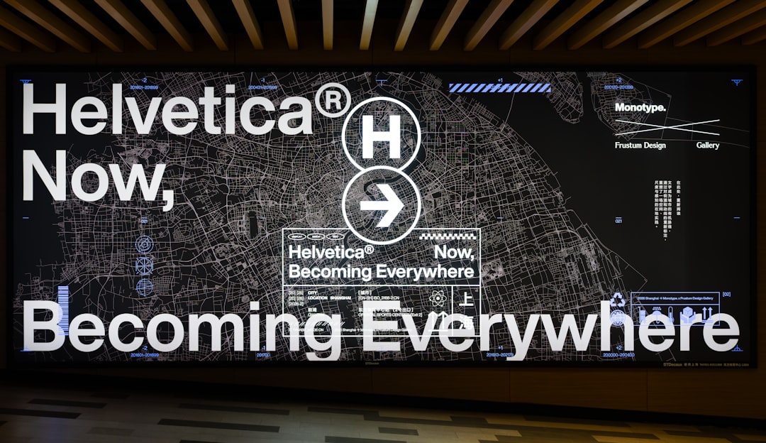
Helvetica was designed by Max Miedinger and Eduard Hoffmann in 1957 at the Haas Type Foundry in Switzerland. It is the definitive neo-grotesque sans-serif: neutral, tightly spaced, and remarkably even in color, with horizontal and vertical terminals that give it a calm, unobtrusive presence. Helvetica became one of the most ubiquitous typefaces in the world, used across corporate identity, signage, transit, and print. It is commercial, though the free near-clone Arial mimics its metrics, and modern free faces like Roboto and Inter serve as contemporary stand-ins.
What’s the difference between DIN and Helvetica?
DIN is narrow and engineered with a signage backbone; Helvetica is wider and neutral with a design-world pedigree. DIN announces precision; Helvetica announces nothing, which is its whole point.
| Property | DIN | Helvetica |
|---|---|---|
| Classification | Industrial / engineered sans | Neo-grotesque sans-serif |
| Designer / year | DIN 1451 standard, 1930s; FF DIN by Albert-Jan Pool, 1995 | Miedinger & Hoffmann, 1957 (Haas) |
| X-height | Moderate, condensed proportions | Moderate, even and balanced |
| Letterform feel | Narrow, technical, no-nonsense | Neutral, calm, ubiquitous |
| Best used for | Signage, technical, modern editorial | Corporate identity, wayfinding, print |
| Availability / license | Commercial (FF DIN and licensors) | Commercial (Arial is free near-clone) |
When should you use each?
Use DIN when you want a precise, engineered, slightly editorial edge: transportation and signage projects, technical brands, sports and automotive design, and headlines that benefit from its narrow, confident rhythm. Use Helvetica when you want maximum neutrality and timelessness, where the type should support the message without imposing a personality, such as corporate systems and clean print layouts. DIN’s condensed forms also save horizontal space, which is handy for tight signage and tabular layouts.
Which is better for body text / on screen?
Helvetica is generally the safer body-text choice because its even, balanced proportions are designed for unobtrusive reading, though classic Helvetica can feel tight on screen and many teams prefer modern stand-ins like Inter or Roboto for digital body copy. DIN can absolutely set text, especially FF DIN’s text-tuned weights, but its narrowness suits captions, labels, and signage more than long paragraphs. For lengthy reading, lean Helvetica or a modern neo-grotesque.
Are DIN and Helvetica free?
Neither is free in its authentic form. FF DIN and licensed Helvetica both require commercial licenses. However, free substitutes exist: Arial closely matches Helvetica’s metrics and ships on most systems, while open fonts like Roboto and Inter offer modern neutral alternatives. For DIN, free options such as Oswald or certain condensed grotesques approximate the look. See our font licensing guide and the original’s context in our Helvetica font guide.
Frequently Asked Questions
Is DIN a grotesque like Helvetica?
Not exactly. Helvetica is a neo-grotesque designed for neutrality, while DIN is an engineered, standards-derived sans with industrial roots. They share a clean, unornamented look, but DIN’s narrow, technical proportions and signage heritage give it a more specialized, mechanical character than Helvetica’s deliberately universal neutrality.
Why does DIN look on so many road signs?
DIN’s letterforms come from the German DIN 1451 standard created in the 1930s for signage and technical use, so it was literally engineered for legibility on signs and at speed. That origin is why DIN-based type still feels at home on roads, transit systems, and wayfinding, and why FF DIN carries that authoritative, infrastructural tone.
Which font is more neutral?
Helvetica is more neutral. It was designed to recede and let content speak, which is why it became a default for corporate and institutional design. DIN has a stronger, more technical personality due to its narrow, engineered shapes. If you want type that imposes no mood, choose Helvetica; if you want subtle industrial character, choose DIN.
What is the best free alternative to FF DIN?
There is no perfect free DIN, but condensed grotesques like Oswald on Google Fonts capture much of its narrow, engineered feel for headlines and signage-style work. For technical or tabular needs, pairing a condensed display face with a neutral text sans works well. Browse comparable free picks in our best sans-serif fonts list.
How does Helvetica compare to other neutral sans?
Helvetica is the benchmark neutral sans, but modern free faces have caught up for screen use. If you are weighing it against contemporary stand-ins, our Helvetica vs Roboto comparison shows how a 1957 classic differs from a screen-native open-source alternative.


