What Font Does DHL Use?
If you have ever watched a yellow van blur past, you already know the DHL font even if you have never seen its name. The red “DHL” letters are engineered for one job: reading fast at a distance, in motion. Like most logistics identities, what looks like a typeface is actually bespoke artwork. This guide is part of our famous brand fonts series, and it breaks down the wordmark, the reported corporate typeface, and free fonts that get you close.
What font is the DHL logo?
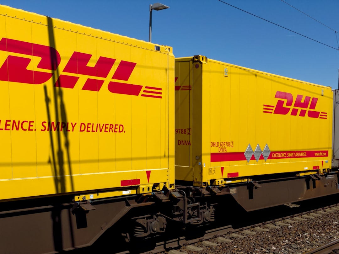
The DHL logo wordmark is custom, trademarked lettering rather than a stock font. The three letters are a heavy, slightly forward-slanting (italic-leaning) sans with rounded terminals and tight, even spacing. That subtle rightward lean is doing strategic work: it reads as momentum and forward motion, which is exactly what a delivery company wants to signal. The letterforms are simplified and chunky, with generous counters inside the D so the shape survives at small sizes and on curved surfaces. Because it is a registered mark, you will not find an official “DHL” font file to install, and the proportions have been hand-tuned rather than typed.
What is DHL’s brand typeface?
Beyond the logo, Deutsche Post DHL uses a corporate type system for headlines, signage and documents. This is typically reported as a clean, neutral sans-serif chosen for clarity across many languages and print conditions; precise foundry details are not publicly published and tend to be locked inside brand guidelines. The safest way to describe it is “a humanist-to-grotesque corporate sans” rather than naming a single face with certainty. What matters for anyone recreating the look is the recipe: a sturdy, low-contrast sans with open apertures, set in DHL red (#D40511) on DHL yellow (#FFCC00). That color pairing carries more brand recognition than any single glyph.
Free fonts that look like the DHL font
You cannot legally reuse the actual wordmark, but you can approximate the energetic, rounded-industrial feel with free, openly licensed faces. Aim for weight, slight roundness and confident spacing.
| Use case | DHL uses | Free alternative |
|---|---|---|
| Logo / wordmark | Custom bold, slightly italic rounded sans (trademarked) | Nunito (Bold/Black) for the rounded feel, or Archivo Black faux-italicized |
| Headlines | Reported corporate grotesque sans | Archivo (Bold) or Roboto (Bold) |
| Body / packaging | Neutral legible sans | Roboto or Inter at regular/medium weights |
Why does DHL use this kind of type?
Logistics branding lives or dies on speed of recognition. A parcel sorter, a driver and a customer all need to identify DHL in a fraction of a second, often at odd angles or small sizes. A heavy, rounded sans with a forward lean reads as fast, friendly and dependable all at once: round terminals soften the industrial heaviness, while the slant injects motion. The extreme yellow-and-red contrast then does the long-distance work no typeface can do alone. It is the same logic behind other transport and beverage giants who lean on bold, simple letterforms; if you like this approach, our guide to the best sans-serif fonts covers similar workhorse choices.
Can I use the DHL font for my own project?
No. The DHL wordmark is a registered trademark, and even if you found a font that matched it perfectly, setting your own brand in DHL’s logo style could create trademark and passing-off problems. The letters themselves are custom artwork, so there is nothing to “license” as a font in the first place. For your own work, pick one of the free alternatives above and build a distinct identity in DHL red and yellow only if you are clearly not impersonating a courier. For the full breakdown of what is and is not allowed, see our font licensing guide.
Frequently Asked Questions
Is the DHL font available to download?
No. The DHL logo is custom, trademarked lettering, not a released typeface, so there is no official file to install. The corporate font used in brand materials is licensed internally and not distributed to the public. To get close, designers use free rounded or grotesque sans-serifs such as Nunito, Archivo or Roboto in heavy weights.
What is the slight slant in the DHL logo called?
It is an oblique or italic-leaning treatment, a forward tilt applied to the letters. Many transport brands use this to suggest forward motion and speed. In DHL’s case the lean is gentle rather than a true cursive italic, which keeps the wordmark stable and legible while still feeling energetic on moving vehicles.
What colors go with the DHL font?
DHL’s identity pairs a bright red wordmark (around #D40511) with a saturated yellow field (around #FFCC00). That contrast is the most recognizable part of the brand and carries more recognition than the letterforms themselves. If you are evoking the look legitimately, lead with the color relationship and a bold, rounded sans.
Which free font is closest to DHL?
For the rounded, friendly weight of the wordmark, Nunito in Bold or Black is the easiest match. For headline and supporting text that feels corporate and neutral like DHL’s wider system, Archivo or Roboto in bold weights work well. None will be identical, because the real letters are hand-built custom artwork.
Why is the DHL logo so simple?
Simplicity is functional. A three-letter, heavy, high-contrast mark reads instantly on trucks, packages and signage at speed, in poor light, and at small sizes. Reducing detail makes the brand reproduce cleanly across every surface in global logistics, from a printed label to a giant warehouse sign, which is why the design avoids fine strokes or decorative flourishes.