Summer Color Palettes (With Hex Codes)
Summer color is all about light, energy, and escape — the saturated brights of beach towels, the cool blues of pools, and the warm glow of golden hour. A strong set of color palettes for summer brings that vacation feeling to branding, weddings, packaging, and digital design. The principle: pair clean, cool blues and greens with one warm, sun-soaked accent like coral or sunny yellow for instant seasonal energy.
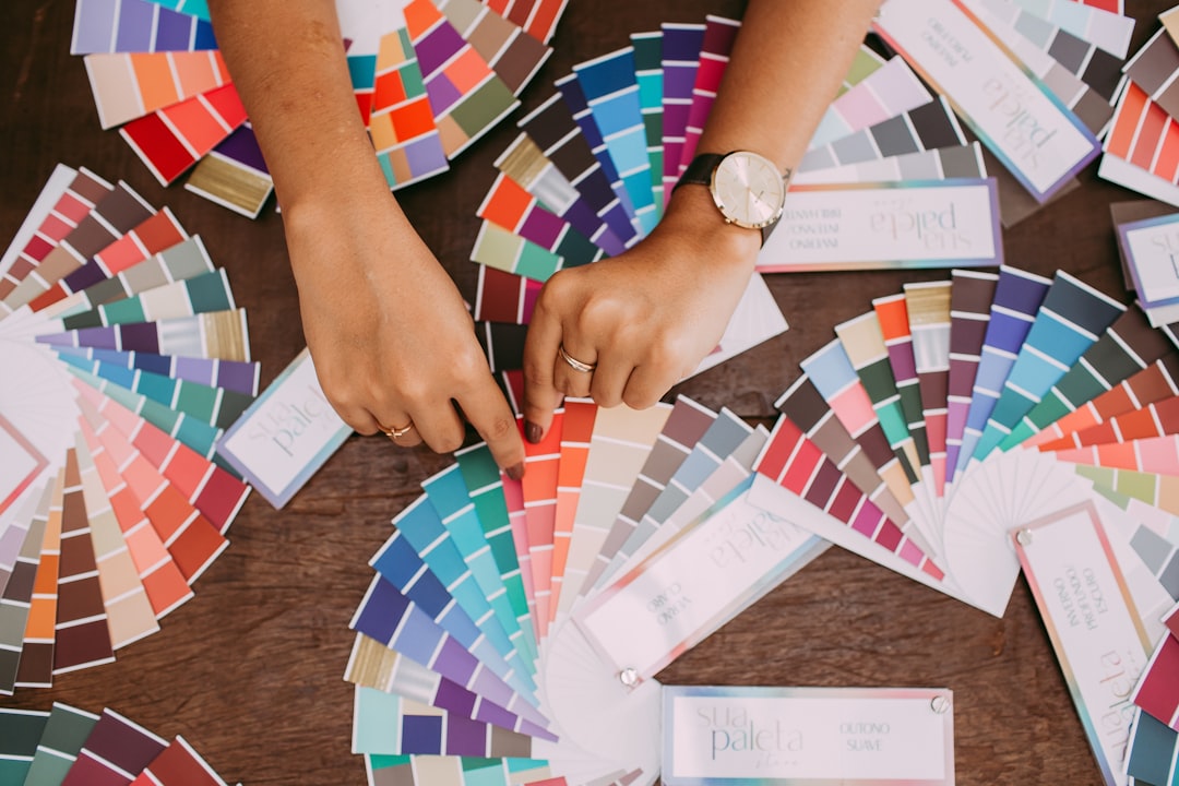
How to choose a summer color palette
Build around three to four colors: a bright dominant, a cool counterpart (aqua, sky, or teal), a warm accent, and a clean neutral. Summer palettes can run more saturated than other seasons — high-energy brights feel joyful rather than garish here. Use the 60-30-10 rule so one hue leads while the others support. Match the mood: tropical brights feel playful, soft pastels feel breezy, sandy neutrals feel relaxed. For pairing cool and warm tones, see warm vs cool colors.
Coral & Turquoise
The quintessential summer pairing — warm coral against cool turquoise reads instantly as beach, sun, and sea.
Hex: #FF6F61, #1AB6B6, #FFD166, #FBF6EE — #FF6F61 leads, #1AB6B6 cool counterpart, #FFD166 sunny accent, #FBF6EE clean background.
Tropical Punch
Loud, juicy, and joyful — saturated fuchsia, lime, and orange capture the energy of a fruit stand in July.
Hex: #FF2E88, #FF8C1A, #7ED957, #00B4D8 — rotate these saturated brights for playful, high-energy branding; let one lead and others accent.
Sandy Beach
Soft, sun-bleached, and relaxed — warm sand and sky-blue neutrals feel like a calm morning by the shore.
Hex: #E7D3A8, #C9A66B, #9CC5D4, #FBF8F1 — #E7D3A8 sand leads, #C9A66B deeper tan, #9CC5D4 sky-blue accent, #FBF8F1 airy background.
Sunny Citrus
Bright and zesty — lemon and orange with a pop of green feel cheerful, fresh, and full of vitamin D.
Hex: #FFD000, #FF9505, #6ABF4B, #FFFAF0 — #FFD000 lemon leads, #FF9505 orange accent, #6ABF4B leafy green, #FFFAF0 bright background.
Ocean Breeze
Cool, calm, and refreshing — layered blues and aqua evoke clear water and big summer skies.
Hex: #0077B6, #48CAE4, #ADE8F4, #FEF9EF — #0077B6 deep ocean base, #48CAE4 and #ADE8F4 aqua layers, #FEF9EF warm sand neutral. More shades of blue.
Sunset Sorbet
Soft, dreamy, and golden-hour pretty — peach, pink, and lavender capture a warm summer evening sky.
Hex: #FF9A76, #FF7EB3, #B388EB, #FFF3E6 — #FF9A76 peach leads, #FF7EB3 pink and #B388EB lavender add gradient warmth, #FFF3E6 soft cream base.
Tips for using these summer palettes
Summer is the one season where high saturation works in your favor — lean into bright, cheerful hues rather than muting them. Balance hot accents like coral or fuchsia with cool blues and plenty of clean white or cream space so the palette feels fresh, not overwhelming. For weddings and decor, pull in natural textures like rattan, linen, and greenery. Test brights on screen and in print, since neon tones can shift between mediums. Dive deeper with our color theory guide and explore how hues set mood in color psychology.
Frequently Asked Questions
What colors represent summer?
Summer is defined by bright, saturated hues: coral, turquoise, sunny yellow, hot pink, lime green, and clear sky blue, often paired with sandy neutrals. These colors evoke beaches, pools, tropical fruit, and golden-hour sunsets. They can run more vivid than other seasons without feeling overdone.
What is a good summer wedding color palette?
Coral and turquoise with cream is a fresh, beachy choice, while sunset sorbet tones of peach, pink, and lavender feel romantic and warm. Pair brights with plenty of white space and natural textures like rattan and greenery for a relaxed, celebratory summer feel.
How do I keep bright summer colors from looking garish?
Let one bright lead and use the others as accents rather than all at full strength. Balance hot tones with cool blues and generous neutral or white space so the eye can rest. Slightly softening one or two hues toward pastel also keeps a vivid palette polished.
What summer palette works for a calm, relaxed brand?
Sandy Beach and Ocean Breeze are ideal — soft sand neutrals, sky blue, and gentle aqua feel breezy and serene rather than loud. These cooler, lower-energy palettes suit spas, coastal brands, and wellness products that want a restful summer mood.
Can I use pastels for a summer palette?
Yes — soft peach, sky blue, mint, and lavender create a breezy, dreamy summer feel that’s lighter than tropical brights. Pastels work especially well for weddings, beauty, and lifestyle brands. Add one slightly stronger accent so the palette still has energy and focus.