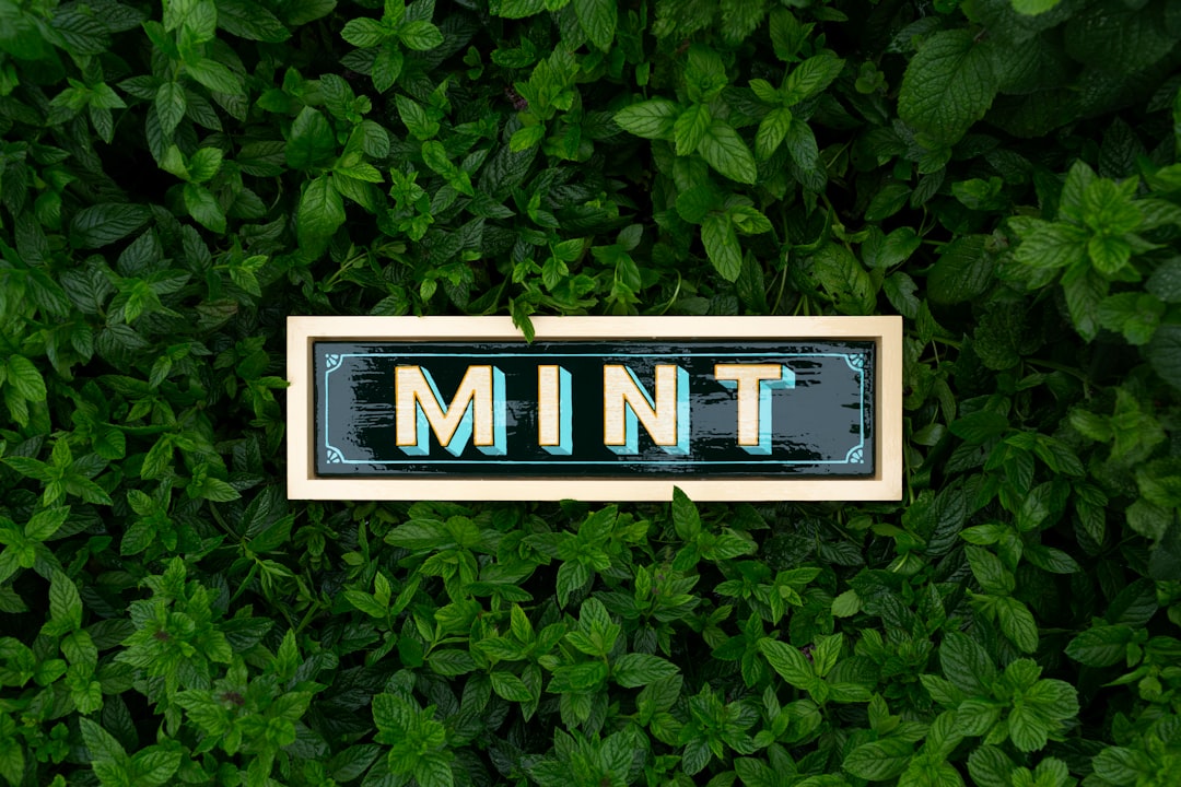
Mint Color Meaning and Symbolism
Mint takes its name from the herb, evoking its crisp scent and cool, refreshing character. Mint color meaning centers on cleanliness, renewal, and gentle tranquility. Mint is a soft green with a slight blue undertone, which gives it a cool, airy quality that feels both natural and modern. It reads as light, hygienic, and calmly optimistic. Compared with deeper forest greens that feel dense and grounded, mint feels weightless and breezy, which is why it is so often used to suggest a sense of openness and renewal.
What does mint symbolize?
Mint symbolizes freshness, calm, renewal, and cleanliness. As a tint of green with cool undertones, it inherits green’s connection to nature, growth, and health while adding a crisp, spa-like sense of purity. Mint is widely associated with new beginnings, hygiene, and a refreshed state of mind. Its pale, gentle character also lends it a youthful, contemporary feel, making it a symbol of lightness and clarity rather than the deep, grounded qualities of darker greens.
The psychology of mint
Psychologically, mint is one of the most calming and restorative colors. It combines green’s balancing, reassuring qualities with the cooling, soothing effects of blue, producing a tone that lowers stress and feels refreshing. Mint can make spaces feel cleaner, more open, and more relaxed, which is why it appears so often in bathrooms, healthcare settings, and wellness products. It also signals freshness and revitalization, subtly suggesting health and a clear, uncluttered mind. For more on how cool greens affect mood, see our guide to color psychology.
Mint symbolism across cultures
Mint’s symbolism draws heavily on the herb itself, which across many cultures represents healing, hospitality, and protection. In ancient Mediterranean traditions, mint was tied to refreshment and was used to welcome guests, while in some folk customs it symbolized virtue and good health. As a color, mint generally inherits green’s broad associations with nature, growth, and harmony. These meanings can shift by region, but the recurring themes of freshness, healing, and renewal make mint a consistently positive and gentle color across most cultural contexts. The color also carries seasonal associations with spring, when new growth emerges in soft, pale greens, reinforcing its links to beginnings and rejuvenation in the cultural imagination.
Positive and negative associations of mint
| Positive | Negative |
|---|---|
| Freshness and cleanliness | Can feel cold or clinical |
| Calm and relaxation | May seem weak or insubstantial |
| Renewal and health | Sometimes reads as overly trendy |
| Lightness and clarity | Lacks warmth and energy |
Mint in branding and marketing
Mint is a popular choice for brands that want to communicate freshness, health, and a clean, modern aesthetic. It is common in oral care, cosmetics, skincare, and cleaning products, where it reinforces ideas of hygiene and revitalization. Wellness, healthcare, and eco-friendly brands use mint to signal calm, nature, and sustainability. In recent years, mint has also become a favorite in tech and lifestyle branding for its fresh, friendly, and contemporary feel, often paired with white space for a clean, minimal look. Because mint feels both calming and youthful, it appeals to brands targeting wellness-minded and design-conscious audiences, and it photographs and renders well on screens, holding its soft character across packaging, apps, and social media without becoming harsh.
Colors that go well with mint
Mint pairs gracefully with both soft and bold tones. Coral (#FF7F50) provides a warm, energetic contrast that makes mint feel lively and modern. White (#FFFFFF) enhances its clean, airy character. Navy (#1F2D5A) grounds mint and adds sophistication, while blush pink (#F7CAC9) creates a soft, fresh pastel palette. For more structured pairing ideas, explore our guide to complementary colors.
Shades and variations of mint
Mint spans a range from barely-there pastels to richer greens. Mint cream (#F5FFFA) is almost white with a hint of green. Spearmint (#3EB489) is deeper, cooler, and more saturated. Seafoam (#9FE2BF) leans slightly toward blue-green, and pistachio (#93C572) shifts warmer and more yellow. Aquamarine mint (#7FFFD4) trends toward cyan. These variations let designers tune mint from delicate and clean to vivid and refreshing. See how greens relate within color theory.
Frequently Asked Questions
What does the color mint mean?
Mint means freshness, calm, renewal, and cleanliness. As a pale, cool green, it combines nature’s growth and balance with a crisp, hygienic quality. It often symbolizes new beginnings, health, and a refreshed, uncluttered state of mind, giving it a light and revitalizing feel.
What emotions does mint evoke?
Mint evokes feelings of calm, refreshment, clarity, and relaxation. Its cool, soft tone soothes and lowers tension, making spaces feel clean and open. Occasionally it can feel cold or clinical, but in most contexts it creates a gentle, restorative, and optimistic emotional response.
What colors go with mint?
Mint pairs well with coral (#FF7F50) for warm contrast, white (#FFFFFF) for a clean look, navy (#1F2D5A) for sophistication, and blush pink (#F7CAC9) for a soft pastel scheme. These combinations highlight mint’s freshness while balancing its cool, light character.
Is mint warm or cool?
Mint is a cool color. Although it is a green, its blue undertone pushes it firmly toward the cool side of the spectrum, giving it a crisp, refreshing, spa-like quality. This coolness is central to its calming and clean associations. Learn more in our guide to warm vs cool colors.
Why is mint associated with cleanliness?
Mint is associated with cleanliness because of the herb’s crisp, fresh scent and its long use in oral care and hygiene products. The pale green color reinforces ideas of purity, freshness, and a clear, sanitized environment, which is why it appears so often in toothpaste, soaps, and cleaning brands.


