Newsletter Design Principles That Work
A newsletter has to deliver several pieces of content without overwhelming a reader who is skimming. The difference between a newsletter people read and one they delete usually comes down to structure: a recognizable masthead, an obvious lead story, and sections clear enough to scan in seconds. Strong newsletter design principles organize varied content into a predictable, repeatable layout, whether the newsletter lands in an inbox or arrives in print, so readers always know where to look and what to do next.
The key principles of newsletter design
These seven principles keep both email and print newsletters organized, readable, and engaging issue after issue.
| Principle | Why it matters |
|---|---|
| Clear masthead | Establishes identity and orients the reader instantly |
| One lead story | Gives the issue a clear focus and entry point |
| Scannable sections | Lets readers skim and find what interests them |
| Consistent columns | Creates a predictable, professional structure |
| Clear hierarchy | Signals what to read first within each section |
| Balanced text and images | Keeps the layout inviting rather than dense |
| Single call to action | Directs readers toward one clear next step |
1. Open with a clear masthead
The masthead is the newsletter’s nameplate, and it should appear consistently at the top of every issue. A recognizable logo, title, and issue date or number orient readers immediately and build familiarity over time. Keep the masthead clean and let it set the tone; readers who recognize it at a glance are more likely to keep reading.
2. Lead with one main story
Every issue needs a focal point. Choose one lead story and give it the most prominent position, the largest headline, and a supporting image so the reader has an obvious place to start. Without a clear lead, a newsletter becomes a flat list of equal items that gives the eye nowhere to land. The lead story anchors the issue and earns the first scroll or page turn.
3. Break content into scannable sections
Most readers skim, so divide the newsletter into clearly labeled sections with descriptive subheads, short paragraphs, and consistent spacing. Recurring sections that appear in the same place each issue help loyal readers jump straight to what they like. Strong subheads and chunked content let someone grasp the whole issue in a quick pass, then dive into the parts that interest them.
4. Keep columns and layout consistent
A consistent column structure, often one column for email and two or three for print, gives the newsletter a dependable rhythm. Reusing the same grid issue after issue makes production faster and the result more polished. Consistency in column widths, margins, and spacing signals professionalism and keeps the reading experience smooth as the eye moves down the page.
5. Build clear visual hierarchy
Within every section, hierarchy guides the reader from the most important element to the least. Use size, weight, and color to distinguish headlines, subheads, and body copy, and apply the same visual hierarchy consistently across the issue. When the structure is clear, readers absorb the newsletter effortlessly instead of having to work out what matters on each page.
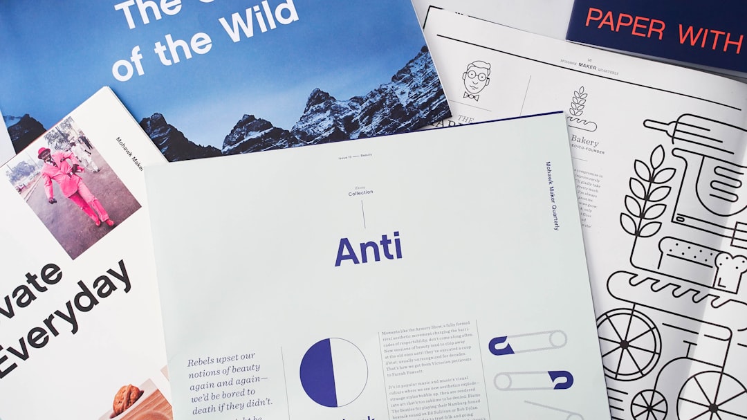
6. Balance text with images and white space
A wall of text discourages reading, while images, pull quotes, and generous white space make the layout inviting. Pair stories with relevant visuals, but avoid overcrowding; the space between elements is what keeps a content-rich newsletter from feeling cramped. Aim for a comfortable balance so the design supports the writing rather than burying it.
7. End with a single clear call to action
A newsletter should move readers toward a next step, whether that is reading the full article, registering for an event, or replying. Feature one primary call to action rather than several competing buttons, and make it stand out with contrast and clear copy. If your newsletter is an email, design it mobile-friendly with a single column and large tappable links; our email design principles cover that side in depth.
Common newsletter design mistakes to avoid
- Treating every story as equally important, so the issue has no clear lead or entry point.
- Packing in long unbroken text with no subheads, making the newsletter impossible to skim.
- Changing the layout and section order every issue, breaking reader familiarity.
- Adding too many competing calls to action so readers do not know what to do next.
Frequently Asked Questions
What are the most important newsletter design principles?
The most important principles are a clear consistent masthead, one prominent lead story, and content broken into scannable sections. Maintaining consistent columns, strong hierarchy, a balance of text and images with white space, and a single clear call to action keeps each issue easy to skim and act on.
Should a newsletter use one column or multiple columns?
Email newsletters generally work best as a single column, since it reflows reliably on mobile and across email clients. Print newsletters can use two or three columns to fit more content and create a traditional editorial feel. Whichever you choose, keep the column structure consistent from issue to issue.
How long should a newsletter be?
Keep it focused enough to be read in a few minutes. Lead with one main story and include a handful of shorter items rather than overwhelming readers. For email, shorter is usually better, with links out to full articles; print newsletters can run longer but should still be tightly edited and scannable.
What is the difference between a newsletter and a regular marketing email?
A newsletter organizes several stories into recurring scannable sections under a masthead, while a marketing email typically pushes one offer with one call to action. Newsletters prioritize ongoing engagement and editorial structure, organizing recurring sections so readers know exactly where to find their favorite content each issue.
How do I make a newsletter easy to scan?
Use descriptive subheads, short paragraphs, consistent recurring sections, and clear hierarchy so the most important items stand out. Add white space between sections and pair stories with images. These structural cues let readers grasp the whole issue at a glance, then read only the parts that interest them.


