Best New Year Fonts: 20+ Glamorous Typefaces for NYE Design
Every December, designers face the same challenge: how do you capture the glamour, excitement, and fresh-start optimism of New Year’s Eve in type? The right new year fonts set the tone for everything from party invitations and social media countdowns to branded holiday campaigns and editorial spreads. The wrong ones make a champagne-and-sequins event look like a dental office newsletter.
New Year’s Eve design draws on a specific visual vocabulary — gold foil, silver glitter, midnight black, crystal clarity, and the energy of a fresh start. The typefaces that work best in this context tend to fall into a few reliable categories: art deco display faces that echo the sophistication of a 1920s ballroom, elegant scripts that convey handwritten invitation charm, high-contrast serifs that channel editorial glamour, and clean modern sans-serifs that keep things contemporary. This guide covers 20+ fonts across those categories, with pairing advice and practical tips for using them in your NYE designs.
What Makes a Great New Year Font
Before diving into individual typefaces, it helps to understand what separates a strong new year font from a generic decorative face. The best celebration fonts share a few qualities.
First, they have a sense of occasion. New Year’s Eve is the most glamorous night on the calendar, and the typography needs to feel like it dressed up for the event. That usually means display typefaces with personality — high contrast, distinctive letterforms, or decorative details that reward a second look. Body-copy workhorses like Arial or Georgia, however well-designed, do not communicate celebration.
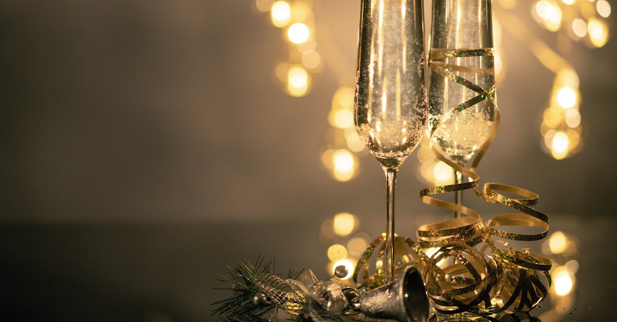
Second, strong NYE fonts work with the standard New Year colour palette. Gold, silver, black, white, and deep midnight blue are the dominant colours in celebration design, and the best typefaces have the structural clarity to look sharp when rendered in metallic textures, set against dark backgrounds, or embossed on heavy card stock. Typefaces with very thin hairlines or intricate details can fall apart when gold foil or glitter textures are applied.
Third, the best nye fonts pair well with each other. A great New Year’s invitation or social graphic usually combines a statement headline typeface with a quieter supporting font. The fonts in this guide have been chosen partly because they play well together.
Art Deco and Gatsby-Era Fonts
Nothing says “black tie celebration” like art deco typography. The geometric precision, vertical emphasis, and decorative elegance of 1920s and 1930s type design are a natural fit for New Year’s Eve, evoking champagne towers, jazz orchestras, and the kind of parties where everyone looks impossibly sophisticated. These art deco faces are among the most popular new year fonts for good reason.
Poiret One
Poiret One is a geometric display typeface with a distinctly art deco personality. Its letterforms are built from clean circles and straight lines, with uniform stroke widths that give it an architectural quality. The uppercase letters are particularly striking — elegant, elongated, and unmistakably 1920s. Poiret One is available free through Google Fonts, making it an excellent choice for designers working on a budget.
Use Poiret One for headline text on invitations, event posters, and Instagram story templates. Its uniform stroke weight makes it an ideal candidate for gold or silver metallic treatments. Because it is a display face with a single weight, pair it with a more versatile typeface for body copy — Montserrat or Lato in light weights work well.
Cinzel
Cinzel takes its cues from classical Roman inscriptions but filters them through a modern lens. Designed by Natanael Gama and available on Google Fonts, Cinzel is an uppercase-focused serif with elegant proportions, fine serifs, and a stately presence that works beautifully for formal New Year’s celebrations. Its companion font, Cinzel Decorative, adds ornamental flourishes that push the design further into the decorative territory NYE demands.
Cinzel is one of the most versatile celebration fonts for formal contexts. It works on black-tie event invitations, gala branding, charity ball materials, and any New Year’s design that calls for sophistication over spectacle. Set it in gold against a deep navy or black background for maximum impact.
Broadway
Broadway is an art deco classic, originally designed by Morris Fuller Benton in 1927. Its high-contrast letterforms — dramatically thick verticals paired with extremely thin horizontals — capture the theatrical energy of the era that inspired it. Broadway is a showpiece typeface: bold, unapologetic, and impossible to mistake for anything other than a celebration.
This is a font for headlines only. Its extreme contrast makes it difficult to read at small sizes or in long passages, but for a large “HAPPY NEW YEAR” across the top of a poster or social graphic, Broadway delivers impact that few other typefaces can match. Its theatrical quality makes it especially effective for 1920s-themed or Great Gatsby-style New Year’s parties.
Metropolis
Metropolis is a geometric sans-serif inspired by the art deco movement and the 1927 Fritz Lang film of the same name. It has the clean lines and strong geometry of the era but with enough contemporary polish to feel current. Metropolis comes in a wide range of weights from thin to black, giving designers significant flexibility. It is available as a free, open-source typeface.
What makes Metropolis particularly useful for new years eve fonts is its versatility. The thin and light weights have an ethereal elegance perfect for upscale celebration design, while the bolder weights deliver the punch needed for countdown graphics and social media announcements. It can serve as both a headline and body text font within the same design, which simplifies the decision-making process considerably.
Elegant Script Fonts
Script typefaces bring warmth, personality, and a handwritten intimacy to New Year’s design. The best script party fonts walk the line between decorative beauty and legibility — ornate enough to feel special, clear enough that guests can actually read the invitation.
Great Vibes
Great Vibes is a flowing calligraphic script that captures the elegance of formal copperplate lettering. Designed by TypeSETit and available free through Google Fonts, it features connected letterforms with graceful ascenders and descenders, sophisticated swashes, and a rhythm that feels genuinely hand-lettered. Great Vibes is one of the most popular script fonts on the web, and its quality justifies that popularity.
For New Year’s design, Great Vibes excels on invitations, save-the-dates, menu cards, and social media graphics where you want to communicate elegance and personal warmth. It renders beautifully in gold and silver metallic finishes. Set it at generous sizes and pair it with a clean sans-serif for supporting information — the contrast between the ornate script and a minimal supporting font creates visual tension that feels festive and sophisticated simultaneously.
Allura
Allura is another calligraphic script from TypeSETit, slightly more restrained than Great Vibes but equally polished. Its letterforms have a gentle, consistent slant and smooth connecting strokes that make it feel effortlessly elegant. Allura is available free on Google Fonts and works well in situations where you want the warmth of a script without the full decorative commitment of a heavily swashed design.
Allura is a strong choice for the words “Happy New Year” on a greeting card, the header text on an event landing page, or the feature line on a party invitation. Its relative restraint compared to more ornate scripts makes it easier to pair and less likely to overwhelm a layout.
Dancing Script
Dancing Script, designed by Pablo Impallari, has a more casual and energetic personality than the formal scripts above. Its bouncing baseline and lively letterforms convey spontaneity and joy, qualities that align well with the celebratory spirit of New Year’s Eve. It is available free through Google Fonts in four weights from Regular to Bold.
Dancing Script works best for informal New Year’s celebrations — house parties, rooftop gatherings, casual dinner invitations. Where Great Vibes and Allura say “black tie gala,” Dancing Script says “bring your favourite champagne and your best stories.” It pairs naturally with rounded sans-serifs and works well in colourful, playful design compositions.
Bold Display Serifs
High-contrast display serifs bring editorial gravitas and classic glamour to New Year’s design. These typefaces carry the weight of centuries of typographic tradition, and their dramatic thick-thin contrast makes them natural candidates for metallic treatments and dark-background compositions.
Bodoni
The Bodoni font is perhaps the single most effective typeface for New Year’s design at the premium end of the spectrum. Giambattista Bodoni’s masterwork, with its extreme stroke contrast, vertical stress, and geometric precision, embodies the same qualities that define great NYE aesthetics: drama, elegance, and confidence. Set “2025” in Bodoni Poster at a hundred points, apply a gold gradient, and you have an instantly recognizable piece of celebration design.
Bodoni’s versatility across the New Year’s design landscape is remarkable. It works for luxury brand holiday campaigns, high-end event invitations, editorial countdown features, and premium social media templates. Bodoni 72 ships with macOS, ITC Bodoni is widely available commercially, and several free alternatives exist for budget projects.
Didot
If Bodoni is the Italian opera of NYE typography, Didot is the French couture. Both are Didone typefaces with extreme stroke contrast, but Didot’s slightly narrower proportions and more refined details give it a distinctly editorial quality. Its long association with Vogue and fashion publishing makes it an instinctive choice for New Year’s designs that skew toward the fashion and lifestyle space.
Didot is exceptional for New Year’s party invitations aimed at a style-conscious audience, fashion brand holiday campaigns, and editorial new-year-new-you content. The hairline strokes demand high-resolution output, so use Didot for print invitations and high-resolution digital graphics rather than small web text.
Playfair Display
Playfair Display, designed by Claus Eggers Sorensen, is a free alternative that captures much of the Didone spirit while being specifically optimized for screen use. Available on Google Fonts, it features high stroke contrast, delicate hairlines, and an elegant personality that channels the drama of Bodoni and Didot in a more web-friendly package.
For designers who need new year fonts that work reliably on websites, email templates, and digital invitations, Playfair Display is one of the strongest options available. It comes in Regular, Medium, SemiBold, Bold, ExtraBold, and Black weights, each with matching italics, giving you significant typographic range within a single free family. Playfair Display pairs beautifully with Source Sans Pro, Lato, or Raleway for body text.
Modern and Minimal Fonts
Not every New Year’s design calls for ornamental script or dramatic Didone contrast. Contemporary celebrations, tech company holiday campaigns, and minimal editorial layouts benefit from clean, modern typefaces that convey sophistication through restraint rather than decoration.
Montserrat
Montserrat is a geometric sans-serif inspired by the urban signage of Buenos Aires’s Montserrat neighbourhood. Designed by Julieta Ulanovsky and available free through Google Fonts, it has become one of the most widely used typefaces on the web — and for good reason. Its clean geometry, extensive weight range (from Thin to Black), and excellent legibility at all sizes make it one of the most reliable choices for modern New Year’s design.
For NYE projects, Montserrat’s thinner weights (Thin, ExtraLight, Light) have an ethereal elegance that pairs beautifully with dark backgrounds and metallic accents. The bolder weights provide strong, contemporary impact for countdown numbers and headlines. Montserrat is also an excellent supporting font to pair with more decorative headline faces from the other categories in this list.
Futura
Paul Renner’s Futura is the defining geometric sans-serif of the twentieth century, and its clean, forward-looking aesthetic makes it a natural fit for New Year’s design. There is something poetic about using a font literally named “future” for a holiday that celebrates the arrival of a new year. Futura’s perfect circles, even stroke widths, and uncluttered forms communicate modernity and optimism in equal measure.
Futura is a commercial typeface available through various foundries. For New Year’s applications, its bold and extra bold weights are particularly effective for countdown numbers and short headlines, while the medium and book weights work well for supporting text. Futura pairs naturally with high-contrast serifs — a Futura body text paired with a Bodoni headline is one of the most classic combinations in graphic design.
Space Grotesk
Space Grotesk, designed by Florian Karsten, is a proportional sans-serif derived from Space Mono. It has a geometric foundation with subtle humanist touches and a distinctive personality that sets it apart from more generic sans-serifs. Available free through Google Fonts, Space Grotesk brings a contemporary, slightly technical edge to New Year’s design.
Space Grotesk is particularly effective for New Year’s designs aimed at younger audiences, tech-forward brands, and social media content that needs to feel current rather than classically elegant. Its five weights (from Light to Bold) provide enough range for most projects, and its slightly unusual character shapes give headlines a memorable quality.
Retro and Disco Fonts
New Year’s Eve has a long tradition of looking backward as much as forward, and retro-styled nye fonts tap into the nostalgia and exuberance of past eras. From the groovy curves of the 1970s disco era to the bold confidence of mid-century display type, these fonts bring warmth and personality to celebration design.
Cooper Black
Cooper Black, designed by Oswald Bruce Cooper in 1922, is one of the friendliest and most recognizable display typefaces ever created. Its ultra-bold weight, soft rounded serifs, and warm personality make it an unconventional but effective choice for New Year’s designs that prioritize fun and approachability over formal glamour.
Cooper Black works brilliantly for casual New Year’s party invitations, 1970s-themed celebrations, social media posts, and any context where the tone is more “dance party” than “champagne gala.” Its bold weight means it holds up well against busy backgrounds, confetti patterns, and colourful gradients. Pair it with a clean sans-serif for contrast.
Groovy Display Faces
The broader category of groovy, 1960s- and 1970s-inspired display faces offers a rich vein of personality for party fonts. Typefaces like Psychedelia, Groovy, and various retro-inspired display fonts from foundries like House Industries and OHNO Type bring swirling curves, flared letterforms, and disco-era energy to New Year’s design.
These faces work best as headline-only accent fonts in compositions that lean into a specific retro theme. A disco-themed New Year’s Eve party, a roller-skating countdown event, or a brand that celebrates vintage culture can all benefit from groovy display typography. The key is commitment: these fonts make a strong stylistic statement, so the surrounding design elements need to support rather than contradict their personality.
Righteous
Righteous, available free on Google Fonts, brings a 1970s-inspired geometric personality to display text. Its wide, confident letterforms and slightly rounded terminals give it a groovy quality without tipping into kitsch. Righteous is an accessible entry point into retro New Year’s typography for designers who want vintage flavour without sourcing a premium typeface.
Pairing Tips for New Year’s Design
Understanding font pairing principles is essential for effective NYE design. Most celebration layouts need at least two typefaces: a display font for headlines and key text, and a supporting font for details, dates, addresses, and body copy. Here are the pairing strategies that work best for New Year’s projects.
Script Headline with Sans-Serif Support
Pair an elegant script like Great Vibes or Allura with a clean geometric sans-serif like Montserrat or Space Grotesk. The contrast between ornate and minimal creates visual hierarchy and prevents the design from feeling cluttered. Use the script for “Happy New Year” or the event name, and the sans-serif for dates, times, venue details, and RSVP information.
High-Contrast Serif with Geometric Sans-Serif
A Didone headline font (Bodoni, Didot, or Playfair Display) paired with a geometric sans-serif body font (Futura, Montserrat, or Space Grotesk) is one of the most reliable combinations for glamorous New Year’s design. The dramatic contrast of the serif provides editorial impact, while the clean sans-serif ensures readability for supporting information.
Art Deco Display with Transitional Serif
Art deco faces like Broadway or Poiret One pair well with transitional serifs for body text. The geometric precision of the art deco headline finds a natural companion in the balanced, readable forms of a well-drawn serif. This combination works particularly well for formal invitations and printed materials.
Size and Weight Contrast
Regardless of which fonts you pair, create clear hierarchy through dramatic size differences. The headline font should be significantly larger than the supporting text — a ratio of at least 3:1 works well for most celebration layouts. Use weight contrast too: a light or thin headline font against a regular-weight body font, or a bold display font against a light supporting face.
Working with NYE Colour and Texture
The right new year fonts only work to their full potential when they are set in colours and textures that reinforce the celebration aesthetic. Here are the most effective approaches.
Gold on black is the single most popular colour combination for New Year’s design, and for good reason. Gold metallic type against a pure black background communicates luxury, celebration, and midnight sophistication instantly. This combination works with almost every font category in this guide, from art deco display to elegant script. When applying gold textures or gradients to type, choose fonts with sufficient stroke weight — very thin letterforms can lose their metallic quality at small sizes.
Silver and white offers a cooler, more contemporary alternative. Silver metallic or white type against dark charcoal, navy, or deep purple backgrounds creates an icy elegance that suits minimal and modern designs. Geometric sans-serifs and clean display serifs work particularly well in this palette.
Black and white with metallic accents is the most versatile approach. Set your primary text in white or off-white against a dark background, and use gold or silver only for accent elements — a decorative rule, a year number, or a single word in the headline. This prevents the design from feeling overwhelming and gives the metallic elements more impact.
Practical Applications
Party Invitations
For printed or digital invitations, combine a display headline font with a legible body font. Ensure that essential information — date, time, venue, dress code, RSVP details — is set in a font that prioritizes clarity. Reserve decorative new years eve fonts for the headline and any decorative elements. For print invitations, test your chosen fonts at actual print size before committing, particularly if you are using metallic foil or embossing.
Social Media Graphics
Social media countdown posts, story templates, and New Year’s greetings need to be legible on small screens. Choose fonts with strong contrast against their backgrounds, avoid overly thin strokes that disappear on mobile, and keep text to a minimum. Bold display fonts and high-contrast serifs tend to perform best in the social media context because they remain legible even when compressed into a feed thumbnail.
Branded Holiday Campaigns
When designing New Year’s content for a brand, the celebration fonts you choose should complement rather than contradict the brand’s existing typography. If the brand uses a geometric sans-serif, lean into the modern and minimal category. If the brand has a serif-based identity, the high-contrast display serifs will feel like a natural seasonal extension. Consistency with brand identity is more important than following NYE design trends.
FAQ
What are the best free new year fonts?
The strongest free options are available through Google Fonts: Playfair Display for high-contrast serif glamour, Great Vibes or Allura for elegant script, Cinzel for classical formality, Montserrat for clean modern design, and Poiret One for art deco style. All of these are free for both personal and commercial use and work well with the gold, silver, and black colour palettes typical of New Year’s design.
How do I make fonts look metallic or gold for New Year’s graphics?
In design software like Adobe Photoshop or Illustrator, apply a gold gradient overlay or a metallic texture clipping mask to your text layer. For gold, use a gradient that moves between a warm dark gold (#B8860B), a bright gold (#FFD700), and a light champagne highlight (#FFF8DC). The key is using fonts with sufficient stroke weight so the gradient has room to transition across the letterforms. Very thin fonts lose their metallic quality because there is not enough surface area for the gradient to read clearly.
Which new year fonts work best for countdown numbers?
Countdown numbers need to be bold, instantly legible, and visually striking. Bodoni Poster and Didot are excellent for dramatic, high-fashion countdowns. Futura Bold and Montserrat Black work well for clean, modern countdowns. Broadway delivers maximum art deco impact. For the year itself (“2025” or “2026”), high-contrast serifs set at very large sizes with gold or silver metallic treatments tend to produce the most visually impressive results.
Can I use the same new year fonts for both digital and print projects?
Most of the fonts in this guide work across digital and print, but there are important considerations. Fonts with very thin hairlines (Didot, Bodoni) require high-resolution output in print — they can look stunning on quality card stock but may reproduce poorly on standard office printers. For web use, stick with fonts optimized for screen rendering; the Google Fonts options in this list (Playfair Display, Great Vibes, Montserrat, Cinzel, Poiret One) are all well-hinted for digital display. Always test your chosen fonts at the actual sizes and on the actual media you plan to use before finalizing your design.


