Periwinkle vs Blue: What’s the Difference?
Periwinkle and blue share a family, but they sit far apart in both lightness and undertone. The periwinkle vs blue distinction is about saturation and a violet shift: periwinkle is a gentle pastel leaning purple, while pure blue is bold and primary. One feels airy and dreamy; the other feels strong and definitive.
What is Periwinkle?
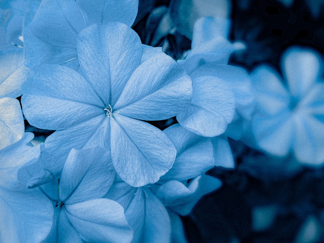
Periwinkle is a pale blue tinged with violet, named after the small five-petaled flower. A representative hex is #CCCCFF, a light tone where a touch of red joins the blue to create its soft purple lean. Periwinkle reads as calm, whimsical, and gentle, occupying the delicate space between blue and lavender. Because it’s both light and slightly violet, it feels dreamy and nostalgic, which is why it appears so often in springtime palettes, soft interiors, and serene branding.
What is Blue?
Blue is the pure primary, the cool anchor of the color wheel. A representative hex is #0000FF: zero red, zero green, full blue, sitting at maximum saturation. With no lean toward green or violet, it reads as the most direct and intense version of the hue. Blue carries deep associations with trust, stability, depth, and calm authority, and its primary neutrality makes it the benchmark against which lighter, warmer, or more violet blues are measured.
What’s the difference between Periwinkle and Blue?
Two qualities separate them: lightness and undertone. Periwinkle is heavily tinted with white and shifted toward violet, while pure blue is dark, saturated, and undertone-free. If you lighten pure blue and add a whisper of red, you arrive at periwinkle. The table below lays it out.
| Property | Periwinkle | Blue |
|---|---|---|
| Hex code | #CCCCFF | #0000FF |
| RGB | 204, 204, 255 | 0, 0, 255 |
| Undertone | Violet / purple lean | Neutral / pure |
| Hue family | Pale blue-violet | Primary blue |
| Best used for | Soft UI, spring palettes, calm branding | Bold logos, links, trust-driven design |
| Mood/feel | Gentle, dreamy, whimsical | Strong, stable, authoritative |
When should you use each?
Choose periwinkle when you want softness and a touch of whimsy, such as a calming wellness brand, a spring or pastel palette, or gentle backgrounds that won’t overpower content. Choose pure blue when you need confidence and clarity, like a trustworthy corporate logo, prominent links, or call-to-action elements that should feel solid and dependable. The emotional contrast is significant, which is why color psychology reads pastel and primary blues so differently.
How to tell Periwinkle and Blue apart
Lightness gives it away instantly: periwinkle is pale and airy, while pure blue is deep and saturated. Look closer at undertone and you’ll see periwinkle’s violet cast, caused by its raised red channel, whereas pure blue holds red at zero and stays cleanly blue. Numerically, periwinkle’s channels sit at 204, 204, 255, very light with equal red and green, while pure blue is 0, 0, 255. Under cool light, periwinkle’s purple lean becomes even more noticeable.
Do Periwinkle and Blue go together?
They pair gracefully as a tonal duo. Because periwinkle is essentially a lightened, violet-leaning relative of blue, layering them builds a soft monochromatic scheme with clear depth: pure blue as the anchor, periwinkle as the gentle highlight. The result reads as calm and harmonious, ideal for serene interiors or airy interfaces. To push toward contrast instead, pair either with a warm accent on the opposite side of the wheel, a strategy grounded in complementary colors.
Frequently Asked Questions
Is periwinkle blue or purple?
Periwinkle is both: it’s a pale blue with a violet undertone, sitting right between blue and purple on the color wheel. Depending on the lighting and surrounding colors, it can read more blue or more lavender, which is why people often disagree on how to classify it.
Is periwinkle a light shade of blue?
Essentially, yes, with a twist. Periwinkle is a light, desaturated blue, but it also leans toward violet thanks to a small red component. So while it’s accurate to call it a pale blue, that violet shift is what distinguishes it from a simple sky or baby blue.
Which is calmer, periwinkle or blue?
Both are calming, but periwinkle tends to feel gentler and more soothing because of its lightness and soft violet lean. Pure blue is calming in a more authoritative, grounded way. Periwinkle reads as dreamy and delicate, while pure blue reads as stable and confident.
Does periwinkle have red in it?
Yes. Periwinkle’s RGB values include a notable red channel (around 204), which is what gives it the violet lean that separates it from pure blue. Pure blue, by contrast, contains no red at all, holding that channel at zero.
Can I use periwinkle and blue together in a design?
Definitely. Combining them creates a layered, monochromatic blue palette with built-in contrast: deep blue grounds the design while periwinkle softens and lifts it. Keep one dominant and the other as an accent, and the pairing will feel harmonious and intentional rather than busy.


