Copper Color Meaning and Symbolism
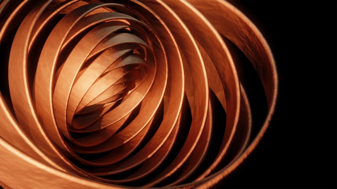
Copper is a warm, reddish-brown metal whose lustrous glow has made it a staple of craft, cookware, and architecture for millennia. The copper color meaning centers on warmth, vitality, and skilled craftsmanship, blending the energy of orange-red with the richness of metal. Its representative shade is approximately #B87333 , a glowing rust-orange with a metallic finish.
What does copper symbolize?
Copper symbolizes warmth, energy, and craftsmanship. As a metal that humans have worked since antiquity, it is closely linked to skilled handiwork, artisanship, and durability. Its reddish-orange glow connects it to fire, vitality, and the warmth of natural materials. Copper is also a symbol of conductivity, since it carries electricity and heat efficiently, lending it associations with connection, flow, and transmission. Over time, exposed copper develops a green patina, which adds layers of meaning around aging gracefully, transformation, and natural change. Together these qualities make copper feel both lively and grounded.
The psychology of copper
Psychologically, copper feels warm, welcoming, and energetic without being aggressive. Its reddish-orange tone stimulates a sense of comfort and approachability, much like the glow of firelight or autumn leaves. People associate copper with craftsmanship and authenticity, perceiving it as handmade, natural, and high-quality. The metallic sheen adds richness and a hint of luxury, while the warm hue keeps it inviting rather than cold. Copper can also evoke nostalgia and rustic charm, recalling vintage cookware, antique fixtures, and traditional trades. This balance of warmth, energy, and earthiness gives copper an emotionally inviting and trustworthy character. For more on how warm hues affect mood, explore our guide to color psychology.
Copper symbolism across cultures
Copper has been valued across cultures for thousands of years, serving as one of the first metals worked by humans. In various traditions, copper is associated with healing, protection, and the planet Venus, linking it to beauty and harmony. It has been used for coins, vessels, tools, and ornaments worldwide, symbolizing both practical utility and refined craft. The famous green patina of weathered copper, seen on landmark statues and rooftops, has become a cultural emblem of endurance and graceful aging. While specific meanings differ by region, copper broadly represents warmth, craft, and natural transformation across many societies.
Positive and negative associations of copper
| Positive | Negative |
|---|---|
| Warmth, energy, and vitality | Can feel dated or overly rustic |
| Craftsmanship and authenticity | Tarnishing and patina (perceived decay) |
| Natural, earthy richness | Overwhelming if overused |
Copper in branding and marketing
Brands use copper to convey craftsmanship, warmth, and artisanal quality. It is popular among premium cookware, craft beverages, coffee roasters, and handmade goods, where its glow signals authenticity and care. Beauty and hair brands use copper to evoke vibrant, natural warmth, while interior and lifestyle brands lean on copper accents for a cozy, upscale aesthetic. In packaging, copper foil and metallic finishes add richness and a tactile, premium feel. Copper’s warm energy makes it ideal for brands that want to feel inviting, established, and rooted in tradition while still appearing modern and refined.
Colors that go well with copper
Copper pairs strikingly with deep teal (#008080), a near-complementary contrast that makes both colors glow. Soft blush pink (#F4C2C2) creates a warm, modern pairing, while charcoal gray (#36454F) grounds copper for an elegant, contemporary palette. Copper also layers well with related earthy metals like bronze for a rich, artisanal effect. To understand why teal and copper play so well together, see our complementary colors guide.
Shades and variations of copper
Copper comes in several named variations. Classic copper (#B87333) is the warm, glowing standard. “Copper red” (#CB6D51) leans more rust and orange. “Pale copper” (#DA8A67) is a softer, lighter tone. “Copper rose” (#996666) introduces a muted, pinkish-brown character. “Copper penny” (#AD6F69) evokes the look of an aged coin. The green-tinged “verdigris” (#43B3AE) represents copper’s oxidized patina. These variants range from bright and energetic to weathered and muted, supporting both vibrant and rustic palettes.
Frequently Asked Questions
What does the color copper mean?
Copper means warmth, energy, and craftsmanship. As a glowing reddish-brown metal, it conveys vitality, authenticity, and a connection to nature. It is also tied to conductivity and graceful aging, symbolized by the green patina that forms on weathered copper over time.
What emotions does copper evoke?
Copper evokes warmth, comfort, and approachable energy. Its reddish-orange glow feels inviting and lively, much like firelight or autumn. It also suggests authenticity and rustic charm, conveying craftsmanship and quality with a touch of nostalgia and richness.
What colors go with copper?
Copper pairs well with teal, blush pink, charcoal gray, and bronze. Teal offers vivid complementary contrast, blush creates warmth, charcoal grounds it elegantly, and related metals like bronze build a layered, artisanal palette with depth and richness.
Is copper warm or cool?
Copper is a warm color. Its reddish-orange, glowing tone places it firmly on the warm side of the spectrum, giving it an energetic, inviting, and earthy character that radiates comfort, much like fire or autumn foliage.
What is the difference between copper and rose gold?
Copper is a more saturated reddish-brown metal, while rose gold is a softer, pinker, and lighter blush-toned metal. Copper reads as rustic and energetic, whereas rose gold feels delicate, modern, and feminine with a subtler warmth.


