Slate Color Meaning and Symbolism
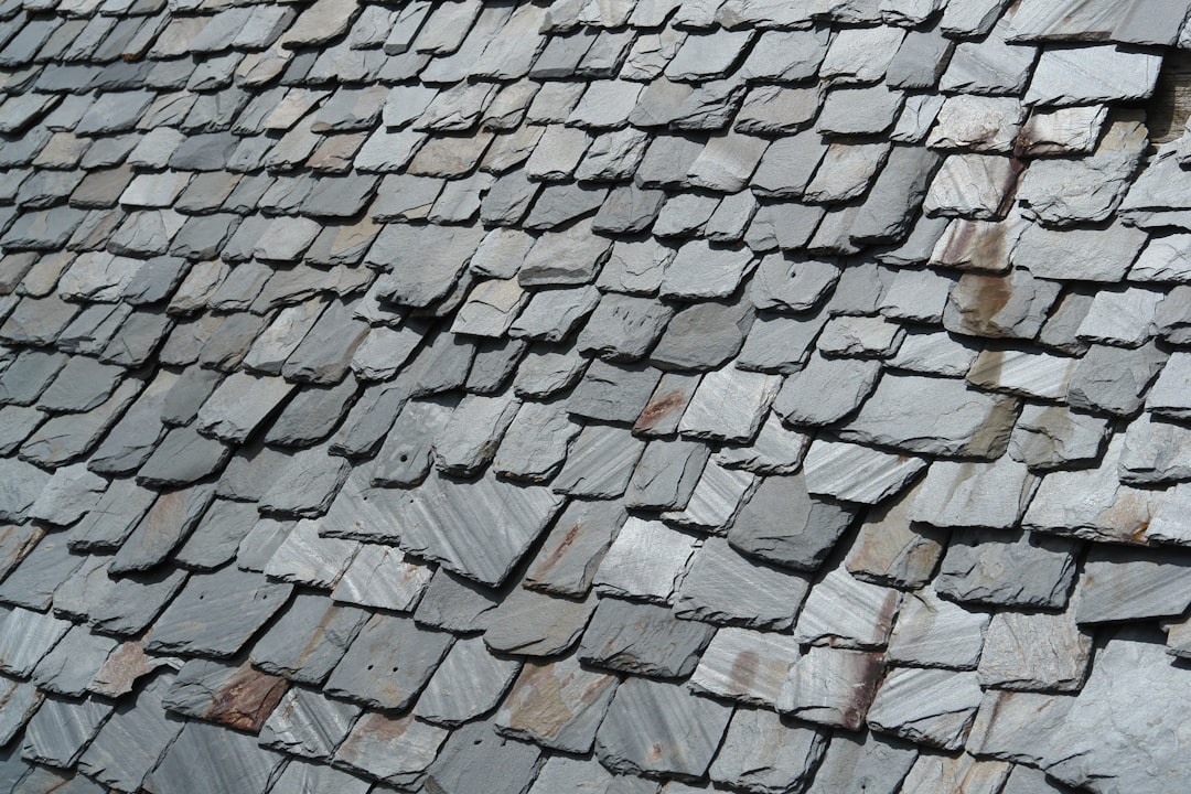
Named after the fine-grained metamorphic rock used for roofs and writing boards, slate is a sophisticated neutral that mixes gray with a quiet whisper of blue. The slate color meaning revolves around professionalism, calm, and steadfast reliability. Cooler and more polished than plain gray, slate feels modern and composed, equally at home in a corporate identity or a minimalist living room.
What does slate symbolize?
Slate symbolizes balance, professionalism, and understatement. Its blend of stable gray and trustworthy blue communicates competence and level-headed reliability, which is why it is so often linked to business, technology, and architecture. Slate represents maturity and calm authority, a color that suggests things are under control. Like the stone it is named for, it also evokes durability, permanence, and quiet strength. As a muted tone, slate carries an air of refinement and restraint, signaling thoughtfulness over flashiness.
The psychology of slate
Psychologically, slate has a stabilizing, calming influence. The gray base neutralizes emotional intensity while the underlying blue introduces serenity and focus, producing a tone that feels composed and trustworthy. Slate reduces visual noise, helping environments and interfaces feel orderly and professional. It can read as cool, distant, or somber when overused, so designers usually warm it with wood tones, soft whites, or a single brighter accent. At its best, slate conveys quiet confidence and clarity of thought, supporting concentration without the stimulation of vivid hues. Learn more about how cool tones shape mood in our guide to color psychology.
Slate symbolism across cultures
As a muted neutral, slate does not carry strong, universal symbolic meanings the way primary colors do, but its associations are fairly consistent. Across many Western cultures, slate gray is linked to formality, professionalism, and seriousness, partly through its long use in business attire, architecture, and chalkboards. Because of its connection to stone, it broadly signals durability and the natural, mineral world. As a blend of gray and blue, it can also inherit some of gray’s associations with neutrality and somberness and blue’s links to calm and trust. Interpretations may shift with context, with darker slates feeling more dramatic and lighter ones more airy and contemporary.
Positive and negative associations of slate
| Positive | Negative |
|---|---|
| Professionalism and reliability | Can feel cold or impersonal |
| Calm, balanced, and composed | May read as gloomy or somber |
| Modern, refined, and durable | Risk of seeming dull or corporate |
Slate in branding and marketing
Slate is a go-to color for technology, finance, consulting, and architecture brands that want to project competence, stability, and modern sophistication. Software companies and SaaS products frequently use slate as a backbone for user interfaces because it is easy on the eyes and conveys reliability. In fashion and interiors, slate signals understated luxury and contemporary taste. Brands often pair slate with a vivid accent such as teal, amber, or coral to add energy while keeping the overall impression professional. Its neutrality also makes it an excellent supporting color in flexible brand systems.
Colors that go well with slate
Slate’s cool, neutral character makes it easy to pair. Warm white (#F7F5F2) keeps schemes light and clean, balancing slate’s coolness. Mustard or amber (#E1AD01) creates a striking warm-cool contrast that feels modern and inviting. Soft blush (#E8C4C4) or dusty rose adds gentle warmth, while deep teal (#2C6E6E) builds a tonal, sophisticated palette. For dramatic depth, pair slate with charcoal (#36454F). Explore more pairing logic in our piece on complementary colors.
Shades and variations of slate
Slate ranges from light blue-grays to nearly black. Classic slate gray (#708090) is the balanced midpoint, while light slate gray (#778899) is a touch brighter. Dark slate gray (#2F4F4F) leans toward deep teal-green and feels moody and dramatic. Blue slate edges further toward navy, and slate blue (#6A5ACD) introduces a noticeable purple cast. Greige-leaning slates warm slightly toward brown. These variants let designers dial the temperature and depth of slate to fit the mood, from airy and modern to dark and authoritative.
Frequently Asked Questions
What does the color slate mean?
Slate means professionalism, calm, and reliability. As a muted blue-gray neutral, it combines the stability of gray with the trust and serenity of blue, signaling competence, balance, and understated sophistication. It is widely used in corporate, technology, and modern design contexts to convey composure and dependability.
What emotions does slate evoke?
Slate evokes calm, focus, and quiet confidence. Its cool, composed quality has a stabilizing effect that reduces visual tension and supports concentration. While it can feel somber or distant when overused, slate generally reads as serene, professional, and trustworthy.
What colors go with slate?
Slate pairs well with warm white and cream for brightness, mustard or amber for warm-cool contrast, blush pink for softness, and teal or charcoal for tonal depth. Because it is a cool neutral, slate complements both warm accents and other cool, muted tones for a refined, modern look.
Is slate warm or cool?
Slate is a cool color. Although it is largely gray, its underlying blue (and sometimes green) undertone places it firmly on the cool side of the spectrum. This coolness gives slate its calm, composed, professional character. See our guide to warm vs cool colors for more.
What is the difference between slate and gray?
Slate is a specific type of gray with a blue (or blue-green) undertone, whereas plain gray is neutral and undertone-free. This subtle blue cast makes slate feel cooler, more refined, and more modern than basic gray, which can appear flatter and more neutral by comparison.


