Grid Design Principles That Work
A grid is the invisible scaffolding that makes a layout feel calm and intentional. Solid grid design principles give you a repeatable system for placing text, images and white space so a page reads as a unified whole rather than a collection of loose parts. Without a grid, alignment drifts and spacing wanders; with one, decisions get faster and the result feels professional. The grid is not a cage, it is a shared set of rules that everything on the page can agree to follow.
The key principles of grid design
These seven principles cover how to build and use a grid, from picking columns to knowing when to break free of them. Each keeps your layout consistent and adaptable.
| Principle | Why it matters |
|---|---|
| Choose the column count | A 12-column grid divides evenly into halves, thirds and quarters for flexible layouts. |
| Consistent gutters and margins | Even spacing between and around columns keeps the page balanced and tidy. |
| Baseline grid | Aligning text to a baseline grid creates steady vertical rhythm across columns. |
| Modular grids | Adding rows creates modules ideal for galleries, cards and dashboards. |
| Alignment to structure | Snapping elements to grid lines produces clean, intentional edges. |
| Content-driven structure | The grid should serve the content, not force it into an ill-fitting frame. |
| Responsive breakpoints | Grids must reflow gracefully as screen width changes. |
1. Choose your column count — start with structure
The number of columns defines how flexibly content can be arranged. A 12-column grid is popular on the web because it divides cleanly into two, three, four and six, supporting many layouts from one underlying system. Print might use fewer columns. Pick a count that matches the variety of arrangements your content needs, then commit to it across the project.
2. Keep gutters and margins consistent
Gutters are the gaps between columns; margins frame the whole composition. Keeping both consistent is what makes a grid feel deliberate rather than accidental. Choose values that relate to your spacing scale and apply them everywhere. When gutters vary at random, the eye senses disorder even if it cannot name the cause. Consistent white space is half of what makes a grid work.
3. Use a baseline grid for vertical rhythm
A baseline grid is a set of evenly spaced horizontal lines that text sits on, so lines of type across adjacent columns align row to row. This vertical rhythm makes dense pages feel orderly and easy to scan. Set your baseline to a multiple of your body line height, then align headings, paragraphs and images to it for a coherent vertical beat.
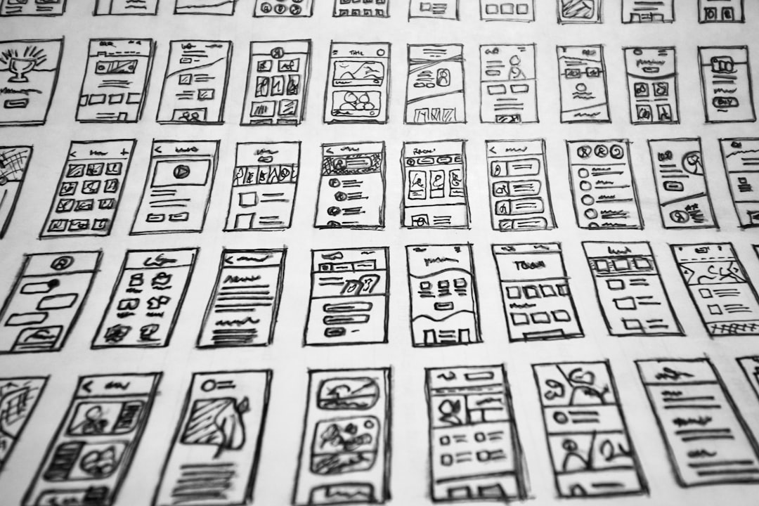
4. Reach for modular grids when content repeats
Add horizontal divisions to your columns and you get a modular grid, a matrix of cells. Modular grids excel for galleries, card layouts, product listings and dashboards, where repeated units need to align in both directions. Each module becomes a predictable container, so a complex page of many items still reads as a tidy, unified system.
5. Align everything to the structure
The grid only pays off if elements actually snap to it. Align text blocks, images and buttons to column edges and baseline lines so their edges share invisible reference lines. Crisp alignment is one of the strongest signals of careful design; misalignment, even by a few pixels, reads as sloppiness. For more on this, see our overview of layout design principles.
6. Let content drive the grid
A grid is a tool, not a goal. Build it around the content you actually have, headlines, body copy, images, data, rather than forcing content into a grid borrowed from elsewhere. If a layout demands awkward compromises to fit, adjust the grid. The best structures feel inevitable because they grew from the material they organize.
7. Plan responsive breakpoints
On screens, the same content must work from phone to desktop. A 12-column grid might collapse to a single column on mobile, two columns on a tablet and the full twelve on a wide monitor. Define how columns merge and stack at each breakpoint so the layout reflows gracefully instead of breaking. A responsive grid keeps your structure intact across every device.
Common grid design mistakes to avoid
- Using inconsistent gutters and margins that make the layout feel unbalanced.
- Ignoring the baseline grid so text rows fail to align across columns.
- Forcing content into a borrowed grid that does not fit the material.
- Breaking the grid randomly instead of deliberately for emphasis.
Frequently Asked Questions
What are the most important grid design principles?
The most important principles are choosing a sensible column count, keeping gutters and margins consistent, using a baseline grid for vertical rhythm, and aligning every element to the structure. Letting content drive the grid and planning responsive breakpoints ensure the system stays useful across content types and screen sizes.
Why is a 12-column grid so common?
Twelve divides evenly into halves, thirds, quarters and sixths, so a single 12-column grid supports a wide range of layouts, two-column splits, three-card rows, sidebars and more, without switching systems. That flexibility is why it became a default on the web and in many design frameworks.
What is a baseline grid?
A baseline grid is a series of evenly spaced horizontal lines that text rests on. Aligning type to it means lines across adjacent columns sit at the same height, creating steady vertical rhythm. It makes dense, multi-column pages feel orderly and easier to read by keeping everything on a shared vertical beat.
When should I break the grid?
Break the grid intentionally, to create a focal point, add energy, or signal that an element is special, never by accident. A deliberately oversized image or an offset headline draws the eye precisely because it departs from an established order. The grid must be clearly present first for breaking it to read as a choice.
How do grids work responsively?
A responsive grid redefines how columns behave at each breakpoint. A 12-column desktop layout might collapse to one column on phones and two on tablets, with elements stacking in a planned order. Defining these rules ahead of time keeps content readable and aligned as the screen width changes.