Print Design Principles That Work
Print is unforgiving in a way screens are not, once ink hits paper, there is no editing the live version. Sound print design principles are mostly about respecting the physical production process so what you designed is what comes off the press. Files fail at the printer because of missing bleed, RGB color, low-resolution images or un-embedded fonts, problems that never show on screen but ruin the final piece. Getting print right means designing with trim, ink and paper in mind from the very first decision.
The key principles of print design
These seven principles cover the production realities that separate a clean printed piece from a costly reprint. Each addresses something that behaves differently on paper than on a display.
| Principle | Why it matters |
|---|---|
| Bleed, trim and safe margins | Extending art past the trim prevents white slivers; keeping text inside the safe zone avoids cut-off content. |
| CMYK color | Presses print in CMYK, so designing in it prevents surprising color shifts from RGB. |
| 300 dpi resolution | Images need enough pixels to look sharp at print size; low-res art prints blurry. |
| Color management and proofs | Profiles and printed proofs catch color problems before the full run. |
| Paper stock and finish | Weight, coating and texture shape how the piece looks and feels. |
| Print typography | Point sizes and legible faces behave differently on paper than on screen. |
| Clean file prep | Outlined fonts, embedded images and correct settings ensure faithful output. |
1. Set bleed, trim and safe margins — design for the cut
Cutting blades are not perfectly precise, so any color or image that should reach the edge must extend past the trim line by a bleed (commonly about 3mm or 0.125 inch). Conversely, keep text and essential elements inside a safe margin away from the edge so they are not clipped. Setting these zones at the start prevents white edges and amputated headlines.
2. Design in CMYK
Screens emit light in RGB; presses mix Cyan, Magenta, Yellow and Black ink. A vivid RGB blue or green can dull noticeably when converted, so build your files in CMYK from the start to see realistic color. Be especially careful with bright, saturated tones, which often fall outside the printable gamut. For the theory behind these color spaces, see our notes on color theory.
3. Use 300 dpi resolution
Print needs far more pixels than screens. Images should be 300 dpi (dots per inch) at their final printed size; anything significantly lower prints soft or pixelated. A graphic that looks crisp on a monitor at 72 dpi may be unusable in print. Source high-resolution images, and never scale small images up to fill a large space.
4. Manage color and proof before the run
Use the correct color profile for your press and paper, and request a proof, ideally a printed hard proof, before committing to a full run. Monitors lie about color, and what looks right on screen may print differently on a given stock. A proof is the cheapest insurance against a thousand mis-colored copies.
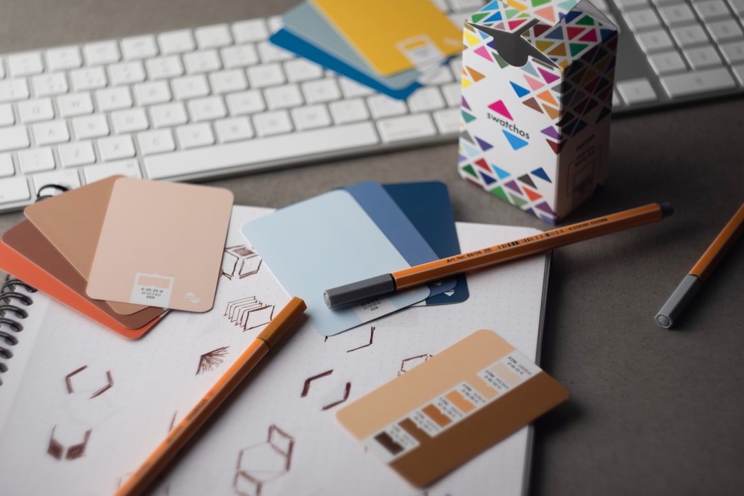
5. Choose paper stock and finish deliberately
The substrate is part of the design. Paper weight (gsm or pound), coating (gloss, matte, uncoated) and texture change how colors appear and how the piece feels in hand. A matte uncoated stock reads soft and tactile; a gloss coating makes images pop. Pick stock and finish to match the purpose, and remember coatings shift how ink looks.
6. Set type for print legibility
Type behaves differently on paper. Body text often sits comfortably around 9 to 12 points, and serif faces can aid readability in long printed passages, where screen rules do not apply. Watch fine hairlines and very small reversed-out text, which can fill in or break up on press. Our typography terms glossary covers the terms that matter when setting type for print.
7. Prepare clean, print-ready files
Before sending to a printer, convert or outline fonts so the press does not substitute them, embed or link all images at full resolution, flatten or correctly handle transparency, and export to the format the printer requests (usually a press-ready PDF with bleed and crop marks). Double-check overprint and spot-color settings. Clean file prep is the final safeguard that what you designed is what prints.
Common print design mistakes to avoid
- Forgetting bleed, leaving thin white slivers along trimmed edges.
- Submitting RGB files that shift color when converted to CMYK on press.
- Using low-resolution images that print blurry or pixelated.
- Not outlining or embedding fonts, causing substitutions at the printer.
Frequently Asked Questions
What are the most important print design principles?
The most important principles are setting bleed, trim and safe margins, designing in CMYK, using 300 dpi images, and proofing color before the run. Choosing the right paper stock, setting type for print legibility, and delivering clean files with outlined fonts and embedded images ensure the printed piece matches your design.
Why design in CMYK instead of RGB?
Presses print with Cyan, Magenta, Yellow and Black ink, while screens display in RGB light. Bright RGB colors often fall outside the printable CMYK gamut and shift or dull when converted. Building in CMYK from the start lets you see realistic color and avoid surprises when the job comes off the press.
What resolution do print files need?
Images should be 300 dpi at their final printed size. That gives presses enough detail to render sharp, clean output. Lower resolutions that look fine on a 72 dpi screen will print soft or pixelated. Always source high-resolution art and avoid scaling small images up to fill larger areas.
What is bleed and why does it matter?
Bleed is extra artwork extended beyond the trim line, typically about 3mm or 0.125 inch. Because cutting is never perfectly precise, bleed ensures color and images that should reach the edge actually do, instead of leaving thin white slivers. Keeping text inside a safe margin similarly prevents important content from being cut off.
How should I prepare files for the printer?
Outline or embed fonts so they are not substituted, include all images at full resolution, set up correct bleed and crop marks, and export a press-ready PDF in the format your printer requests. Verify CMYK color, overprint and any spot colors. Requesting a proof before the full run is the final check.


