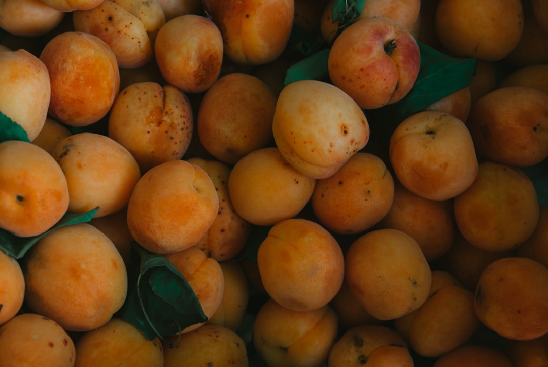
Apricot Color Meaning and Symbolism
Apricot takes its name from the soft-skinned fruit, and it carries the same sun-warmed, gentle glow. A delicate pastel blend of orange and pink, apricot color meaning centers on cheerfulness, warmth, and quiet creativity . It offers orange’s optimism and energy in a softened, more approachable form, making it feel cozy rather than loud. Represented by hex #FBCEB1, apricot reads as nurturing and friendly, a flattering, light-filled tone that appears throughout spring fashion, interiors, and wellness branding.
What does apricot symbolize?
Apricot symbolizes warmth, friendliness, and gentle vitality. As a tint of orange, it inherits associations with enthusiasm, sociability, and creativity, but its pastel softness adds tenderness and calm. The color evokes ripe fruit, golden hour light, and warm skin tones, lending it a wholesome, natural, and nourishing feel. Apricot also suggests playfulness and youthful optimism, while staying delicate enough to feel soothing. It is a color of encouragement and approachable cheer rather than bold demand for attention. Because apricot sits so close to natural skin and fruit tones, it tends to feel organic, healthy, and appetizing, which deepens its associations with nourishment and well-being. That wholesome warmth gives apricot a grounding quality despite its lightness, making it feel reassuring as well as cheerful, a rare combination among warm pastels.
The psychology of apricot
Psychologically, apricot lifts the mood while keeping things relaxed. Orange tones are known to feel energizing and sociable, and apricot delivers that warmth in a muted form that avoids overstimulation. People often perceive apricot as comforting, optimistic, and creatively inspiring, which makes it well suited to spaces meant to feel welcoming and gently uplifting. Its closeness to skin and fruit tones gives it an organic, appetizing quality that feels both fresh and reassuring. For more on how warm pastels influence emotion, explore our guide to color psychology.
Apricot symbolism across cultures
Apricot’s symbolism blends orange and peach associations, which differ across regions. In many Western contexts, soft warm tones like apricot signal friendliness, creativity, and approachable energy. In several East Asian cultures, the apricot tree and its blossoms hold rich meaning, sometimes representing education, refinement, and the arrival of spring, with the apricot flower carrying connotations of beauty and renewal. Because these readings vary considerably by culture and setting, apricot is best understood as broadly warm, hopeful, and life-affirming rather than tied to a single fixed meaning.
Positive and negative associations of apricot
| Positive | Negative |
|---|---|
| Warmth, cheerfulness and optimism | Can feel faint or washed out |
| Creativity, friendliness and energy | May read as overly sweet or delicate |
| Gentle, nurturing and inviting | Hard to pair with very cool, stark palettes |
Apricot in branding and marketing
Brands choose apricot to feel warm, creative, and approachable without overwhelming the viewer. It is popular in beauty and skincare, food and beverage, wellness, children’s products, and lifestyle brands aiming for a soft, optimistic personality. Apricot has become a fashionable choice in modern design because it feels fresh, gender-neutral, and emotionally warm, conveying friendliness and creativity at once. As an accent it adds a cheerful glow, and as a base it creates a cozy, inviting atmosphere. Apricot is also a strong choice for seasonal campaigns, evoking spring blossoms and late-summer fruit, and it photographs warmly against natural light, which suits brands built around food, skincare, and lifestyle imagery. Used thoughtfully, it communicates a sense of care and craft, signaling that a product is wholesome and considered rather than mass-produced.
Colors that go well with apricot
Apricot pairs beautifully with both cool and neutral tones. Combine it with teal or aqua (#40E0D0) for a fresh, energetic contrast, since cool blue-greens balance apricot’s warmth. Pair it with cream (#FFFDD0) and soft white for a delicate, airy palette. For depth, set apricot against charcoal (#36454F) or navy. Sage green (#9CAF88) also creates a natural, harmonious combination.
Shades and variations of apricot
The apricot family spans warm pastel oranges. Peach (#FFE5B4) is paler and softer. Apricot orange (#FB8B24) is deeper and more saturated. Melon (#FEBAAD) leans slightly pinker. Cantaloupe (#FFA177) is brighter and juicier, while peach fuzz sits gently between apricot and pink. Each variant adjusts brightness and the orange-to-pink balance while keeping apricot’s warm, fruity softness. The palest tints read as quiet and elegant, suited to minimal, sophisticated layouts, while the brighter, juicier shades feel playful and energetic, perfect for lively, youthful designs. Because the whole family shares a sun-warmed glow, these variations blend together harmoniously, letting designers build gentle gradients and tonal palettes that feel cohesive, fresh, and inviting without any single shade overpowering the rest.
Frequently Asked Questions
What does the color apricot mean?
Apricot means warmth, cheerfulness, creativity, gentleness, and energy. A soft pastel orange with a pinkish glow, it offers orange’s optimism in a muted, approachable form. It evokes ripe fruit and golden light, signaling friendliness, nurturing comfort, and playful, light-filled positivity.
What emotions does apricot evoke?
Apricot evokes optimism, comfort, and gentle excitement. Its warm orange base feels energizing and sociable, while its pastel softness keeps the mood relaxed and soothing. People often find apricot cheerful, welcoming, and creatively inspiring, lifting the spirit without overstimulating.
What colors go with apricot?
Apricot pairs well with teal and aqua for fresh contrast, cream and white for airy softness, and charcoal or navy for grounding depth. Sage green creates a natural harmony. Cool tones balance apricot’s warmth especially nicely, making the palette feel fresh and energetic.
Is apricot warm or cool?
Apricot is a warm color. As a pastel tint of orange with a pink glow, it sits firmly on the warm side of the spectrum, though its lightness makes it feel gentle. See our guide to warm vs cool colors for more.
What is the difference between apricot and peach?
Apricot and peach are very close, but apricot carries a touch more orange and warmth, while peach tends to be paler, softer, and slightly pinker. Apricot feels a bit richer and more golden; peach feels lighter and creamier, though the two are often used interchangeably.