What Font Does Trader Joe’s Use?
Few grocery brands have a visual identity as charming as this one, so it makes sense people keep asking about the trader joes font. The truth is there isn’t a single font at all. The wordmark is bespoke hand-lettering, and the in-store signage famously mixes hand-painted styles, chalkboard scrawl and playful slab serifs. That handcrafted mishmash is the whole personality. Below we unpack the logo, the broader type approach, and free fonts that get you close, plus the strategy behind the handmade look and how to recreate it without infringing. For more brand breakdowns, visit our famous brand fonts hub.
What font is the Trader Joe’s logo?
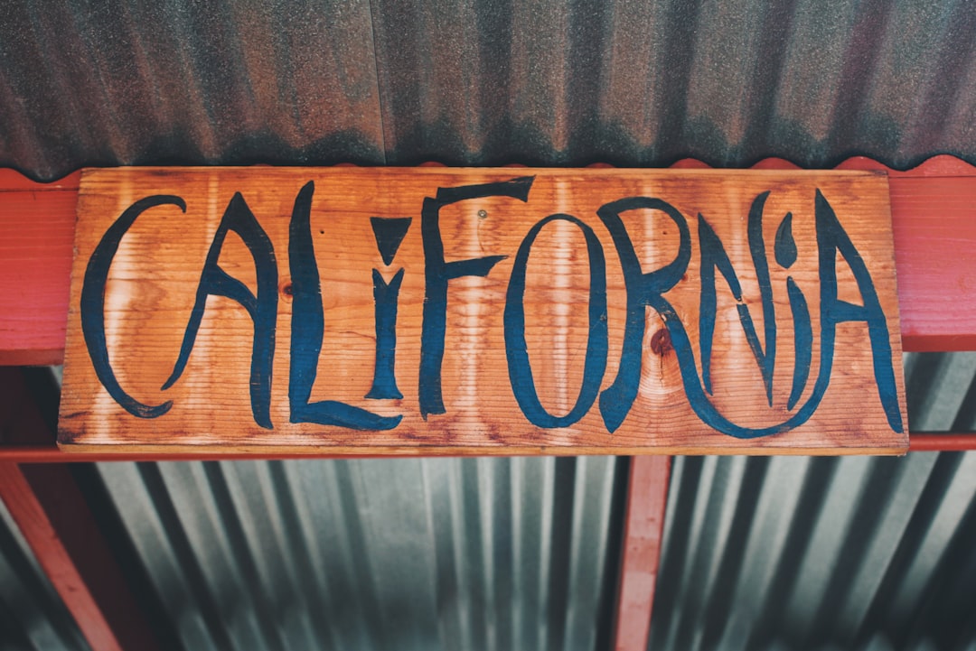
The Trader Joe’s wordmark is custom hand-lettering, not a typeface you can download. The red letters carry a loose, slightly irregular, handcrafted quality that nods to the chain’s faux-nautical “trading post” theme, all crew shirts, ship motifs and island-trader whimsy. Those imperfect strokes are intentional: they make the brand feel small, local and made-by-hand even at massive scale. Because the lettering is unique, trademarked artwork, no public font matches it exactly. To approximate it, designers reach for a free hand-lettered brush or marker font and tweak the weight and slant to capture that warm, slightly rough character.
What is Trader Joe’s brand typeface?
Trader Joe’s doesn’t really run on one tidy brand typeface. Its signage and packaging reportedly blend hand-painted lettering, chalk-style display type and chunky slab serifs to create a deliberately eclectic, handmade aesthetic. We hedge on naming any single official font because the brand’s charm comes precisely from variety rather than uniformity. Headlines and signs lean playful and tactile, product names often feel hand-set, and the retro slab serifs add a vintage general-store warmth. The result is a system that feels curated by real people, not generated by a template, which is central to the company’s neighborhood-shop identity.
Free fonts that look like the Trader Joe’s font
You can’t use the real artwork, but you can build a similar handcrafted, retro mood with free fonts. Here’s a practical mapping by use case.
| Use case | Trader Joe’s uses | Free alternative |
|---|---|---|
| Logo / wordmark | Custom hand-lettered script | A free brush/marker font like Caveat, Permanent Marker, or Kalam |
| Headlines / signage | Chunky retro slab serif | Alfa Slab One, Bevan, or Zilla Slab |
| Body / UI | Simple readable type | Source Serif 4, Bitter, or Work Sans |
A marker-style face like Permanent Marker or the softer Caveat captures the hand-drawn wordmark energy, while a chunky slab such as Alfa Slab One delivers the vintage signage punch. Pair them carefully so the look feels curated, not chaotic. If you’re new to mixing display and slab type, our font roundups can help you find clean partners for body copy.
Why does Trader Joe’s use this kind of type?
The handcrafted typography is pure strategy disguised as whimsy. Hand-lettering and chalkboard styles signal that products are chosen by people, not algorithms, reinforcing the brand’s quirky, value-driven, anti-corporate image. The nautical theme and retro slabs evoke an old-fashioned trading post, making a national chain feel like a discovery-filled local find. This tactile, imperfect look also stands out sharply against the slick, geometric branding of mainstream supermarkets. By leaning into variety and handmade charm, Trader Joe’s builds emotional loyalty: shoppers feel they’re in on a fun, friendly secret rather than just buying groceries. The inconsistency that would sink most brand systems becomes an asset here, because each hand-painted sign and quirky label feels like a one-off discovery, exactly the treasure-hunt experience the chain is famous for delivering.
Can I use the Trader Joe’s font for my own project?
No. The Trader Joe’s wordmark is custom, trademarked artwork, and imitating it, or using a knockoff “Trader Joe’s font” to mimic the brand, can land you in legal trouble. The better route is to combine free, openly licensed hand-lettered and slab fonts to create your own original retro identity. Always check each font’s license, since some display faces restrict commercial or logo use. Our font licensing guide explains the difference between personal, commercial and trademark-safe usage so your handcrafted project stays fully legitimate.
Frequently Asked Questions
Is the Trader Joe’s font free to download?
The actual hand-lettered wordmark is not available for free because it is custom, trademarked artwork rather than a retail font. You can download free brush and slab fonts like Caveat, Permanent Marker and Alfa Slab One from Google Fonts to approximate the handcrafted, retro signage look for your own non-infringing projects.
What font is closest to the Trader Joe’s logo?
There’s no exact match because the logo is hand-drawn, but a marker-style font such as Permanent Marker or the gentler Caveat captures its loose, hand-lettered character. Pairing that with a chunky slab like Alfa Slab One recreates the broader nautical, vintage feel of the brand’s signage.
Why does Trader Joe’s signage look hand-painted?
Trader Joe’s deliberately uses hand-painted and chalk-style lettering to feel local, human and curated rather than mass-produced. Stores often employ sign artists, reinforcing the neighborhood-shop personality. That handmade aesthetic is a core part of the brand strategy, which is why no single downloadable font fully reproduces the look.
Does Trader Joe’s use a slab serif font?
Slab serifs feature prominently in Trader Joe’s signage and packaging, contributing to its retro, general-store warmth. The brand blends these chunky serifs with hand-lettering and chalk styles rather than committing to one typeface, which is why free slabs like Alfa Slab One, Bevan and Zilla Slab feel appropriate for the look.
What fonts pair well for a Trader Joe’s-style design?
A hand-drawn marker or brush font for the wordmark pairs well with a chunky retro slab serif for headlines and a simple, readable serif or sans for body copy. This three-part combination, for example Caveat plus Alfa Slab One plus Source Serif, recreates the curated, handcrafted balance that defines the brand’s eclectic identity.


